Minimalist Architecture Professional Website Template
A bold brutalist landing page built for the solo real estate agent who sells architecturally significant homes on conviction alone. This single-page template uses a narrative masonry scroll, monument-scale serif typography, and an obsidian-and-gold color system to turn a design-obsessed practice into an unforgettable first impression that earns the click before asking for anything.
by Rocket studio
Quick summary
This is a single-page, masonry-layout landing page for a minimalist realtor specialist. It opens with a monument-scale manifesto headline, unspools an origin story through staggered card rows, then closes with two deliberate calls to action. The design is severe, gallery-quiet, and built entirely around earning trust through obsession and proof.
Who this template is for
This template was designed for one very specific kind of real estate professional: a solo agent whose entire practice is built around architecturally significant homes and the clients who refuse to sell them like ordinary properties.
- Solo agents specializing in mid-century modern, brutalist, or loft-conversion listings
- Design-conscious buyers and architects selling their own renovations
- Realtors leaving traditional brokerages to build a niche, narrative-led practice
What problem this template solves
Generic real estate landing pages treat every home as a commodity. They lead with contact forms, carousel sliders, and stock-photo smiles. For an agent whose edge is taste and conviction, that kind of page actively undermines trust.
- No story means no differentiation from the hundreds of other agents in the market
- A contact form too early breaks the relationship before it begins
- Architecture-obsessed clients bounce fast when the page does not match the promise
What you get with this template
You get a fully structured, single-page landing page that tells a complete story from manifesto to proof to action. Every section is purposeful. Nothing is decorative for its own sake.
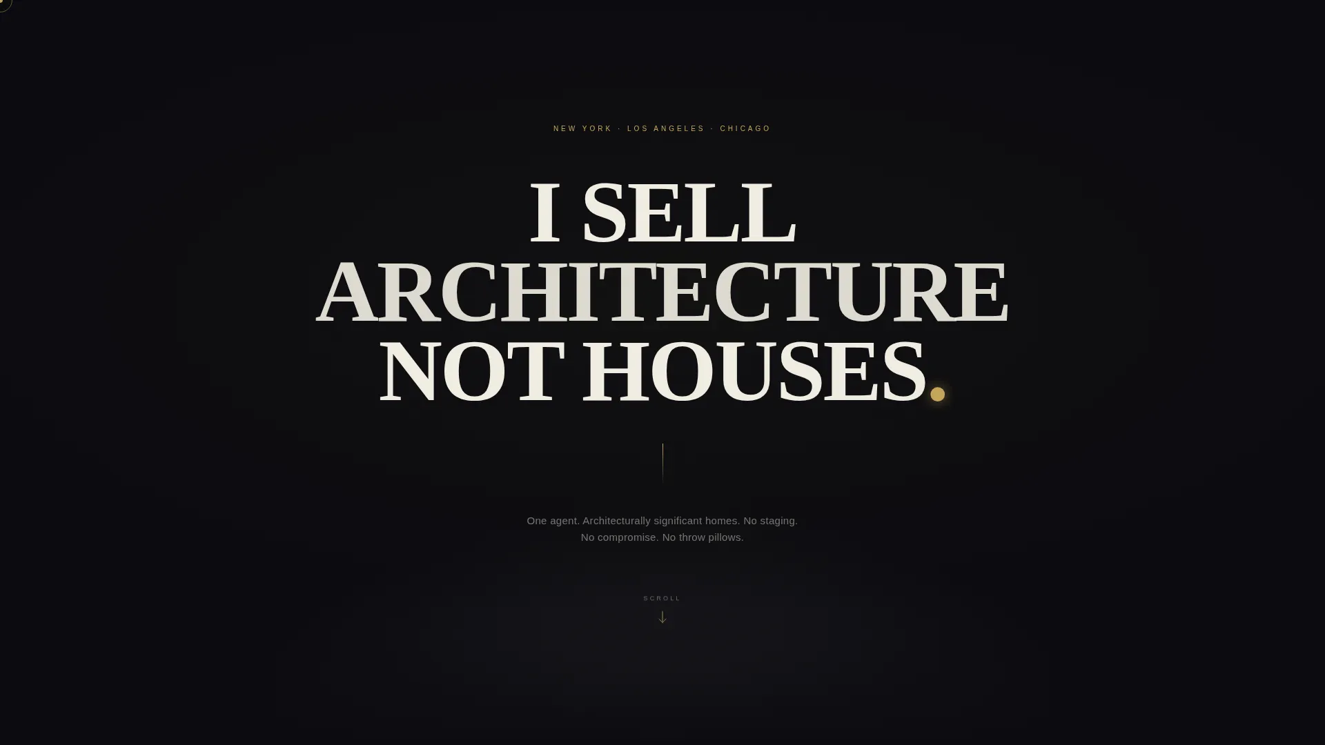
- A hero section with monument-scale uppercase serif headline on a pure obsidian field
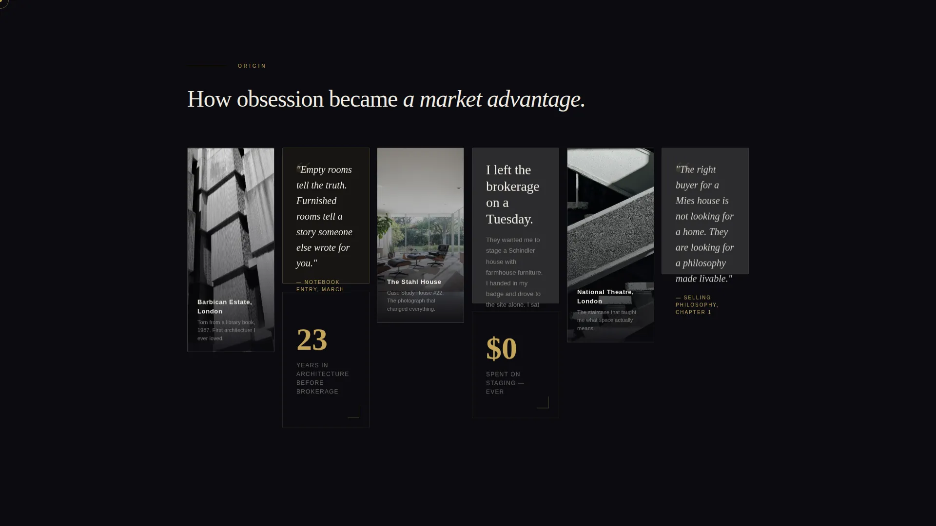
- A two-phase masonry grid: personal artifact cards followed by sold-property proof cards
- Two distinct call-to-action placements and a secondary philosophy text link
Feature list
This section walks through the core capabilities built into the template as described in the source brief.
Monument-Scale Hero Typography
The header is a single line of enormous uppercase serif text centered on a deep obsidian background. The letterforms are set so large they bleed off the viewport edges on mobile. No navigation, no logo, no image. The visitor reads a manifesto before they see a single property.
Narrative Masonry Scroll
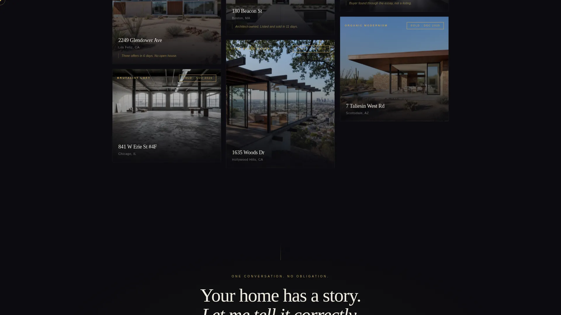
The masonry grid unfolds in two distinct phases. The first rows carry personal artifact cards: childhood photographs of brutalist buildings, handwritten notes, and a line about leaving a traditional brokerage. Subsequent rows shift to professional evidence: sold properties grouped by architectural movement, each with a stark photograph and a gold-stamped sold date.
Staggered Reveal Animations
Cards enter the viewport through a staggered masonry reveal tied to scroll position. Scroll-linked opacity and gold shimmer hover states give the grid a tactile, gallery-quality feel without distracting from the content.
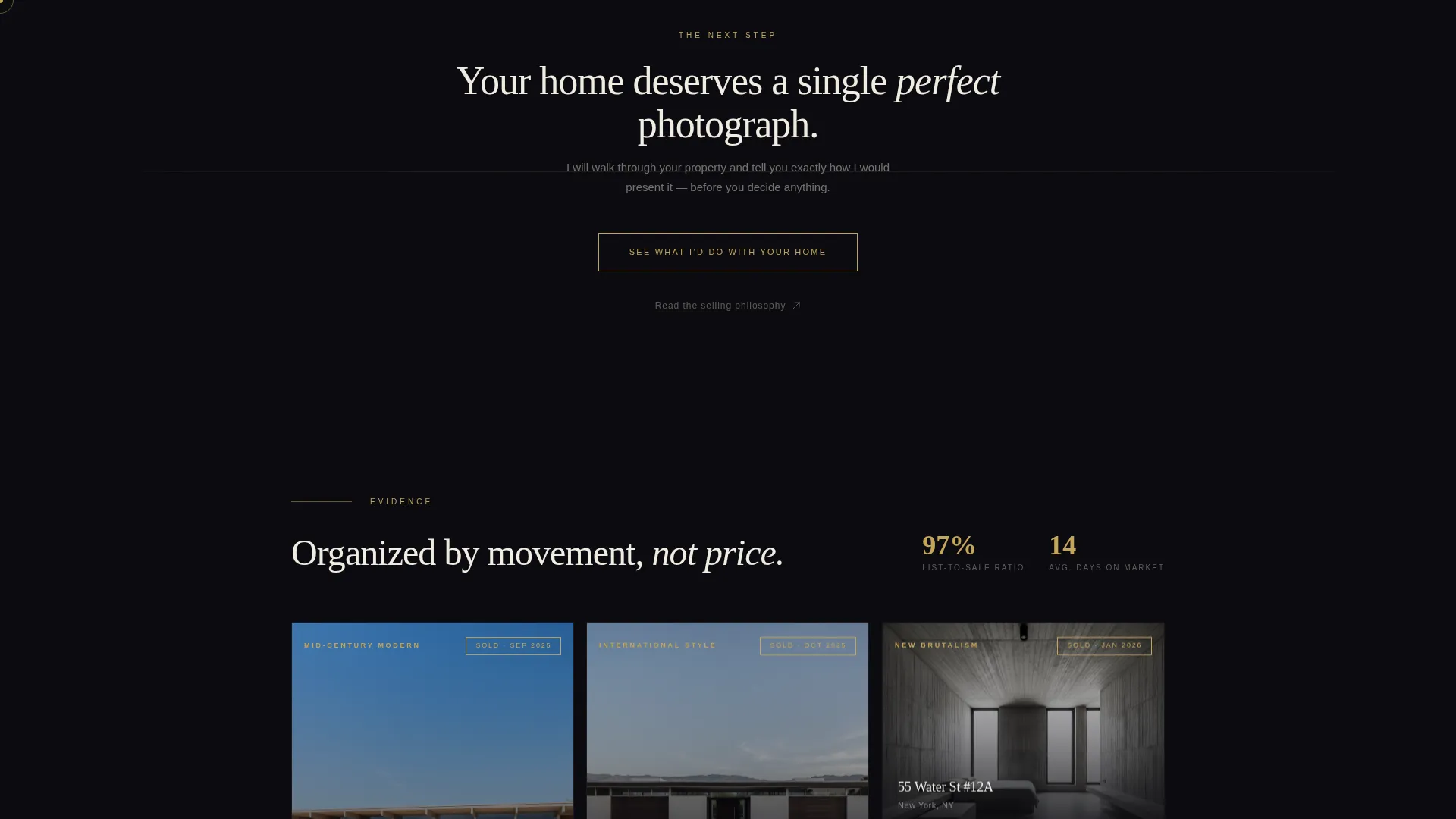
Dual Call-to-Action Placement
The primary call to action, "See What I'd Do With Your Home," appears first as a gold-outlined ghost button after the origin sequence, then again as a solid gold bar anchored at the bottom of the page. This placement mirrors the emotional arc of the scroll.
Cursor Spotlight Effect
A cursor spotlight effect follows the visitor's pointer across the obsidian background. The effect reinforces the gallery metaphor: one beam of light, one house, nothing wasted.
Minimalist Footer
The footer follows a centered social-plus-copyright pattern. It is spare by design, keeping the visitor's attention on the call to action rather than pulling them into secondary navigation.
Page sections overview
| Section | Purpose |
|---|---|
| Hero Manifesto | Delivers the agent's core statement at monument scale before any property appears |
| Origin Artifact Cards | Builds personal credibility through childhood references and a brokerage departure note |
| Sold Properties Grid | Demonstrates proof via architectural-movement grouping and gold sold-date stamps |
| Ghost call to action Button | Captures mid-page curiosity with a low-commitment click after the origin story |
| Solid Gold call to action Bar | Anchors the page's bottom with a high-visibility primary action |
| Philosophy Text Link | Offers a long-form essay route for logic-driven visitors who need more before clicking |
| Minimal Footer | Closes with centered social links and copyright, keeping exit paths clean |
Design & branding system
The visual identity is built around a Bold Brutalist theme. Every color choice and type decision is intentional, severe, and impossible to misread.
- Color palette: deep volcanic black (#0B0B0F) as the dominant background, poured-concrete charcoal (#2C2C2E) on card surfaces, molten antiqued gold (#C5A55A) for interactive elements and typographic accents, and stark bone white (#F0ECE2) for body text
- Typography: Fraunces serif display for headlines, DM Sans for body text, creating tension between monumental and functional
- Gold is reserved exclusively for the period in the manifesto headline, hover states, sold-date stamps, and call-to-action elements
Mobile & speed optimization
The template is designed desktop-first because the monument typography experience demands full viewport width. However, it is fully responsive down to 375 pixels, so the manifesto still lands on a phone screen.
- Letterforms in the hero scale down gracefully, maintaining the bleed-off-edge effect at narrower widths
- Server components handle static content sections, and image optimization is applied across the masonry grid cards
- Card hover states adapt cleanly for touch interfaces, preserving the gallery feel without requiring a mouse
How this template helps you convert
Conversion here means earning a single curious click, not filling a form. The page is structured so that trust accumulates before any action is requested.
- The manifesto headline creates immediate self-selection: the right visitor leans in, the wrong one leaves, and that is the point.
- The narrative masonry scroll builds a case across two phases, moving from personal obsession to market proof before any call to action appears.
- The dual call-to-action placement meets visitors wherever they are in the story: mid-scroll curiosity or bottom-of-page conviction.
Other information about this template
This template is categorized under Architecture and Design with a subcategory focus on minimalist architecture. It is built for the United States market, uses English-language copy, and is priced and framed in United States dollars where relevant.
- The template style is Masonry/Pinterest, which means the grid is variable-height and scroll-driven rather than a rigid row-and-column layout
- The creative direction is Origin Story, meaning the page is structured as a personal and professional narrative arc rather than a features-and-benefits list
- The landing page direction is Click-Through: the goal is one earned click to a single-property case study page, not a form submission on this page
- This template is well-suited for use inside portfolio builders, solo-agent websites, or standalone listing presentation pages for design-focused brokers
Theme
Bold Brutalist
Creative direction
Origin Story
Color system
Obsidian & Gold
Style
Masonry/Pinterest
Direction
Click-Through
Page Sections
Monument-scale Manifesto Headline
Two-phase Narrative Masonry Grid
Staggered Scroll Animations
Dual Call-to-action Placement
Cursor Spotlight Effect
Minimal Centered Footer
Related questions
Does this landing page include a contact form?
Can I use this template if I am not a brutalist architecture specialist?
What does clicking the call to action lead to?
Is the masonry grid built to show multiple sold properties?
What typography does this template use?



