Real Estate Agency Specialist Professional Website Template
A dark-cockpit landing page built for elite real estate agencies. This single-page template uses animated data panels, a pinned anchor navigation bar, and five comparison grids to position your brokerage above every competitor. The Midnight Blue palette, electric cyan accents, and glass-panel components create an authoritative, information-dense experience that earns buyer trust before a single word is read.
by Rocket studio
Quick summary
This is a single-page, hub-and-spoke landing page for a high-performance real estate agency. It leads with three animated metric panels, flows through five competitive comparison sections, and closes with two conversion paths. The design runs on a Midnight Blue palette with electric cyan highlights, built to feel like a live trading dashboard rather than a typical agency website.
Who this template is for
This template is purpose-built for established residential and commercial brokerages that operate in fast-moving metro markets. It suits agencies that win on data and want their page to reflect that edge.
- Real estate agencies serving relocating families, first-time buyers, and landlords with active portfolios
- Brokerages that want to replace soft brand storytelling with hard performance metrics
- Agency principals who need a credible "about us" page that holds up in competitive, high-inventory-turnover markets
What problem this template solves
Most real estate agency pages look the same: a hero photo, a short mission statement, and a contact form. That approach fails completely when your actual advantage is speed, negotiation record, and market data depth.
- Visitors cannot easily compare your agency against discount brokerages without a structured side-by-side layout
- Animated stat counters and comparison grids are missing from generic templates, leaving agencies unable to show performance at a glance
- Standard pages lack a conversion path that lets hesitant prospects self-qualify through a low-commitment form or downloadable report
What you get with this template
You get a fully structured, single-page real estate agency landing page with every section already designed and sequenced. No blank canvas to fill from scratch.
- A sticky anchor navigation bar linking five distinct spoke sections: Market Intelligence, Negotiation Record, Technology Stack, Client Experience, and Commission Structure
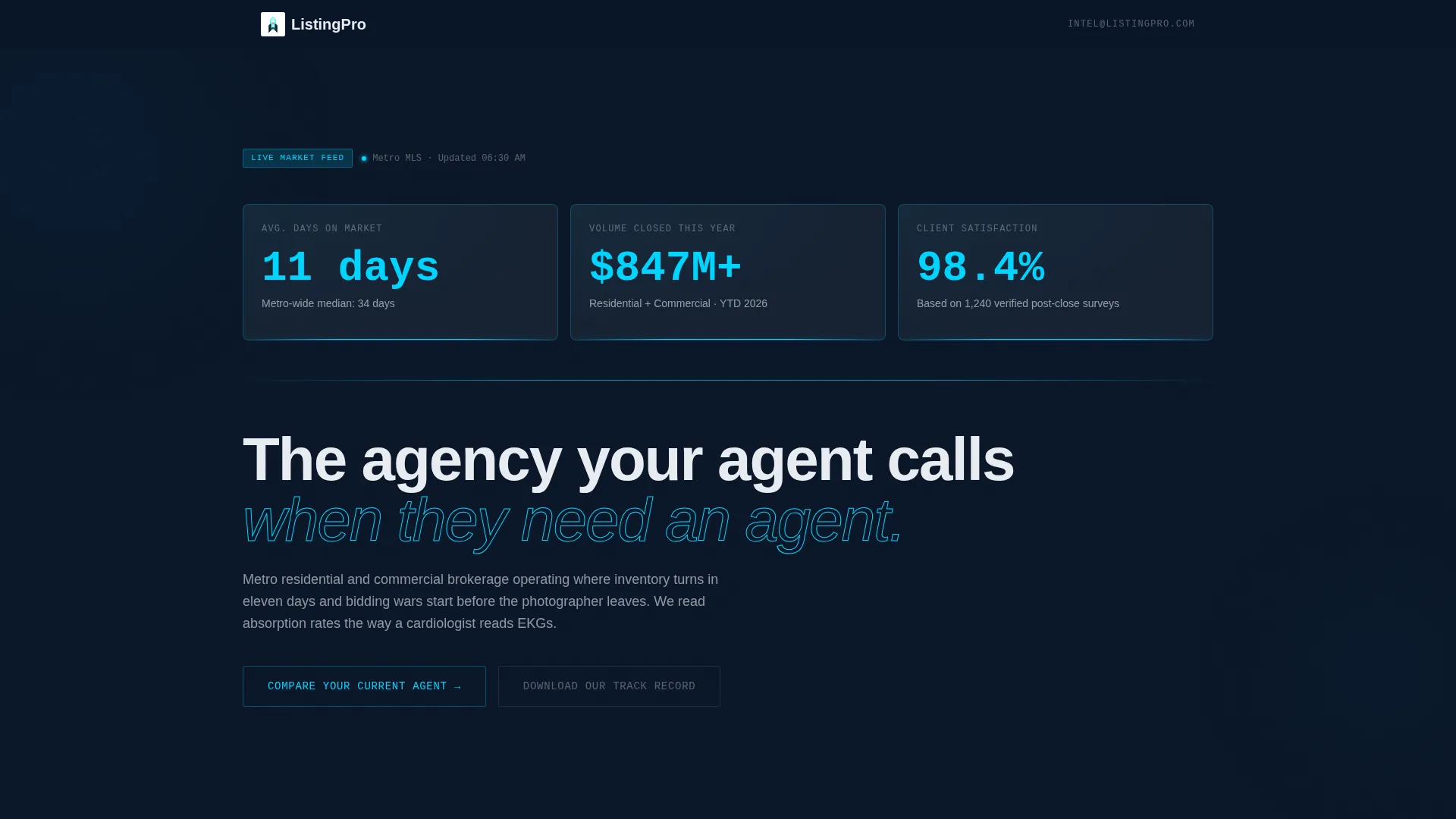
- Three animated header metric panels displaying average days on market, total closed volume, and client satisfaction score with count-up animations on load
- Two built-in conversion paths: a dark-glass modal form for the primary call to action and a gated email-only form for the downloadable market report
Feature list
This template's components are built from the source brief details and reflect what the layout actually delivers.
Animated Dark Glass Header Panels
Three frosted-glass rectangles float over the deep navy background in the header zone. Each panel holds one live metric: average days on market, total volume closed this year, and client satisfaction percentage. Numbers count up on load, connected by a thin electric cyan line at each panel's base.
Pinned Anchor Navigation Bar
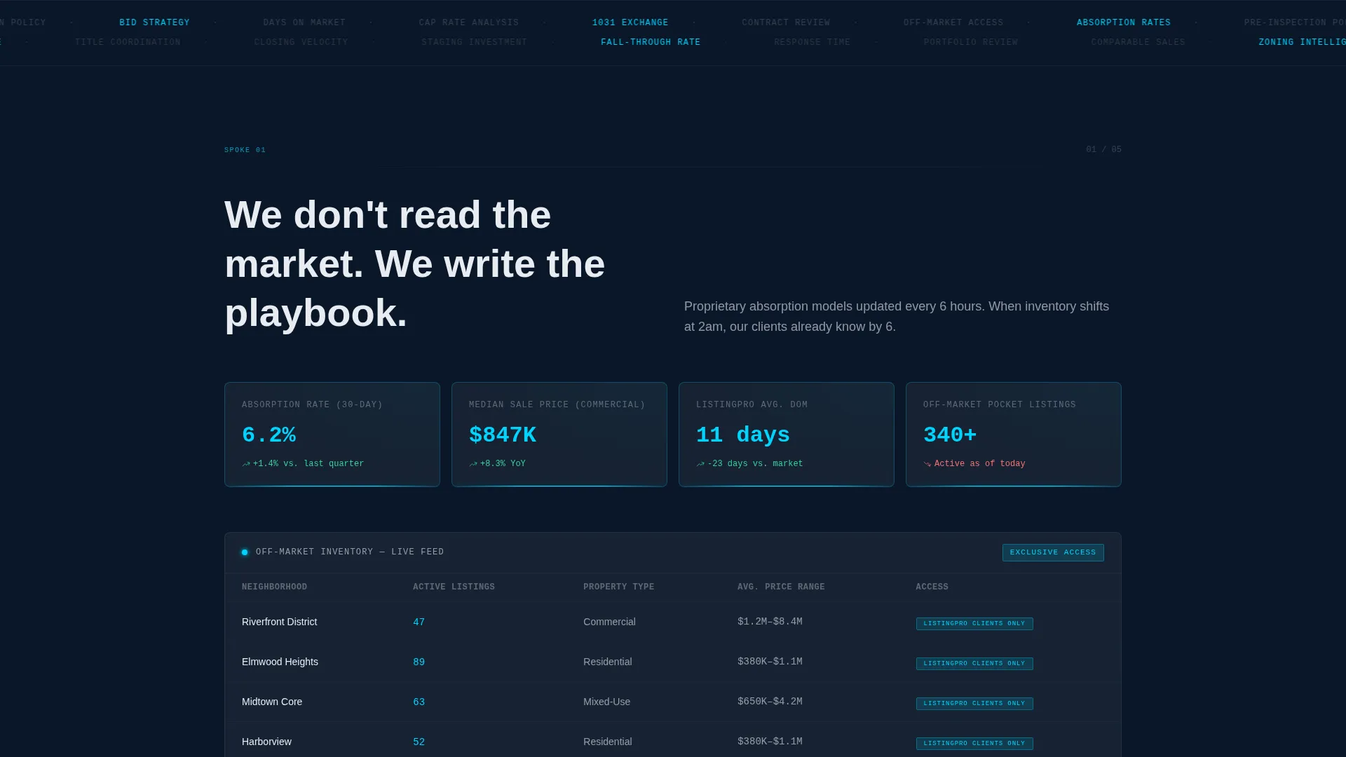
A five-item anchor nav bar pins to the top of the viewport as the visitor scrolls. Each label jumps directly to its spoke section: Market Intelligence, Negotiation Record, Technology Stack, Client Experience, and Commission Structure. Active state indicators glow in electric cyan so the visitor always knows their position on the page.
Competitive Comparison Grid
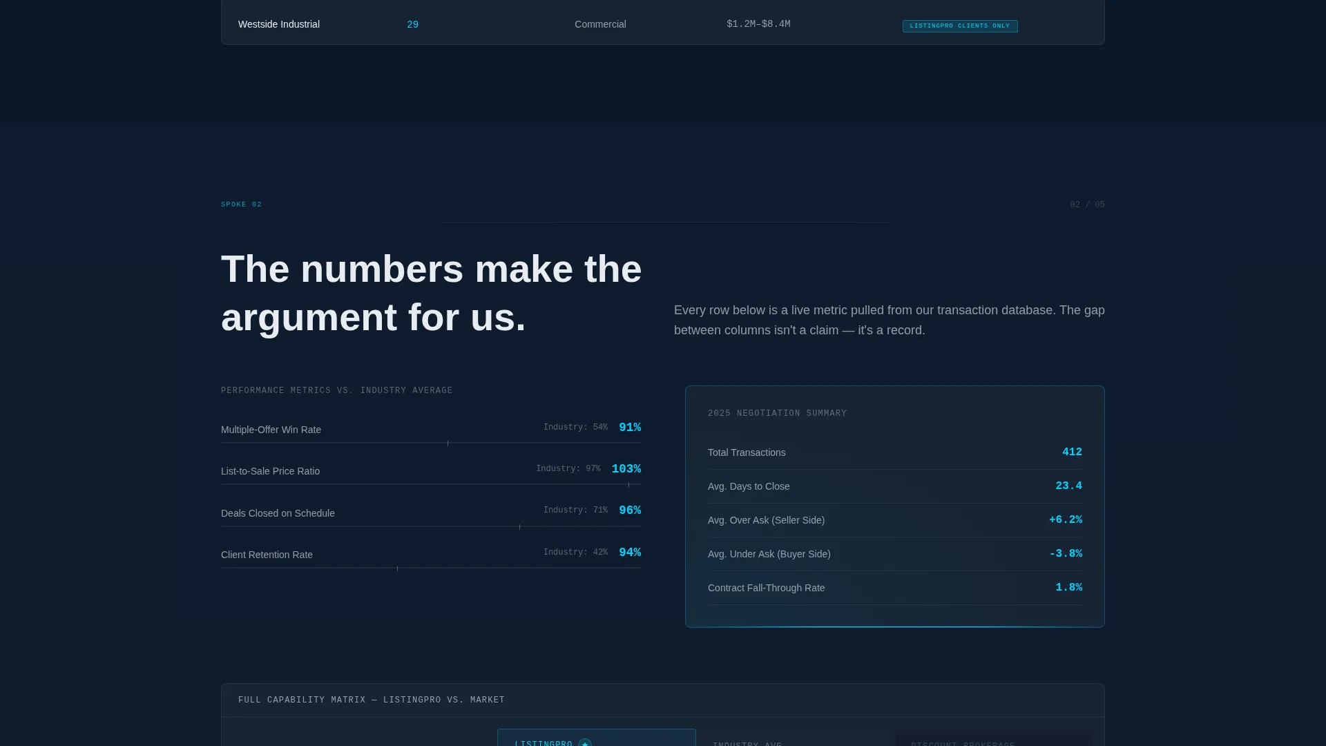
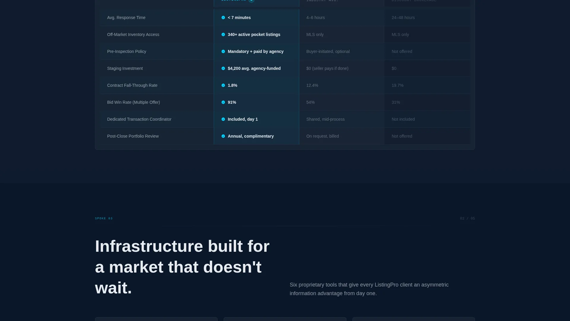
Each spoke section contains a glass-panel comparison grid. Rows cover response time, staging investment, pre-inspection policy, off-market access, and contract fall-through rate. Three columns show this agency's position alongside an industry standard column and a discount brokerage column, letting the data make the case without editorial commentary.
Dual Conversion Path Design
The primary call to action, "Compare Your Current Agent," opens a slim dark-glass modal. The modal collects property zip code, current listing status, and email. A secondary path, "Download Our Track Record," gates a PDF market report behind a single email field. Both paths are designed to feel low-commitment at the point of contact.
Dashboard Pro Visual System
The full page uses a Midnight Blue color system: deep terminal navy for full-bleed backgrounds, slate panel gray for card surfaces, and ice-white for body text. Electric cyan appears on active nav indicators, stat counter highlights, and call-to-action borders that pulse on scroll entry. The result is a cockpit-grade visual density without clutter.
Page sections overview
| Section | Purpose |
|---|---|
| Animated Header Panels | Display three live agency metrics on load |
| Sticky Anchor Nav | Link to five spoke sections from any scroll position |
| Market Intelligence Grid | Compare market data capabilities row by row |
| Negotiation Record Grid | Show win-rate and negotiation metrics versus. competitors |
| Technology Stack Grid | Contrast agency tools against industry and discount standards |
| Client Experience Grid | Highlight service depth, response time, and staging investment |
| Commission Structure Grid | Break down fee transparency against competing models |
| Primary call to action Modal | Capture zip code, listing status, and email |
| Report Download Gate | Collect email in exchange for PDF market report |
Design & branding system
The visual identity follows a Dashboard Pro theme built entirely on the Midnight Blue color system. Every design decision points toward authority, precision, and focus.
- Deep terminal navy (#0A1628) covers all full-bleed backgrounds; slate panel gray (#1B2838) surfaces each card and glass panel; ice-white (#E8ECF1) handles primary body text for legibility against dark backgrounds
- Electric cyan (#00D4FF) appears only as a functional accent: active anchor nav indicators, stat counter highlights mid-tick, and call-to-action borders that pulse once on scroll entry
- The frosted-glass panel treatment on headers, comparison rows, and modals creates a layered, instrument-cluster depth without introducing photography or illustrative elements
Mobile & speed optimization
The template is structured to reflow cleanly from desktop viewport widths down to mobile screen sizes. The anchor nav and comparison grids are the most layout-intensive components and are designed with this in mind.
- The sticky anchor nav compresses to a scrollable horizontal strip on smaller screens so all five spoke labels remain accessible without cluttering the viewport
- Comparison grid columns restack vertically on mobile, keeping row labels readable without horizontal scrolling
- Glass panels, cyan glow effects, and count-up animations are scoped to the visible viewport so they do not block the initial render of above-the-fold content
How this template helps you convert
The page is built around a Comparison/Versus conversion strategy. Every design and copy decision delays the ask until the visitor has already seen the proof.
- The animated header metrics establish performance authority within the first five seconds of load, before any scroll occurs, reducing early bounce intent from skeptical visitors.
- The five comparison grids build a cumulative case row by row, so by the time the visitor reaches the call-to-action section, the form feels like confirming a conclusion rather than making a commitment.
- The dual conversion path captures both action-ready prospects through the modal and research-phase visitors through the report download, widening the total addressable audience on a single page.
Other information about this template
This template sits in the Real Estate Agency Website Templates subcategory and is specifically matched to the Real Estate Agency About Us niche. It is classified under the Technology category in the template marketplace.
- The template style is Hub and Spoke with Anchor Navigation, meaning the single page acts as a hub and each comparison section acts as a named spoke
- The header concept is Dark Glass Panels, a design pattern where translucent frosted-glass containers float over a full-bleed dark background and display single focused data points
- The creative direction is Feature Matrix, where the primary content structure is a literal grid comparing this agency against named competitor tiers rather than a narrative scroll
- The landing page direction is Comparison/Versus, optimized for visitors who arrive already evaluating multiple agency options and need a structured reason to choose
- This template is well-suited for brokerages building or refreshing their digital presence in dense metro markets where speed, data literacy, and negotiation record are primary differentiators
Theme
Dashboard Pro
Creative direction
Feature Matrix
Color system
Midnight Blue
Style
Hub & Spoke (Anchor Nav)
Direction
Comparison/Versus
Page Sections
Animated Dark Glass Header Panels
Pinned Anchor Navigation Bar
Competitive Comparison Grid Sections
Dual Conversion Path Layout
Dashboard Pro Midnight Blue Visual System
Related questions
Can I update the animated metric numbers to reflect my agency's real stats?
Do both conversion forms collect the same information?
Can I add or remove comparison rows in the grid sections?
Is this template suitable for agencies handling both residential and commercial properties?
What page type is this template built as?



