Eco-Friendly Business Blog Website Template
Loaf is a masonry-style landing page template built for artisan and eco-friendly bakeries. It features a customer photo wall header, a before-and-after ingredient reveal layout, and a five-question "Find Your Perfect Loaf" quiz that ends in a personalized bread recommendation. The warm Cloud Canvas color system and editorial grid make every loaf feel worth biking across town for.
by Rocket studio
Quick summary
Loaf is a single-page bakery landing page template with a Directory and Discovery theme. It combines a full-viewport photo wall, a scroll-driven masonry card layout with before-and-after reveals, and a central quiz flow. The design speaks to eco-conscious customers and translates a bakery's values into an experience visitors feel before they read a word.
Who this template is for
This template is built for bakery owners who want their online presence to match the warmth and honesty of their product. It works just as well for a one-location artisan shop as it does for a small-batch bakery taking pre-orders and subscriptions.
- Artisan and sourdough bakers launching or refreshing a direct-to-customer storefront
- Eco-friendly food businesses that lead with sustainability credentials and sourcing stories
- Bakery owners targeting regulars, office catering clients, and specialty dietary needs like nut-free or vegan options
What problem this template solves
Most food business templates look like stock-photo catalogs. They flatten the story behind the product and give visitors no reason to linger. A bakery built around regenerative grain, zero-waste fermentation, and handmade goods deserves a page that actually shows the process.
- Generic templates bury the sourcing story and sustainability values that drive loyal customers
- Static product grids give no guidance to first-time visitors who don't know where to start
- There is no clear path from "curious browser" to "Saturday pickup regular" without a structured discovery flow
What you get with this template
You get a fully designed single-page layout built around three core ideas: visual discovery, ingredient transparency, and guided product matching. Every section works together to move a visitor from first impression to confident first order.
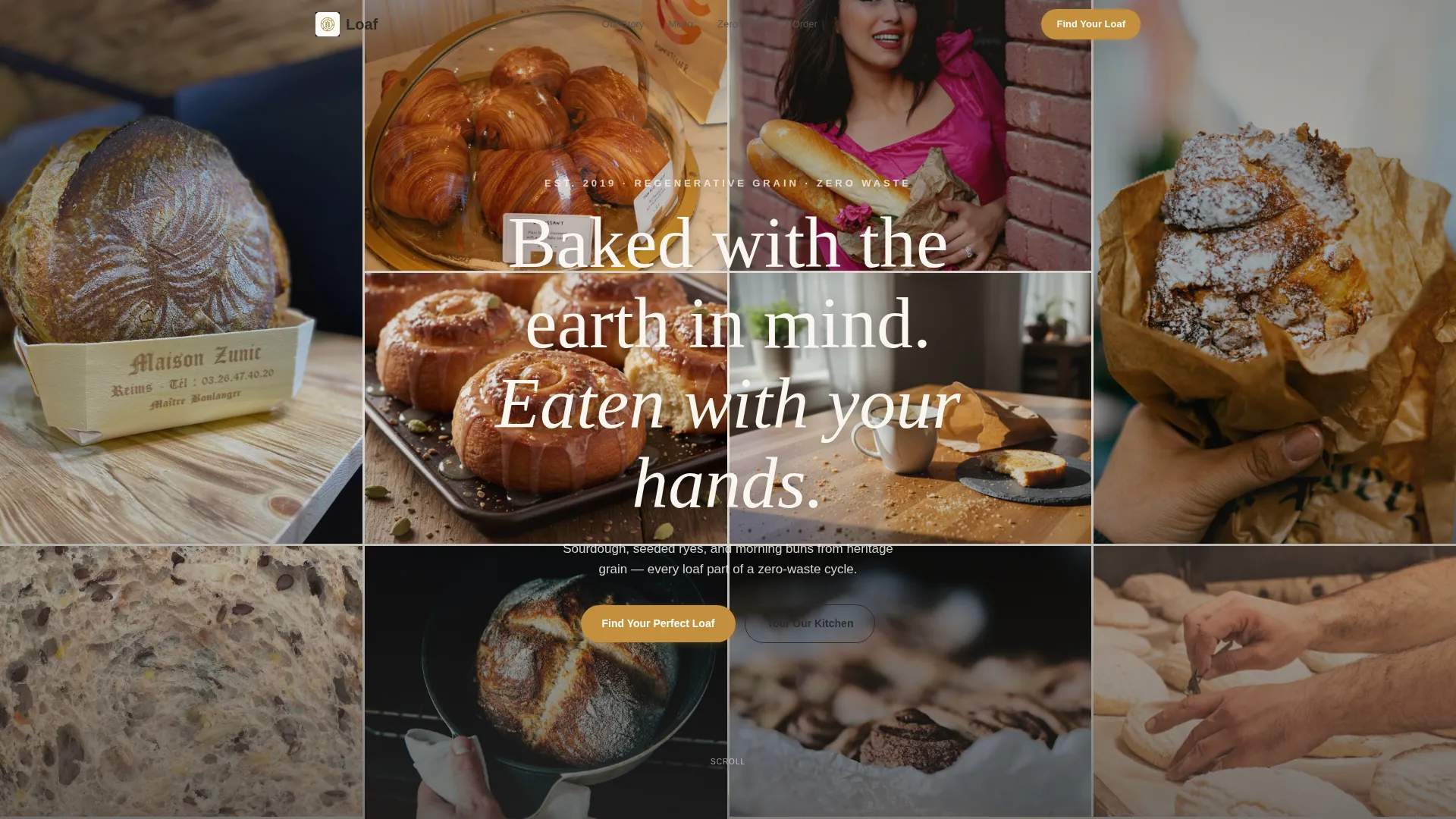
- A full-viewport UGC photo wall header with a single floating headline for immediate atmosphere
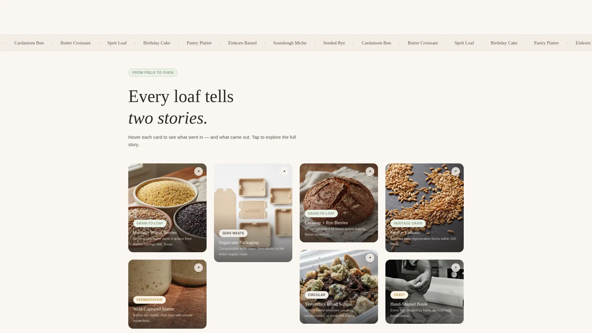
- A scroll-driven masonry grid where each card reveals the raw ingredient on one side and the finished product on the other
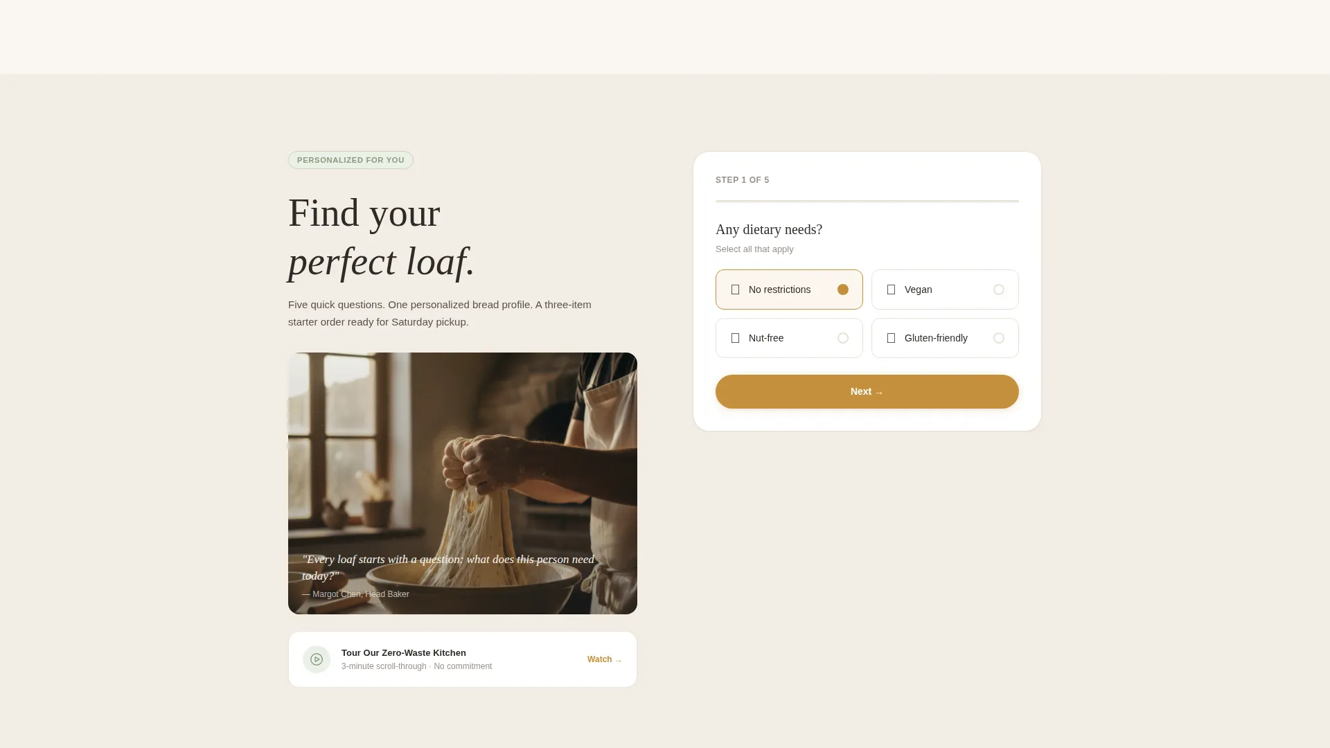
- A five-question illustrated quiz that ends with a personalized bread profile, a match-percentage badge, and a one-tap pickup button
Feature list
A brief overview of what makes this template work as a complete discovery and conversion tool for an artisan bakery.
UGC Photo Wall Header
The header fills the entire viewport with a mosaic of customer-submitted, phone-shot photos. Images feel unposed and golden-hour real. A single charcoal headline floats over the mosaic: "Baked with the earth in mind. Eaten with your hands."
Before and After Masonry Cards
Each card in the masonry grid has two faces. The front shows the raw ingredient: heritage wheat berries, a jar of wild-captured starter, or flat-packed compostable sugarcane packaging. The back reveals the finished product. As visitors scroll deeper, reveals shift from single items to systems like composting timelines and grain-sourcing maps with farm portraits.
Find Your Perfect Loaf Quiz
The primary call to action launches a five-question illustrated quiz. It covers dietary needs, texture preference via draggable sliders, flavor leaning, occasion, and order frequency. Results deliver a personalized bread profile with a recommended three-item starter order and a one-tap "Add to Saturday Pickup" button.
Zero-Waste Kitchen Video Path
Below the quiz sits a secondary conversion path. A scroll-triggered video titled "Tour Our Zero-Waste Kitchen" lets hesitant visitors build trust before committing to an order. It complements the quiz without competing with it.
Waste Audit and Sourcing Infographics
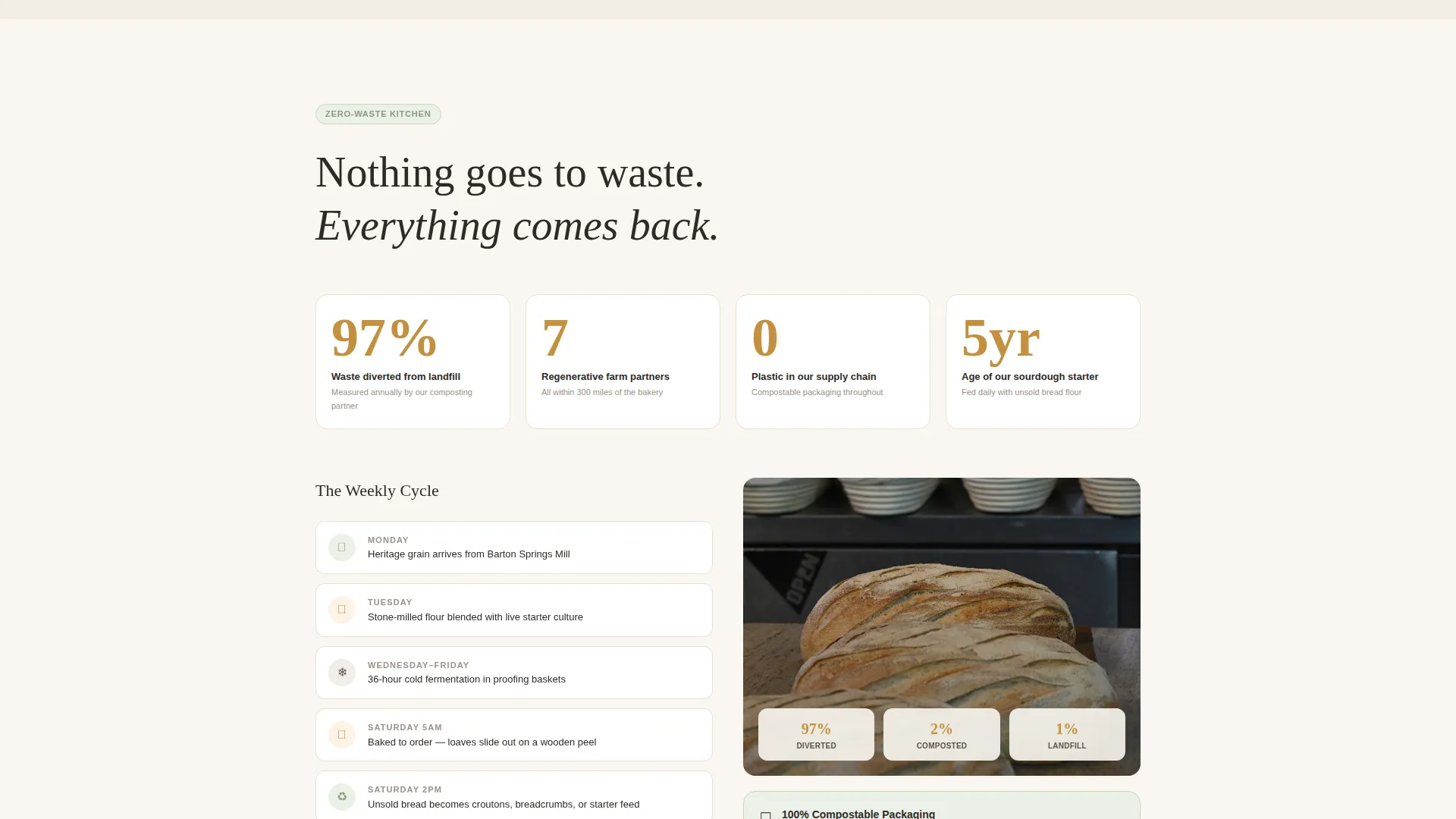
Later in the scroll, the template includes a waste-audit infographic showing 97% diversion and a grain-sourcing map with farm portraits. These visuals turn sustainability claims into specific, readable evidence.
Cloud Canvas Color System
The palette uses unbleached flour white for backgrounds, sourdough crust amber for interactive card highlights on hover, fresh herb sage for category tags and eco-credential badges, and charred scoring mark charcoal for body text and labels. Every color choice is grounded in the bakery's physical world.
Page sections overview
| Section | Purpose |
|---|---|
| UGC Photo Wall | Sets warm, real atmosphere with a floating brand headline |
| Mosaic Card Grid | Reveals ingredient-to-product stories through scroll interaction |
| Before/After Reveals | Pairs raw inputs with finished baked goods on flip cards |
| Sourcing Story Map | Shows farm origins and grain provenance with portraits |
| Waste Audit Panel | Displays 97% waste diversion data as a visual infographic |
| Loaf Quiz Flow | Guides visitors through five questions to a bread match |
| Quiz Results Profile | Delivers personalized recommendations with a pickup button |
| Zero-Waste Video | Builds trust through a scroll-triggered kitchen tour video |
| Eco Credentials Strip | Highlights sustainability badges using sage tag styling |
| Catering and Events | Addresses office platters, birthday cakes, and bulk orders |
Design & branding system
The Cloud Canvas color system ties the entire layout to the physical experience of a real bakery. Every color has a functional role in the interface as well as a sensory one.
- Flour white (#FAF6F0) dominates all backgrounds, keeping the page airy and legible
- Crust amber (#C4903D) activates on card hover states, signaling interactivity without shouting
- Fresh herb sage (#8A9A7B) marks category tags, eco-credential badges, and section dividers
- Charcoal (#2E2A27) anchors all body text, labels, and prices with weight but no heaviness
Mobile & speed optimization
The masonry grid and full-viewport header are both designed to translate to smaller screens without losing their editorial feel. The layout reflows cleanly at mobile widths.
- Masonry columns collapse to a single-column scroll on small screens while preserving card proportions
- The quiz flow is touch-friendly, with draggable sliders and tappable illustrated answer options
- The scroll-triggered video only loads when the visitor reaches that section, keeping the initial load lightweight
How this template helps you convert
The page is structured so that every section reduces a different kind of friction. Visitors who arrive skeptical leave with a specific product recommendation and a clear next step.
- The photo wall and floating headline create instant emotional trust before any product appears, lowering the barrier to scroll
- The before-and-after masonry cards answer "what makes this bakery different" through visual storytelling rather than copy-heavy claims
- The loaf quiz transforms vague interest into a personalized order, giving first-time buyers confidence and a ready-made pickup list
Other information about this template
This template is built specifically for the Retail and E-Commerce category with a focus on the Eco-Friendly Business subcategory. It is ideal for businesses whose brand story is inseparable from their sourcing and production values.
- The Directory and Discovery theme makes the page feel browsable and reward-rich, not transactional
- The template style is Masonry and Pinterest-inspired, which suits businesses with a wide, photogenic product range
- The Quiz and Assessment landing-page direction is particularly effective for bakeries with complex menus covering gluten-friendly, vegan, and nut-free ranges
- The Intersection Match Score for this template is 9 out of 10, reflecting strong alignment between the Eco-Friendly Bakery niche and the chosen design system
- The template supports catering inquiry paths for office managers and event planners alongside the standard individual order flow
Theme
Directory & Discovery
Creative direction
Before/After Reveal
Color system
Cloud Canvas
Style
Masonry/Pinterest
Direction
Quiz/Assessment
Page Sections
UGC Photo Wall Header
Before and After Masonry Grid
Find Your Perfect Loaf Quiz
Scroll-triggered Kitchen Video
Sustainability Infographic Panels
Cloud Canvas Color System
Related questions
Can I use this template if my bakery has a small product range?
Does the before-and-after card layout require professional photography?
Is this template suitable for subscription or pre-order flows?
Can office catering or event orders be handled through this template?
How customizable is the color system in this template?



