Translation & Localization Blog Website Template
Localize is a sidebar companion landing page template for website and app localization services. It pairs an editorial magazine aesthetic with a Navy Authority color system, featuring oversized typographic stats, persistent sidebar navigation, team-profile sections, and two conversion paths, a playbook download and a readiness score audit, designed for professional services teams targeting international markets.
by Rocket studio
Quick summary
Localize is a single-page sidebar companion landing page built for translation and localization services. It opens with three bold editorial statistics, guides visitors through a team-profile narrative, and closes every section with a clear next step. The design draws from serious international print journalism, ink-heavy, confident, and structured to earn trust before asking for anything.
Who this template is for
This template speaks directly to growth-focused professionals who need to communicate the value of localization clearly and credibly. It is built for teams presenting a sophisticated service to technically literate buyers.
- Product managers at SaaS companies shipping products into new international markets
- E-commerce directors tracking abandoned carts in non-English-speaking regions
- Startup chief technology officers with international expansion as a funded priority
What problem this template solves
Most localization service pages read like feature lists. They fail to convey the human expertise, cultural nuance, and process discipline that separates serious localization from surface-level translation. Buyers leave without understanding the actual value on offer.
- Generic service pages do not build enough trust for a high-stakes international expansion decision
- Visitors cannot see the people, methodology, or proof behind the service
- There is no clear editorial narrative tying the problem, the team, and the solution together
What you get with this template
You get a fully structured sidebar companion landing page that tells a localization story through real data, real people, and a clear editorial flow. Every section is designed to earn the next scroll.
- A stats-led header featuring three oversized typographic figures set against a deep navy field
- A persistent sidebar with contextual content that shifts as the visitor scrolls through each section
- Two distinct conversion paths: a playbook download form and a readiness score audit link
Feature list
This template is built around a tight editorial system where every component earns its place on the page.
Oversized Editorial Stats Header
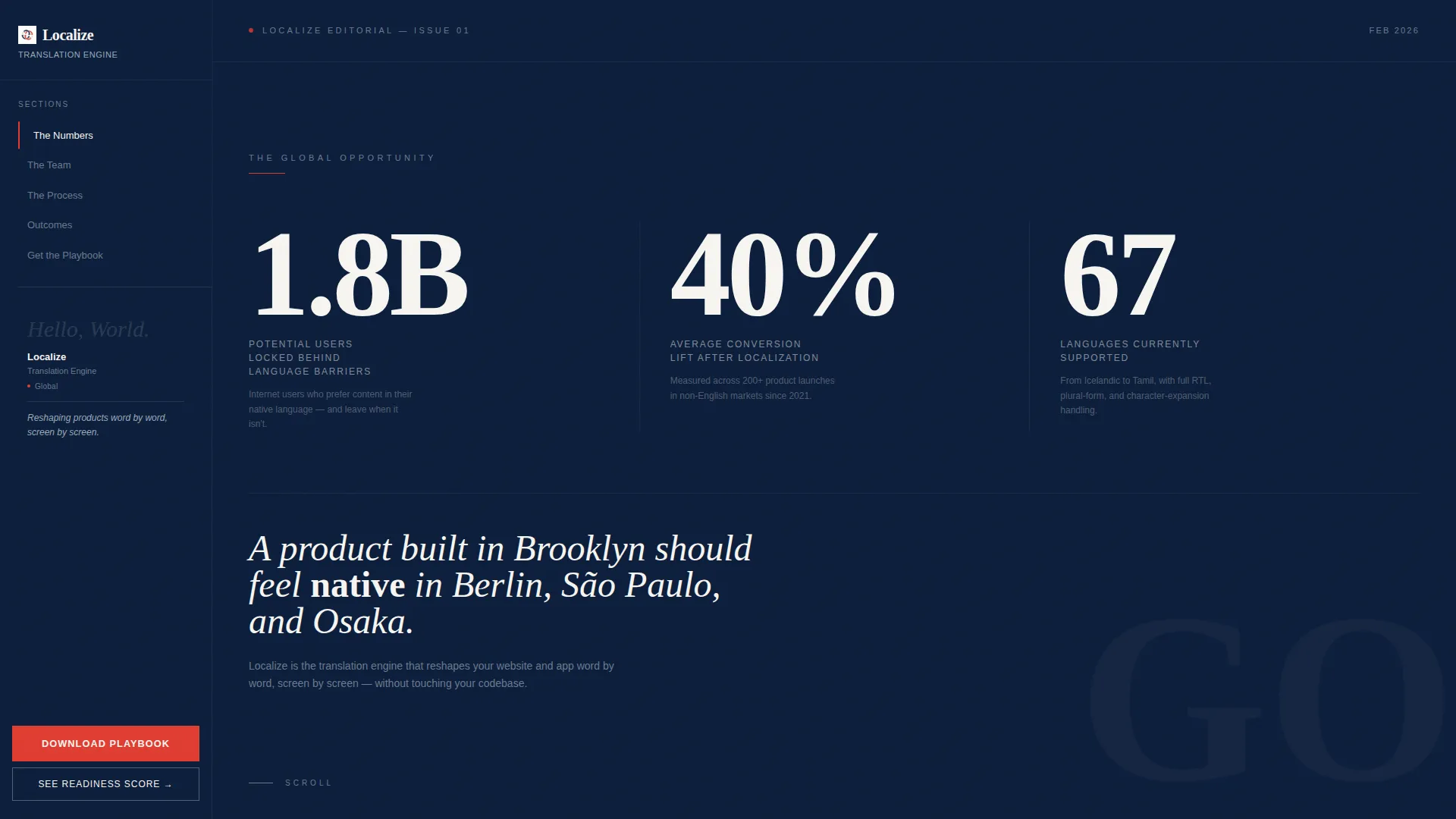
Three typographic figures dominate the opening spread: "1.8B" potential users locked behind language barriers, "40%" average conversion lift after localization, and "67" supported languages. Each number is set in a high-contrast serif on a deep navy field with a single-line caption in pressed-linen white. No stock photography is used, the data carries the visual weight.
Persistent Contextual Sidebar
The left-rail sidebar stays anchored as visitors scroll. It surfaces relevant content dynamically, a linguist bio card when the visitor reaches the team section, a framework checklist when they reach the quality assurance methodology section. This keeps navigation and context available without interrupting the main narrative.
Team Profile Narrative Sections
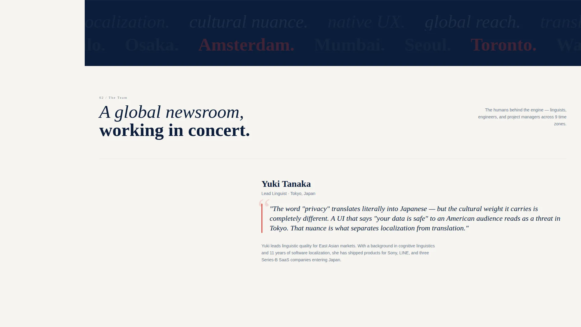
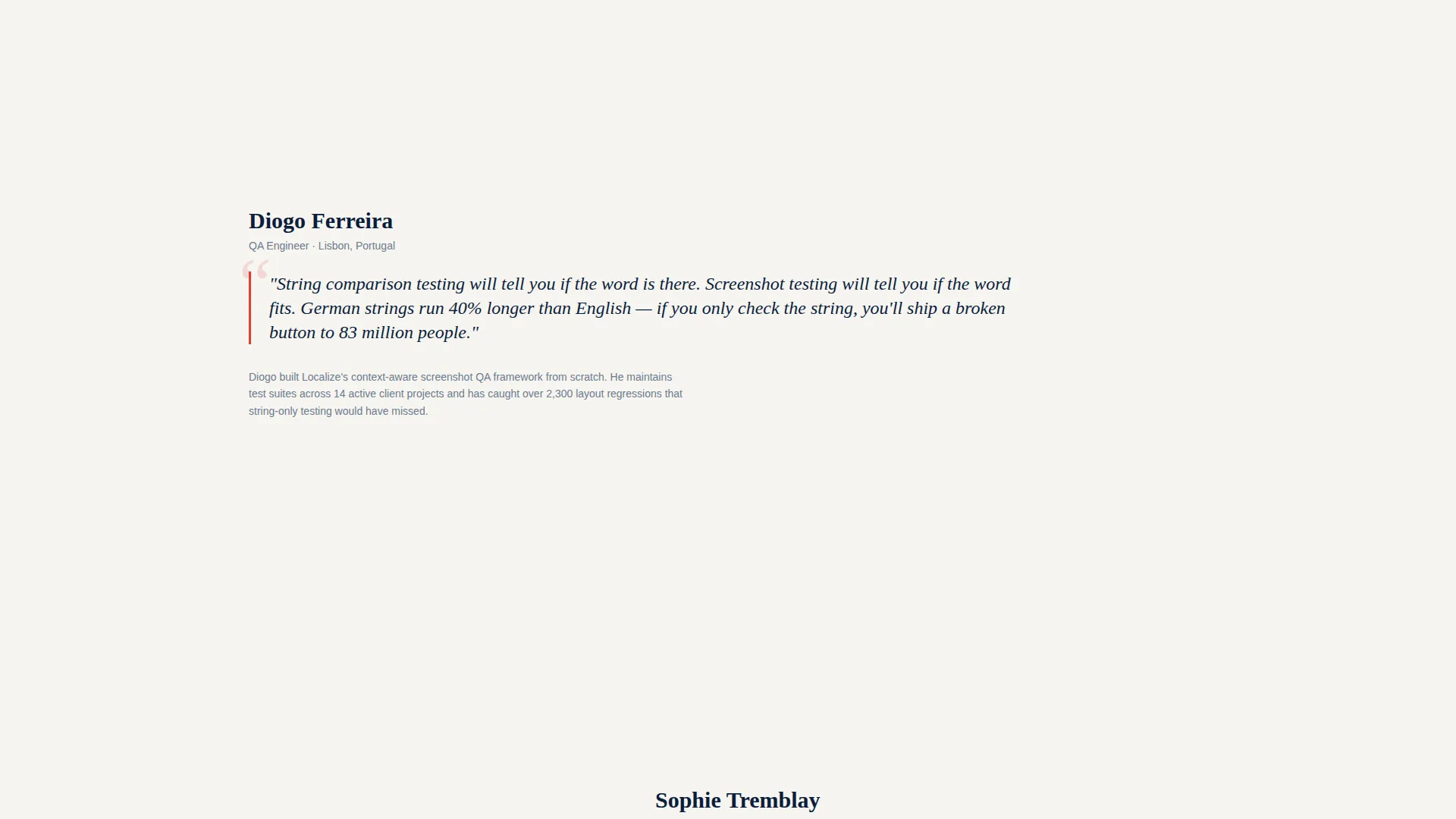
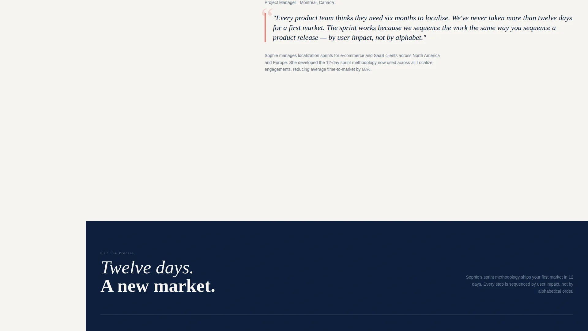
Each section of the page reads like a magazine profile. A lead linguist in Tokyo explains cultural nuance in pull-quote format. A quality assurance engineer in Lisbon walks through context-aware screenshot testing. A project manager in Montreal maps a sprint timeline. The transitions between people create the feel of a global newsroom.
Dual Conversion Path Design
The primary call to action is "Download the Localization Playbook," placed both in the sticky sidebar and at the narrative midpoint. It asks only for a work email and primary product URL. The secondary path offers "See Your Readiness Score," linking to an interactive audit tool that evaluates the visitor's current site for localization gaps.
Editorial Pull-Quote System
Signal vermillion is used selectively for pull-quotes, active sidebar states, and call-to-action buttons. This restraint makes each accent feel intentional rather than decorative, drawing the eye exactly where the page needs it most.
Navy Authority Color Framework
The full palette, deep command navy, pressed-linen white, steel column gray, and signal vermillion, is applied consistently across all sections. The result feels like the masthead page of a serious international journal, where whitespace functions as punctuation and color earns meaning through scarcity.
Page sections overview
| Section | Purpose |
|---|---|
| Stats Header Spread | Opens with three oversized typographic figures to establish scale and credibility immediately |
| Persistent Sidebar Rail | Anchors navigation and surfaces contextual cards as the visitor scrolls through sections |
| Lead Linguist Profile | Introduces the Tokyo-based linguist with a pull-quote on cultural nuance |
| QA Engineer Profile | Showcases the Lisbon-based engineer and context-aware screenshot testing methodology |
| Project Manager Profile | Maps a sprint timeline through the Montreal-based project manager's workflow |
| Playbook Download call to action | Mid-page form collecting work email and product URL for the localization playbook |
| Readiness Score Link | Secondary conversion path directing visitors to the interactive site audit tool |
Design & branding system
The visual identity follows an Editorial Magazine theme grounded in the Navy Authority color system. Every design decision is rooted in the aesthetic of a serious international print publication.
- Deep command navy (#0B1D3A) as the dominant background, pressed-linen white (#F6F4F0) for body text, and steel column gray (#6B7B8D) for supporting details
- Signal vermillion (#E03C31) reserved exclusively for pull-quotes, active sidebar states, and call-to-action buttons to maintain visual hierarchy
- High-contrast serif typography used for oversized statistics, with whitespace treated as a structural element rather than empty space
Mobile & speed optimization
The sidebar companion structure is designed to translate cleanly across screen sizes. On smaller viewports, the persistent sidebar adapts to keep conversion paths accessible without crowding the main editorial content.
- The sticky sidebar and dual call-to-action placement ensure conversion options remain visible throughout the scroll experience
- Typographic figures and pull-quote treatments scale to maintain visual impact on mobile displays
- The layout avoids heavy image assets, relying on typographic data visuals that load cleanly across devices
How this template helps you convert
The conversion architecture is built into the editorial structure itself. Visitors are not asked to trust a sales pitch, they are given real frameworks, real failure stories, and real data before any ask is made.
- The stats header immediately establishes the scale of the problem, making the case for localization before a single word of body copy is read
- The team profile narrative builds credibility through specific people and methodologies, so the playbook download feels like a natural next chapter rather than a gate
Other information about this template
This template is designed for use as a lead generation landing page within the Professional Services category, specifically for translation and localization offerings. It sits at the intersection of service utility and editorial storytelling.
- The template style is a Sidebar Companion, making it well-suited for services that benefit from persistent navigation and contextual guidance alongside a long-scroll narrative
- The creative direction is Team and People, meaning the localization process is introduced through the humans who do the work rather than through a feature checklist
- The header concept uses a Stats and Metrics approach, letting data function as the primary visual element in place of photography
- The lead generation direction supports two opt-in moments: a mid-page playbook download and a secondary readiness score audit path
Theme
Service Utility
Creative direction
Case Study Narrative
Color system
Slate & Sky
Style
Sidebar Companion
Direction
Lead Generation
Page Sections
Oversized Editorial Stats Header
Persistent Contextual Sidebar
Team Profile Narrative Layout
Dual Conversion Path Design
Editorial Pull-quote System
Navy Authority Color Framework
Related questions
What kind of business is this landing page template built for?
Can I adapt the team profile sections for my own staff?
What are the two conversion paths included in this template?
Does this template use stock photography?
Who are the ideal visitors this page is designed to speak to?



