Dentist Directory & Insurance-Aware Provider Finder Website Template
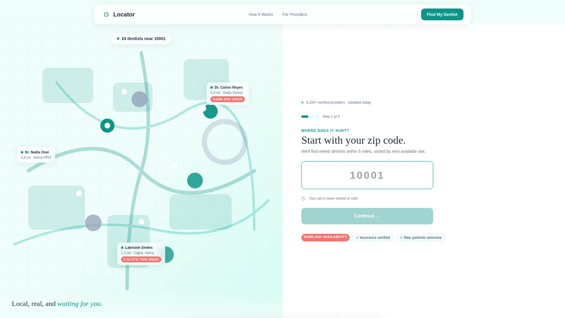
The Locator template is a split-screen dentist provider directory landing page built for urgent, insurance-aware dental searches. A multi-step form on the right guides visitors through zip code, insurance, and care type. An animated neighborhood map fills the left. The design uses a clinical-warm Teal Catalyst palette to feel both trustworthy and approachable from the very first scroll.
by Rocket studio
Quick summary
The Locator template is a single-page dentist provider directory designed for people who need a dentist now. A 50/50 split-screen hero pairs an animated local map with a progressive multi-step form. The Problem→Solution Arc below the fold speaks directly to visitor anxiety, then resolves it with filtered results, insurance verification badges, and real-time appointment availability.
Who this template is for
This template is built for dental directory operators, healthcare lead generation platforms, and dental network publishers who need to convert anxious visitors into booked appointments. It also works well for HR teams building onboarding dental resources.
- New-to-town families searching for a local dentist late at night
- Adults re-entering dental care after a long gap, often mid-insurance-change
- HR coordinators adding vetted dental network links to employee onboarding materials
What problem this template solves
Finding a dentist who actually accepts your insurance and has an opening this week is harder than it should be. Most directory pages dump a long list of names with no urgency context, no insurance filter, and no clear next step. Visitors bounce before they find help.
- Visitors cannot quickly filter by insurance carrier or plan type
- Generic search pages do not acknowledge the emotional state of someone in dental pain
- No secondary conversion path exists for visitors who are not ready to browse results immediately
What you get with this template
You get a fully structured, single-page lead generation layout that moves a visitor from panic to action in a few focused scroll sections. Every section is purpose-built around the dental directory use case.
- A 50/50 split-screen hero with an animated neighborhood map and a three-step progressive form
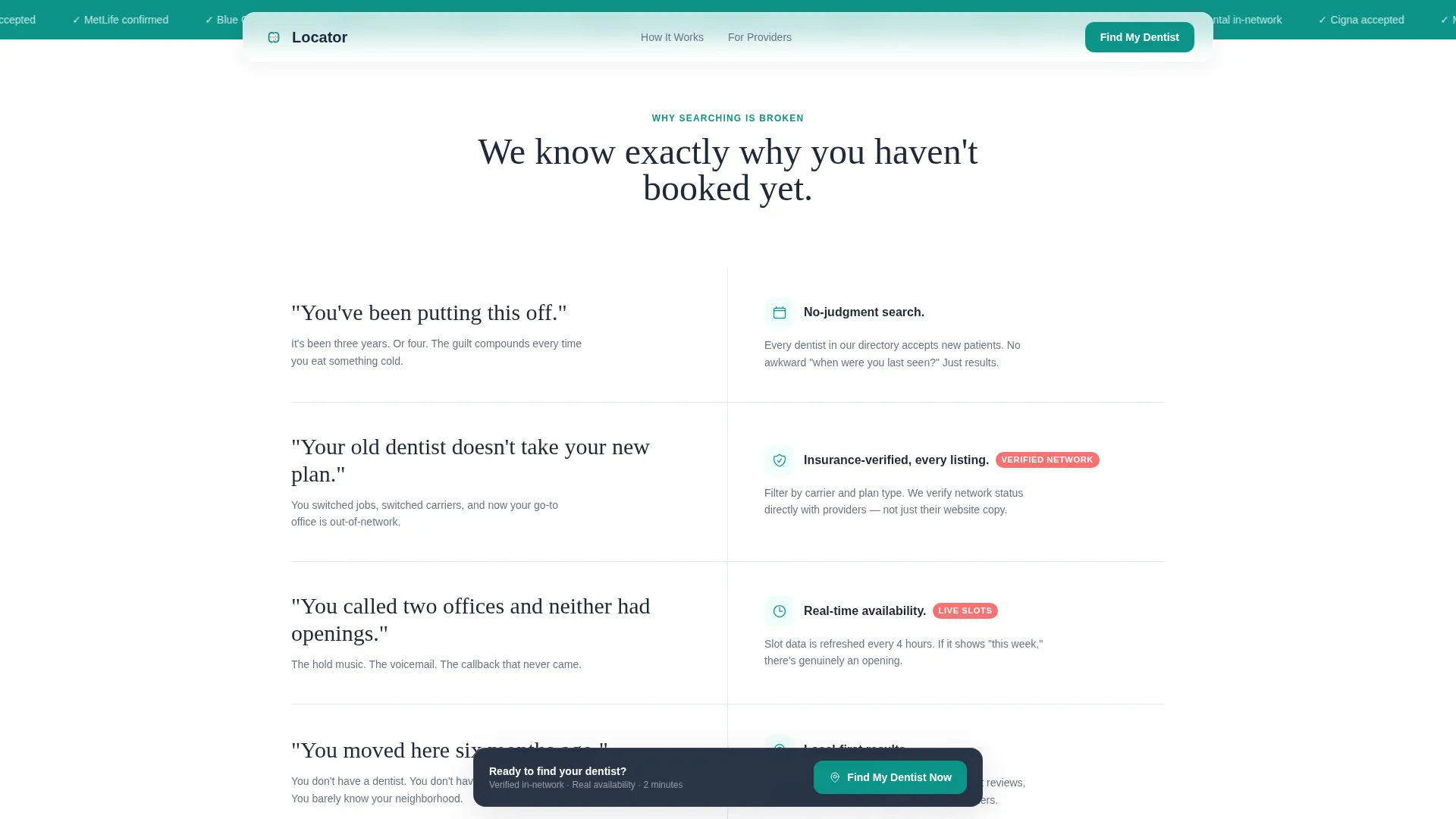
- A Problem→Solution Arc section that mirrors visitor anxiety and resolves it visually
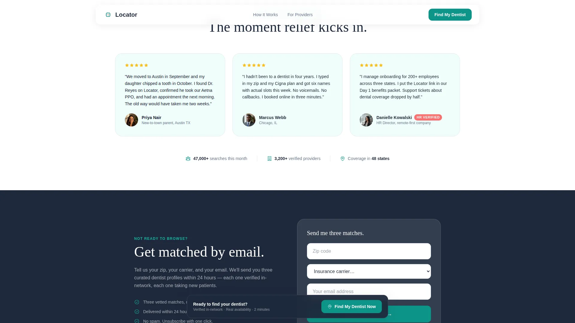
- A secondary email match call-to-action for visitors who need more time before committing
Feature list
This template ships with six purpose-built components, each designed to reduce friction and build trust at the right moment in the visitor's journey.
Three-Step Progressive Disclosure Form
The header form reveals fields one step at a time. Step 1 collects only a zip code. Step 2 adds insurance carrier and plan type as filterable dropdowns. Step 3 presents icon-driven care-type tiles for cleaning, pain, cosmetic, and emergency. This approach reduces form abandonment by keeping each step simple and focused.
Animated Neighborhood Map Panel
The left half of the split screen shows a calm illustration of a local map with gently pulsing pin drops. It visually communicates that results are nearby and real, without using stock photography of smiling faces or clipart teeth.
Problem→Solution Arc Section
Below the fold, each visitor pain point appears on the left in deep charcoal text, stated in plain, anxious language. The directory's answer appears on the right, showing filtered results, verified insurance badges, and real-time appointment slots. The rhythm builds trust section by section.
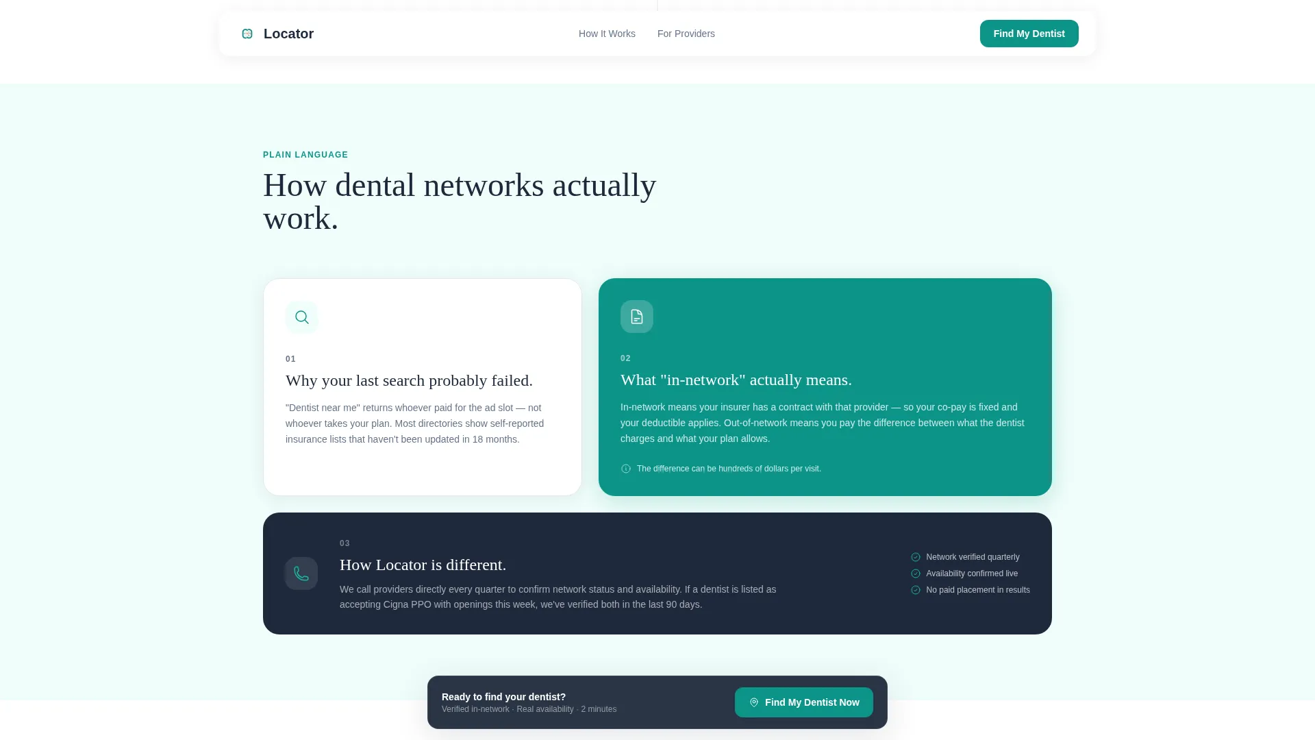
Plain-Language Provider Network Band
A mid-page educational band explains how dental provider networks work in three plain-language steps. It removes jargon and directly addresses why a previous search may have failed, giving the visitor confidence to try again with this tool.
Sticky "Find My Dentist Now" Bar
After the visitor scrolls past the header form, a teal sticky bar appears at the bottom of the viewport. The primary call-to-action follows the visitor down the page, ensuring the conversion path is always one tap away.
Email Match Secondary Conversion Path
Visitors who are not ready to browse results can enter their zip code, insurance carrier, and email address. The template promises a curated list of three matching dentists delivered within 24 hours, capturing leads who would otherwise leave without converting.
Page sections overview
| Section | Purpose |
|---|---|
| Split-Screen Hero | Launches the multi-step form alongside the animated map |
| Problem→Solution Arc | Mirrors visitor anxiety, then resolves it with directory answers |
| Provider Network Band | Educates visitors on how insurance networks work in three steps |
| Social Proof Cards | Builds trust through testimonial cards with outcomes and star ratings |
| Email Match Call-to-Action | Offers a secondary conversion path for not-yet-ready visitors |
| Single-Row Footer | Closes the page with a clean, minimal linear footer pattern |
Design & branding system
The visual identity follows an Educational Guide theme. The palette feels clinical and warm at the same time, like a clean, well-lit dental operatory that does not intimidate. Typography pairs Plus Jakarta Sans for body and interface text with Fraunces for display headings.
- Clinical teal (#0D9488) as the primary action color for buttons, form elements, and the sticky bar
- Deep charcoal (#1E293B) for body text and grounding headers; soft mint wash (#F0FDFA) for all background areas
- Warm coral (#F87171) used exclusively for urgency cues such as same-day availability badges
Mobile & speed optimization
The template is built desktop-first around the split-screen layout, but stacks cleanly into a full mobile flow. Static sections use server-rendered components, while the form and animated map run as client components to keep the interactive experience smooth.
- Desktop: 50/50 split screen with simultaneous map and form visibility
- Mobile: full vertical stack with the form appearing above the map illustration for immediate engagement
- Form step transitions, scroll reveals, and pulsing map pin animations are medium-weight and load progressively
How this template helps you convert
Every layout decision in this template is designed to lower the barrier between a stressed visitor and a submitted form.
- The multi-step form starts with a single oversized zip code field and the micro-prompt "Where does it hurt?", reducing the cognitive load of first contact to almost nothing.
- The Problem→Solution Arc earns visitor trust before asking for any personal information, so the sticky call-to-action bar appears after the visitor already believes the tool works.
- The email match path captures undecided visitors with just three fields, turning a bounced session into a qualified lead that can be followed up within 24 hours.
Other information about this template
This template is localized for the United States market. It references zip codes, USD pricing contexts, and common insurance carrier names used across American dental networks.
- Designed for the Health & Medical category, specifically the Dentist Website subcategory and Dentist Provider Directory niche
- Insurance carrier dropdown content in the form is built around carriers common to US dental plans
- The template style is Split Screen (50/50) with a Lead Generation page direction and a Multi-Step Form header concept
- Creative direction follows the Problem→Solution Arc pattern under the Educational Guide theme
- Color system is Teal Catalyst; typography uses Plus Jakarta Sans paired with Fraunces display headings
Theme
Educational Guide
Creative direction
Problem→Solution Arc
Color system
Teal Catalyst
Style
Split Screen (50/50)
Direction
Lead Generation
Page Sections
Three-step Progressive Disclosure Form
Animated Neighborhood Map Panel
Problem→solution Arc Layout
Plain-language Provider Network Band
Sticky Primary Call-to-action Bar
Email Match Secondary Conversion Path
Related questions
Can I customize the insurance carriers shown in the dropdown fields?
Does this template include live directory search or database functionality?
Is the animated map a live map or a design illustration?
Who is the secondary email match path designed for?
Can this template be used for a single dental practice instead of a directory?



