Professional Rehearsal Space Rental Landing Page
Lockout is a professional rehearsal space landing page template built for music rehearsal facilities. It uses an asymmetric 60/40 grid to showcase each room as an architectural study, pairing floor plans with gear specs and transparent pricing. The design communicates scale and reliability from the first scroll, guiding working musicians and event professionals straight to a booking click.
by Rocket studio
Quick summary
Lockout is a single-page template designed for professional rehearsal space rental businesses. It combines a stats-led header, room-by-room architectural layouts, and a persistent booking call to action into one confident, dark-toned landing page. The result feels less like a directory listing and more like walking into a facility that already knows what it's doing.
Who this template is for
This template is built for operators who rent rehearsal rooms to serious musicians and production professionals. It speaks directly to facilities that need to communicate equipment quality, room availability, and transparent pricing without relying on soft marketing language.
- Rehearsal studio owners renting rooms to cover bands, indie artists, and session players
- Facility managers serving corporate event musicians and pre-tour production teams
- Space rental businesses that want a booking-focused page without a complex web build
What problem this template solves
Most rehearsal space pages bury the details that musicians actually care about. Room dimensions, installed backline, PA wattage, and hourly rates are either hidden behind a contact form or scattered across an outdated layout. Visitors leave before they find what they need.
- Clients cannot quickly compare rooms by size, gear, and price in one scroll
- No persistent call to action means motivated bookers lose their path to a reservation
- Generic designs fail to communicate the professional atmosphere serious musicians expect
What you get with this template
You get a fully structured, single-page layout that walks visitors through every room in the facility. Each section is designed to communicate specs clearly and push qualified visitors toward a booking click.
- A stats dashboard header displaying live operational figures with amber-accented typography
- An asymmetric 60/40 grid presenting isometric floor plans alongside room specs and pricing
- A persistent "Check Room Availability" button, per-room "Book This Room" buttons, and two "Tour the Facility" secondary calls to action
- A horizontal social proof ticker showing client logos from venues, labels, and production companies
Feature list
This template includes the following built-in layout capabilities and design components.
Stats Dashboard Header
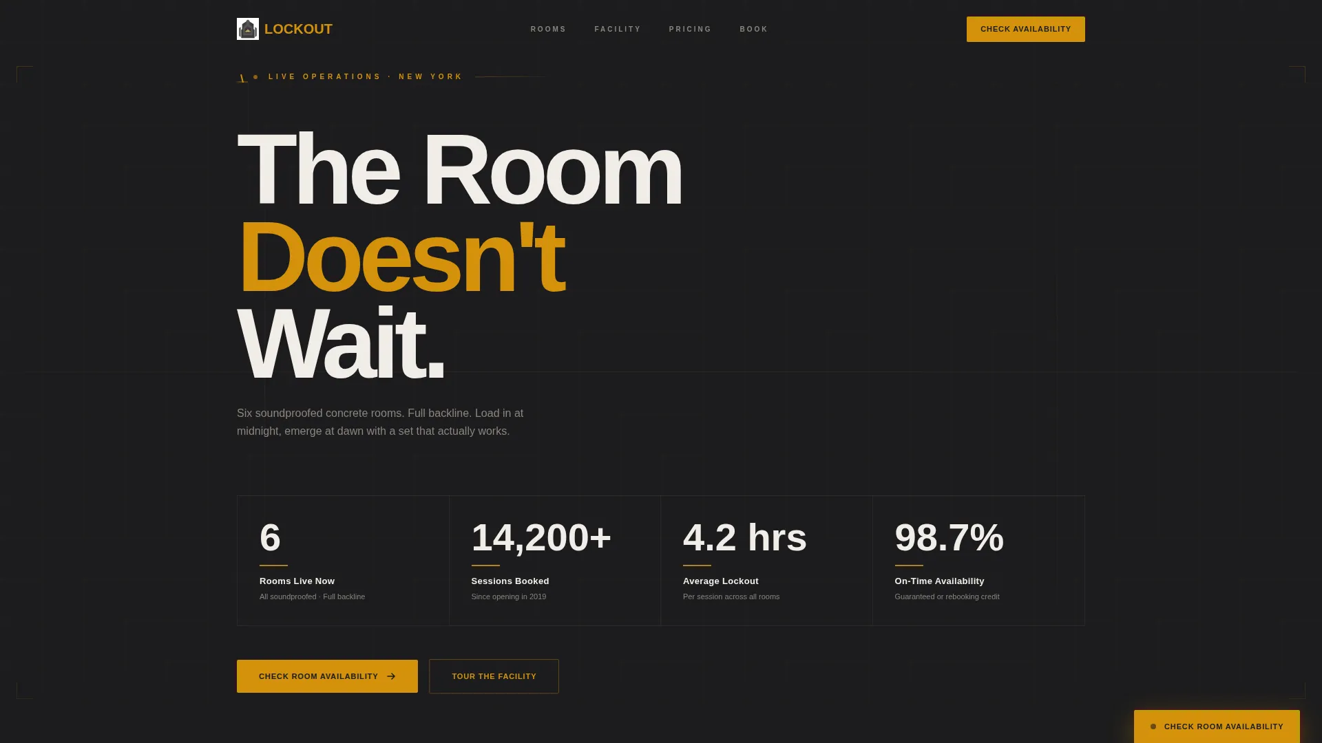
The header skips a hero image entirely. Instead, it displays four operational figures: "6 Rooms Live Now," "14,200+ Sessions Booked," "4.2 hrs Average Lockout," and "98.7% On-Time Availability." Each number is set in large condensed sans-serif type against deep charcoal, with a thin amber underline that pulses subtly like a VU meter needle. The numbers alone establish scale and reliability before a visitor reads a single line of copy.
Asymmetric 60/40 Room Grid
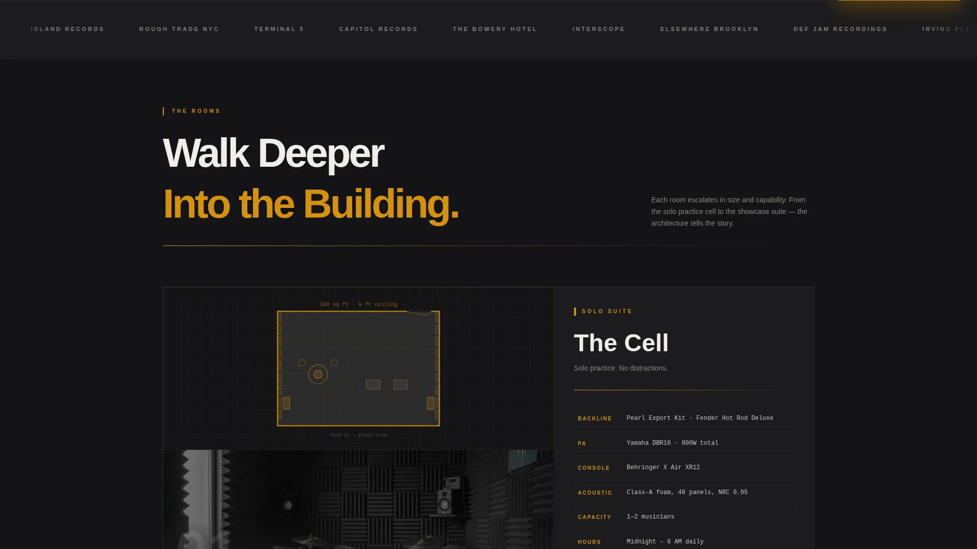
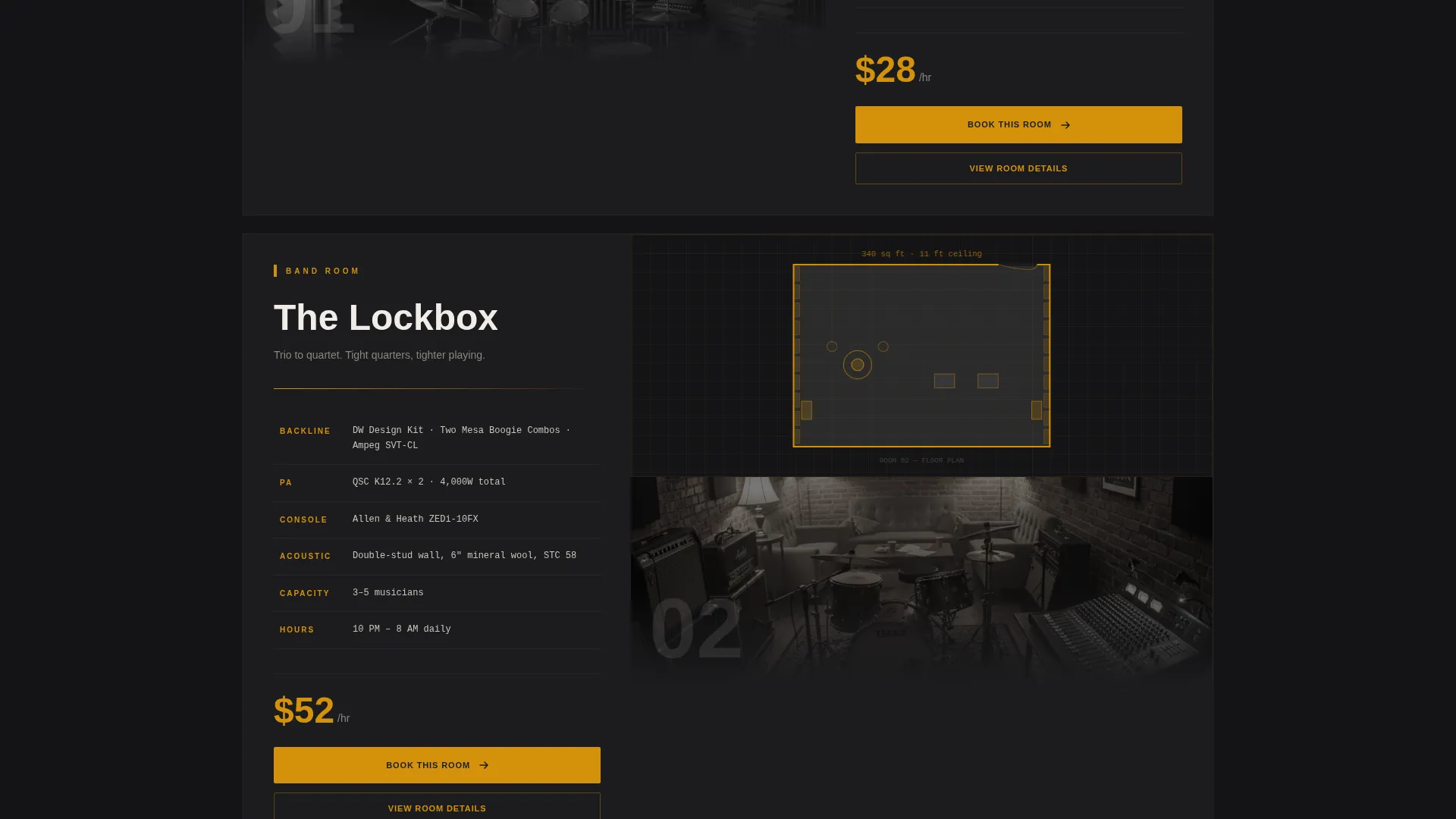
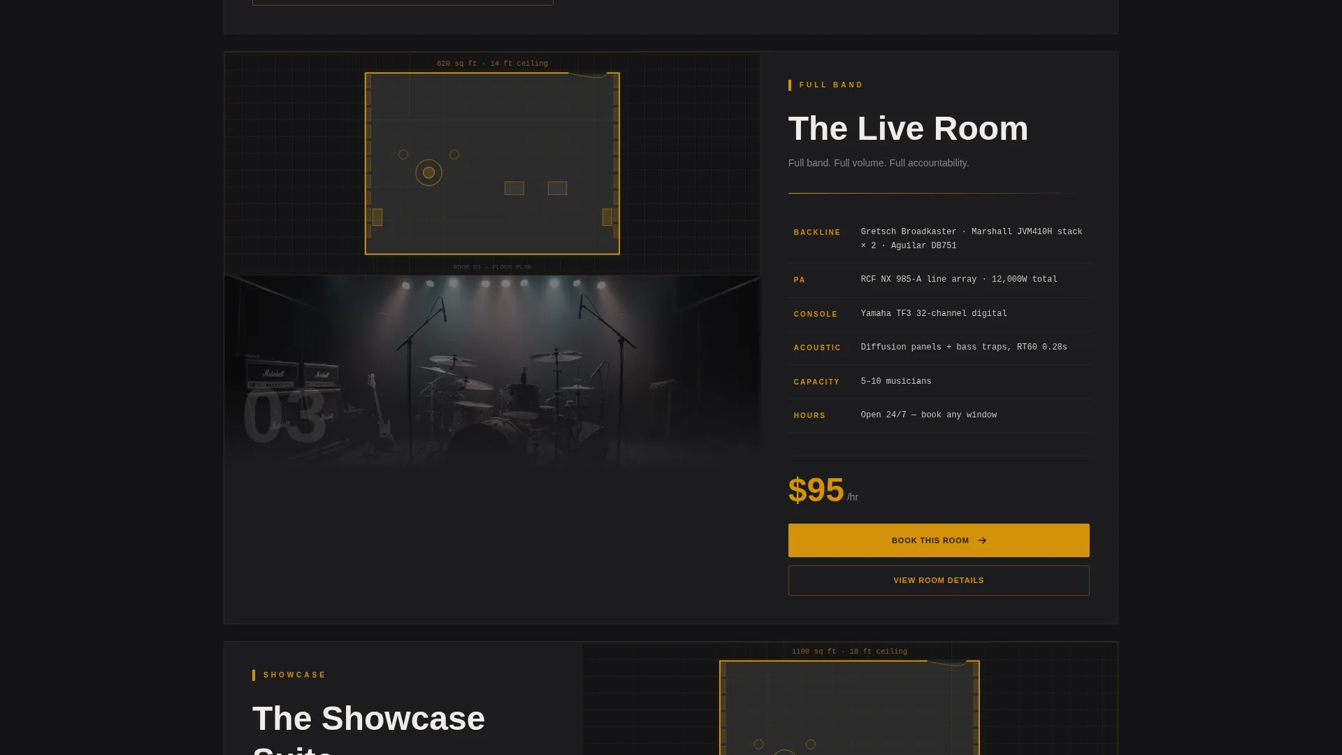
Each room section uses a 60-column layout for an isometric floor plan and a 40-column panel for the room's specs. The floor plan shows square footage, ceiling height, gear layout, and acoustic treatment zones. The spec panel lists installed backline, PA wattage, console model, and hourly rate in clean amber-accented type. Rooms escalate in size and capability as the visitor scrolls, creating a natural sense of moving deeper into the building.
Persistent Booking Call to Action
A fixed amber button labeled "Check Room Availability" follows the scroll at the bottom-right corner of the page. It stays visible throughout the entire session without obscuring content. Each individual room card also carries its own "Book This Room" button that links directly to the scheduling platform.
Social Proof Ticker
A slim horizontal ticker runs across the page displaying client logos from venue names, labels, and production companies. It provides third-party credibility without requiring a dedicated testimonial section. The ticker reinforces trust at the moment visitors are evaluating room options.
Secondary Facility Tour Path
A "Tour the Facility" call to action appears twice: once midway through the page and once in the footer. This secondary path serves visitors who want physical proof of the space before committing. It provides a lower-pressure option alongside the primary booking flow.
Charcoal and Amber Visual System
The full design uses a four-color palette: deep charcoal (#1C1C1E) as the primary background, warm amber (#D4920B) on hover states and active booking elements, brushed graphite (#3A3A3C) for card surfaces and dividers, and bone white (#F0EDE8) for body text. The combination reads like a private members' lounge built inside a recording studio, communicating professionalism without clinical coldness.
Page sections overview
| Section | Purpose |
|---|---|
| Stats Dashboard Header | Display live operational numbers to establish scale and reliability instantly |
| Room One Layout | Present the solo practice cell with floor plan and spec panel |
| Room Two Layout | Showcase the mid-size band room with upgraded backline details |
| Full-Band Room | Feature the large live room with complete gear and pricing |
| Showcase Suite | Highlight the flagship room with front-of-house mixing capability |
| Social Proof Ticker | Build trust through a scrolling strip of client logos |
| Facility Tour call to action | Offer a physical tour path for visitors who need on-site proof |
| Page Footer | Close with secondary tour call to action and facility contact context |
Design & branding system
The visual identity follows an Executive Suite theme that balances architectural seriousness with the warmth of vintage studio gear. Every design decision reinforces the feeling of a high-end, professionally run facility.
- Deep charcoal (#1C1C1E) backgrounds read like acoustic panel fabric under low light; bone white (#F0EDE8) body text sits softly against the dark without clinical harshness
- Warm amber (#D4920B) activates on hover states and booking elements, referencing a tube amp filament glowing at idle
- Brushed graphite (#3A3A3C) defines card surfaces and section dividers, keeping the layout structured without heavy borders
Mobile & speed optimization
The 60/40 grid is designed to reflow cleanly on smaller screens. Room floor plans and spec panels stack vertically on mobile so that visitors can still move through each room in sequence without losing context.
- The persistent booking button remains accessible on mobile without blocking critical content areas
- Typography scales from large condensed display sizes on desktop to readable body sizes on smaller screens
- The social proof ticker adapts to narrower viewports while maintaining continuous scroll behavior
How this template helps you convert
The page is built around a single conversion goal: getting a qualified visitor to click through to the scheduling platform. Every layout decision reduces friction and builds enough confidence to make that click feel natural.
- Transparent room specs and pricing eliminate the need to ask questions before booking, so motivated visitors move directly to the reservation step
- The persistent amber booking button stays reachable at every scroll position, meaning the path to conversion is never more than one click away
- The escalating room sequence builds desire as visitors scroll, so by the time they reach the showcase suite they are already imagining the session
Other information about this template
This template is designed as a single-page layout, meaning all content lives in one scrollable experience rather than across multiple pages. It is built for music rehearsal space rental businesses operating in the space and rental platforms category, with a natural fit for artist loft and studio rental niches.
- The template does not include an on-page booking form; the conversion goal is a click-through to an external scheduling platform
- The isometric floor plan areas are layout zones intended to hold custom room illustrations or architectural graphics supplied by the operator
- The client logo ticker is a layout component; actual logo assets would be replaced with the facility's own client references
- This template suits any rehearsal studio rental business that wants to lead with operational credibility rather than lifestyle photography
Theme
Atelier Studio
Creative direction
Gallery Walk
Color system
Midnight Blue
Style
Zigzag/Alternating
Direction
Quiz/Assessment
Page Sections
Stats Dashboard Header
Asymmetric 60/40 Room Grid
Persistent Booking Button
Social Proof Ticker
Secondary Facility Tour Path
Executive Suite Color System
Related questions
Does this template include an on-page booking form?
How many rooms can I display with this template?
Can I replace the floor plan graphics with my own room images?
Who is this landing page best suited for?
Is the amber color system easy to adapt to a different brand palette?



