Time & Attendance Professional Website Template
Logbook is a single-page absence management landing page template built for HR teams and operations managers at growing companies. It walks visitors through three comparison stages, Request, Approve, and Report, contrasting spreadsheet chaos with a cleaner way to work. The design uses a Scandinavian soft-mist palette and ends with a clear click-through to a free trial signup.
by Rocket studio
Quick summary
Logbook is a comparison table landing page template designed for absence management platforms. It guides visitors through three scroll stages, Request, Approve, and Report, using side-by-side tables that make the old way of tracking staff absences look painfully manual. The template is built to earn a click-through to a free trial, not to host a form.
Who this template is for
This template is built for B2B SaaS products in the HR and operations space. It works especially well for platforms targeting small to mid-sized companies that still rely on spreadsheets and email to manage staff time off.
- HR generalists and operations managers at companies with 50 to 200 employees
- Finance directors who need reliable absence cost data at quarter-end
- SaaS founders pitching an absence management platform to team leads and office managers
What problem this template solves
Most HR teams at growing companies carry a hidden administrative burden. Absence tracking lives across spreadsheets, email threads, and shared calendars that nobody fully trusts. This template addresses that problem head-on by giving the platform a page that names the pain before presenting the solution.
- Staff constantly ask HR how many leave days they have left, creating a daily interruption loop
- Managers approve time off through email chains with no central record or audit trail
- Finance teams piece together absence cost data manually at the end of every quarter
What you get with this template
You get a fully structured single-page layout built around three staged comparison sections. Each stage contrasts the old manual workflow against the platform's approach, using animated tables that reveal rows on scroll and highlight on hover.
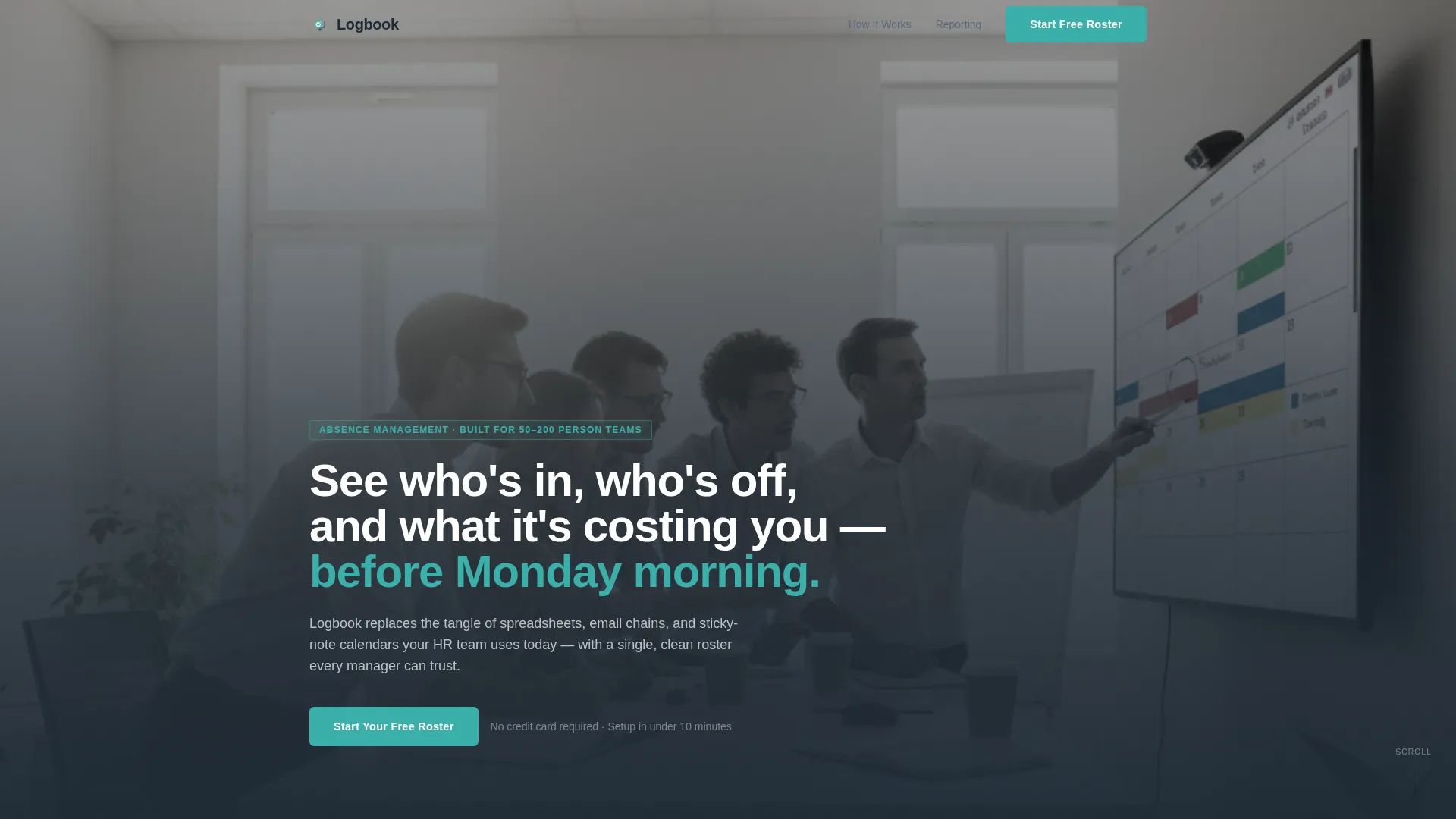
- A cinematic team photo hero section with a fade-in headline and a primary call-to-action button
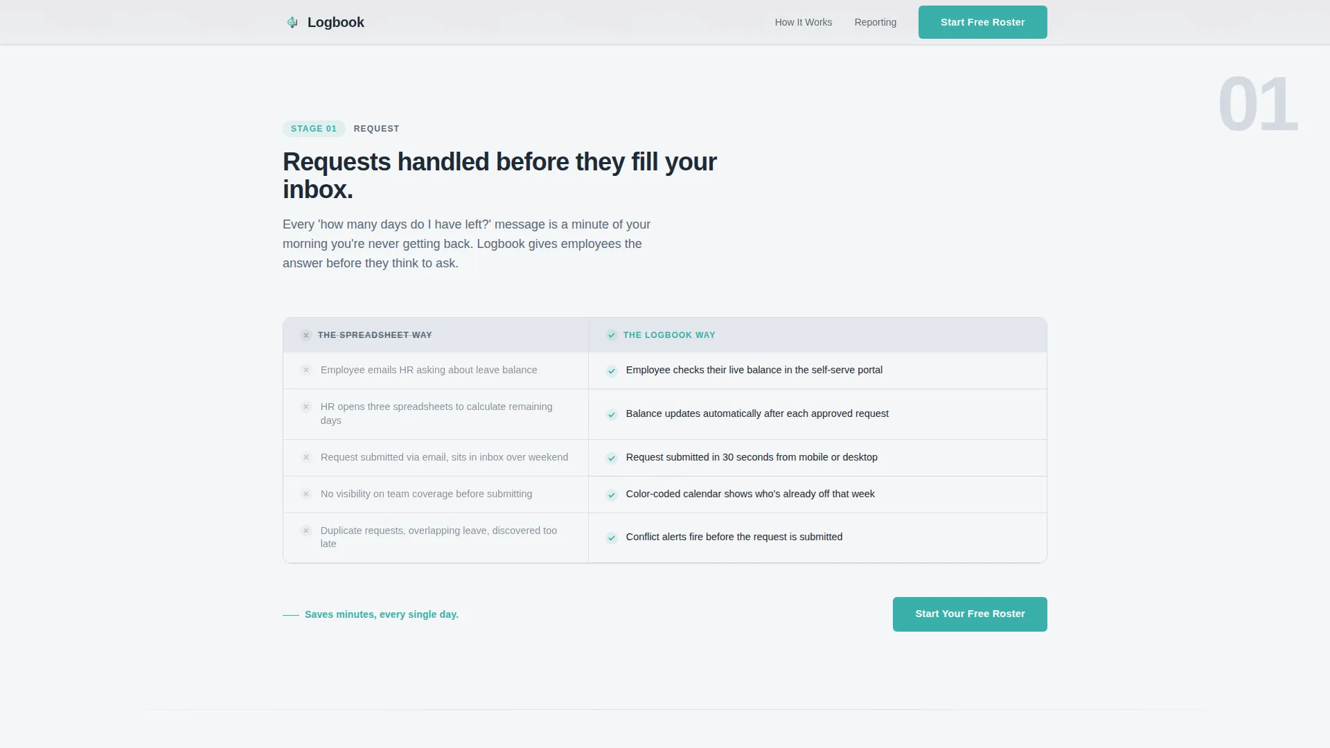
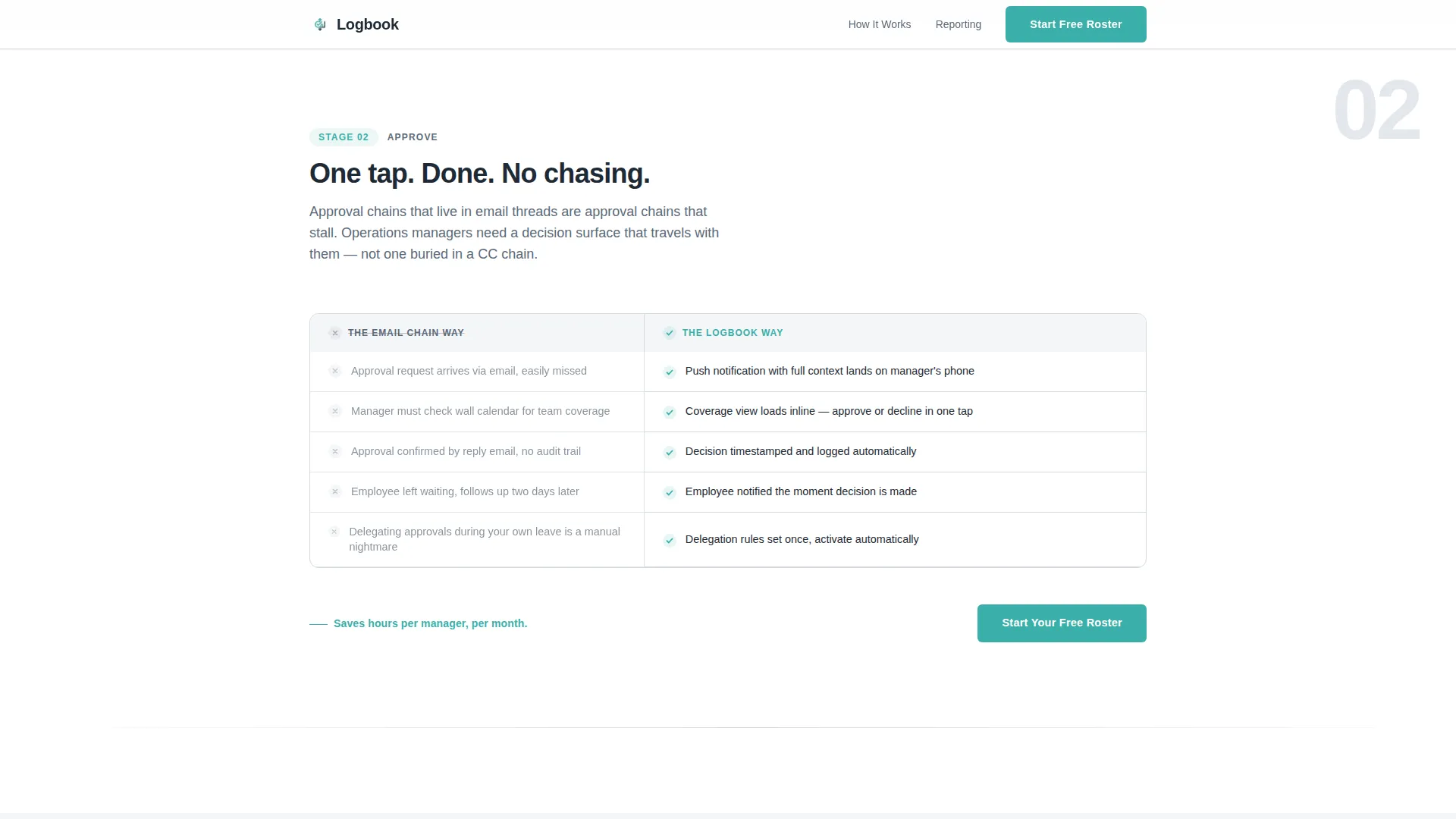
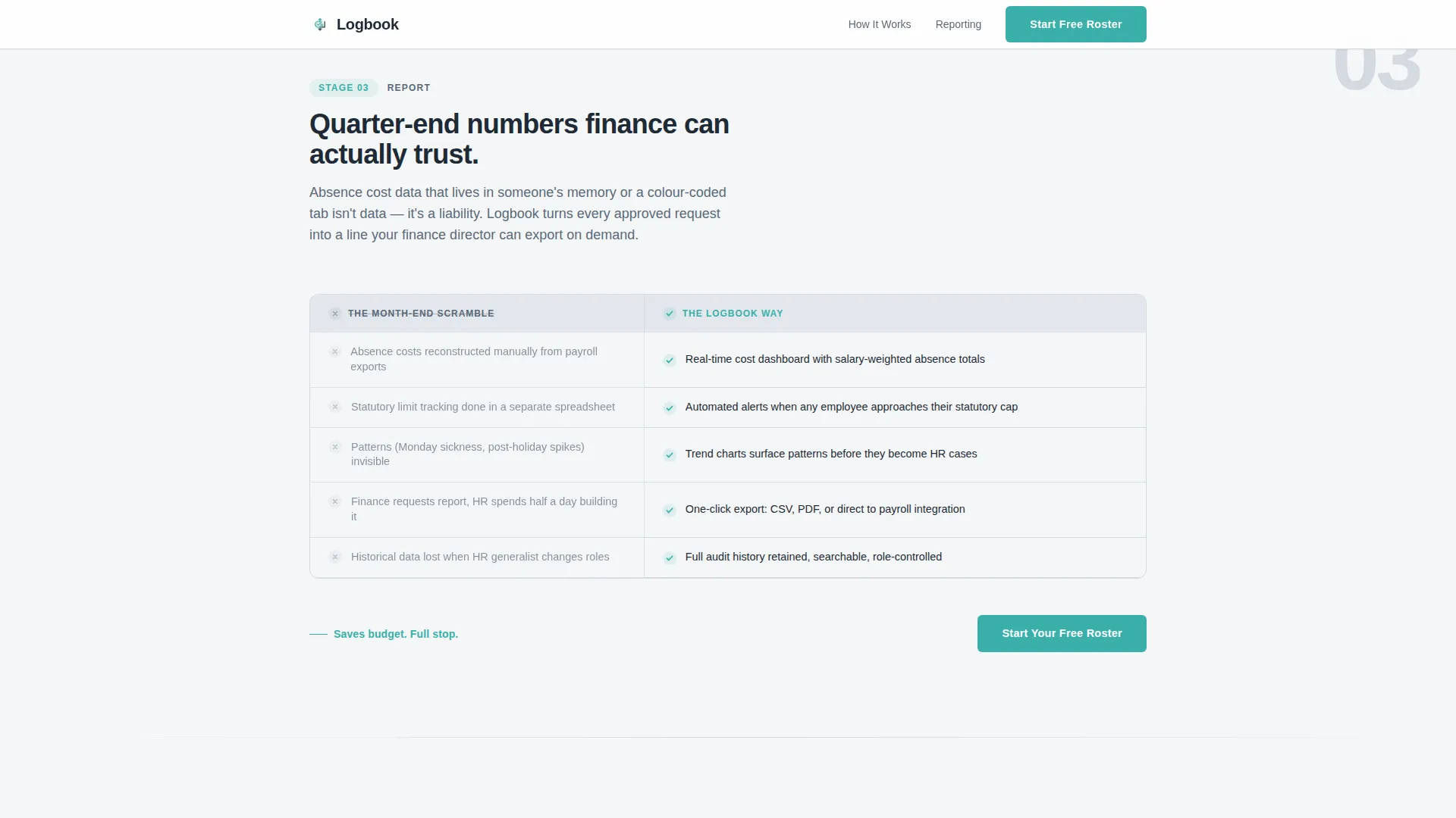
- Three full comparison table sections covering the Request, Approve, and Report stages of absence management
- A final call-to-action block with a primary teal button and a secondary enterprise text link
Feature list
This template is built around a specific set of functional and visual features drawn directly from the design brief.
Scroll-Triggered Comparison Tables
Each of the three stages uses a two-column comparison table. Rows reveal on scroll and highlight on hover. Teal checkmarks bloom into view as the visitor enters each section, creating a sense of progressive discovery without overwhelming the reader.
Cinematic Team Photo Hero
The header uses a wide, warm, candid team photo set against window light. The image is slightly desaturated to stay inside the soft-mist palette. A single headline fades in over the photo, setting the platform's value proposition before any feature is mentioned.
Staged Step-by-Step Narrative
The scroll flow is structured as a three-act guide: Stage 1 saves minutes, Stage 2 saves hours, Stage 3 saves budget. Each stage escalates the stakes deliberately, so visitors mentally map their own workflows onto the platform as they read.
Repeating Click-Through Call to Action
The primary call-to-action button, labelled "Start Your Free Roster," appears beneath the hero and repeats after each comparison stage. Every button clicks through to the trial registration page. No form lives on this page.
Enterprise Secondary Link
A quiet secondary text link, "See pricing for teams over 200," sits below the final call-to-action block. It acknowledges larger-team visitors without distracting from the primary conversion path.
Soft Mist Visual System
The page uses a four-value color system. Cloud white and fog gray handle all backgrounds. Slate pencil carries body text. Calm teal is reserved strictly for interactive elements, active table states, and calls to action, keeping visual noise low throughout.
Page sections overview
| Section | Purpose |
|---|---|
| Hero photo header | Introduce platform value with a human, candid team image and fade-in headline |
| Stage 1: Request | Compare spreadsheet chaos against a self-serve absence calendar using an animated table |
| Stage 2: Approve | Compare email approval chains against one-tap mobile approvals using an animated table |
| Stage 3: Report | Compare month-end data scrambles against real-time absence cost dashboards |
| Final call to action block | Repeat the primary teal button and surface the enterprise text link below it |
| Footer | Single-row linear footer pattern |
Design & branding system
The visual identity follows a Scandinavian minimal style that feels like a clean desk at the start of a new year. Every color decision is deliberate, and teal never appears as decoration.
- Four-value Soft Mist palette: cloud white (#F4F6F8), morning fog gray (#D4DAE0), slate pencil (#5A6978), and calm teal (#3AAFA9) for interactive elements only
- Typography pairing: Plus Jakarta Sans in bold for all headings, DM Sans for body text across every section
- Teal is reserved strictly for calls to action, hover states, and the animated checkmarks inside comparison tables
Mobile & speed optimization
The template is designed desktop-first to match how operations managers typically work, but it is built to stay usable on smaller screens as well.
- Comparison tables are structured to reflow cleanly on mobile viewports without losing their two-column logic
- Scroll-triggered animations use minimal JavaScript, keeping the page light and the interactions smooth
- Static content sections use server components, reducing the amount of client-side processing needed on load
How this template helps you convert
The page is built as a click-through, so every design choice points toward a single action: getting the visitor to start a free trial.
- The comparison tables do the persuasion work before the call to action appears, making the old manual workflow feel embarrassingly inefficient by the time the button shows up.
- The repeating "Start Your Free Roster" button after each stage means the visitor never has to scroll back up to act, regardless of where they decide they have seen enough.
- The enterprise text link below the final button quietly addresses larger-team visitors without cluttering the primary conversion path or asking them to navigate away prematurely.
Other information about this template
This template sits inside the Directory and Discovery theme family and is paired with the Step-by-Step Guide creative direction. It is categorized under HR and Hiring, with a specific focus on the Time and Attendance subcategory and the Absence Management Platform niche.
- The template style is Comparison Table, and the landing page direction is Click-Through, with no embedded forms anywhere on the page
- The header concept is Team Photo, using a candid, slightly desaturated group image rather than a product screenshot or dashboard mockup
- Color system label is Soft Mist, and the full palette is cloud white, fog gray, slate pencil, and teal as documented in the design brief
- The template is suited for B2B SaaS products positioning themselves against manual HR workflows at companies in the 50 to 200 employee range
Theme
Directory & Discovery
Creative direction
Step-by-Step Guide
Color system
Soft Mist
Style
Comparison Table
Direction
Click-Through
Page Sections
Scroll-triggered Comparison Tables
Cinematic Team Photo Hero
Three-stage Narrative Flow
Repeating Click-through Call to Action
Enterprise Secondary Link
Soft Mist Design System
Related questions
Does this template include a signup form?
Can the comparison table rows be customised?
Is this template suitable for a product targeting larger enterprise teams?
What animations does this template include?
How many times does the call-to-action button appear?


