Cinematic Fiber Art Gallery Landing Page Template
Loom is a cinematic dark landing page template built for textile and fiber art galleries. It opens with a full-screen macro video of woven work, then guides visitors through immersive full-bleed artwork reveals with editorial sidebars. The design drives click-throughs to exhibition pages or private viewing bookings, using restrained typography and deliberate negative space.
by Rocket studio
Quick summary
Loom is a hero-dominant, single-page landing template for textile and fiber art galleries. A full-screen video header pulls visitors into the work immediately. Scrolling through reveals artwork at full-bleed scale, each paired with a concise editorial sidebar. The page closes with a clear path to your current exhibition or a private viewing booking.
Who this template is for
This template is built for galleries and artists working in textile and fiber art who need a landing page that matches the cultural weight of the work they show. It suits spaces where craft and contemporary art overlap and where the audience expects a considered, unhurried visual experience.
- Interior designers sourcing statement textile pieces for residential or commercial projects
- Private collectors and curators following fiber art exhibitions and biennials
- Gallery directors and independent textile artists presenting new or ongoing shows
What problem this template solves
Most gallery templates are built around product grids or event calendars. They move too fast and treat art like inventory. A textile and fiber art gallery needs a page that makes visitors slow down, look closely, and feel the pull of the work before they are asked to do anything.
- Generic templates dilute the presence of large-scale woven works with cluttered layouts
- Visitors leave before desire builds because the page asks for action too early
- There is no editorial rhythm to guide collectors and curators toward a meaningful next step
What you get with this template
You get a fully designed, single-page layout that treats the scroll as a curated walkthrough. Every section is intentional, every spacing decision is deliberate, and the visual hierarchy is built to match the pace of gallery viewing rather than e-commerce browsing.
- A full-screen video hero with a delayed editorial headline and an optional ambient sound toggle
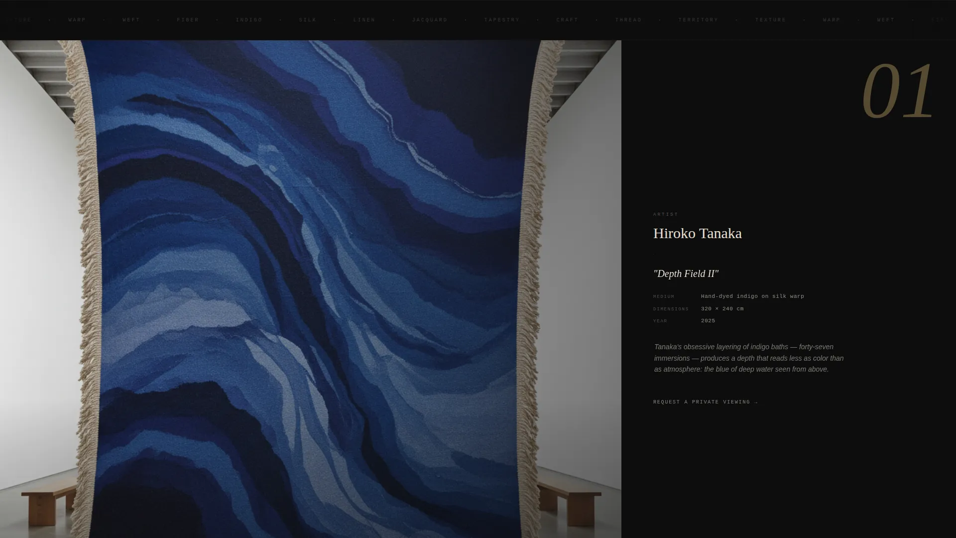
- Immersive full-bleed artwork sections with thin editorial sidebars carrying artist name, medium, dimensions, and a single critical caption
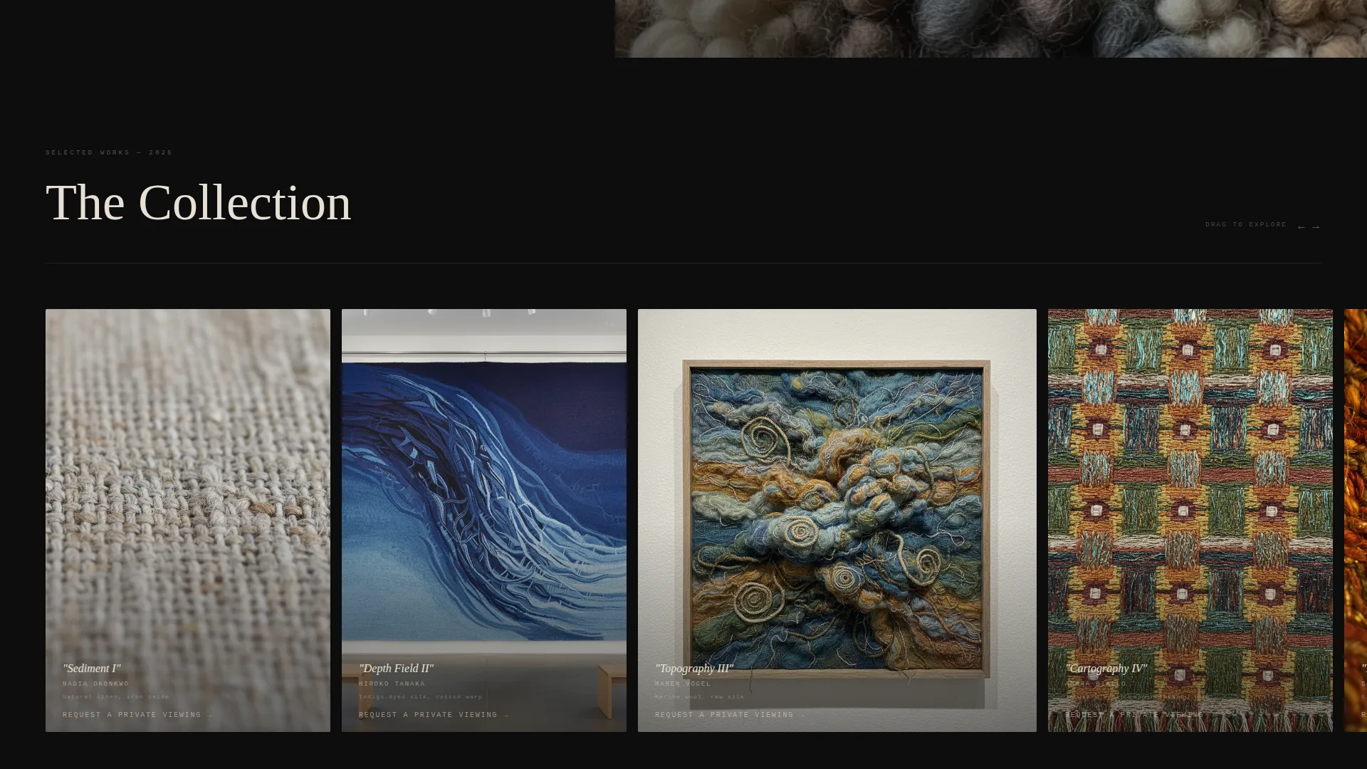
- A mid-page horizontal scroll gallery that breaks vertical momentum like a printed gatefold
- Primary and secondary call-to-action placements timed to appear after desire has been established
Feature list
This template was designed around one core idea: the landing page as an exhibition space. Every feature listed below comes directly from that brief.
Full-Screen Macro Video Header
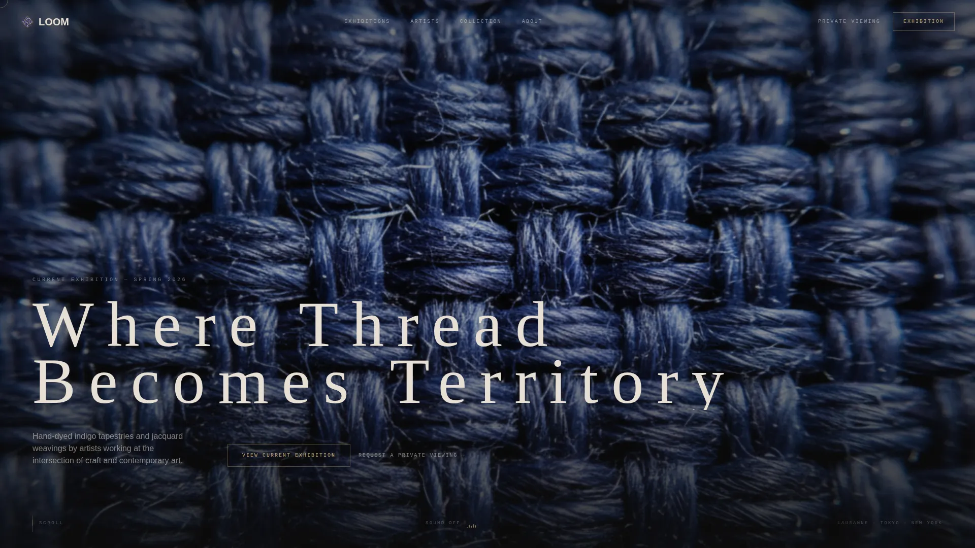
The hero fills the entire viewport with a slow tracking shot across the surface of a large-scale woven work. The camera moves at a breathing pace, showing individual fibers catching light. No headline appears for the first four seconds, giving the texture time to register before text enters the frame.
Delayed Editorial Headline
After the opening video sequence, a single headline appears in tracked-out uppercase lettering against the dark field. The timing is controlled to feel like a reveal rather than an announcement. This single typographic moment sets the editorial register for everything that follows.
Immersive Full-Bleed Artwork Sections
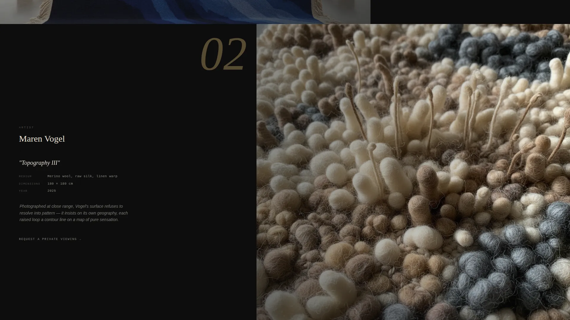
Each artwork occupies the full screen width and alternates between overwhelming scale views and intimate detail crops. A thin sidebar carries the artist name, medium, dimensions, and one sentence of criticism written in a magazine caption style. The rhythm is slow, confident, and unapologetic about negative space.
Mid-Page Horizontal Scroll Gallery
Midway through the page, the vertical scroll pauses and a horizontal gallery takes over, mimicking the physical action of opening a printed gatefold. This section forces active engagement and breaks the pacing in a way that refreshes attention before the primary call to action appears.
Timed Primary Call to Action
The "View Current Exhibition" button in filament gold on exhibition black appears after the third artwork reveal. Placement is deliberate: the visitor has already seen enough to want more before they are offered a next step. This timing is built into the section order of the template.
Per-Artwork Private Viewing Link
Each artwork section carries a secondary text link reading "Request a Private Viewing." This understated link is positioned beneath each piece for collectors who are ready to act on a specific work. There is no form on this page; the click earns itself through the quality of the presentation.
Page sections overview
| Section | Purpose |
|---|---|
| Full-Screen Video Hero | Immerses visitors in macro textile footage before any text appears |
| Delayed Headline Reveal | Introduces the editorial voice with a single tracked-out uppercase line |
| First Artwork Reveal | Opens the full-bleed scrolling gallery with scale and editorial sidebar |
| Second Artwork Reveal | Continues the alternating scale-and-detail rhythm with per-piece viewing link |
| Third Artwork Reveal | Completes the desire-building sequence and triggers the primary call to action placement |
| Horizontal Scroll Gallery | Breaks vertical flow with a gatefold-style interactive section |
| Exhibition call to action Block | Presents "View Current Exhibition" in filament gold after full desire is built |
Design & branding system
The color system is Cinematic Dark, built around four tones that evoke an ink-heavy editorial monograph viewed under low light. Typography is spare, weighted, and deliberately minimal to let the artwork carry visual authority.
- Core palette: exhibition black (#0D0D0D), unbleached linen (#E8E0D5), oxidized copper (#8B5E3C), and filament gold (#C9A96E) reserved for hover states and pull-quote borders
- Type treatment: tracked-out uppercase headlines in linen white, lowercase editorial body text in a weighted serif or editorial sans, all set with generous leading and negative space
- Visual rhythm: alternating full-bleed scale shots and intimate detail crops, slow pacing, and deliberate use of dark negative space throughout
Mobile & speed optimization
The template layout is designed to translate the cinematic pacing of the desktop experience into a mobile-friendly format. The horizontal scroll gallery adapts to touch-based swiping, and the full-bleed sections maintain their visual impact at narrower widths.
- The full-screen video header is designed to scale across viewport sizes without breaking the immersive first impression
- Editorial sidebars reflow below artwork images on smaller screens to keep the reading experience intact
- The horizontal scroll gallery responds to touch-swipe gestures on mobile devices
How this template helps you convert
This page is built around a Click-Through conversion model. There is no form, no friction, and no transaction language. The click earns itself because the experience makes the next step feel like privileged access.
- The three-artwork reveal sequence is timed so that the primary "View Current Exhibition" call to action appears only after the visitor has spent real time with the work, making the click feel like a natural continuation rather than a prompt.
- The per-artwork "Request a Private Viewing" text link gives collectors a low-pressure path to act on a specific piece at any point in the scroll, reducing drop-off among high-intent visitors who do not need to see the full page before deciding.
Other information about this template
Loom is part of a broader family of Editorial Magazine-themed templates using the Cinematic Dark color system. It is designed for the intersection of art gallery presentation and fiber art specifically, making it a strong fit for textile-forward exhibitions that position handcraft within contemporary art discourse.
- The template style is Hero-Dominant (90/10), meaning the visual content carries approximately 90 percent of the page weight while copy stays minimal and editorial
- The ambient sound toggle uses a subtle waveform icon to invite optional loom-clatter audio; sound is off by default
- The Cinematic Dark color system and Editorial Magazine theme together reference the visual language of art monographs, making the template legible to collectors and curators who move in those circles
- This template is suited for galleries preparing for fiber art biennials, seasonal exhibition launches, or debut presentations of new textile commissions
Theme
Editorial Magazine
Creative direction
Immersive Visual
Color system
Cinematic Dark
Style
Hero-Dominant (90/10)
Direction
Click-Through
Page Sections
Full-screen Macro Video Header
Delayed Editorial Headline Reveal
Immersive Full-bleed Artwork Sections
Mid-page Horizontal Scroll Gallery
Timed Primary Call to Action
Per-artwork Private Viewing Link
Related questions
Can I use this template without a video for the hero section?
Is there a contact form included in this template?
How many artwork sections does this template include?
Who is the primary audience this template is designed to attract?
Can the filament gold color be changed to match my gallery's brand?