Industrial Onlinecarsales | Free Website Template | Rocket
Lot is a storybook, full-page landing page template built for online car sales platforms. It pairs an industrial raw visual identity with a scroll-driven comparison journey, guiding buyers past the old dealership experience and toward a frictionless digital showroom. Every section builds trust, and every call to action moves visitors directly into live inventory.
by Rocket studio
Quick summary
Lot is a single-page landing page template designed for online car sales platforms. It uses a charcoal and amber industrial palette, a full-bleed photo header, and a scroll-driven comparison journey to make the case for buying a car without ever setting foot in a dealership. The layout is built around one goal: getting buyers into your live inventory.
Who this template is for
This template is built for businesses that sell cars entirely online and need a landing page that does the heavy persuasion work before a visitor ever clicks browse. It speaks directly to buyers who shop on their own terms, at their own hours, without the pressure of a showroom floor.
- Online car dealerships and digital-first automotive retailers
- Independent used-car platforms offering full vehicle history and home delivery
- Small-business operators and first-time car buyers who need clarity, not a sales pitch
What problem this template solves
Most car dealership websites feel like a digital replica of the lot itself: cluttered, pushy, and hard to trust. Buyers who shop online are looking for transparency, not a form with fifteen fields. This template removes every friction point that makes a visitor close the tab.
- It replaces vague pricing and hidden history with a clear, contrast-driven narrative
- It eliminates form walls by routing visitors straight into live inventory with one tap
- It gives skeptical buyers a visible reason to trust the platform before they commit to anything
What you get with this template
You get a fully designed, storybook-style landing page built around a single persuasive scroll path. Every section has a job, and every visual choice reinforces the same message: this is a better way to buy a car.
- A full-bleed photo header with a cinematic low-angle vehicle shot and knockout white headline
- Three full-page comparison sections that stack evidence with each scroll
- A persistent amber call-to-action bar and a secondary trade-in text link to keep every visitor in the funnel
Feature list
A paragraph introducing the feature set: each component below is grounded directly in the template brief and serves a specific role in the landing page experience.
Full-Bleed Cinematic Header
The header opens with a matte-black sedan shot low and wide on wet asphalt at dusk. Headlights cut two clean lines into amber-tinted fog. A single line of knockout white type fades in over the image, setting the tone before the visitor scrolls an inch.
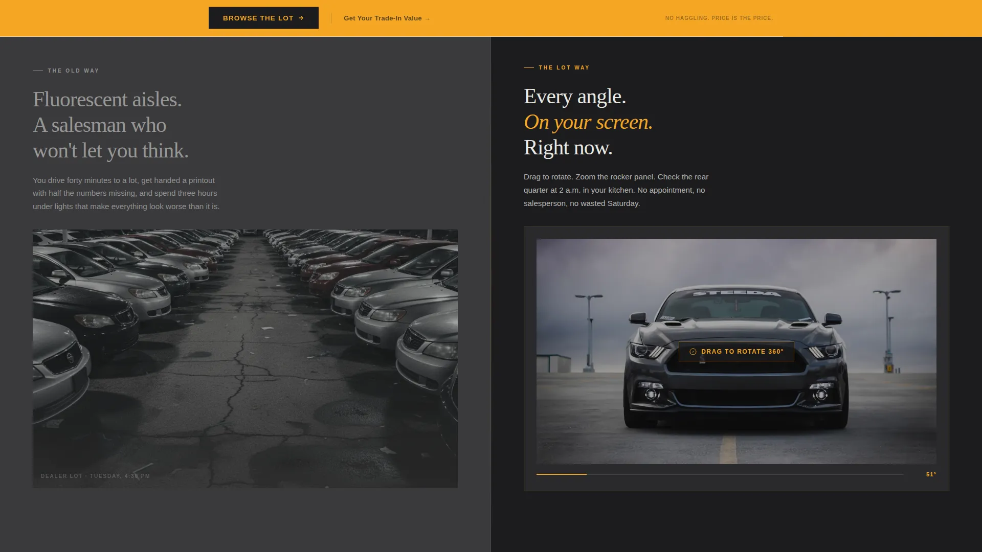
Scroll-Driven Comparison Journey
Three full-page sections pair the traditional dealership experience against the platform's version. Each contrast is visual and immediate: grainy lot photo versus 360-degree spin viewer, redacted history snippet versus full-disclosure timeline, stock handshake versus doorstep delivery photo. The old way feels worse with every scroll.
360-Degree Vehicle Walkaround Section
The first comparison section introduces a 360-degree spin viewer as the visual centerpiece. It communicates the depth of the listing experience without a single word of explanation. Buyers understand the product before they read a bullet point.
Transparent Vehicle History Timeline
The second comparison section replaces the familiar redacted history report with a full-disclosure timeline. The contrast between what buyers are used to seeing and what this platform provides is sharp and intentional. Trust is built visually, not just claimed in copy.
Persistent Amber Call-to-Action Bar
The primary call to action, Browse the Lot, appears first as a ghost button over the header. After the third comparison section, it solidifies into a persistent amber bar fixed to the page. One tap routes the visitor directly into live inventory with filters pre-loaded.
Secondary Trade-In Estimator Link
A secondary text link, Get Your Trade-In Value, catches visitors who are not ready to browse but are ready to do the math. It routes them to a single-field license-plate estimator. This keeps deal-curious visitors in the funnel without adding friction to the main conversion path.
Page sections overview
| Section | Purpose |
|---|---|
| Full-Bleed Header | Establish mood and brand promise with a cinematic vehicle image and headline |
| Comparison Section One | Contrast dealer lot photography with a 360-degree spin viewer |
| Comparison Section Two | Contrast redacted history report with a full-disclosure vehicle history timeline |
| Comparison Section Three | Contrast a stock handshake photo with a real doorstep delivery photograph |
| Primary call to action Bar | Convert scroll momentum into a direct click into live inventory |
| Trade-In Link | Retain fence-sitting visitors with a low-friction trade-in value entry point |
Design & branding system
The visual identity follows an industrial raw theme built around a charcoal and amber color system. The palette feels like a well-kept garage at golden hour: oil-stained concrete, brushed steel surfaces, and a single work lamp casting long shadows across a freshly detailed hood.
- Deep asphalt (#1C1C1E) and shop-floor gunmetal (#3A3A3C) form the base, while warm amber (#F5A623) drives all primary actions and accents
- Exhaust-cloud white (#E8E8E3) is used for body text, keeping contrast readable against dark backgrounds
- The overall visual tone is raw and confident: polished concrete underfoot, nothing decorative, nothing unnecessary
Mobile & speed optimization
The storybook layout is structured for a clean single-column reading experience on smaller screens. Each full-page comparison section stacks vertically in a way that preserves the visual contrast without losing impact on a phone display.
- The persistent amber call-to-action bar remains accessible at all scroll depths on mobile
- The header image and headline composition are framed to retain their cinematic quality on portrait-oriented screens
How this template helps you convert
Every design and copy decision in this template points toward one outcome: a visitor who clicks into live inventory or starts a trade-in estimate. The layout does not ask for information before it gives something in return.
- The comparison journey removes doubt progressively, so by the time the persistent amber bar appears, the visitor has already seen three clear reasons to trust the platform over a traditional dealership
- The no-form, one-tap conversion path means there is no moment where a motivated buyer has to pause, fill out a field, or wonder what happens next
Other information about this template
This template is designed as a storybook, full-page layout, meaning the entire experience lives on one continuous scroll path. It is categorized under the Automotive and Transport niche, specifically for online car sales platforms and digital car dealership use cases. The template style and creative direction were matched at an intersection score of 13 across the Car Dealership subcategory.
- The creative direction is a Comparison Journey, a deliberate structure that makes the contrast between old and new buying experiences feel inevitable by the final section
- The header concept is a Full-Bleed Photo, chosen to establish emotional tone before any product detail is introduced
- The landing page direction is Click-Through, meaning every design element serves the goal of moving a visitor to inventory or a trade-in estimate with minimal steps


Theme
Industrial Raw
Creative direction
Comparison Journey
Color system
Charcoal & Amber
Style
Storybook/Full-Page
Direction
Click-Through
Page Sections
Full-bleed Cinematic Header
Scroll-driven Comparison Journey
Degree Walkaround Display
Transparent History Timeline
Persistent Amber Call-to-action Bar
Secondary Trade-in Estimator Link
Related questions
Who is this landing page template designed for?
What sections are included in this template?
Does this template include a contact form or lead capture form?
Can I customize the colors and typography to match my brand?
Is this template suited for mobile visitors?


