Narcolepsy Sleep Clinic Landing Page Template
Lucid is a narcolepsy treatment center landing page built to turn years of misdiagnosis into a single moment of recognition. It pairs an interactive symptom checklist with a three-column comparison table, guiding visitors from private suspicion to a scheduled sleep study. The Alpine Fresh color palette and weighted serif typography create a calm, clinically trustworthy space that earns every click.
by Rocket studio
Quick summary
Lucid is a conversion-focused, single-page template for a narcolepsy sleep medicine clinic. It opens with a bold, centered serif headline on a glacier-white field, then walks visitors through an interactive symptom checklist and a diagnostic comparison table. Every scroll reinforces recognition. The page closes with a clear call to action that sends visitors directly to a scheduling portal.
Who this template is for
This template is built for sleep medicine clinics and specialist practices that treat narcolepsy and related sleep disorders. It works especially well for clinics whose patients arrive already worn down by years of wrong answers.
- Sleep medicine clinics offering diagnostic sleep studies
- Specialist practices treating narcolepsy, idiopathic hypersomnia, or related conditions
- Healthcare marketers building direct-to-patient conversion pages
What problem this template solves
Most narcolepsy patients spend years being told they are depressed, anxious, or simply tired. By the time they find a specialist, they have lost jobs, licenses, or entire chapters of their lives. This template addresses that gap directly.
- Visitors arrive without a diagnosis and leave feeling clinically recognized
- The scroll replaces vague medical jargon with specific, relatable symptom language
- The comparison table corrects false diagnoses in plain, honest terms
What you get with this template
You get a fully structured, single-page layout with five purpose-built sections, interactive checklist functionality, and a click-through conversion path. Every component connects to a specific point in the patient's decision journey.
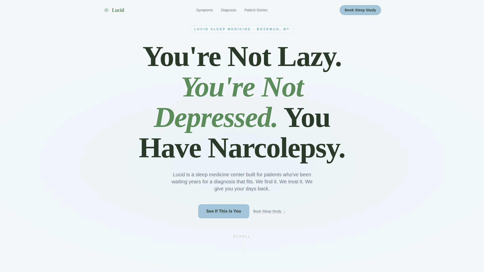
- A hero block with a centered, full-viewport serif headline and a single subline
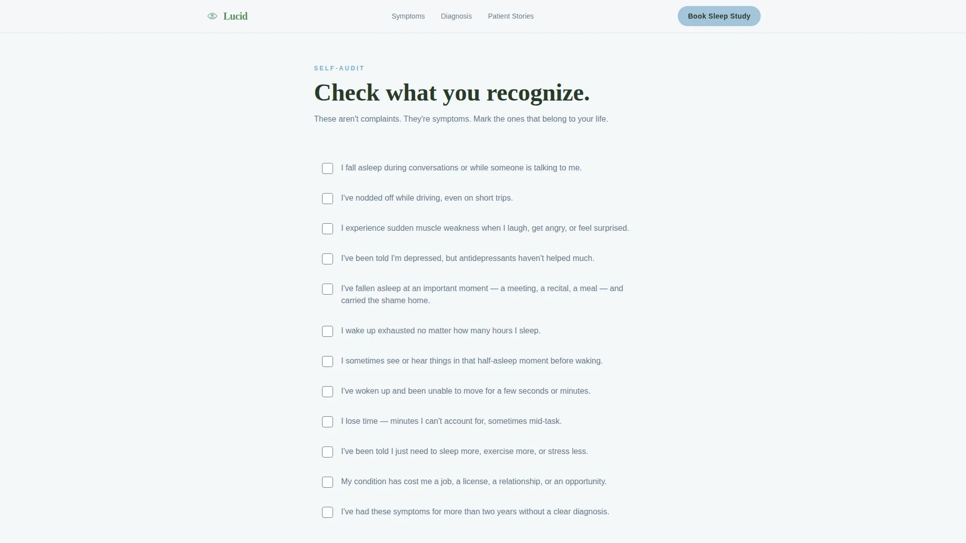
- An interactive symptom checklist with a live running count and a primary call-to-action button
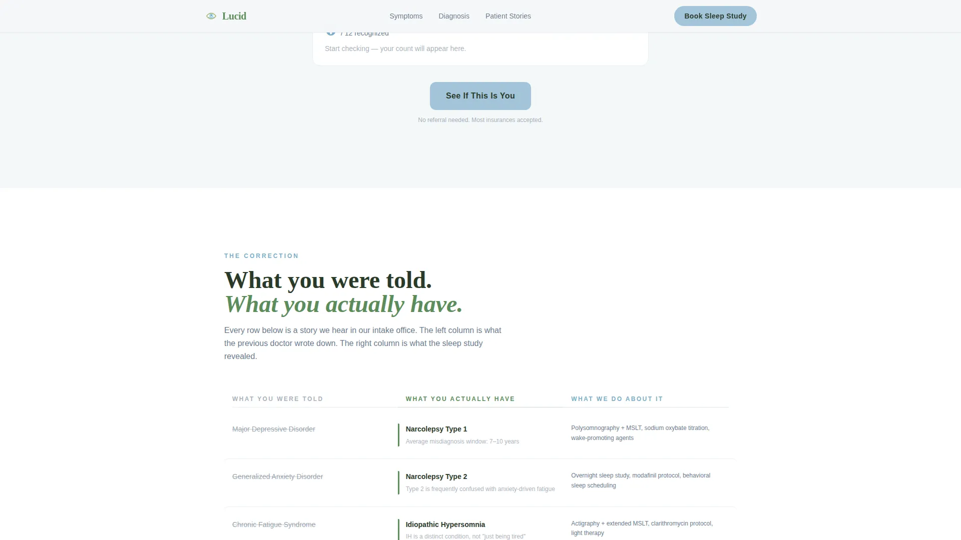
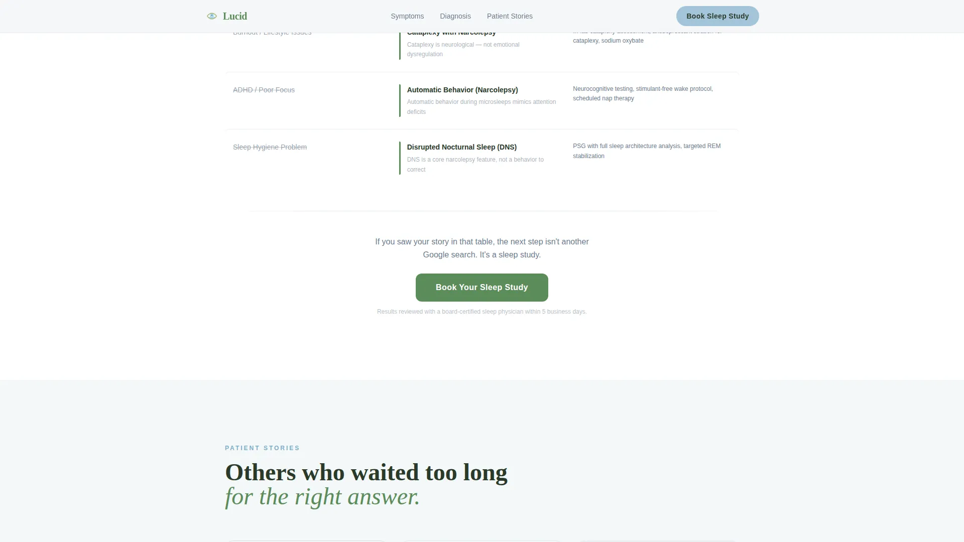
- A three-column comparison table contrasting past misdiagnoses with correct diagnoses and the clinic's treatment protocol
- A social proof section with three patient vignettes representing distinct life contexts
- A final anchored call-to-action block with trust signals and a secondary button that routes to the scheduling portal
Feature list
This template is built on a small set of components, each doing deliberate work.
Giant Centered Hero Headline
The hero opens with a single weighted serif headline set at viewport scale on a clean glacier-white background. No image, no video, no illustration competes for attention. The headline is the entire first impression, and it is designed to land like a diagnosis the visitor has been waiting years to read.
Interactive Symptom Checklist
The checklist section presents a set of tap-able symptom statements written in first-person patient language. A live counter styled in morning sky blue tracks each selected item. The counter builds quiet momentum and moves visitors naturally toward the first call-to-action button below the list.
Three-Column Diagnostic Comparison Table
The comparison table is organized into three clear columns: what patients were told, what they actually have, and what the clinic does about it. Each row functions as a correction. The format is calm and authoritative, replacing years of wrong answers with specific, verifiable alternatives.
Patient Vignette Social Proof
Three brief patient stories represent distinct real-world contexts: a long-haul truck driver, a college student, and a parent. Each vignette includes a transformation-focused quote. The specificity of these stories makes the social proof feel earned rather than generic.
Anchored Click-Through Calls to Action
Two calls to action appear at deliberate points in the scroll. The first, labeled "See If This Is You," follows the symptom checklist. The second, labeled "Book Your Sleep Study," anchors the bottom of the comparison table. Both route to a dedicated scheduling portal with no on-page form required.
Page sections overview
| Section | Purpose |
|---|---|
| Hero Headline Block | Opens with a full-viewport centered serif statement that reframes the visitor's experience |
| Symptom Checklist Audit | Lets visitors self-identify through interactive, first-person symptom statements with a live count |
| Diagnostic Comparison Table | Contrasts past misdiagnoses with correct diagnoses and the clinic's specific treatment approach |
| Patient Vignette Stories | Builds trust through three brief, role-specific transformation stories |
| Final Call to Action | Closes the page with a trust-anchored block and a direct link to the scheduling portal |
| Footer | Single-row linear footer with clinic contact and navigation essentials |
Design & branding system
The visual system follows a Healing Space theme inspired by an alpine sanatorium above the tree line. The palette feels cold, clean, and authoritative without any clinical coldness.
- Glacier white (#F4F7F9) covers all major backgrounds, creating open breathing room around every element
- Soft pine (#5B8C5A) anchors headlines and section dividers with quiet, grounded authority
- Stone path gray (#6B7B8D) carries all body text, staying readable without competing with the headline hierarchy
- Morning sky blue (#A3C4D9) highlights every button, interactive element, and the checklist counter, drawing the eye to every clickable surface
Mobile & speed optimization
This template is built mobile-first, designed for patients who research their symptoms late at night on a phone. Every layout decision prioritizes legibility and tap-friendly interactions on small screens.
- The symptom checklist uses tap-target sizing appropriate for mobile interaction
- Static sections use server-rendered components for a fast first paint, while the interactive checklist runs as a client component
- Scroll-reveal animations are staggered and light, keeping the experience smooth without interrupting the diagnostic flow
How this template helps you convert
The page does not rush visitors. It builds recognition at every scroll position, so by the time a visitor reaches a call-to-action button, the click feels like a logical next step.
- The symptom checklist creates a private moment of self-recognition before any clinic claim is made, reducing the skepticism a patient carries after years of misdiagnosis
- The comparison table replaces emotional uncertainty with structured clarity, showing the difference between what they were told and what a correct diagnosis looks like
- Both calls to action are earned through the content above them, so the scheduling portal click arrives with patient intent already formed
Other information about this template
This template is category-specific and built entirely for the sleep medicine and narcolepsy treatment niche. It is not a general medical template adapted for this use case.
- Typography uses Fraunces for all serif headlines and DM Sans for body text, a pairing chosen for calm authority and high mobile readability
- Scroll-reveal animations are staggered on entry, and the checklist includes checkbox micro-interactions and a counter animation
- The footer follows a linear single-row layout pattern, keeping the close of the page clean and uncluttered
- The page contains no on-page form; all conversion happens through a click to a separate scheduling portal
- The template is localized for English (United States) use, with date formatting in MM/DD/YYYY and pricing in USD where applicable
Theme
Healing Space
Creative direction
Checklist & Audit
Color system
Alpine Fresh
Style
Comparison Table
Direction
Click-Through
Page Sections
Giant Centered Hero Headline
Interactive Symptom Checklist
Three-column Comparison Table
Patient Vignette Social Proof
Click-through Calls to Action
Related questions
Does this template include an on-page appointment form?
Can I edit the symptom checklist statements?
Is the comparison table limited to three columns?
Who is the target patient this page speaks to?
Does the page work for conditions other than narcolepsy?



