Scandinavian Architecture Blog Website Template
Lumina is a full-width immersive landing page template for a Scandinavian lighting designer who crafts hand-bent brass and mouth-blown glass pendant lights. Built for interior architects, discerning homeowners, and editorial set designers, it uses a cinematic scroll sequence, an animated SVG illustration header, and an Obsidian and Gold color system to turn quiet craft into undeniable desire.
by Rocket studio
Quick summary
Lumina is a single-page, scroll-driven landing page template for an artisan Scandinavian lighting brand. It opens with a stroke-animated pendant illustration that blooms into warm gold light. From there, cinematic scenes move the visitor from workshop craft to intimate living spaces, building curiosity until a clear call to action earns the click through to the full collection.
Who this template is for
This template is built for makers and studios in the luxury design space who need to communicate craft, restraint, and singular vision. It speaks the visual language that architects and design-literate buyers already trust.
- Independent Scandinavian lighting designers selling hand-crafted pendant lights to trade and private buyers
- Interior architects and studio owners who need a portfolio-adjacent product page for boutique hotel and residential projects
- Set designers and creative directors sourcing editorial hero pieces and needing a brand reference that reflects the quality of the object
What problem this template solves
Most product landing pages rush the visitor. They stack testimonials, price tables, and pop-up forms before trust has been earned. For an artisan lighting brand, that approach destroys the very atmosphere the work is meant to create.
- Visitors leave before they feel anything because the page prioritizes conversion mechanics over experience
- Craft-led brands struggle to communicate the weight and intimacy of a handmade object through standard e-commerce layouts
- Interior architects and design professionals expect editorial pacing and visual confidence, not generic grids and stock-photo backgrounds
What you get with this template
You get a complete, production-ready landing page structured as a slow, cinematic narrative. Every section is built to carry one image, one thought, and one breath of space, so the visitor arrives at the call to action already convinced.
- An animated SVG hero section with a stroke-by-stroke pendant illustration and a gold bloom reveal on completion
- A scroll-driven sequence of six distinct sections, from workshop origin story to intimate lifestyle spaces, each paced like a scene in a Nordic film
- Two clear conversion paths: a primary "Explore the Collection" link and button, plus a footer-placed "Commission a Piece" secondary option
Feature list
Stroke-Animated SVG Hero Illustration
The header features a custom ink-drawn cross-section of a pendant lamp. Fine black linework on a parchment background draws itself stroke by stroke on page load. When the final line completes, warm gold light blooms outward from the bulb, flooding the surrounding illustration. No photograph competes with this opening moment.
Cinematic Scroll-Driven Narrative
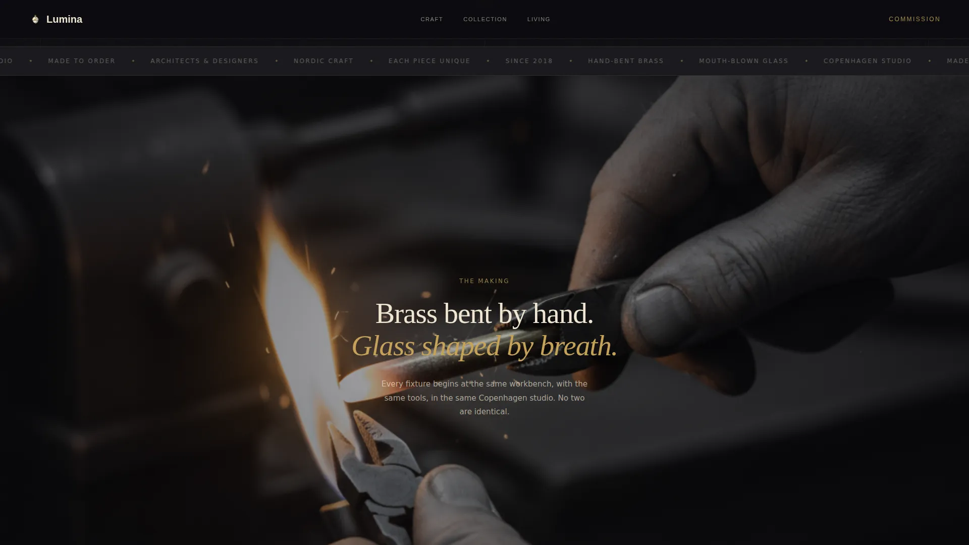
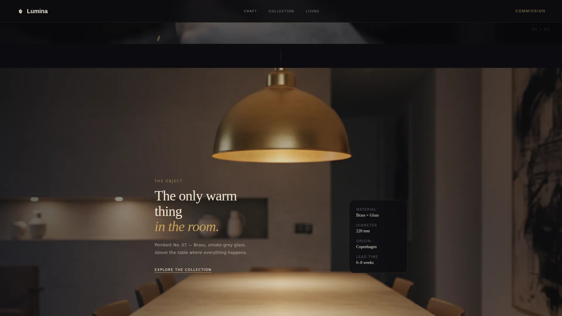
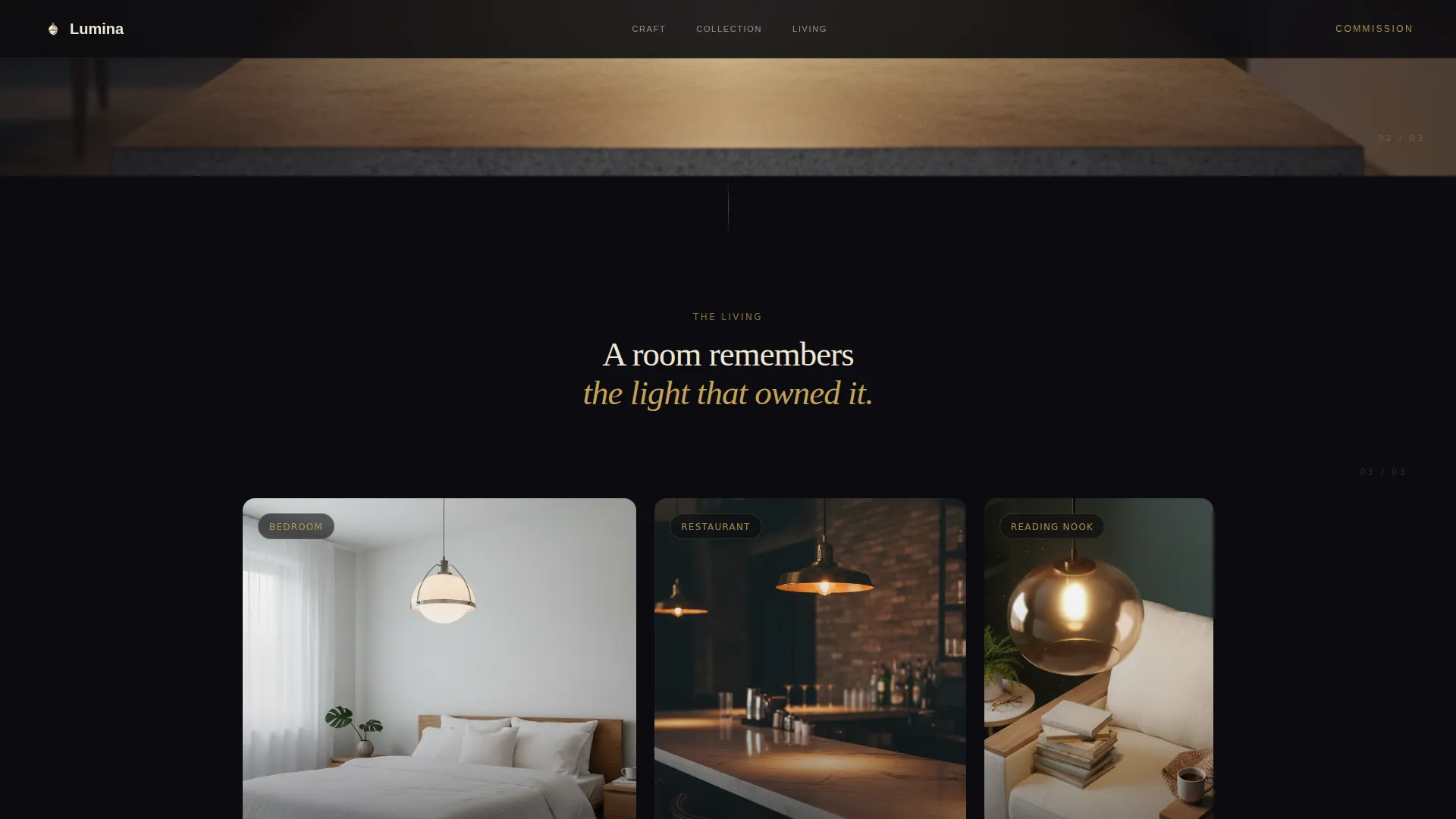
The page unfolds like scenes in a slow Nordic film. Each scroll step reveals one full-bleed image paired with a single line of copy. The sequence moves from a high-contrast black-and-white workshop scene through a color-saturated dining room pendant shot to a triptych of intimate living spaces. Scroll-triggered color reveals and parallax motion control the pacing deliberately.
Dual Conversion Path Structure
The primary call to action, "Explore the Collection," first appears as a subtle gold-underlined text link after the third scene. It returns as a full-width button on a parchment band after the final lifestyle image. A secondary path, "Commission a Piece," sits in the footer for visitors already certain they want a bespoke piece. No forms, no friction.
Obsidian and Gold Color Reveal System
Hover states and accent lines use tarnished gold (#C5A258) that activates on interaction. The deep matte obsidian background (#0B0B0F) makes every warm tone feel like light emerging from darkness. The color system is restrained by design and dramatic by effect.
Editorial Typography Pairing
Fraunces serif headlines carry the weight of craft and history. DM Sans handles body copy and navigation with clean Nordic clarity. The pairing balances warmth and precision, matching the hand-formed and machine-finished qualities of the pendant lights themselves.
Responsive Layout with Desktop-First Design
The template is designed desktop-first, where interior architects and hotel specifiers typically review work on large screens. The layout scales responsively to mobile without losing its cinematic atmosphere. GPU-accelerated transforms and image lazy loading keep the experience smooth across devices.
Page sections overview
| Section | Purpose |
|---|---|
| Hero Illustration | Animated SVG pendant drawing with gold bloom reveal on page load |
| Workshop Scene | Full-bleed B&W-to-color image with a single line of copy establishing craft origin |
| Dining Room Pendant | Color seeps into a concrete-and-oak interior, gold fixture as the only warm tone |
| Living Spaces Triptych | Bedroom, counter, and reading nook scenes shift focus from making to living |
| Call to Action Band | Parchment-colored full-width section with the primary collection button |
| Footer | Social links and copyright only, with the secondary "Commission a Piece" path |
Design & branding system
The visual identity follows an Ink and Paper theme. Every color choice, typographic decision, and spacing rule serves one goal: making a handmade object feel irreplaceable on screen.
- Color palette built on four values: Obsidian (#0B0B0F) for backgrounds, Parchment (#F0E6D3) for text and space, Tarnished Gold (#C5A258) for hover states and accents, and soft Graphite (#3A3A3C) for secondary type
- Typography uses Fraunces for all editorial headline moments and DM Sans for navigation and body copy, a pairing that holds Nordic restraint while reading with warmth
- Hover interactions across call-to-action elements and accent lines activate the gold tone, so the interface only reveals its warmth when the visitor reaches toward it
Mobile & speed optimization
The template is built desktop-first to serve the interior architects and hotel specifiers who are its primary audience. Responsive scaling ensures the cinematic pacing translates to smaller screens without breaking the atmosphere.
- Image lazy loading is implemented across all full-bleed scene images so the page does not load content the visitor has not yet reached
- GPU-accelerated transforms power the scroll-triggered animations and parallax effects, keeping motion smooth on capable hardware
- A reduced-motion preference is respected across all animations, so the template remains fully usable for visitors who have that system setting enabled
How this template helps you convert
Lumina does not convert through pressure. It converts through desire. The page builds a specific emotional state, admiration for craft followed by personal longing, before it ever asks for a click.
- The stroke animation and gold bloom create an arresting first impression that holds the visitor's attention from the first second, establishing the brand's visual authority before a single word of copy is read.
- The cinematic scroll sequence escalates intimacy deliberately, moving from workshop hands to lived-in rooms, so that by the time the visitor reaches the call-to-action band, they have already imagined the pendant above their own table.
- The curiosity-led conversion model, showing only five fixtures with the implication of dozens more waiting, drives clicks to the collection through genuine desire rather than urgency tactics or discount pressure.
Other information about this template
This template is built specifically for the Scandinavian architecture and design market, where editorial restraint and material honesty are understood as marks of quality. It sits within the Architecture and Design category, under the Scandinavian Architecture subcategory, and is matched to the Scandinavian lighting designer niche.
- The template uses an Intersection Match Score of 13, reflecting a strong alignment between the creative direction, color system, and niche audience expectations
- The lp direction is click-through, meaning the page earns navigation to a separate collection page rather than closing a transaction directly on the landing page
- The footer follows a minimal social-plus-copyright pattern, keeping the closing moment quiet and brand-consistent with the overall editorial tone
- The template is designed for a B2C and B2B hybrid context, serving both private homeowners and trade professionals such as interior architects and hotel procurement teams
- No currency, no pricing, and no checkout flow are present on this page by design, keeping the focus on brand desire and collection discovery

Theme
Ink & Paper
Creative direction
Cinematic Sequence
Color system
Obsidian & Gold
Style
Full-Width Immersive
Direction
Click-Through
Page Sections
Stroke-animated SVG Hero Illustration
Cinematic Scroll-driven Narrative
Dual Conversion Path Structure
Obsidian and Gold Interaction System
Editorial Typography Pairing
Responsive Desktop-first Layout
Related questions
Is this template suitable for a single artisan or a small lighting studio?
Does the page include a contact form or inquiry form?
Can the color palette and typography be changed to match a different brand?
What kind of images work best in the cinematic scene sections?
Is the animated SVG illustration included in the template?



