Premium Beauty Landing Page Template
Glow is a Neo-Retro beauty landing page built for Asian-owned skincare brands. It pairs a Before/After slider header with a masonry Comparison Journey grid, warm Citrus Burst colors, and direct-commerce features like expandable product tiles, a routine-builder quiz, and a sticky cart bar with a free-shipping progress tracker.
by Rocket studio
Quick summary
Glow is a single-page beauty landing page template designed for heritage-meets-science skincare brands. Its masonry grid pairs archival ingredient imagery with studio-lit product shots, building a visual story that earns trust and drives purchases. The Citrus Burst palette, interactive slider header, and built-in commerce tools make this template immediately shoppable.
Who this template is for
This template is built for founders and creative directors who need a landing page that sells and tells a story at the same time. It suits brands where cultural roots and modern formulation are both part of the pitch.
- Asian-owned beauty and skincare brands launching a new product line
- Independent cosmetics founders targeting second-generation Asian-American and K-beauty audiences
- Beauty editors or brand consultants building a showcase page for a cult-status product range
What problem this template solves
Most beauty landing pages force a choice: look editorial or be shoppable. Glow refuses that trade-off. It gives heritage brands a visual language that communicates identity without sacrificing the clear, direct path to purchase that converts browsers into buyers.
- Generic e-commerce templates flatten cultural storytelling into plain product grids
- Visitors leave without understanding the brand's origin, ingredient philosophy, or point of difference
- Decision fatigue from too many products kills conversions before a visitor reaches checkout
What you get with this template
You get a complete, ready-to-customize landing page with every layout section pre-built. The template covers the full visitor journey from first impression to cart, with no placeholder logic or incomplete sections.
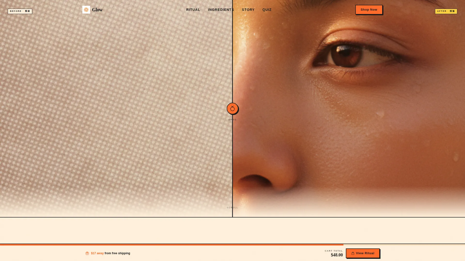
- A Before/After viewport slider as the hero header, complete with a tangerine drag handle and a stamp-in headline reveal
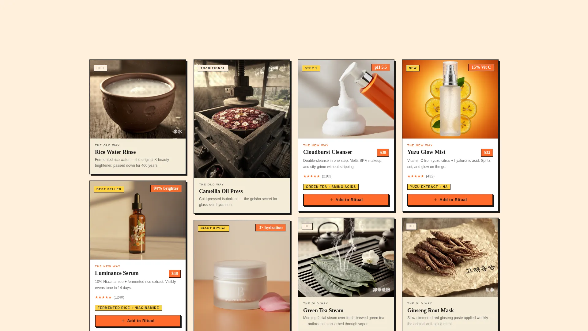
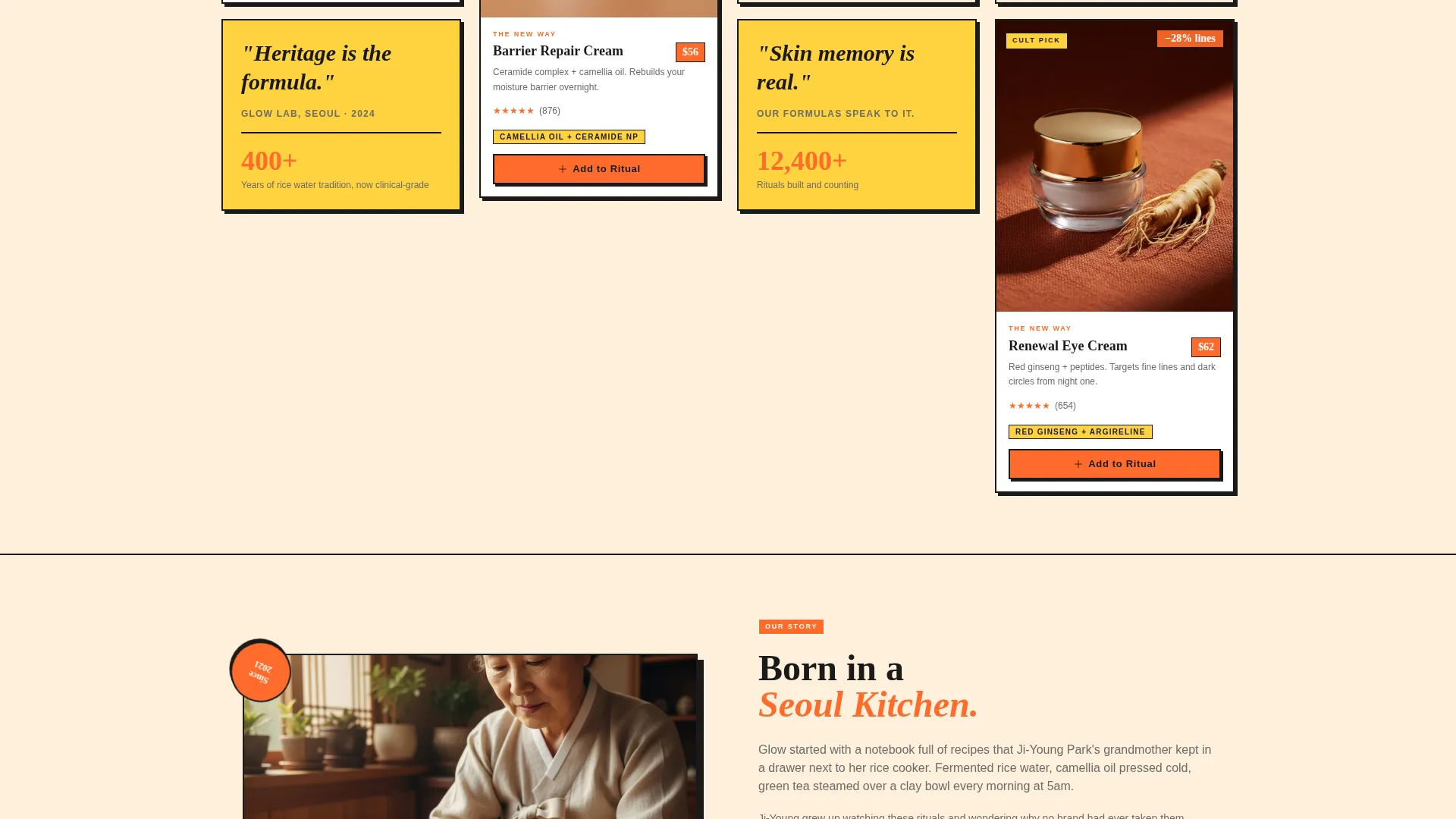
- A masonry Comparison Journey grid with two-column editorial tiles, archival ingredient photography slots, and clinical stat overlays
- Expandable product tiles with shade selectors, ingredient callout lines, star ratings, and "Add to Ritual" call-to-action buttons
Feature list
This template ships with a focused set of interactive and layout features drawn directly from the Glow brief. Each feature supports either brand storytelling or direct conversion.
Before/After Viewport Slider
The hero header splits the full viewport into two states: bare skin under flat fluorescent light on the left, and golden dewy skin color-graded in a 1978-era aesthetic on the right. A miniature tangerine icon serves as the drag handle. The headline "Your Grandmother Knew. Now You Do Too." stamps into view only after the slider crosses center.
Masonry Comparison Journey Grid
Each scroll row pairs an "old way" tile with a "new way" tile. Old-way tiles feature grainy archival photography of traditional ingredients with hand-lettered Korean or Cantonese text. New-way tiles show studio-lit product shots with clinical stat overlays. Some tiles span two columns for editorial weight; others cluster tightly for a mood-board feel.
Expandable Product Tiles
Clicking any product tile opens an expanded view with shade selectors, a single-line hero ingredient callout, and star ratings. The primary call-to-action reads "Add to Ritual" in ink-black on mandarin, maintaining brand consistency across every product entry.
Build My Routine Quiz
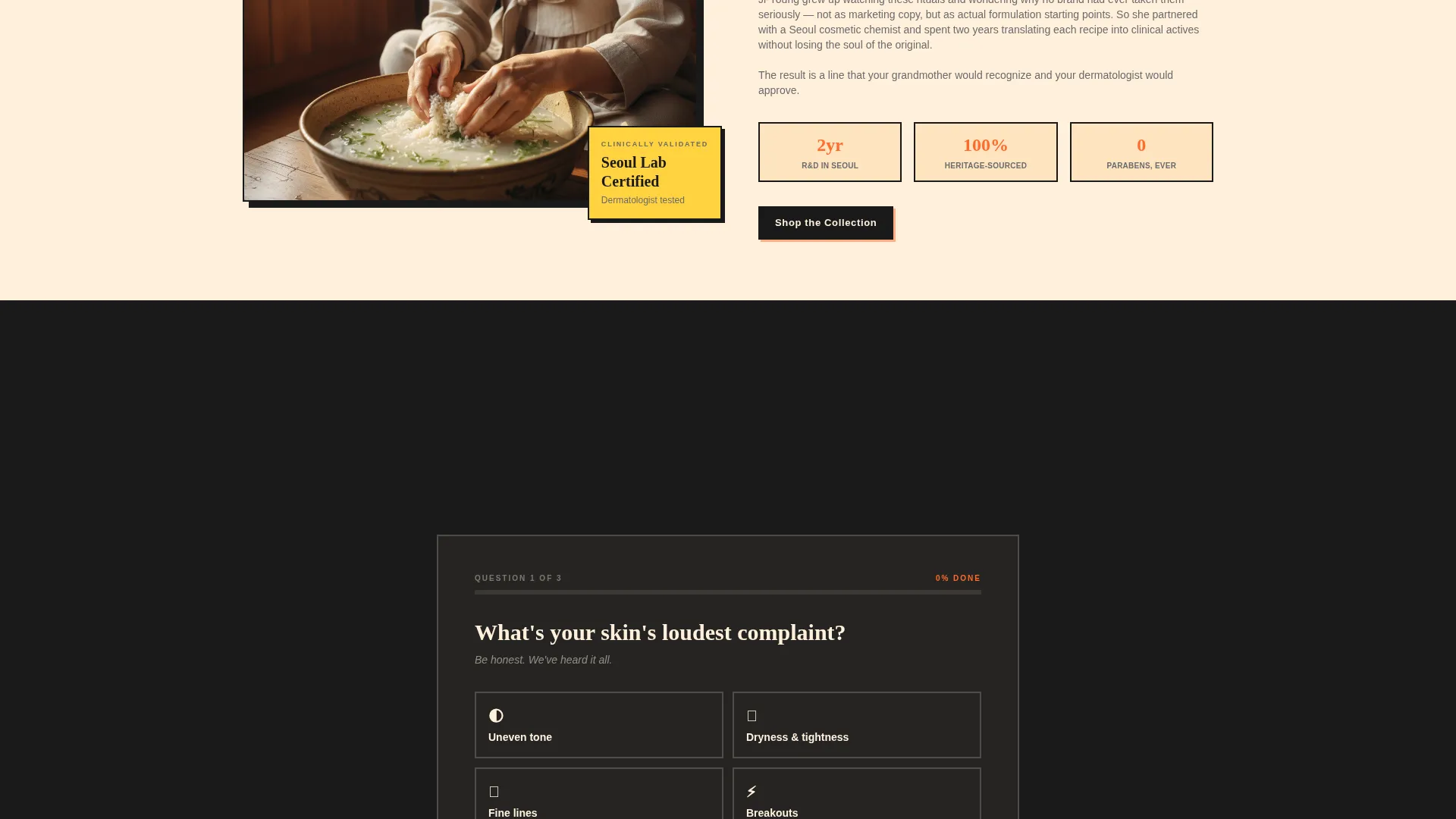
A secondary conversion path lets visitors answer a short quiz that recommends a three-product bundle. The bundle carries a 15% discount, reducing decision fatigue and encouraging higher-value orders compared to single-item purchases.
Sticky Cart Progress Bar
A bottom bar stays visible as visitors scroll. It displays the running cart total and shows a yuzu-colored filling progress bar that tracks progress toward a free-shipping threshold at $65. This creates a low-friction nudge to add one more item.
Neo-Retro Citrus Burst Color System
The full palette is pre-applied across every section. Hot mandarin covers call-to-action buttons and price tags. Yuzu washes behind testimonial tiles. Persimmon cream holds background card tiles. Ink-black anchors all typography and card borders for maximum legibility.
Page sections overview
| Section | Purpose |
|---|---|
| Before/After Slider | Hero header revealing brand transformation |
| Headline Stamp Reveal | Activates brand tagline at slider midpoint |
| Comparison Journey Grid | Pairs heritage ingredients with modern product shots |
| Editorial Two-Column Tiles | Creates visual pauses and brand storytelling moments |
| Expandable Product Tiles | Delivers shade, ingredient, rating, and cart action |
| Build My Routine Quiz | Recommends bundles and lifts average order value |
| Sticky Cart Bar | Tracks total and motivates free-shipping completion |
Design & branding system
The visual identity follows a Neo-Retro direction that feels like a vintage fruit crate label found in a Chinatown market: sun-faded but still punchy, warm but never soft. Every color and typographic choice reinforces the brand's dual identity of heritage and clinical modernity.
- Citrus Burst palette: hot mandarin (#FF6B2B) for calls to action, yuzu highlight (#FFD23F) for testimonial washes, soft persimmon cream (#FFF0DB) for background tiles, and ink-black (#1A1A1A) for all type and borders
- Typography uses bold ink-black stamping on light backgrounds, echoing vintage print aesthetics while keeping product information clean and readable
- Photography art direction slots accommodate both archival halftone-grain imagery for heritage tiles and clean studio-lit shots for product tiles, keeping the two visual languages distinct and intentional
Mobile & speed optimization
The masonry grid and interactive slider are designed to translate well to smaller screens. The layout prioritizes legibility and tap targets so the shopping experience stays smooth on mobile devices.
- Masonry columns reflow to single-column on narrow screens, preserving the Comparison Journey narrative without horizontal scrolling
- The sticky cart bar and "Add to Ritual" buttons remain thumb-accessible at the bottom of the viewport on mobile
- Expandable product tile overlays are sized for touch interaction, with shade selectors and ratings visible without zooming
How this template helps you convert
Glow layers multiple conversion moments across a single scroll, so visitors encounter purchase opportunities whether they pause at the header, browse the grid, or reach the bottom of the page.
- The Before/After slider creates an immediate emotional hook that primes visitors to believe in the product's results before they read a single claim, making the call-to-action feel earned rather than pushed.
- The Comparison Journey grid builds cumulative evidence across ingredients, routines, and results, so by the time a visitor reaches a product tile they already understand the brand's philosophy and are ready to act.
- The "Build My Routine" quiz with a 15% bundle discount converts undecided visitors who have multiple needs, turning a browsing session into a higher-value multi-product order.
Other information about this template
Glow is categorized under Retail and E-Commerce with a specific focus on Asian-owned business templates. It is built to serve the Gallery and Detail template style, meaning it balances editorial presentation with clear product detail delivery on the same page.
- The template theme is Neo-Retro, drawing on 1970s Hong Kong cinema poster aesthetics and vintage Shiseido color-grading references for visual art direction
- The creative direction follows a Comparison Journey structure, a layout approach that uses paired contrasting tiles to guide visitor understanding from problem to solution
- The header concept is a Full-Bleed interactive element that occupies the full viewport, creating high visual impact before any product information appears
- The landing page direction is Marketplace and Multi, meaning the grid supports multiple products and purchase paths within a single-page layout
- This template is well suited to K-beauty and Asian skincare brands targeting culturally informed audiences who value both ingredient transparency and brand identity
Theme
Neo-Retro
Creative direction
Comparison Journey
Color system
Obsidian & Gold
Style
Gallery + Detail
Direction
Marketplace/Multi
Page Sections
Before/after Viewport Slider Header
Masonry Comparison Journey Grid
Expandable Product Tiles
Build My Routine Quiz
Sticky Cart Progress Bar
Neo-retro Citrus Burst Design System
Related questions
Can I customize the color palette for a different brand identity?
Does the Before/After slider work on mobile devices?
How does the Build My Routine quiz recommend products?
Can I add more products to the masonry grid?
What does the sticky cart progress bar show?



