Fencing Specialist Booking Website Template
Lunge is a single-column fencing venue landing page built around a futuristic neon aesthetic. It opens with a slow-motion hero video, then walks visitors through a series of before/after transformation reveals. A persistent "Reserve Your Piste" call to action drives clicks directly to your booking system, with real-time piste availability displayed as a visual grid at the bottom of the page.
by Rocket studio
Quick summary
Lunge is a hero-dominant, single-column landing page for a competitive fencing venue. It pairs a full-screen slow-motion video header with a sequence of dramatic before/after reveals, escalating contrast between old training conditions and what your facility offers. A fixed magenta call to action keeps the booking click always in reach.
Who this template is for
This template is built for fencing venues that need to attract serious, motivated visitors and convert them without friction. It speaks directly to people who already know what quality training looks like.
- Competitive fencers looking for a dedicated, well-equipped training facility
- Parents enrolling teenagers who have outgrown recreational or community-center programs
- Collegiate fencing clubs searching for tournament-ready venues and regulation pistes
What problem this template solves
Most fencing facilities present themselves with flat photography and generic text, giving serious athletes no reason to trust the environment before they visit. This template closes that trust gap through visual contrast.
- Visitors land in an immersive atmosphere that communicates professional-grade conditions immediately
- The before/after reveal sequence makes the quality difference self-evident without a single written claim
- A real-time availability grid reduces hesitation by showing open pistes as something to claim, not a form to complete
What you get with this template
You get a fully designed, single-column landing page structured to move visitors from first impression to booking click. Every section is purpose-built and sequenced for momentum.
- Full-screen slow-motion video header with a typewriter headline animation
- A multi-stage before/after reveal section with a draggable neon slider
- A fixed bottom call-to-action bar and a real-time piste availability display
Feature list
This template delivers a focused set of visual and structural components, each grounded in the brief and built for one outcome: getting serious fencers to click through to your booking system.
Full-Screen Hero Video Header
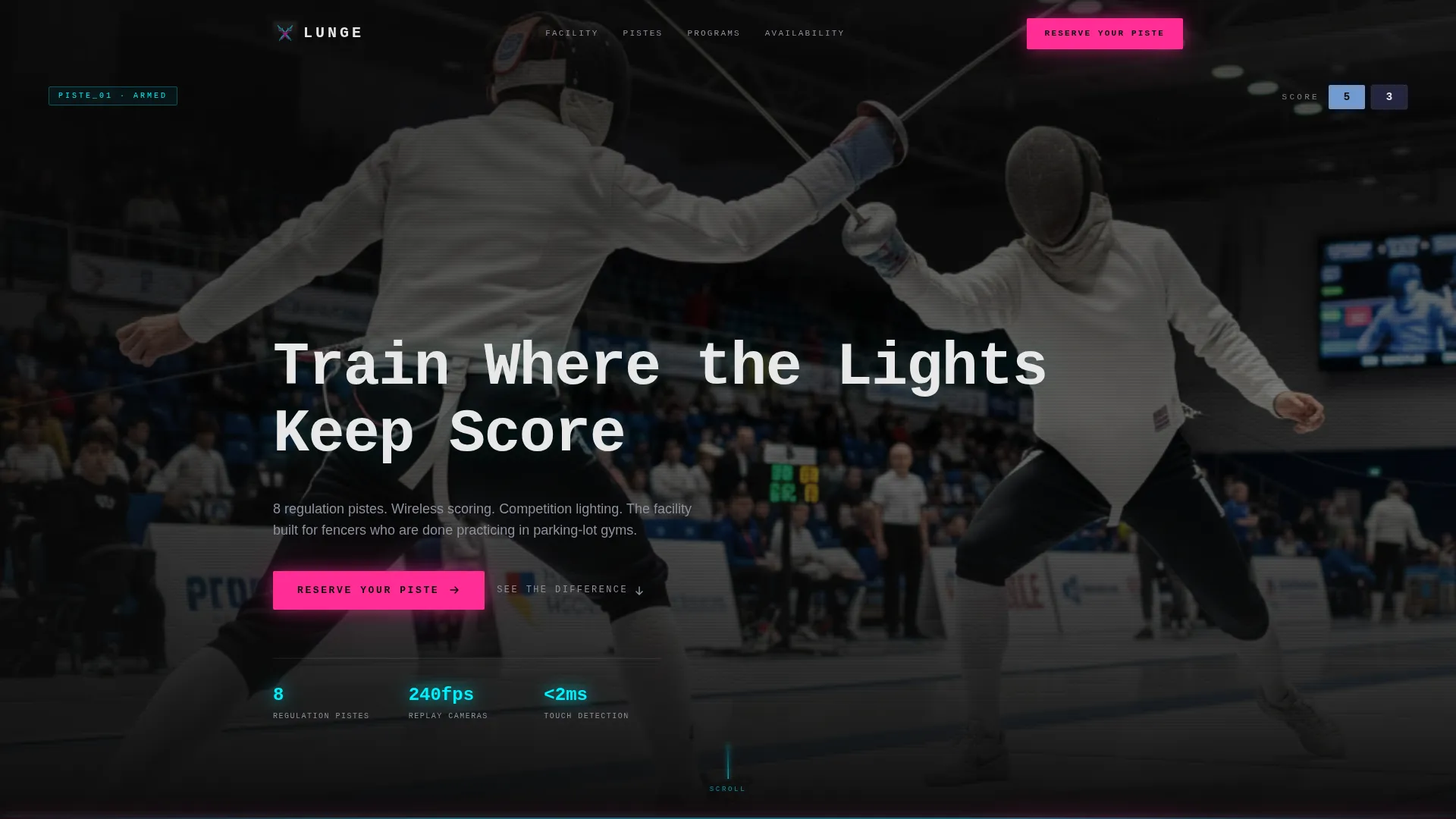
The header fills the entire viewport with slow-motion footage shot to show a fleche in progress. A monospaced typewriter headline types itself one character at a time over the footage. The scoring box flashes blue in the background, setting the competitive tone from the first second.
Before/After Transformation Reveals
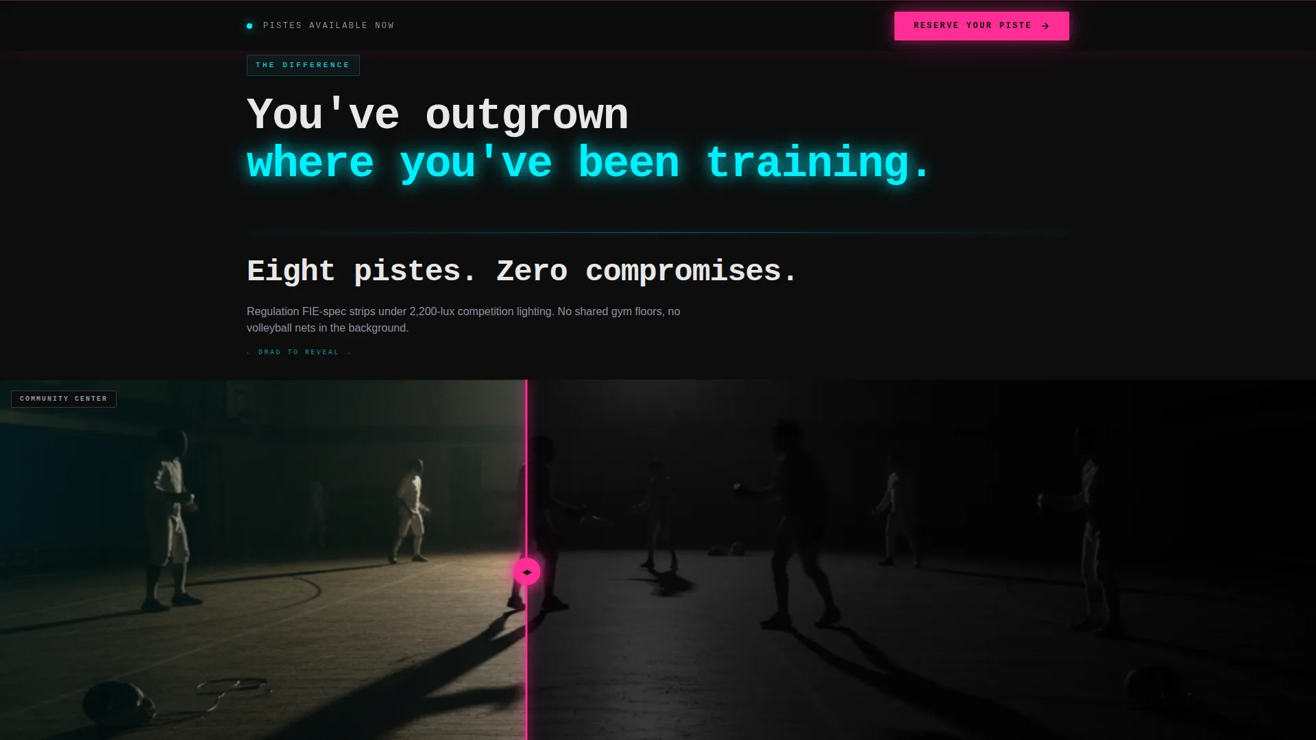
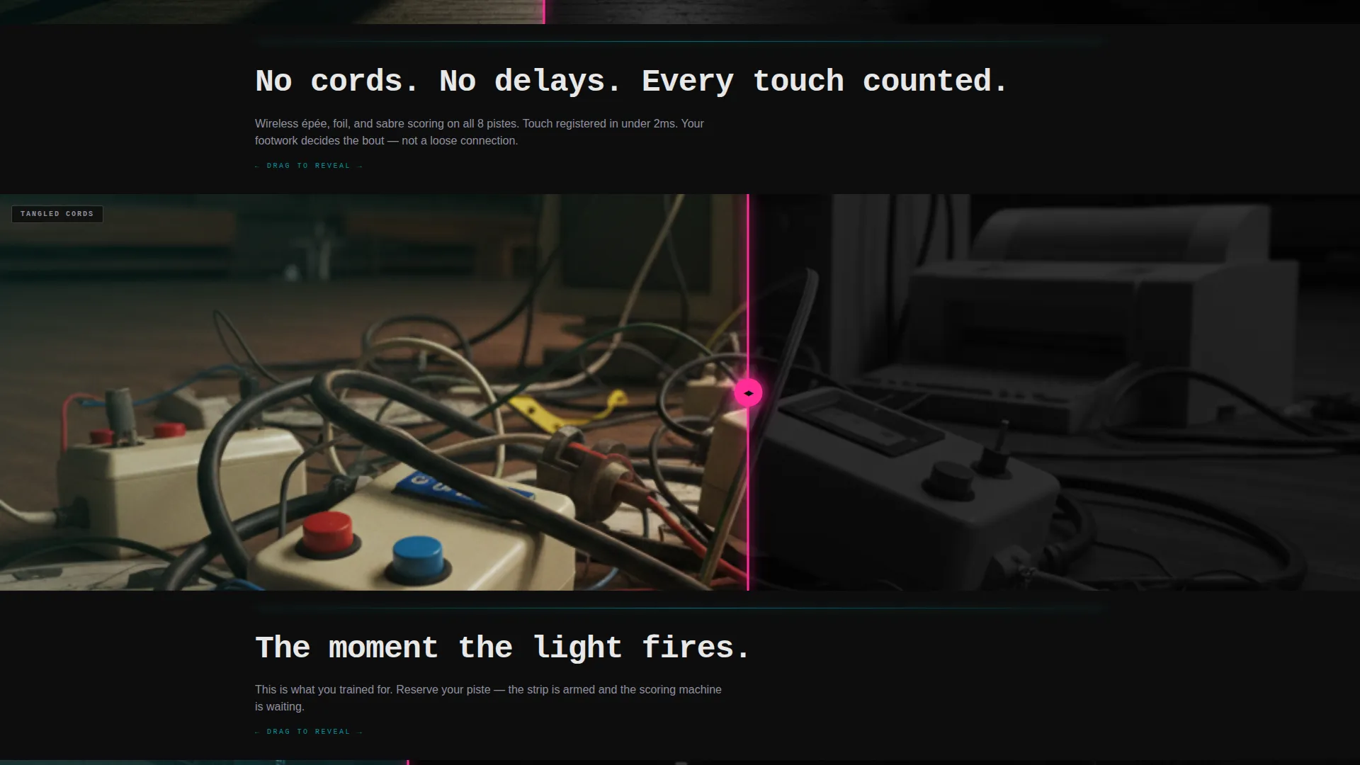
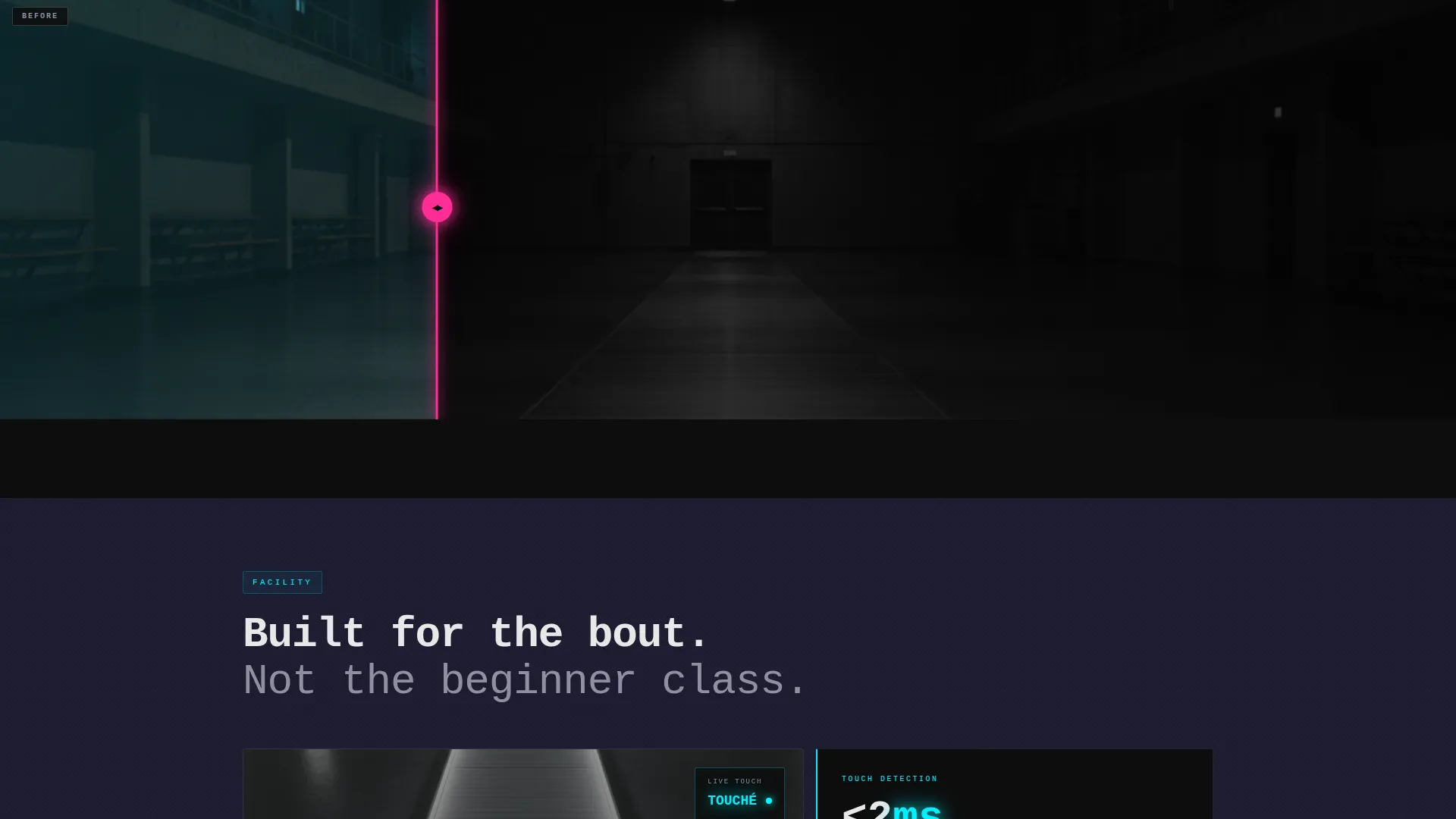
A sequence of draggable slider panels splits the screen between old training conditions and your facility's standards. Each pairing escalates the contrast, moving from overcrowded gymnasium floors to regulation pistes under competition lighting, from paper bout sheets to a live digital leaderboard. The sequence tightens in rhythm, with the final reveal showing an empty piste against a mid-attack fencer, blade tip glowing magenta at touché.
Fixed Persistent Call to Action
After the second scroll, a "Reserve Your Piste" bar locks to the bottom of the viewport and stays visible throughout the entire page. It uses electric magenta text on carbon black, making the booking click available at any point in the visitor's journey without interrupting the content flow.
Real-Time Piste Availability Grid
The final section displays piste availability as a grid of colored blocks. Blue blocks indicate open pistes and dim graphite blocks show booked slots. This framing turns the booking action into claiming a specific, scarce slot rather than submitting a generic inquiry form.
Hero-Dominant Single-Column Flow
The entire page runs in a single vertical column with a 90/10 hero-to-content ratio. Sections are sequenced for scroll momentum, with each reveal building on the last. There are no sidebars, competing navigation panels, or distracting layouts.
Page sections overview
| Section | Purpose |
|---|---|
| Hero Video Header | Opens with immersive slow-motion footage and typewriter headline |
| Primary call to action Block | Introduces the "Reserve Your Piste" click-through beneath the header |
| Before/After Reveals | Walks visitors through escalating transformation contrasts using draggable sliders |
| Piste Availability Grid | Displays real-time open and booked piste slots as a visual color grid |
| Fixed Bottom call to action | Persists the booking call to action at the viewport base after second scroll |
Design & branding system
The visual identity follows a futuristic neon direction built on a Carbon Fiber color system. The palette reads like the cockpit of a precision machine, dark surfaces interrupted by thin, purposeful lines of light.
- Core colors: deep carbon black (#0D0D0D), woven graphite (#1A1A2E), electric épée blue (#00F0FF), scoring-light magenta (#FF2D95), and titanium white (#E8E8E8) for all body text
- Typography uses a monospaced typeface for the animated headline, consistent with the precision and technical tone of the venue
- Magenta is reserved strictly for calls to action and active user interface states, keeping every glow functional and nothing purely decorative
Mobile & speed optimization
The single-column layout translates cleanly to smaller screens without structural changes. The hero-dominant format means the most important content loads and renders at the top of the page on every device.
- Single-column flow eliminates grid reflow issues on narrower viewports
- The fixed bottom call-to-action bar works naturally with thumb-reach interaction on mobile devices
- Availability grid color blocks scale proportionally to maintain legibility on small screens
How this template helps you convert
Every structural and visual decision in this template points toward one outcome: a click to your booking system. There are no forms, no distractions, and no unclear next steps.
- The before/after reveal sequence does the persuasion work for you. Visitors see the contrast between ordinary training environments and your facility before they read a single marketing claim.
- The real-time availability grid introduces visible scarcity. Open pistes displayed in blue feel like something a visitor can claim right now, which moves hesitant browsers toward an immediate decision.
Other information about this template
This landing page is designed specifically for fencing academy and training businesses where the target visitor arrives with competitive intent. A few practical notes for getting the most from this template:
- The header video component is built to accept slow-motion footage at high frame rates, consistent with the 240fps brief referenced in the design direction
- The before/after slider is designed for three or more paired reveals, with each subsequent reveal intended to run shorter in duration for escalating scroll rhythm
- The template carries a Hero-Dominant (90/10) layout ratio, meaning the video header and transformation sequence are the primary trust-building tools, not written copy blocks
- The click-through structure means no contact form or lead-capture field lives on the page itself; the entire page is optimized to deliver a warm, motivated visitor to your external scheduling interface
Theme
Festival Energy
Creative direction
Immersive Visual
Color system
Carbon Fiber
Style
Hero-Dominant (90/10)
Direction
Click-Through
Page Sections
Full-screen Slow-motion Hero Video
Draggable Before/after Reveal Sequence
Fixed Persistent Call to Action Bar
Real-time Piste Availability Grid
Hero-dominant Single-column Layout
Related questions
Does this template include a contact form or lead capture?
Can I use my own video footage in the hero header?
How does the before/after slider work?
Who is this landing page designed for?
Is the piste availability grid connected to a live system?