Handcrafted Kulfi And Falooda Shop Landing Page Template
Kettle is a full-width immersive keto meal delivery landing page template built around a Neo-Retro visual identity and a Sensory Appeal creative direction. It pairs a flame-kissed food brand story with an interactive meal selector, flip-card plan carousel, and corkboard testimonial layout to convert hungry visitors into committed subscribers before they reach checkout.
by Rocket studio
Quick summary
Kettle is a single-page, full-width immersive template designed for keto meal delivery businesses. It opens with a retro bull mascot and a slab-serif headline, then guides visitors through sensory food imagery, three flip-card meal plan tiers, an interactive box builder with a live macro tally, and handwritten testimonial postcards. Every section is prepared to earn the click before the pricing card is ever reached.
Who this template is for
This template is built for food and beverage companies in the keto diet space who want to sell meal subscriptions through a single, story-driven page. It suits founders, marketers, and creative teams who love bold visual branding and want a landing page that does the persuading for them.
- Direct-to-consumer keto meal delivery services launching or relaunching a subscription box
- Food entrepreneurs who want fresh, restaurant-quality positioning without expensive custom development
- Gym-focused brands and diet-conscious companies whose customers track protein, calories, and net carbs daily
What problem this template solves
Most keto diet food brands lose visitors before the first click because their pages feel generic, cluttered, or slow. Visitors who are twelve weeks into a diet plateau or new keto converts on day five need to feel understood quickly. A cold product page does not do that. This template solves the problem by making the food irresistible and the path to purchase simple.
- Visitors leave before they understand the meal plan tiers, pricing, or what a weekly box actually includes
- Calorie and macro anxiety stops potential buyers from committing, so the live tally removes that friction at the point of decision
- Generic food websites fail to build appetite or trust, while this page layers sensory imagery, reviews, and ingredient poetry to keep readers engaged
What you get with this template
You get a fully structured, ready-to-customize landing page with every section already prepared and placed in conversion order. The design is rich enough to feel premium and specific enough to feel personal. No blank canvas, no guessing where to put your content.
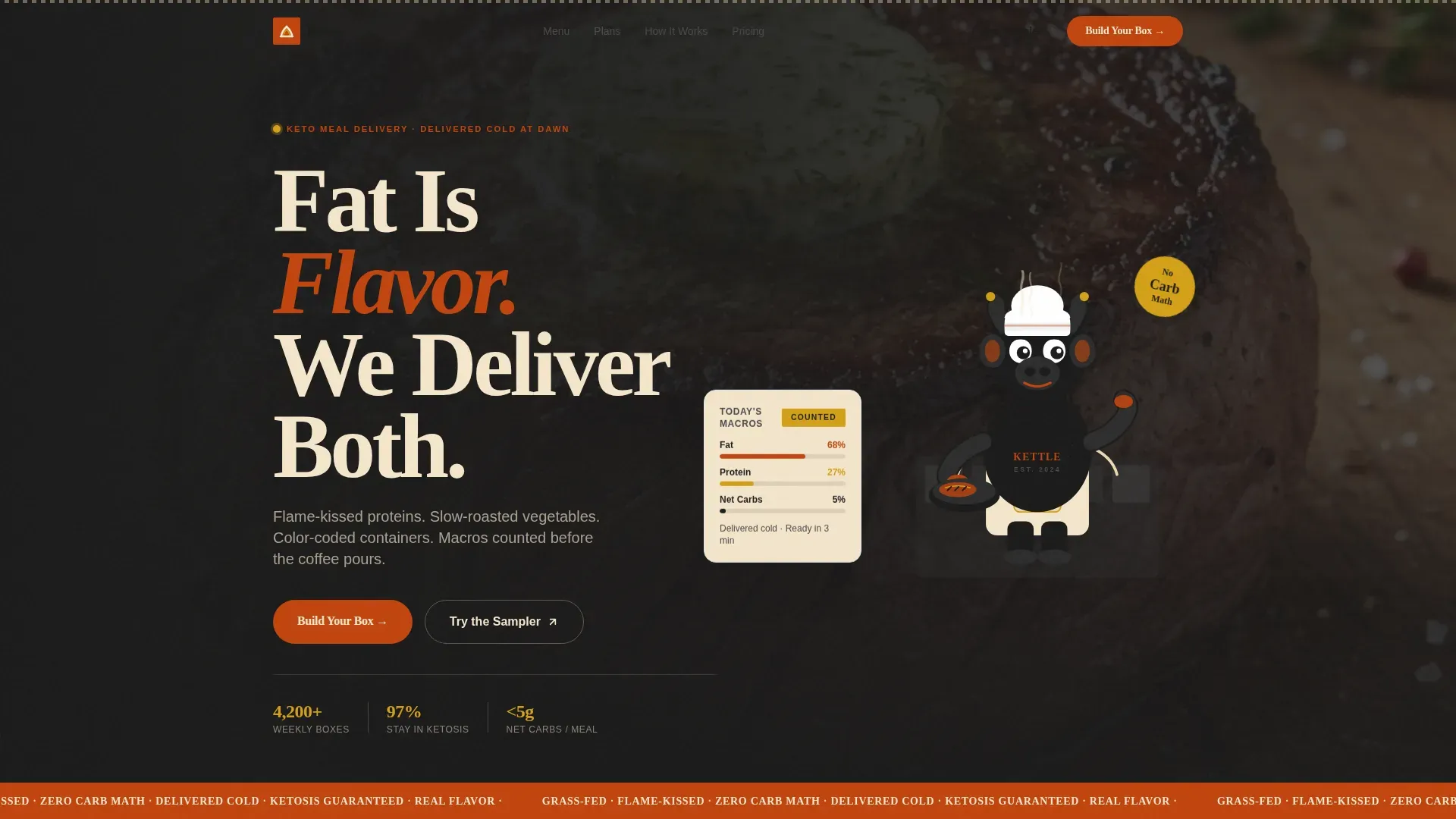
- A hero section with an animated mascot, slab-serif headline, and a floating macro card that communicates the diet value proposition above the fold
- A sensory scroll sequence including a full-bleed food video section, hover-triggered ingredient whisper reveals, and a flip-card meal plan carousel
- An interactive meal selector where visitors drag dishes into a weekly tray and watch net carbs and calories update in real time, plus a corkboard testimonial layout and transparent pricing cards
Feature list
The template packages the following built-in capabilities, each prepared to work together as one cohesive landing page experience.
Animated Hero with Mascot and Macro Card
The hero section opens with a hand-illustrated retro bull mascot rendered in thick-lined cartoon style with grain texture and animated steam wisps curling off a cast-iron skillet. A chunky slab-serif headline sits beside the character. A floating macro card communicates the keto diet value proposition clearly above the fold, giving diet-focused visitors an immediate reason to keep reading.
Sensory Scroll Sequence with Video and Hover Reveals
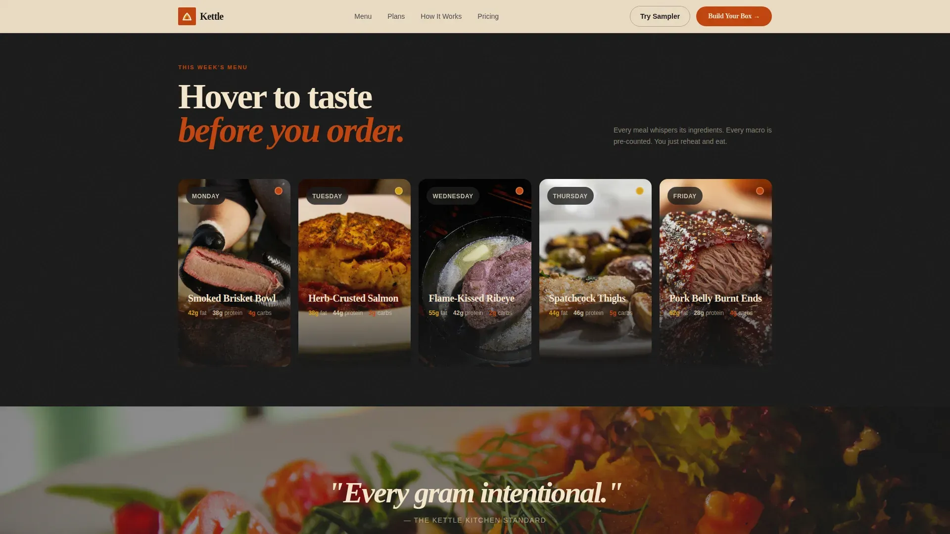
A full-bleed slow-motion video of melted herb butter poured over a seared ribeye anchors the first sensory section. As visitors scroll, hovering over each weekly meal card triggers a short ingredient whisper-list written like poetry. Examples read like "grass-fed brisket, smoked salt, roasted marrow." This approach helps visitors taste the food through text before they ever make a purchase.
Flip-Card Meal Plan Carousel
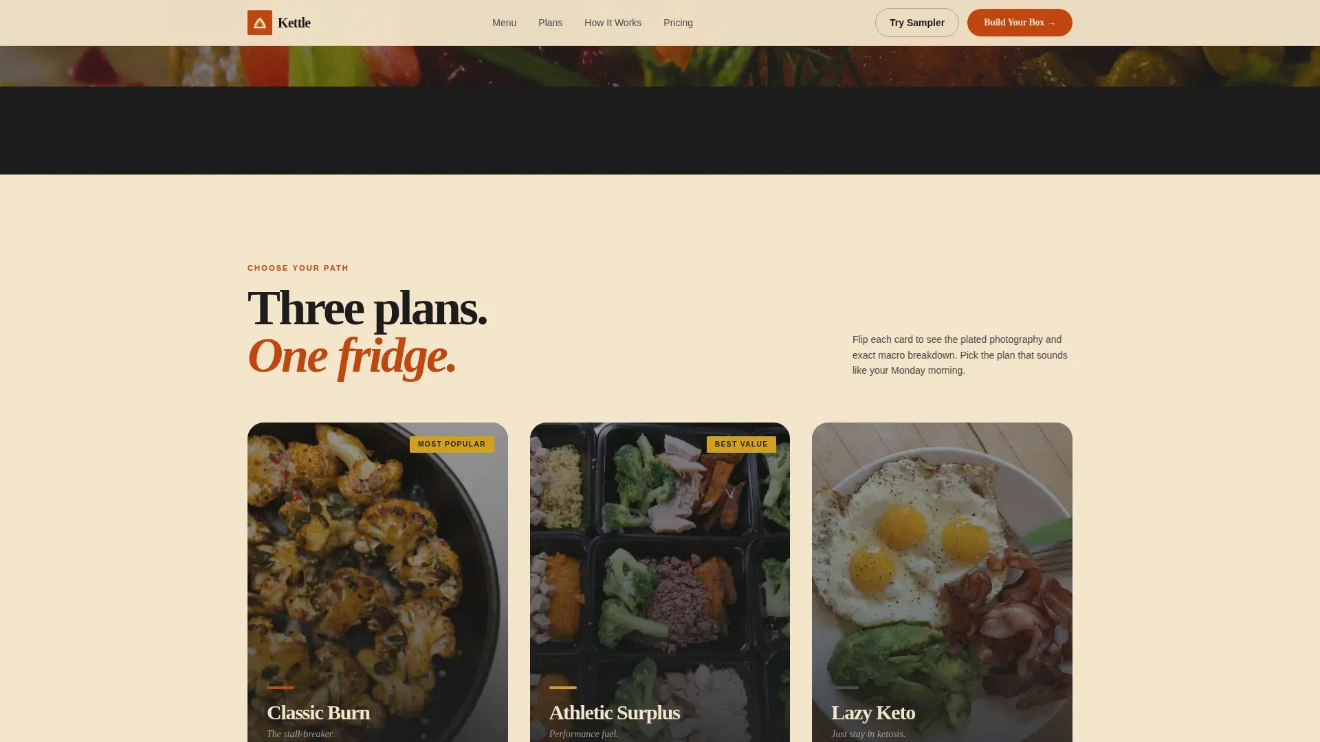
Three plan tiers sit on flip cards: Classic Burn, Athletic Surplus, and Lazy Keto. Each card shows the plan name and key diet details on the front, then flips to reveal tight plated food photography showing grill marks on fresh protein. Subscriptions are clearly listed per card so visitors can read the price, understand the offer, and choose their path without leaving the page.
Interactive Build-Your-Box Meal Selector
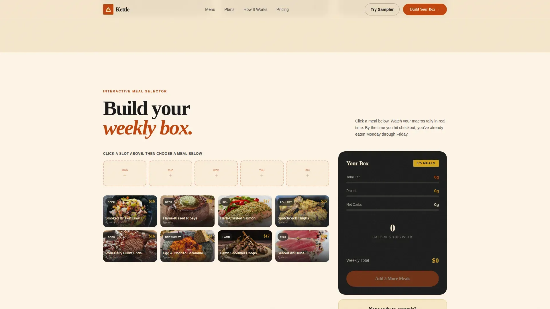
The "Build Your Box" section lets visitors drag dishes into a weekly tray. Net carbs and calories tally in real time as each meal is added. This interactive element lets buyers mentally commit to Monday through Friday before they reach the checkout form. It is one of the most filling, trust-building elements a keto meal delivery page can offer.
Corkboard Testimonial Layout
Customer stories appear as handwritten-style postcard reviews pinned to a corkboard texture background. The layout feels warm and analog, which matches the Neo-Retro brand tone. Each postcard can display outcome-specific stories such as pounds lost and weeks sustained on the diet, giving new visitors social proof that feels personal and credible rather than corporate.
Transparent Pricing Cards with Dual Call-to-Action
Every pricing card shows the per-meal cost clearly. The primary call-to-action, "Build Your Box," opens the interactive selector. A secondary path, "Try the Sampler," offers a fixed five-meal intro box with a single-click checkout. Both options keep the purchase decision simple and remove the hesitation that expensive or opaque pricing often creates on food service pages.
Page sections overview
| Section | Purpose |
|---|---|
| Hero with Mascot | Opens with character, headline, and macro card above the fold |
| Sensory Video Block | Full-bleed food video to trigger appetite and engagement |
| Ingredient Hover Reveals | Whisper-list poetry appears on meal card hover |
| Flip-Card Meal Plans | Three diet tiers flip to show food photography and plan details |
| Build Your Box | Interactive meal selector with live calorie and carb tally |
| Corkboard Testimonials | Postcard-style customer reviews on a textured board |
| Transparent Pricing Cards | Per-meal price and dual call-to-action for box or sampler |
| Linear Footer | Single-row footer with brand links and sign-up prompt |
Design & branding system
The visual identity follows a Neo-Retro theme that feels like a 1970s diner menu redesigned by someone who ferments their own hot sauce. The color system is called Fire and Earth, and every shade is chosen to evoke warmth, char, and appetite. Typography pairs a chunky slab-serif for headlines with a clean humanist sans-serif for body text, creating a beautiful contrast between bold personality and easy reading.
- Color palette: scorched paprika red (#C1440E) as the primary, cast-iron black (#1A1A1A) for text, roasted bone cream (#F5E6CC) for backgrounds, and smoked turmeric gold (#D4A017) reserved for price tags, badges, and hover states
- Typography: Fraunces for chunky slab-serif headlines paired with DM Sans for body copy, giving the brand message weight and clarity
- Texture and animation: grain texture overlays, animated steam wisps, noise texture on section backgrounds, reveal animations on scroll, and GPU-accelerated card flip transitions keep the page feeling alive without sacrificing a clean visual hierarchy
Mobile & speed optimization
The template is built desktop-first with full mobile responsiveness to ensure the food photography reads beautifully at large viewport sizes while adapting cleanly to smaller screens. Mobile viewers follow a single-column layout that keeps the message focused and the key call-to-action always within reach. Fast load behavior is supported through native CSS scroll, Intersection Observer-based reveal animations, and GPU-accelerated transforms only.
- All interactive elements are sized generously for touch input, with call-to-action buttons meeting recommended tap target dimensions so mobile users can click without frustration
- A single-column responsive layout on mobile minimizes distractions and keeps visitors focused on the core message and the "Build Your Box" or "Try the Sampler" prompts
- Reveal animations trigger only when sections enter the viewport, reducing unnecessary rendering work and helping the page feel fast even on mid-range devices
How this template helps you convert
This template is tailored to move visitors from appetite to action without friction. Every section is ordered to build desire first and then resolve objections, so that by the time a visitor reaches the pricing card, they have already mentally committed to their weekly box.
- The hero section captures attention immediately with a bold mascot, a pain-point-specific headline, and a macro card that speaks directly to diet-focused visitors who track their protein and calories every day, establishing trust above the fold before a single scroll happens.
- The interactive Build-Your-Box selector lets visitors drag, customize, and watch their tally update live, which means they arrive at the checkout form already invested in their choices rather than uncertain, making the final purchase feel like a natural next step rather than a risk.
- Social proof delivered through handwritten-style postcard reviews with specific outcome stories gives new visitors the confidence to follow through, because real customer stories with concrete numbers are far more persuasive than any marketing message a company can write about itself.
Other information about this template
This template is one example of how a purpose-built landing page can save significant time and effort in design and development. Using a structured template means you do not need technical skills to launch a high-converting page. It provides consistent brand messaging from the first fold to the footer. You can customize the text, food photography, video, and plan details to fit your specific service without rebuilding from scratch.
The kettle flame kissed keto meal delivery landing page template is designed with the importance of high-quality food imagery at its core. A scannable menu gallery with professional photos and concise descriptions helps visitors quickly read through the offer. Menu highlights like Salmon with Mango Salsa or Butter Chicken with Cauliflower Rice are perfect examples of the type of delicious, fresh, gluten free dishes this template is built to showcase. Each veggie side and protein main can be presented with the same visual care.
- The template is ready for a company that wants to highlight gluten free and always-fresh credentials alongside a clear 15g net carb limit per meal
- Subscription tiers are clearly listed so new visitors build immediate trust and know exactly what they are buying before they sign up
- The page supports a first-order discount message displayed as a badge in smoked turmeric gold, making it simple to offer a lower barrier for new customers to book their first box
- A three-step "How It Works" visual guide can be placed in the value pillars section using icons and short paragraphs to explain the process without overwhelming the reader
- Social share elements can follow the call-to-action sections to encourage customers to spread their stories across networks after they enjoy their first delivery
- The corkboard testimonials section is a helpful place to include authentic reviews with specific numbers, such as how many pounds a client lost or how many weeks they managed to stick to their diet plan
- For teams interested in running tests, the structured layout makes it straightforward to swap headlines, video clips, recipes, sauce descriptions, or cheese pairings to learn which version converts best
Theme
Neo-Retro
Creative direction
Sensory Appeal
Color system
Fire & Earth
Style
Full-Width Immersive
Direction
Marketplace/Multi
Page Sections
Animated Mascot Hero with Macro Card
Sensory Video and Ingredient Hover Reveals
Flip-card Meal Plan Carousel
Interactive Build-your-box Selector
Corkboard Testimonial Postcards
Transparent Dual-cta Pricing Cards
Related questions
Can I change the meal plan names and food photography?
Does the template support both a subscription box and a one-time sampler purchase?
Is this template suitable for a keto diet brand that is just starting out?
How does the live macro tally in the meal selector work?
Can I showcase gluten free and veggie options using this template?



