Research & Strategy Agency Pricing Website Template
Margin is a dark, immersive landing page template built for pricing strategy consultants. It uses an overlap and layered layout, floating black-and-white header photos, and a manifesto-style scroll to build a compelling argument from diagnosis to conviction. The design targets SaaS founders, CFOs, and private equity operators ready to request a pricing audit.
by Rocket studio
Quick summary
Margin is a single-page template designed for a pricing strategy consultant who works with SaaS founders, mid-market CFOs, and private equity operating partners. The layout stacks overlapping sections like dossiers spread across a desk. The tone builds from sharp provocation to inevitable action, and every visual choice reinforces quiet, boardroom-level authority.
Who this template is for
This template is built for consultants who operate at the intersection of revenue strategy and executive decision-making. If your clients are comparing margin compression against a pricing page they last touched two years ago, this page speaks their language directly.
- Pricing strategy consultants targeting SaaS founders and CFOs
- Research and strategy agency owners positioning for enterprise or private equity engagements
- Independent operators who need a landing page that closes the credibility gap before the first call
What problem this template solves
Most consultant landing pages read like résumés. They list services, show headshots, and ask for a meeting. That approach fails with senior buyers who want evidence of thinking before they engage. Margin solves this by replacing a feature grid with a structured argument that makes inaction feel expensive.
- Consultants struggle to communicate pricing expertise without sounding generic or academic
- Senior buyers such as CFOs and PE operators need to feel the diagnostic rigor before they trust the consultant
- Standard templates force consultants into bullet-point formats that undercut the authority the work actually commands
What you get with this template
You get a fully structured, single-page layout built around a manifesto-style scroll. Every section is designed to do specific argumentative work, not just fill visual space. The result is a page that reads like a brief being assembled in real time.
- A floating photos header with three to four high-contrast black-and-white images suspended at different parallax depths
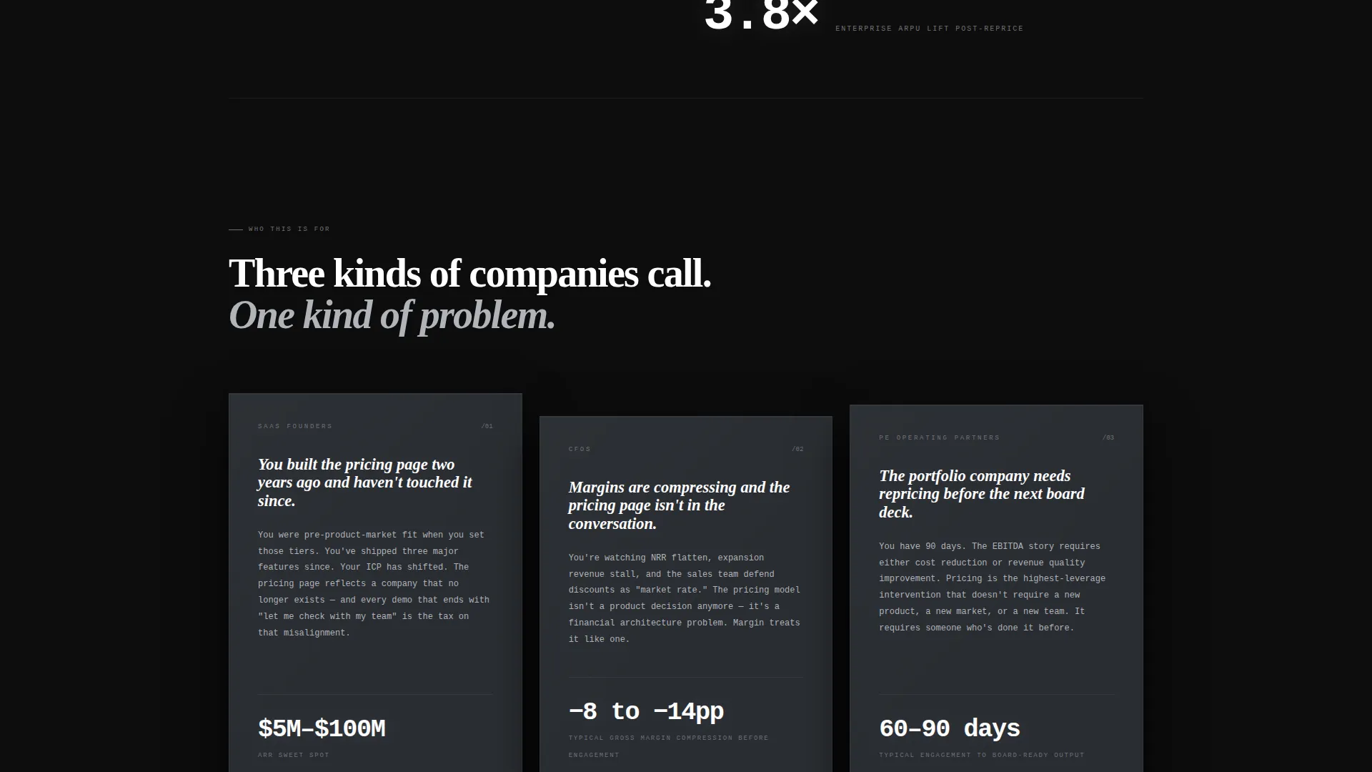
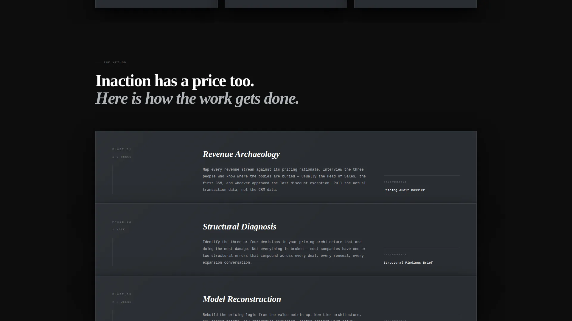
- Overlapping layered section cards that stack like dossiers, each casting a faint shadow onto the surface beneath
- A persistent bottom bar housing the primary call to action, activated after the third scroll section
Feature list
This section covers the core functional and structural features built into the Margin template as described in the source brief.
Floating Parallax Header
Three to four cropped, high-contrast black-and-white images open the page. They drift at slightly different depths as the user scrolls, creating the feeling that evidence is still assembling itself against a forge-black void.
Manifesto Scroll Architecture
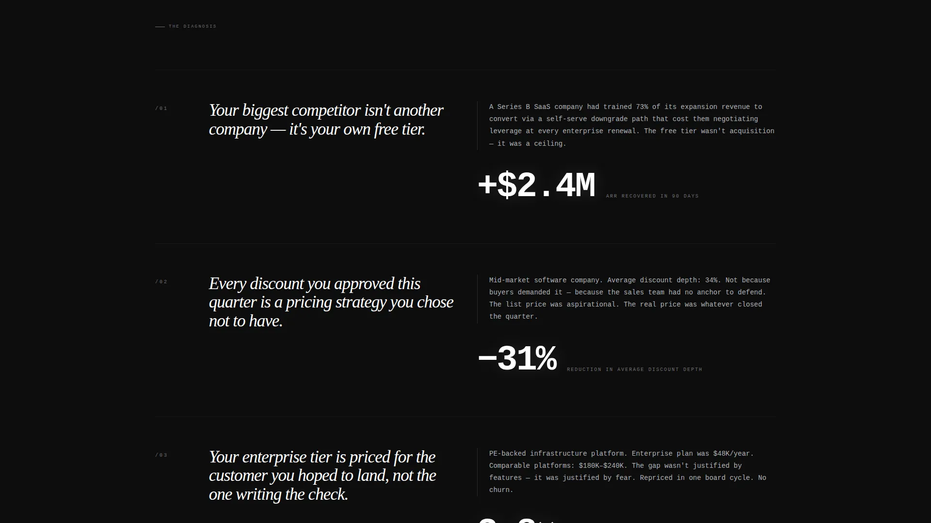
Each layered section introduces a provocation followed by a brief, devastating case study fragment. The tone escalates from diagnosis to conviction. Redacted revenue delta percentages float in isolation, giving the argument visual punctuation without breaking the narrative.
Overlapping Layered Card Layout
Section cards overlap like dossiers spread across a boardroom desk. The next section is always partially visible beneath the current one, pulling the reader forward with a sense of momentum and incomplete information that demands resolution.
Persistent Audit Request Bar
A sticky bottom bar activates after the third scroll section. It contains the primary call to action and a focused intake form asking for company name, annual recurring revenue range, and a single open-ended question about the one pricing decision keeping the prospect up at night.
Gated PDF Lead Magnet
A secondary conversion path offers a downloadable PDF titled "The Margin Manifesto: 7 Pricing Mistakes Funded Companies Make." It is gated behind a work email field only, qualifying leads while extending the consultant's authority beyond the page itself.
Oversized Manifesto Typography
A single manifesto line fades in across the center of the header in oversized phosphor-white type. Pull quotes and isolated data points throughout the page use the same white phosphor accent, creating visual hierarchy through restraint rather than decoration.
Page sections overview
| Section | Purpose |
|---|---|
| Floating Photos Header | Opens with high-contrast images and the central manifesto line to establish immediate authority |
| Manifesto Provocation One | Introduces the first diagnostic argument with a redacted case study fragment |
| Manifesto Provocation Two | Escalates the argument with a second provocation targeting free-tier pricing logic |
| Manifesto Provocation Three | Adds a third layer of evidence, reinforcing the cost of inaction |
| Persistent call to action Bar | Anchors the audit request form in a sticky bottom bar after scroll section three |
| PDF Lead Magnet | Presents the secondary conversion path gated behind a work email address |
Design & branding system
The visual identity runs on a Monochrome Steel color system built to feel like a Bloomberg terminal after hours. There is no warmth and no decorative color. Every choice signals information density and calm authority.
- Forge-black (#0D0D0D) dominates as the background, brushed graphite (#2A2D32) surfaces the layered card panels, and cold-rolled silver (#B0B3B8) carries body text
- White phosphor (#FFFFFF) is reserved exclusively for data points, pull quotes, and call-to-action borders, never used as a general type color
- Layers stack with subtle parallax depth and faint card shadows, reinforcing the dossier-spread-across-a-desk visual metaphor
Mobile & speed optimization
The overlapping layered layout and parallax effects are designed with scroll performance in mind. The template preserves the dark, immersive feel across viewport sizes while keeping the core argument readable and the call-to-action accessible at every breakpoint.
- Parallax depth effects scale back appropriately on smaller screens so the content hierarchy stays clear
- The persistent bottom bar remains accessible on mobile, keeping the primary call to action within reach throughout the scroll
- High-contrast monochrome images maintain visual weight on smaller displays without requiring additional color support
How this template helps you convert
Margin is built around two conversion paths that work together without competing. The primary path collects qualified audit requests. The secondary path builds authority through a downloadable resource. Together they serve buyers at different readiness levels.
- The persistent audit request bar activates mid-scroll, capturing high-intent prospects at the moment the argument has landed. The intake form qualifies them by revenue range before the first conversation.
- The gated PDF lead magnet converts readers who are not yet ready to request an audit. A work email gate filters for professional context while the resource itself extends the consultant's credibility between sessions.
Other information about this template
Margin sits in the Portfolio and Agency category under the Research and Strategy Agency subcategory, with a niche focus on pricing strategy consulting. It uses the Overlap and Layered template style with a Dark Immersive theme and a Manifesto creative direction. The Floating Photos header concept and Partnership and Business-to-Business landing page direction are both reflected throughout the layout.
- This template is a single landing page, not a multi-page website
- The Monochrome Steel color system and dark theme make it well suited for high-stakes B2B positioning where restraint signals expertise
- The template is built to support consultants who want to communicate the cost of inaction rather than the list of services they offer

Theme
Dark Immersive
Creative direction
Manifesto
Color system
Monochrome Steel
Style
Overlap/Layered
Direction
Partnership/B2B
Page Sections
Floating Parallax Header Images
Manifesto Scroll with Case Study Fragments
Overlapping Dossier Card Layout
Persistent Audit Request Call to Action Bar
Gated PDF Lead Magnet Path
Phosphor-white Typographic Hierarchy
Related questions
Who is the ideal consultant to use this template?
What conversion paths does this template include?
Can I replace the placeholder case study fragments with my own client results?
What does the intake form ask for?
Does this template work for a consultant in a niche other than pricing strategy?



