Restaurant Consulting Landing Page Template
Margin is an editorial-style restaurant consulting landing page built for profitability-focused advisors. It pairs oversized data callouts, alternating zigzag sections, and a deliberately short lead-capture form to move independent and multi-unit restaurant owners toward a free margin audit. The design feels like a premium magazine spread, authoritative, number-driven, and impossible to ignore.
by Rocket studio
Quick summary
Margin is a single-page restaurant consulting landing page that leads with hard numbers before it asks for anything. Built on an editorial magazine visual system, it guides overwhelmed restaurant owners through a credibility-escalating scroll, from anonymous industry stats to named case studies, ending at a frictionless audit request form.
Who this template is for
This template is built for restaurant profitability consultants who work directly with operators on finances, labor, and menu structure. It suits professionals whose value proposition is measurable and whose clients need proof before they pick up the phone.
- Independent restaurant owners generating between $1.2 million and $5 million in annual revenue
- Multi-unit operators whose newer locations are pulling resources from their strongest site
- First-generation owners with strong culinary skill but limited financial management experience
What problem this template solves
Most restaurant owners are busy every night and still watching their bank accounts flatline. A generic consulting website does nothing to fix that trust gap. This template solves the credibility problem head-on by opening with a stat that stops the right reader cold.
- Visitors arrive skeptical and leave without booking because the page never earns their trust
- Standard service pages bury the value proposition under vague language and stock photography
- Long contact forms create friction for owners who are already tired of being sold to
What you get with this template
You get a complete, conversion-focused landing page designed around a single goal: getting a restaurant owner to request a free margin audit. Every section is structured to escalate proof and reduce hesitation.
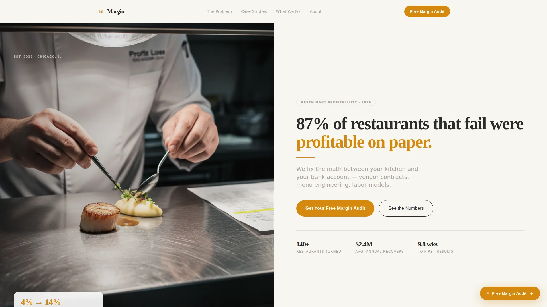
- A half-page hero with an editorial photograph paired with a bold, number-led headline
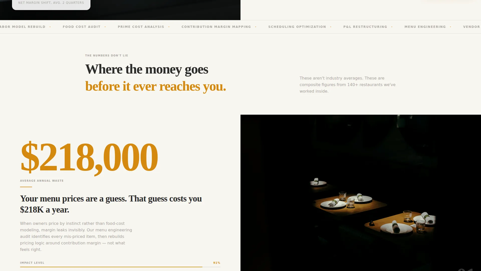
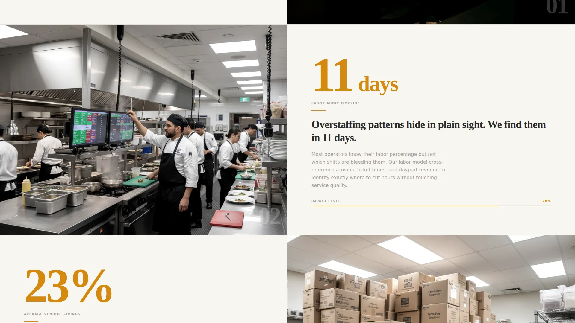
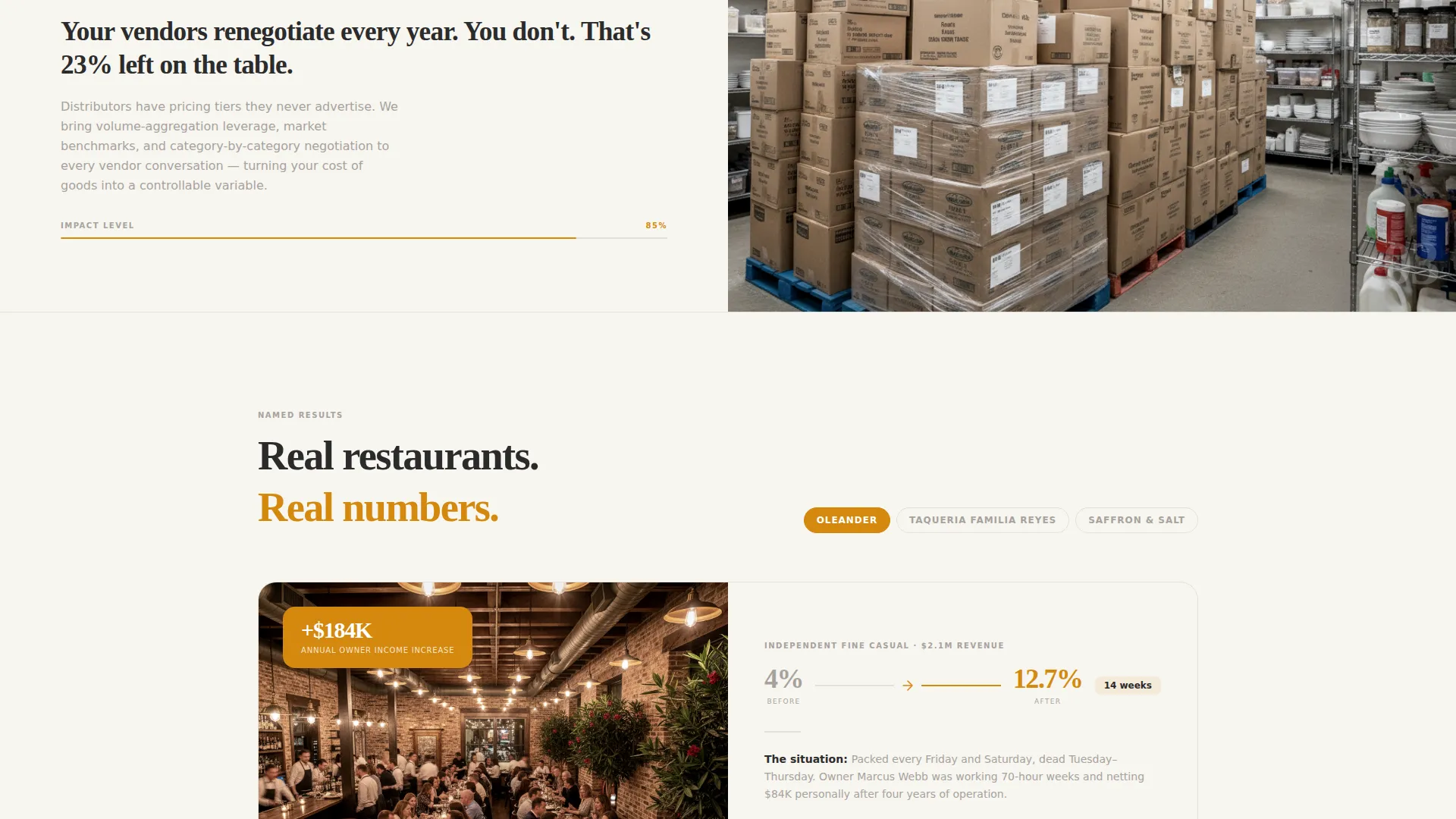
- Alternating zigzag content blocks that open with an oversized data stat before any explanation appears
- A short primary lead form collecting restaurant name, revenue range, optional frustration, and email only
- A secondary conversion path offering a downloadable PDF resource gated behind email capture
Feature list
A paragraph introduces each feature block below. This landing page packs a focused set of purpose-built components designed to earn trust and generate qualified leads from restaurant operators.
Stats-First Zigzag Layout
Each alternating section opens with a single oversized number in deep saffron before any supporting copy appears. The rhythm, shock with the number, satisfy with the story, switch sides, repeat, keeps readers leaning forward through the entire scroll.
Half-Page Editorial Hero
The header splits into two columns. The left side holds a moody, editorially lit photograph of a chef plating with a P&L statement in sharp foreground focus. The right side delivers a massive serif display stat and a sans-serif magazine-style subheadline on warm white.
Frictionless Lead Capture Form
The primary form collects only four fields: restaurant name, annual revenue range via dropdown, an optional free-text frustration field, and email. No phone number is required, reducing friction for owners who are cautious about unsolicited sales contact.
Secondary PDF Gated Offer
A second conversion path offers a downloadable resource titled "The 7 Line Items Bleeding Your Restaurant Dry." It is gated behind email-only capture, giving visitors who are not ready for a consultation a low-commitment way to engage.
Sticky Repeat call to action Button
The primary call to action, "Get Your Free Margin Audit," first appears anchored below the hero. After the visitor passes the third section, it returns as a sticky element so the invitation to act is always visible without interrupting the reading experience.
Credibility Escalation Structure
The page deliberately sequences proof. Anonymous industry statistics appear first, then editorial-style case photographs, then named case studies, then video testimonials. Each layer builds on the last so that by the time the form appears, the visitor feels surrounded by evidence.
Page sections overview
| Section | Purpose |
|---|---|
| Half-Page Hero | Lead with a striking stat and editorial photograph to stop the right reader |
| First Stat Block | Open with "$218,000" to quantify menu pricing waste before explaining the context |
| Second Stat Block | Present "11 days" to show how quickly a labor audit surfaces overstaffing patterns |
| Case Study Section | Transition from anonymous stats to named operator stories for deeper credibility |
| Video Testimonials | Add a human voice layer after written case studies to complete the proof sequence |
| PDF Resource Offer | Capture email addresses from visitors not yet ready to book a consultation |
| Primary Lead Form | Convert audit-ready visitors with a short, low-friction four-field form |
Design & branding system
The visual identity is built on an Editorial Magazine theme using the Cloud Canvas color system. The palette mimics the texture of heavyweight uncoated print stock, where ink sits visibly on the surface and every element has deliberate breathing room.
- Soft warm white (#F7F5F0) as the primary background, charcoal ink (#2B2B2B) for all headline typography, and muted stone gray (#A8A29E) for secondary text and dividing rules
- Deep saffron (#D4880F) reserved exclusively for oversized data callouts, pull-quote marks, and call-to-action buttons to ensure every high-priority element commands attention
- Generous whitespace used as an active design element, letting numbers and editorial photography breathe the way a well-art-directed magazine spread would
Mobile & speed optimization
The layout is structured to translate cleanly from a wide editorial desktop spread to a vertically stacked mobile reading experience. Zigzag blocks reflow into single-column sections without losing the stat-first rhythm.
- Oversized saffron stat numbers remain visually dominant on small screens, preserving the emotional impact of the data-first layout approach
- The sticky call-to-action button is sized and positioned for thumb-friendly interaction on mobile viewports
How this template helps you convert
This landing page is engineered around one conversion goal, and every design and copy decision supports it. The page does not try to explain everything; it tries to earn enough trust to prompt one specific action.
- The editorial hero immediately qualifies visitors by opening with an industry truth that only the right reader recognizes, filtering for motivated operators before a single service claim is made.
- The escalating proof sequence moves visitors from general industry data to specific named outcomes, closing the credibility gap that typically prevents a restaurant owner from trusting a consultant they have not met.
- The dual conversion path ensures visitors at different levels of readiness both have a reason to leave their email, expanding the top of the lead funnel without diluting the primary audit offer.
Other information about this template
This template is a strong fit for restaurant profitability consultants, menu engineering specialists, and food-service business advisors who want a professional, lead-generating web presence without building from scratch. The Cloud Canvas color system gives it a print-editorial authority that separates it from typical service-business templates.
- The template style draws from comparison-based presentation principles, making it easy to position a consultant's method against the status quo that restaurant operators are already living
- The landing page direction prioritizes lead generation and consultation booking over passive content browsing
- The header concept uses bold statistical credibility in place of award badges or logo walls, which suits consultants whose proof comes from financial outcomes rather than industry recognition
- Designed for the professional services category with a restaurant consulting focus, this template addresses a niche where trust and specificity are the primary conversion drivers
Theme
Legal Shield
Creative direction
Logo Wall Authority
Color system
Cloud Canvas
Style
Comparison Table
Direction
Booking/Scheduling
Page Sections
Stats-first Zigzag Content Blocks
Half-page Editorial Hero Header
Short-form Lead Capture
Gated PDF Secondary Offer
Sticky Repeat Call to Action Button
Credibility Escalation Sequence
Related questions
Can I use this template if I am a solo restaurant consultant?
Is the PDF lead magnet content included in the template?
Can I edit the stat numbers and case study sections?
What type of restaurant operator is this landing page built for?
Does the sticky call-to-action button require custom coding to activate?



