Precision Retail Consulting Landing Page Template
Margin is a precision retail consulting landing page built for operators who turn around underperforming store portfolios. It leads with quantified proof, a before-and-after comparison table structure, and a stats-first visual rhythm that earns the click before asking for it. The design feels authoritative, data-driven, and built for a six-figure conversation.
by Rocket studio
Quick summary
Margin is a single-page retail consulting template built around one idea: let the numbers do the convincing. Every section leads with a metric before an explanation. The layout moves from award badges and a bold headline to comparison tables, case study carousels, and a single focused call to action that routes visitors to a diagnostic intake page.
Who this template is for
This template is built for retail performance consultants and turnaround specialists who need their landing page to command credibility instantly. It suits practices where the client is already sophisticated and needs proof, not persuasion.
- Regional retail chain owners managing 8 to 40 locations with flat same-store sales
- District managers tasked with reversing performance at a struggling flagship store
- Private equity operators who acquired a retail portfolio and need fast earnings improvement
What problem this template solves
Most consulting landing pages bury the proof. They lead with credentials and descriptions, and the visitor leaves before seeing a single result. This template solves that problem by front-loading quantified outcomes so the reader builds conviction on every scroll.
- Visitors arrive skeptical and need hard evidence before they will book a diagnostic call
- Generic consulting pages fail to speak to retail-specific metrics that operators actually track
- A form on the landing page creates friction before the visitor is ready to engage
What you get with this template
You get a fully structured single-column landing page designed around a stats-first content rhythm. Every layout decision serves one goal: accumulate enough proof that the visitor's only remaining question is what their own numbers would look like.
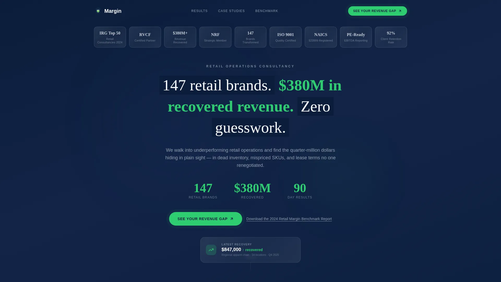
- An award badge header grid with monochrome silver seals against deep navy, replacing stock photography with instant social proof
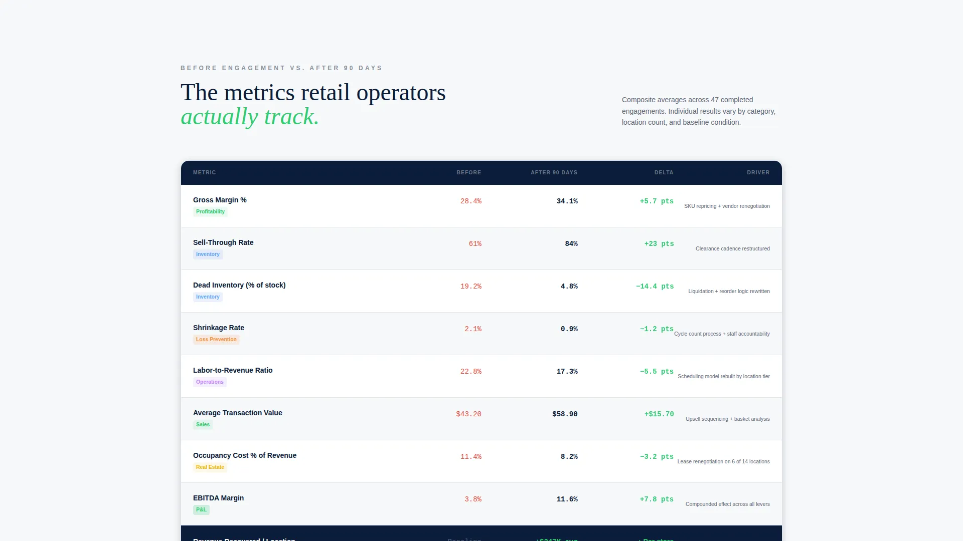
- Animated before-and-after comparison tables tracking gross margin, sell-through rate, shrinkage, labor-to-revenue ratio, and average transaction value
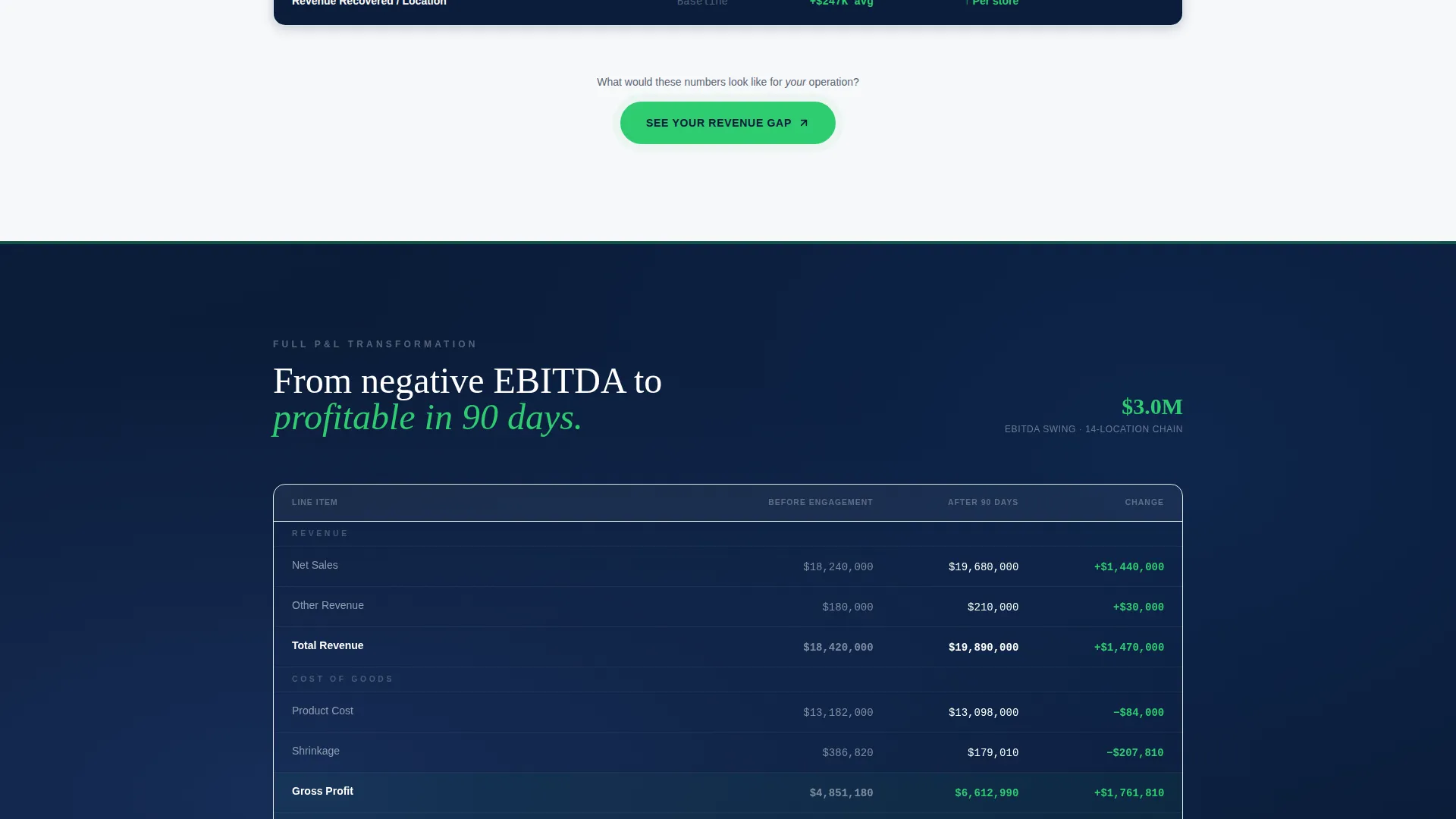
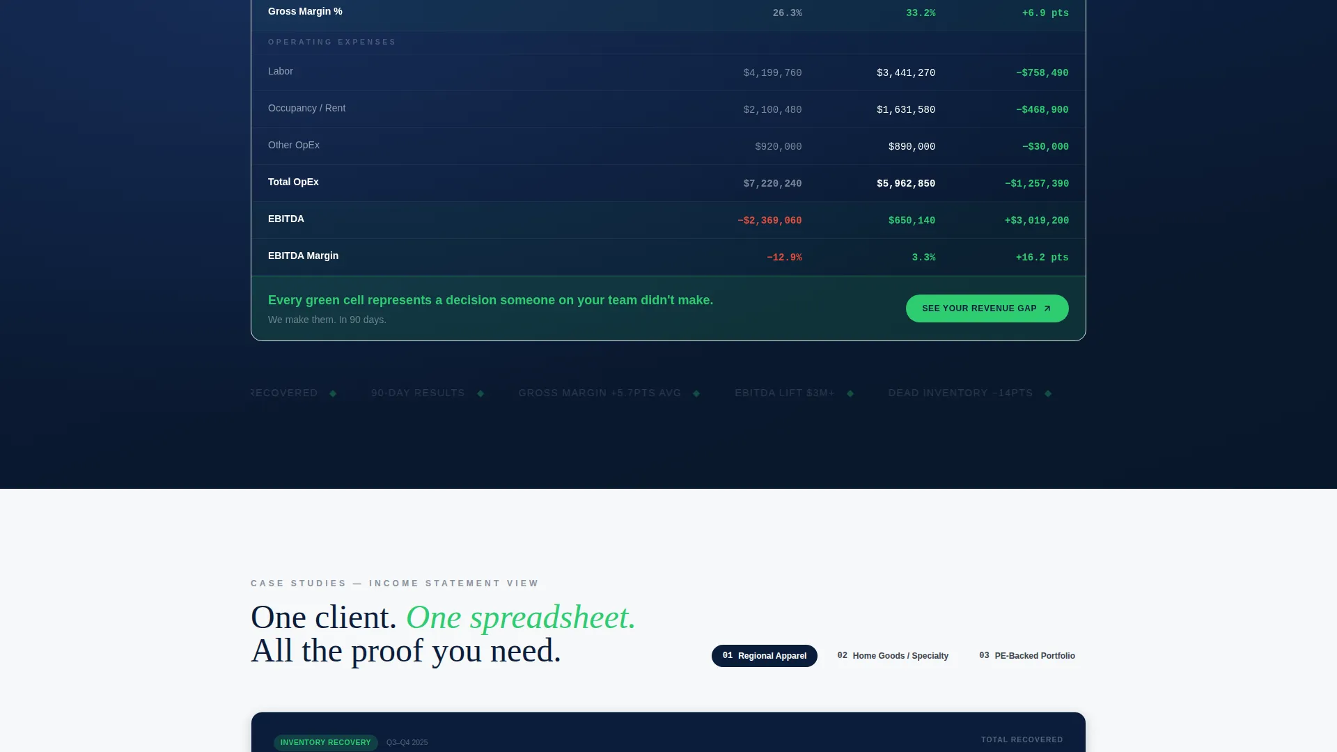
- A case study carousel where each slide presents a single client's before-and-after income statement
Feature list
This section covers the core built-in components that give the template its structure and persuasive momentum.
Award Badge Header Grid
The header opens with a symmetrical constellation of industry recognition badges, client logos, and certified-result seals. Each badge renders in monochrome silver with a subtle metallic sheen against deep boardroom navy. There is no hero image and no stock photography. The badges deliver social proof before the visitor reads a single line of body copy.
Stats-First Headline Block
Centered beneath the badge grid sits a single bold headline in clean white type. It leads with three hard numbers before any descriptive language. This sets the page's tone immediately: every claim will be quantified, not asserted.
Animated Comparison Tables
The core of the page is a set of before-and-after comparison tables. Columns are labeled "Before Engagement" and "After 90 Days." Rows cover the retail key performance indicators operators actually track. Each row's delta value animates in performance green as it enters the viewport, making improvement visible and immediate.
Case Study Income Statement Carousel
After the comparison tables, the scroll ends with a carousel of real client transformations. Each slide shows a single client's before-and-after income statement, not a testimonial quote. The format mirrors how retail operators already think about performance, in profit-and-loss terms.
Repeating call to action Placement
The primary call to action, "See Your Revenue Gap," appears after the first comparison table and repeats after each case study slide. This placement earns the click by accumulating proof at every stage rather than asking cold at the top of the page.
Secondary Lead Capture Link
A text link below the primary call to action offers a downloadable retail margin benchmark report. This captures visitors who are not ready to book a diagnostic but are willing to exchange an email for industry data. It extends reach without adding form friction to the main page flow.
Page sections overview
| Section | Purpose |
|---|---|
| Award Badge Header | Establish authority before copy |
| Stats Headline Block | Lead with quantified proof immediately |
| First Comparison Table | Show before-and-after KPI wins |
| Primary call to action Block | Route ready visitors to diagnostic intake |
| Expanded KPI Tables | Escalate from single metrics to full margins |
| P&L Transformation Carousel | Present full income statement case studies |
| Post-Carousel call to action | Repeat the revenue gap prompt |
| Secondary Capture Link | Offer benchmark report for email exchange |
Design & branding system
The visual identity follows a Corporate Precision theme. The palette feels like the cover of a boardroom strategy deck: authoritative enough to command a high-value engagement, restrained enough to let the data speak.
- Core colors: boardroom navy (#0B1D3A), polished charcoal (#3D4550), quarterly-report white (#F7F8FA), and performance green (#2ECC71) used exclusively for positive metrics, upward arrows, and call-to-action buttons
- Typography is clean and white on dark backgrounds in headline positions, ensuring contrast and command
- Performance green appears only where the numbers are positive, keeping its meaning consistent and visually impactful throughout the scroll
Mobile & speed optimization
The single-column layout is structured to translate directly to mobile screens without layout compromise. The stats-first rhythm works well on a phone scroll, where each metric hits before the explanation loads.
- Single-column flow ensures the comparison tables and carousel stack cleanly on smaller screens
- No hero images or heavy photography assets reduce page weight and support faster initial load
- Badge grid and table animations are viewport-triggered, so content loads progressively as the visitor scrolls
How this template helps you convert
The conversion logic is deliberate: every design and content decision is sequenced to make the primary click feel inevitable rather than premature.
- The award badge header and quantified headline establish enough authority in the first viewport that skeptical visitors stay to scroll instead of bouncing immediately.
- Animated comparison tables build a running tally of proof, so by the time the first call to action appears, the visitor has already seen measurable results across five tracked retail metrics.
- The case study carousel closes the argument with full income statement transformations, and the repeating call to action catches visitors at peak conviction after each proof point.
Other information about this template
This template sits at the intersection of professional services positioning and retail consulting delivery. It is designed for a single-page, high-stakes context where the visitor is a sophisticated operator, not a first-time buyer.
- The template follows a single-column flow structure, keeping content hierarchy clean and scroll momentum uninterrupted
- The lp direction is partnership and business-to-business, meaning the copy and layout assume a buyer who evaluates on data, not emotion
- The header concept centers the headline rather than pushing it left, which suits the symmetrical badge grid and the centered proof-first layout
- The page is built for retail compliance and performance consulting contexts where specific operational metrics, such as shrinkage, sell-through rate, and labor-to-revenue ratio, are the language of trust
- No form appears on the landing page itself; the conversion action is a single click to a dedicated diagnostic intake page, keeping the page clean and the ask low-friction
Theme
Educational Guide
Creative direction
Logo Wall Authority
Color system
Slate & Sky
Style
Single Column Flow
Direction
Partnership/B2B
Page Sections
Award Badge Header Grid
Animated Before-and-after Tables
Case Study Income Statement Carousel
Repeating Call to Action Architecture
Secondary Benchmark Report Link
Stats-first Content Rhythm
Related questions
Does this template include a contact form on the landing page?
Can I update the comparison table metrics to reflect my own client results?
Is this template suitable for a solo retail consultant or only for larger advisory firms?
Can I replace the award badges with my own client logos or certifications?
What is the purpose of the secondary download link on this page?



