Specialist Consulting & Advisory Reviews & Social Proof Website Template
Marginfinder is a split-screen landing page built for operations consulting firms. It pairs a press credentialing header with a scrolling testimonial mosaic, full-width stat breaks, and two targeted conversion paths. The design uses a navy and gold executive palette to signal authority from the first scroll, helping COOs, private equity partners, and mid-market CEOs take the next step.
by Rocket studio
Quick summary
Marginfinder is a single-page, split-screen (50/50) landing page template for operations consulting practices. It opens with a press mentions bar, builds trust through a scrolling testimonial mosaic, and drives two conversion paths: a confidential assessment intake form and a gated methodology download. The layout is designed to feel like a boardroom conversation, not a sales pitch.
Who this template is for
This template is built for consulting practices that work inside complex organizations and need to earn trust fast. If your clients measure success in margin points and operational throughput, this page speaks their language.
- Operations consultants serving COOs, private equity operating partners, and mid-market CEOs
- Advisory firms that help portfolio companies improve earnings before interest, taxes, depreciation, and amortization (EBITDA)
- Change management consultancies focused on supply chain, workflow redesign, and process efficiency
What problem this template solves
Operations consulting firms often lose leads because their web presence does not match the authority of their in-room presence. A generic template cannot replicate the weight of a firm that has already delivered results at scale.
- Buyers need credentialed proof before they book a call, and most pages do not deliver it fast enough
- Complex service offerings get lost in text-heavy layouts that do not signal clarity or confidence
- Two distinct buyer types, those ready for a call and those evaluating methodology, rarely get separate conversion paths
What you get with this template
You get a structured, single-page layout that does the credentialing work before your visitor reaches the first call to action. Every section is purposeful and sequenced to move a skeptical executive toward commitment.
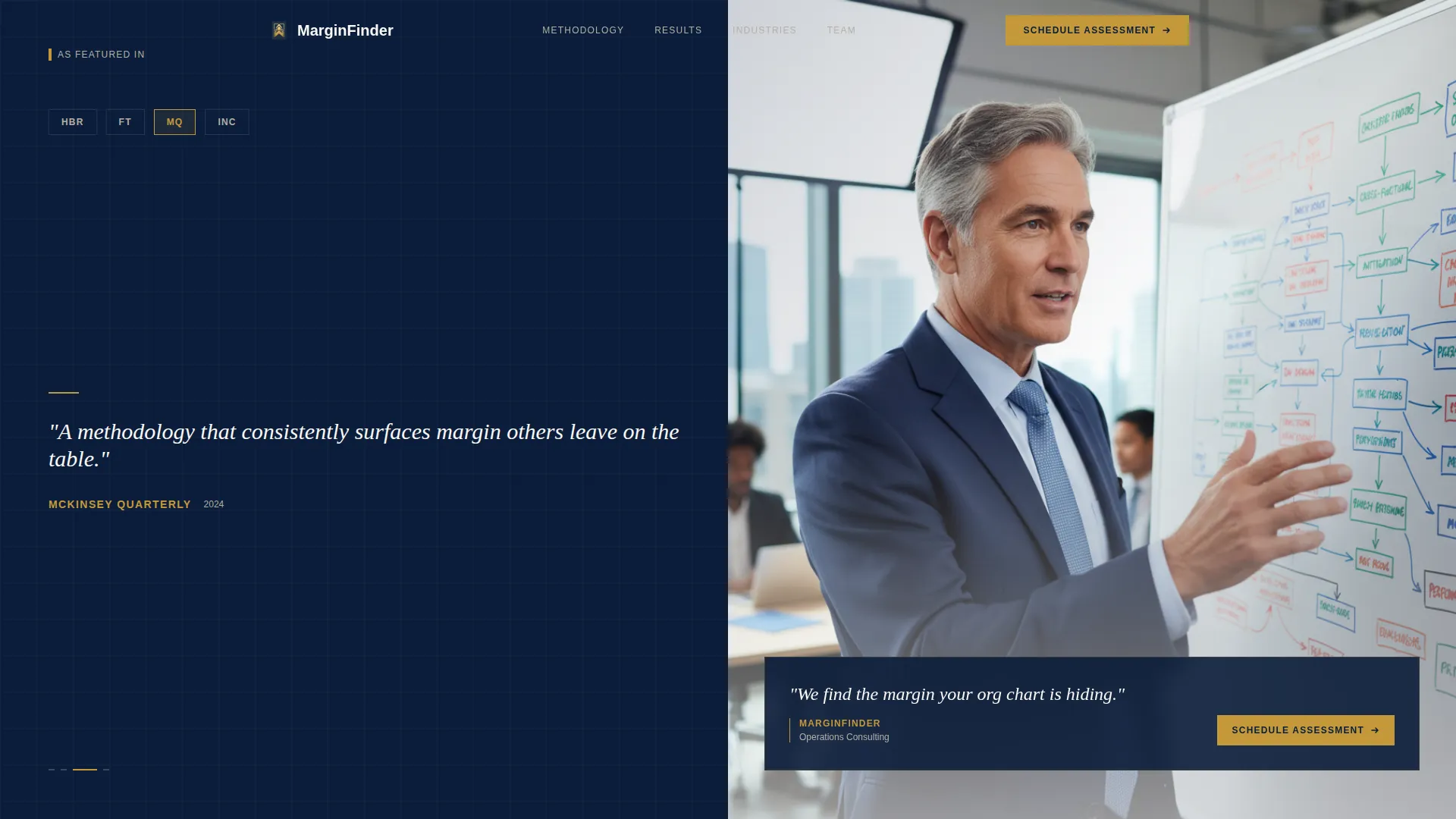
- A press mentions header with a rotating publication logo carousel and a consultant photograph
- A scrolling testimonial mosaic pairing named executive quotes with case visuals
- Two conversion components: a short-form assessment intake and a gated playbook download
Feature list
This template delivers a set of focused, high-intent components built specifically for business-to-business (B2B) professional services.
Split-Screen Press Credentialing Header
The header divides into two equal panels. The left panel rotates publication logos alongside pull-quote excerpts in serif type against deep navy. The right panel holds a single shallow-depth-of-field consultant photograph. A composed tagline fades in beneath: "We find the margin your org chart is hiding."
Scrolling Testimonial Mosaic
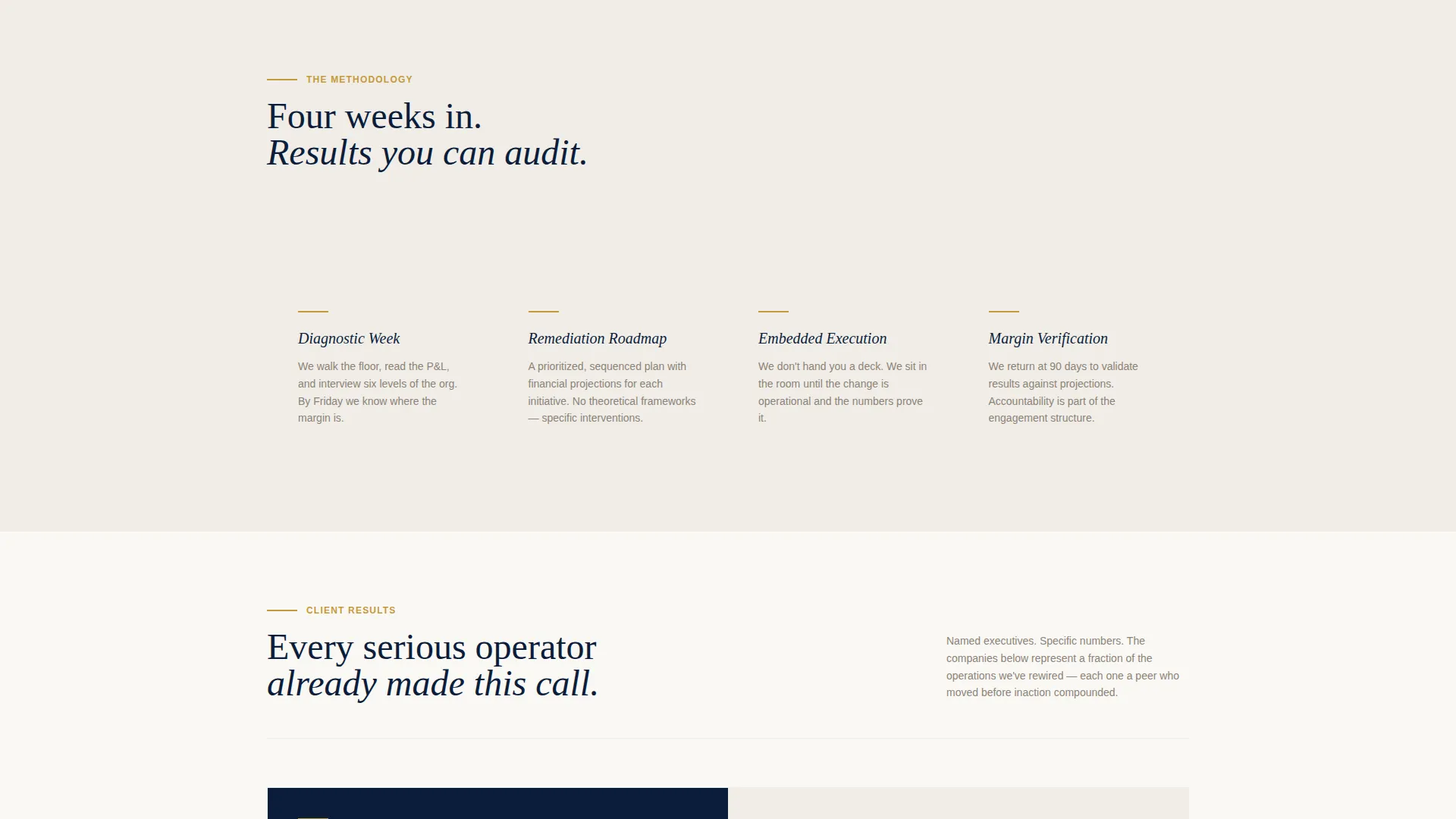
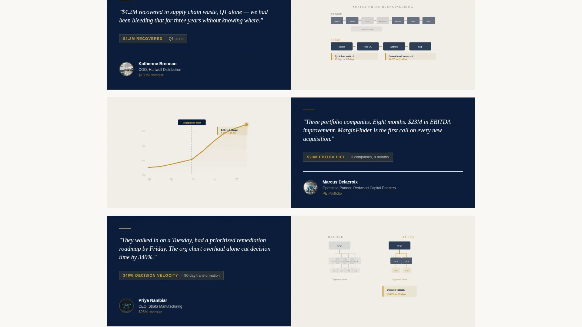
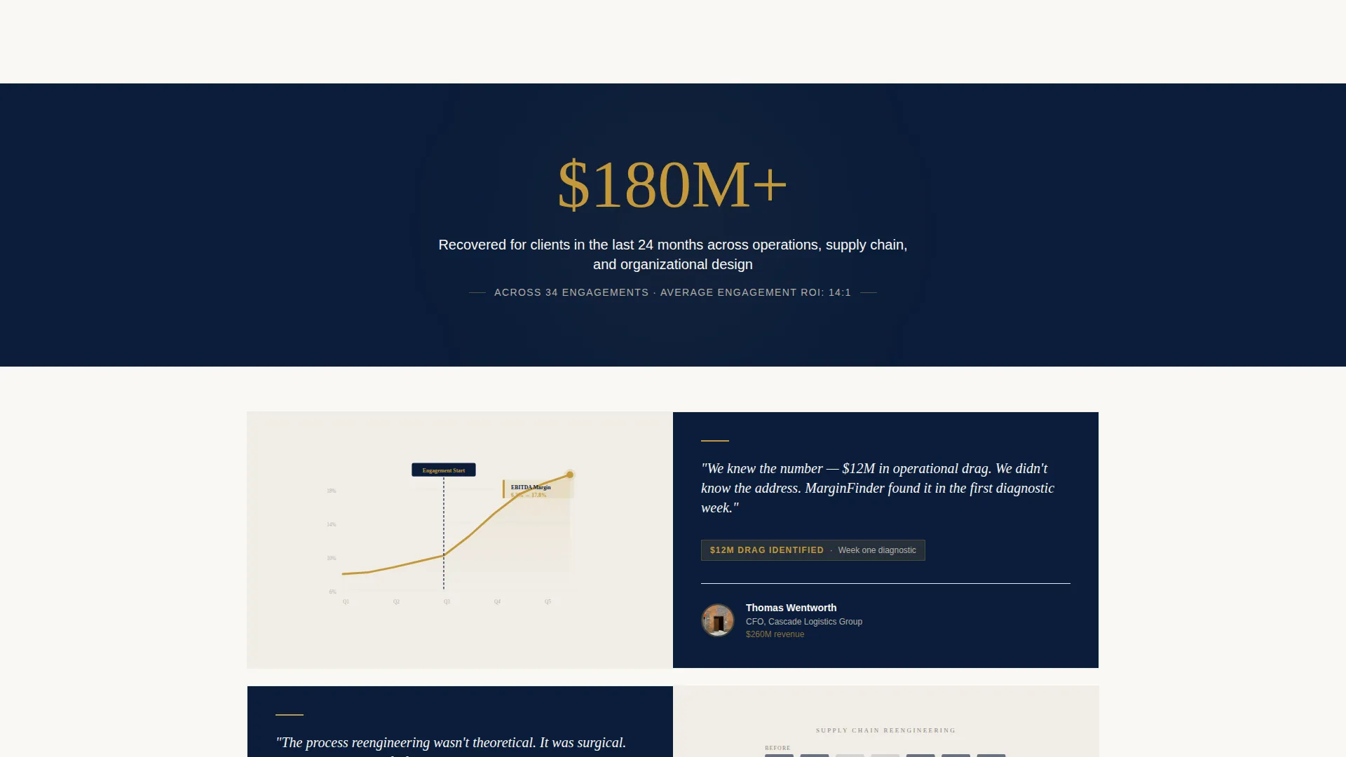
As the visitor scrolls, the split screen fills with layered client proof. Each mosaic block pairs a named executive testimonial on the left with a corresponding case visual on the right. The density builds from one voice to three to nine, creating the impression that every serious operator has already made this call.
Full-Width Stat Break Bands
Between mosaic clusters, a full-width navy band interrupts the scroll. A gold numeral anchors the center with a white descriptor beneath. These stat breaks punctuate the evidence wall and reinforce scale without requiring any copy-heavy argument.
Confidential Assessment Intake Form
The primary call to action (call to action) is "Schedule a Confidential Assessment." It appears at the split-screen midpoint and again after the final mosaic cluster. The short-form collects company name, annual revenue range via dropdown, primary operational challenge in free text, and preferred contact method.
Gated Playbook Download
A secondary conversion path offers "Download Our Portfolio Company Playbook" gated behind email address and firm name. This path is designed to capture private equity partners who are evaluating methodology before committing to a call.
Executive Suite Color and Typography System
The navy authority palette uses boardroom navy (#0B1D3A), polished charcoal (#2C3E50), ivory paper stock (#FAF8F5), and a single decisive gold (#C5993A). Gold is reserved strictly for calls to action, key metrics, and partner-tier logos. Serif type in pull quotes reinforces the leather-bound strategy deck aesthetic.
Page sections overview
| Section | Purpose |
|---|---|
| Press Mentions Header | Opens with publication logos and consultant photograph to establish authority in the first two seconds |
| Tagline Fade-In | Delivers the positioning statement beneath the header with understated confidence |
| First Testimonial Mosaic | Introduces the first named executive result paired with a case visual |
| Full-Width Stat Break | Interrupts scroll rhythm with a single gold metric on a navy band |
| Expanded Mosaic Wall | Builds to a dense grid of client testimonials and case visuals |
| Second Stat Break | Reinforces scale with another full-width metric band |
| Primary call to action Block | "Schedule a Confidential Assessment" form at the midpoint of the page |
| Final Mosaic Cluster | Completes the evidence wall before the closing conversion moment |
| Closing call to action Block | Repeats the assessment form after the final mosaic cluster |
| Playbook Download Gate | Captures email and firm name for the methodology download secondary path |
Design & branding system
The visual identity follows an Executive Suite theme built on the Navy Authority color system. Every element signals seniority: heavy palette, serif credentialing type, and gold used only where it needs to command attention.
- Color palette: boardroom navy (#0B1D3A), polished charcoal (#2C3E50), ivory paper stock (#FAF8F5), and decisive gold (#C5993A) reserved for calls to action, key metrics, and partner logos
- Typography: serif type for pull quotes and credentialing text to evoke a printed strategy document; clean sans-serif for body and form elements
- Photography and visuals: shallow depth-of-field consultant photograph, before/after org charts, process flow diagrams, and margin improvement graphs paired with testimonials
Mobile & speed optimization
The split-screen layout is structured to reflow cleanly on smaller viewports without losing the visual authority of the desktop experience.
- The 50/50 split stacks vertically on mobile so the press header, mosaic blocks, and call to action forms remain readable and tappable
- Stat break bands scale to full width at all screen sizes, keeping the gold metric prominent on every device
- Form fields in both conversion components are sized for easy input on touchscreens without requiring pinch-to-zoom
How this template helps you convert
The page earns the click by making inaction feel expensive. Every scrolled section adds another layer of peer evidence, and the two conversion paths meet buyers exactly where they are in their decision process.
- The testimonial mosaic accumulates named, specific results as the visitor scrolls, so by the time they reach the first call to action, the authority case has already been made without a single persuasive argument.
- Two distinct conversion paths serve two distinct buyer types: the executive ready to book a call gets the assessment form, and the private equity partner still evaluating gets the gated playbook, so neither buyer hits a dead end.
Other information about this template
This template is part of the Marginfinder collection and sits at the intersection of editorial magazine design and high-stakes B2B lead generation. It is built for change management consulting practices that need a single page to carry the full weight of their market reputation.
- The creative direction is Testimonial Mosaic, meaning proof accumulates visually as the visitor scrolls rather than being presented in a static grid
- The header concept follows a Quote/Manifesto approach: credentialing through recognized publication logos and a composed image rather than a hero headline
- The template style is Split Screen (50/50), a layout well suited to pairing human context on one side with structured data or visuals on the other
- The landing page direction is Partnership/B2B, meaning every design decision prioritizes trust-building with senior decision-makers over broad consumer appeal
- The theme is Editorial Magazine, which informs the serif typography, the restrained use of gold, and the sense that each section has been edited with intention
Theme
Editorial Magazine
Creative direction
Testimonial Mosaic
Color system
Navy Authority
Style
Split Screen (50/50)
Direction
Partnership/B2B
Page Sections
Split-screen Press Credentialing Header
Scrolling Testimonial Mosaic
Full-width Stat Break Bands
Confidential Assessment Intake Form
Gated Playbook Download Path
Executive Suite Color and Type System
Related questions
Can I customize the testimonial content and case visuals?
How does the two-path conversion system work?
What does the revenue range dropdown include?
Is this template suited for a firm that works across multiple industries?
Do I need design experience to set up this template?



