Real Estate Market Data & Analytics Website Template
Marketcompass is an analytical real estate landing page built around live data instead of polished imagery. It surfaces median prices, days-on-market counters, listing-to-sale ratios, and inventory trends as animated headline metrics. Interactive comparison tables let visitors stack neighborhoods side by side, while a mortgage scenario calculator and contextual call-to-action buttons guide serious buyers toward the next step.
by Rocket studio
Quick summary
Marketcompass replaces glossy agency brochures with a data-first landing page. Animated metric counters open the page, followed by an interactive neighborhood comparison table, a mortgage scenario calculator, and curated blog post links. Every section earns attention through analytical authority, and every call-to-action button appears exactly when the visitor is ready to act.
Who this template is for
This template is built for real estate agencies and agents who want to attract research-driven visitors rather than casual browsers. It works best when the agency has local market data to present and wants the page itself to do the convincing.
- First-time home buyers comparing school districts, walkability scores, and tax burden across multiple neighborhoods
- Relocating families who need a quick, side-by-side snapshot of different zip codes before committing to a visit
- Investor landlords scanning price-per-square-foot figures and capitalization rates before placing an offer
What problem this template solves
Most real estate agency blog pages look the same: a hero photo, a tagline, and a contact form. Visitors who arrive with specific data questions leave quickly when they find only promotional copy. This template solves that gap.
- It replaces vague listing pitches with concrete market metrics that answer buyer questions on the spot
- It removes the need to visit multiple sources by presenting neighborhood comps, mortgage snapshots, and inventory changes in one scrollable page
- It builds trust through visible data before asking for any personal information or commitment
What you get with this template
You get a fully structured, single-page layout designed around the Dashboard Pro theme. Every section has a clear job, and the visual hierarchy guides visitors from curiosity to confidence to click.
- An animated stats header displaying median home price, average days on market, listing-to-sale ratio, and month-over-month inventory change
- An interactive neighborhood comparison table with toggleable columns for price per square foot, walkability score, school rating, and tax burden, plus inline mini-profiles with street-view thumbnails and three recent comps per neighborhood
- A mortgage scenario calculator section and a curated blog post block that surfaces articles matching the data questions the page just raised
Feature list
This landing page is built around six core components, each designed to move an analytical visitor forward without friction.
Animated Metrics Header
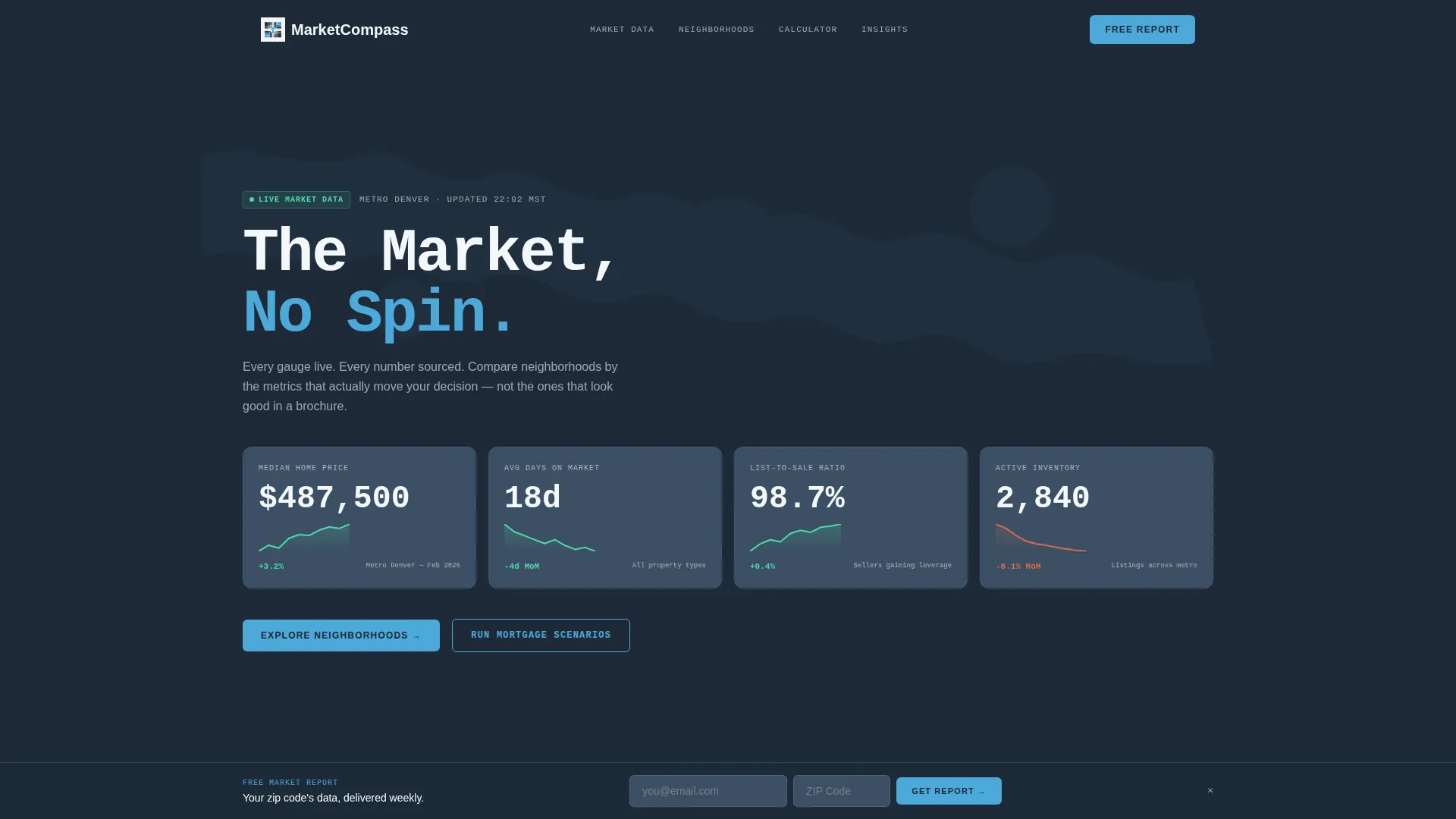
Four oversized counters animate upward on page load, each tied to a specific metro area. Median home price, average days on market, listing-to-sale ratio, and month-over-month inventory change appear in a monospaced typeface. Sky-blue sparkline graphs pulse beneath each counter, making the header feel live and authoritative rather than static.
Interactive Neighborhood Comparison Table
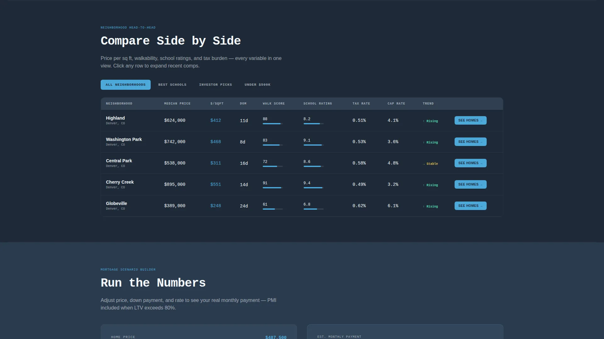
Visitors can toggle between neighborhoods and stack columns for price per square foot, walkability score, school rating, and tax burden. Rows highlight in sky blue on hover. Clicking any row expands an inline mini-profile showing a street-view thumbnail and three recent comparable sales, giving buyers exactly the detail they came for.
Mortgage Scenario Calculator Section
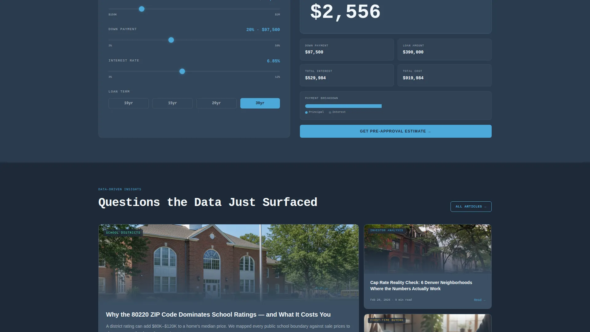
A dedicated scroll section lets visitors model different financing scenarios without leaving the page. This component addresses one of the most common mid-research questions: what will this actually cost per month? Keeping that answer on the page reduces drop-off at a critical decision point.
Contextual In-Row Call-to-Action Buttons
The primary call-to-action, "See Homes in This Neighborhood," appears inside every comparison row and every expanded neighborhood profile. It is colored in open-sky blue against the deep slate background, making it visually prominent without being intrusive. The placement is intentional: the button appears only after the data has already made the case.
Persistent Bottom Bar
A fixed bar at the bottom of the viewport carries the secondary call-to-action, "Get a Free Market Report." It requires only an email address and a zip code. The bar stays visible throughout the entire scroll session, capturing intent at any point without interrupting the research flow.
Curated Blog Post Block
The final scroll section surfaces blog posts that answer the specific questions the earlier data sections raise. This creates a natural content loop: the visitor finds a metric interesting, the page anticipates the follow-up question, and a linked article is already waiting. It extends session time and reinforces the agency's analytical authority.
Page sections overview
| Section | Purpose |
|---|---|
| Animated Stats Header | Opens with live-feel metric counters and sparkline graphs as the data hero |
| Neighborhood Comparison Table | Lets visitors toggle and stack key metrics across multiple neighborhoods |
| Inline Neighborhood Profile | Expands on row click to show street-view thumbnail and three recent comps |
| Mortgage Scenario Calculator | Helps visitors model financing costs without leaving the page |
| Curated Blog Posts | Surfaces relevant articles matched to the data questions raised above |
| Persistent Bottom Bar | Carries the secondary call to action throughout the full scroll session |
Design & branding system
The visual identity follows a Dashboard Pro theme built on the Slate & Sky color system. The palette is structured, serious, and visually cool without feeling cold. Typography is monospaced for metric displays and clean sans-serif for body copy, creating a clear distinction between data and context.
- Deep charcoal slate (#1E2A38) for primary backgrounds, mid-tone gunmetal (#3B4F63) for card surfaces and table rows, open-sky blue (#4DA8DA) for interactive highlights and hover states, and crisp cloud white (#F4F7FA) for body text and spacing
- Map silhouette graphics appear behind the metric counters in the header, grounding each data point in a real geographic location without using photography
- Sky-blue sparkline graphs beneath each header metric reinforce the live-data aesthetic and give the page visual rhythm without requiring actual data feeds
Mobile & speed optimization
The layout is built with a scrollable, section-led flow that translates naturally to smaller screens. The comparison table uses horizontal scroll and collapsible columns so the core data remains accessible without reformatting the entire layout.
- The persistent bottom bar is sized and positioned for thumb-friendly interaction on mobile viewports
- Inline neighborhood profiles expand within the flow rather than opening modal overlays, keeping the mobile reading experience uninterrupted
- Metric counters and sparkline graphs are lightweight visual elements that load quickly without complex media assets
How this template helps you convert
This template earns clicks by building analytical credibility before presenting any call-to-action. Visitors who arrive with data questions leave with data answers and a clear next step.
- The animated metrics header establishes authority in the first five seconds, replacing promotional language with specific, readable numbers that signal the agency knows its market
- The comparison table and inline profiles give visitors the depth they need to self-qualify, so by the time they see "See Homes in This Neighborhood," they are already invested in a specific area
- The persistent bottom bar and low-friction "Get a Free Market Report" form capture intent from visitors at every stage of the scroll, not just at the bottom of the page
Other information about this template
This template is categorized under real estate agency website templates and is specifically designed for the real estate agency blog page niche. It fits agencies that publish regular market data and want a dedicated landing page to showcase that analytical content.
- The template style is a comparison table layout, making it well suited for any agency that needs to present multiple neighborhoods, property types, or market segments side by side
- The Dashboard Pro theme and Interactive Explorer creative direction make this a strong fit for data-forward agencies differentiating from image-heavy competitors
- The Click-Through landing page direction means the page is optimized for directing visitors toward specific next actions rather than simply providing passive information

Theme
Dashboard Pro
Creative direction
Interactive Explorer
Color system
Slate & Sky
Style
Comparison Table
Direction
Click-Through
Page Sections
Animated Metrics Header with Sparklines
Interactive Neighborhood Comparison Table
Mortgage Scenario Calculator
Contextual In-row Call-to-action
Persistent Bottom Bar with Lead Form
Curated Blog Post Block
Related questions
Can I update the metric counters with my own local market data?
Does the comparison table work if I have more than four neighborhoods?
Is the mortgage scenario calculator connected to live rate feeds?
What happens when a visitor clicks the primary call-to-action button?
Who is this landing page best suited for?



