Bold Brand Strategist Landing Page Template
Marque is a bold, overlap-layered landing page template built for independent brand strategists. It combines a Photo Grid Mosaic header, Gallery Walk scroll experience, and a lead-generating brand audit download into one cohesive single-page flow. The Void and Violet color system and Ink and Paper visual theme create a portfolio that feels tactile, deliberate, and impossible to ignore.
by Rocket studio
Quick summary
Marque is a single-page landing page template designed for solo brand strategists who want their portfolio to feel like a curated exhibition rather than a resume. It uses an overlap-layered structure, a dark Void and Violet palette, and a scroll-driven Gallery Walk to showcase brand work with depth and intention. A built-in content offer anchors the primary conversion path.
Who this template is for
This template is built for a very specific kind of creative professional. If you work alone, charge premium rates, and need your portfolio to qualify clients before they ever send a message, Marque was designed with you in mind.
- Independent brand strategists running a one-person studio practice
- Creative consultants working with Series B founders, agency creative directors, or legacy family businesses
- Experienced brand professionals who have outgrown generic portfolio templates and need something that reflects the quality of their thinking
What problem this template solves
Most portfolio templates are built around volume. They show everything and say little. For a senior brand strategist, that approach actively undermines credibility. Clients who hire at this level need to feel the strategist's point of view before they reach out.
- Generic portfolio layouts flatten the depth of brand work into slideshows that look like everyone else's
- There is no built-in mechanism to capture leads or seed methodology into a visitor's thinking before the first conversation
- The page does the work of a passive gallery instead of an active qualification tool
What you get with this template
You get a fully structured, single-page layout that moves visitors from visual proof to intellectual trust to a concrete conversion action. Every section is designed to do a specific job in sequence.
- A Photo Grid Mosaic header that opens on brand artifacts and dissolves on scroll to reveal the portfolio headline
- A Gallery Walk scroll experience where each brand project fills a full viewport and layers deliverables like acetate sheets
- A primary content offer section with a minimal capture form and a secondary footer path linking to a long-form case study
Feature list
This section details the core built-in components that make the Marque landing page template function as both a portfolio and a lead generation tool.
Photo Grid Mosaic Header
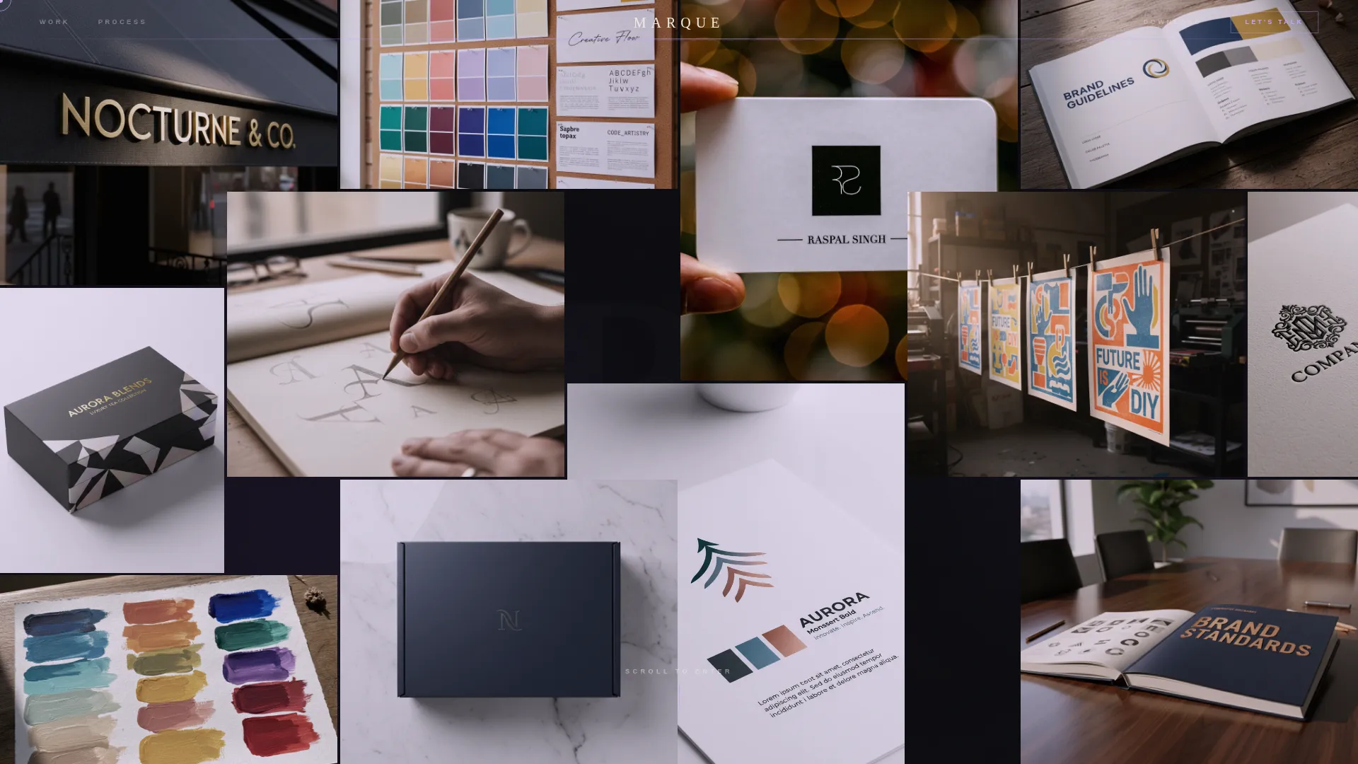
The header opens with an asymmetric, tightly packed grid of brand artifact images. Items like wordmarks, business cards, style guide spreads, and packaging mockups overlap at their edges like prints scattered across a lightbox. On scroll, the mosaic tiles slowly drift apart to reveal the portfolio headline typeset in bone-white beneath.
Gallery Walk Scroll Experience
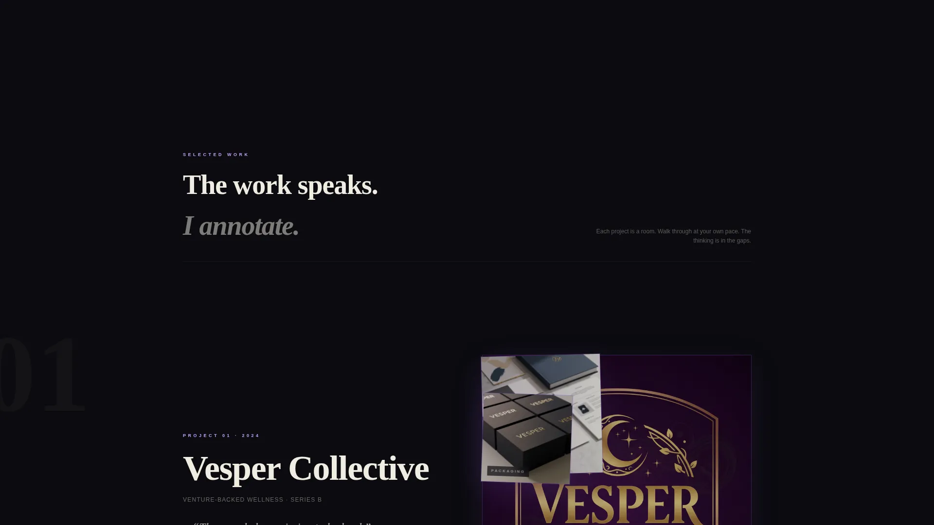
Each brand project occupies a full viewport "room." As the visitor scrolls, layers of deliverables stack and peel away in sequence: a logo animates onto a violet field, then a brand guidelines spread slides over it, then packaging photography overlaps both. The layered depth mimics acetate sheets on an overhead projector.
Curator-Style Interstitial Cards
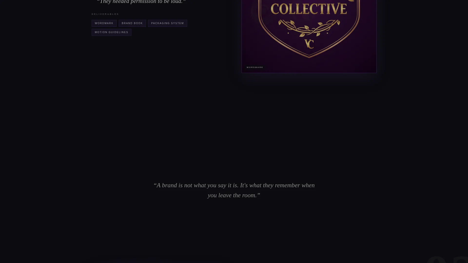
Between project rooms, brief italic cards in bone-white surface the strategist's thinking. These are not case study blocks. They are single-sentence statements, such as "They needed permission to be loud," that pace the scroll and give the work a distinct editorial voice.
Brand Audit Download Section
After the third project room, a primary call to action invites visitors to download a functional Brand Audit template as a PDF. A minimal form captures a name, an email address, and one open question: "What's broken about your current brand?" This section is positioned where credibility peaks.
Secondary Case Study Footer Path
A secondary navigation anchor at the footer reads "See the Full Process." It links to a long-form case study that acts as a soft qualification funnel. Visitors who follow this path signal higher intent and readiness for a real conversation.
Overlap and Layered Layout System
The entire page uses an overlap and layered visual structure. Sections do not simply stack; they intersect and peel. This compositional approach reinforces the brand identity of the strategist and signals a level of craft that a standard grid layout cannot.
Page sections overview
| Section | Purpose |
|---|---|
| Photo Grid Mosaic Header | Opens with brand artifacts; dissolves on scroll to reveal headline |
| Portfolio Headline Block | Delivers the primary positioning statement in bone-white type |
| Project Room One | First full-viewport brand case with layered deliverable reveal |
| Project Room Two | Second brand project room with sequential layer animation |
| Project Room Three | Third project room; establishes credibility peak before call to action |
| Curator Interstitial Cards | Single-sentence thinking cards paced between project rooms |
| Brand Audit call to action Section | Primary download offer with minimal lead capture form |
| Case Study Footer Anchor | Secondary path linking to long-form process documentation |
Design & branding system
The Marque template is built around an Ink and Paper visual theme expressed through a Void and Violet color system. Every color decision has a structural purpose, not just an aesthetic one.
- Absolute black (#0B0B0F) dominates the canvas; bruised violet (#6B3FA0) bleeds through like ink soaking wet cotton; bone-white (#F0ECE2) gives type a letterpressed quality against the dark
- Sharp lilac (#C4A1FF) is reserved for hover states and cursor trails, creating a sense of reactive tactility without breaking the dark mood
- Typography feels set by hand, and the overall palette references the look of a freshly printed risograph pulled from the drum at midnight: layered, slightly imperfect, and impossible to look away from
Mobile & speed optimization
The overlap and layered layout is built to adapt across screen sizes without losing the depth that defines it. Scroll-driven animation sequences are structured to degrade gracefully on smaller viewports.
- Mosaic grid tiles reflow into a tighter vertical arrangement on mobile without losing the overlapping edge quality
- Full-viewport project rooms maintain their compositional integrity at tablet and phone widths, keeping the Gallery Walk experience readable across devices
- The minimal lead capture form is lightweight by design, with only three fields, keeping the conversion section fast and friction-free on any screen
How this template helps you convert
Marque earns the conversion by building trust through craft before it ever asks for anything. The page is structured so that the download offer feels like a natural next step, not an interruption.
- The Gallery Walk scroll experience builds visual credibility across three full project rooms before the brand audit download call to action appears, so the offer lands with context rather than cold.
- The curator-style interstitial cards seed the strategist's methodology into the visitor's thinking between projects, making the "Download the Brand Audit Template" offer feel like the logical continuation of what they have already been reading.
- The secondary "See the Full Process" footer path captures higher-intent visitors who want more before committing, turning the page into a two-lane funnel that serves both quick and deliberate decision-makers.
Other information about this template
Marque belongs to the Portfolio and Agency category, specifically within the Brand Strategist Interactive Portfolio niche. It is designed as a single-page overlap-layered landing page, not a multi-page site.
- The template style is Overlap and Layered, meaning sections and components are intentionally designed to intersect rather than sit in clean isolation
- The creative direction is Gallery Walk: the scroll experience is curated and paced like moving through a physical exhibition space, with deliberate breathing room between projects
- The header concept is Photo Grid Mosaic, a distinct compositional approach that uses density and asymmetry as its primary visual statement
- The content and resource landing page direction means the primary goal is a lead-generating PDF download that embeds the strategist's thinking into the prospect's workflow before any sales conversation begins
- The Ink and Paper theme and Void and Violet color system are cohesive decisions that run through every layer of the template, from background to type to interactive states

Theme
Ink & Paper
Creative direction
Gallery Walk
Color system
Void & Violet
Style
Overlap/Layered
Direction
Content/Resource
Page Sections
Photo Grid Mosaic Header
Gallery Walk Scroll Experience
Curator Interstitial Cards
Brand Audit Download and Lead Form
Overlap and Layered Layout System
Secondary Case Study Footer Anchor
Related questions
Who is this landing page template designed for?
What is the primary conversion action on this page?
Does the page work without an existing portfolio of brand work?
Is there a long-form case study included in this template?
Can a small agency use this template instead of a solo practitioner?



