Osteoporosis Care Specialist Education Website Template
Marrow is a calming osteoporosis support community landing page built around a guided, zigzag layout and an eight-question bone health risk quiz. It walks newly diagnosed visitors through DEXA scan education, nutrition guidance, exercise resources, and peer community features, all wrapped in a warm, linen-soft visual identity that replaces clinical anxiety with quiet confidence.
by Rocket studio
Quick summary
Marrow is a single-page landing page designed for an osteoporosis support community. It uses a warm, educational tone and a transparent step-by-step layout to move newly diagnosed visitors toward completing a personalized bone health risk assessment. The zigzag section flow pairs clinical context with human stories, building trust before asking for any commitment.
Who this template is for
This template is built for health and wellness communities focused on bone health education and peer support. It fits organizations, clinics, or groups that need to reach people at the moment a diagnosis changes everything.
- Post-menopausal women who have recently received a first DEXA scan result and need plain-language guidance
- Men over sixty who have been told about osteopenia and are looking for a trusted next step
- Adult children researching osteoporosis treatment options and community resources on behalf of an aging parent
What problem this template solves
A frightening bone density result often sends people to search engines, where they find clinical language, conflicting advice, and very little warmth. This template replaces that cold experience with a calm, guided walkthrough that feels like a knowledgeable friend explaining the results over tea.
- Visitors arrive anxious and leave with a clear sense of what their score means and what to do next
- The progressive quiz format reduces overwhelm by introducing one question at a time rather than a long form
- The zigzag layout separates the educational content into digestible steps so nothing feels like a wall of text
What you get with this template
You get a fully structured, single-page layout with five distinct content zones and a high-interactivity quiz modal at its center. Every section is designed to both inform and reassure.
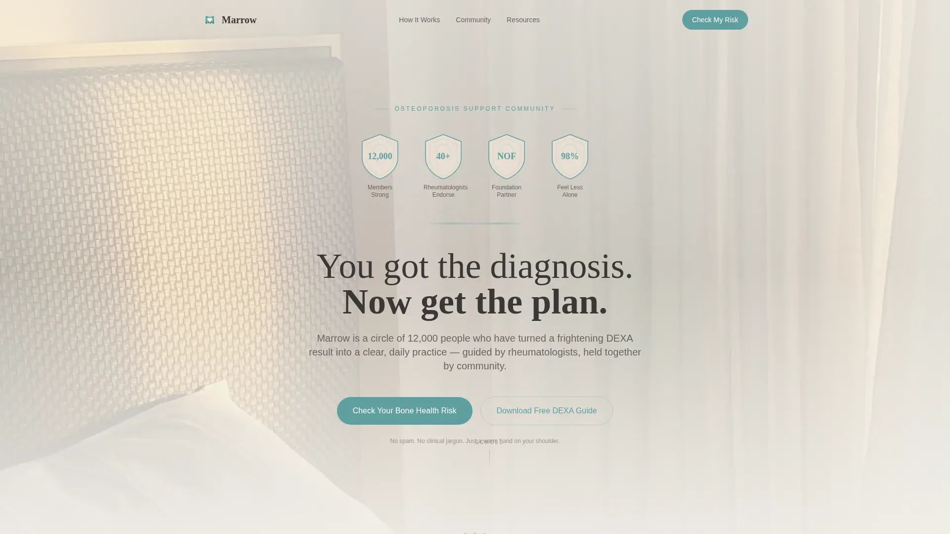
- A hero section with hand-illustrated award badges, a serif headline, and two conversion entry points
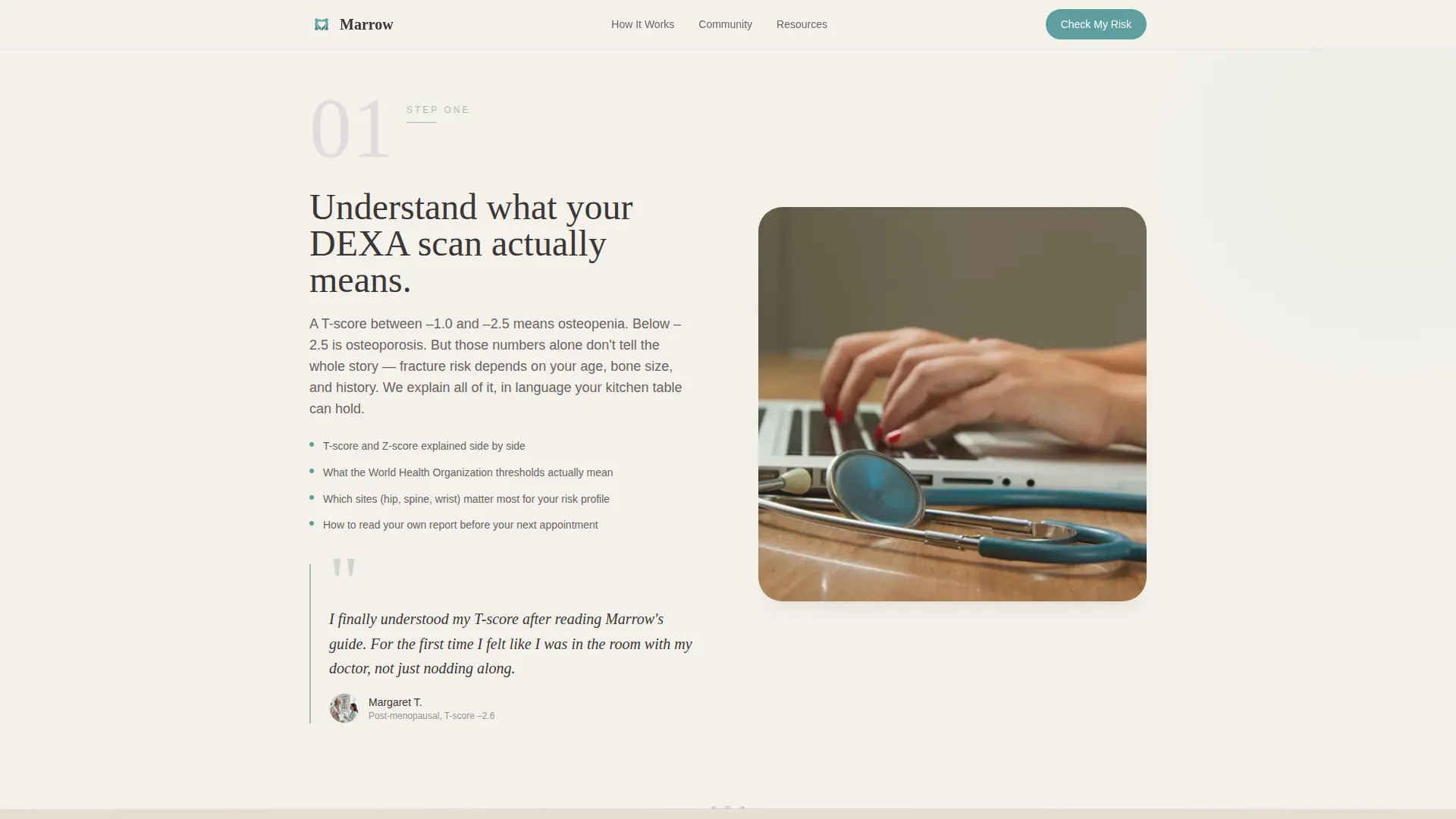
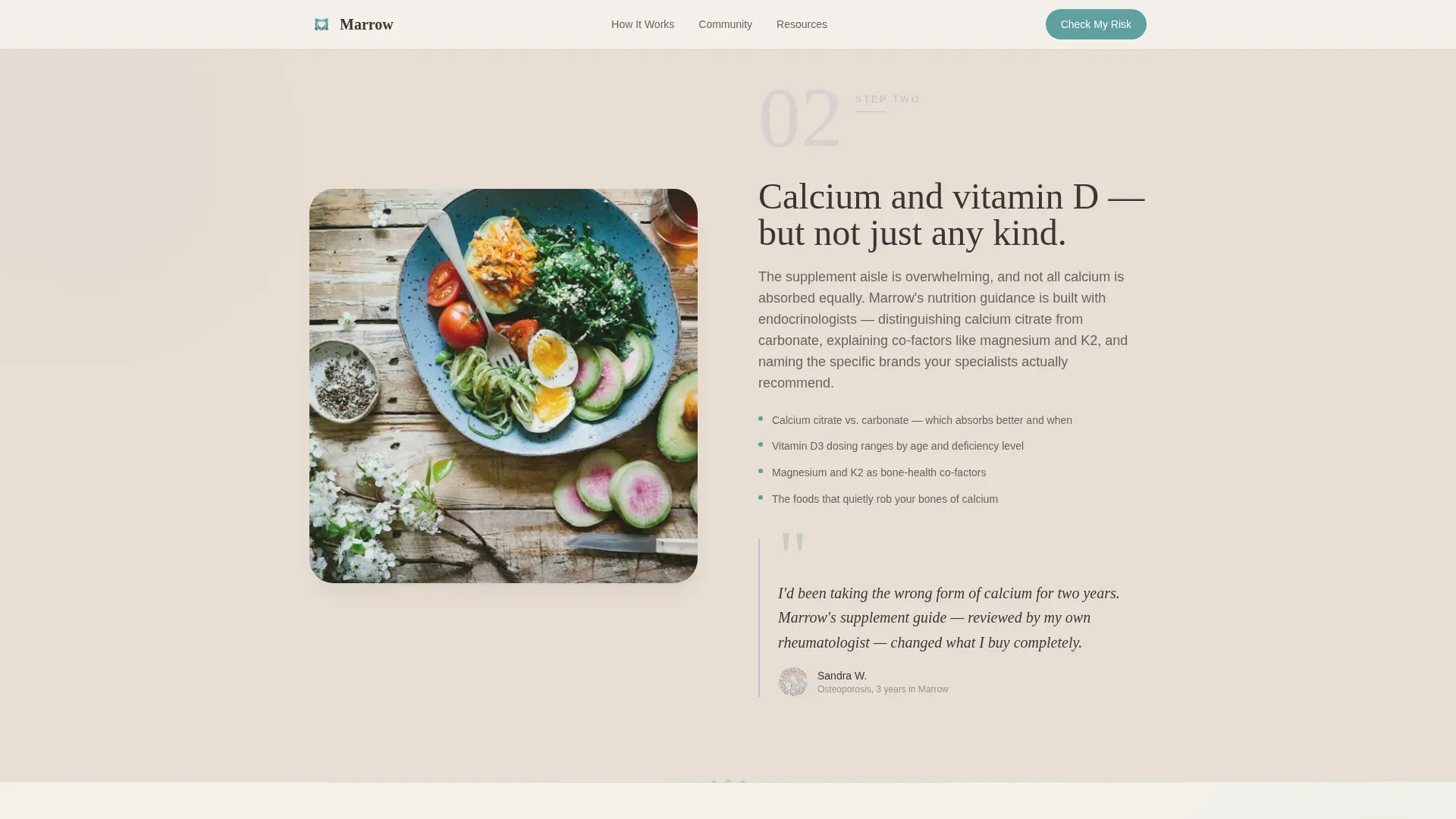
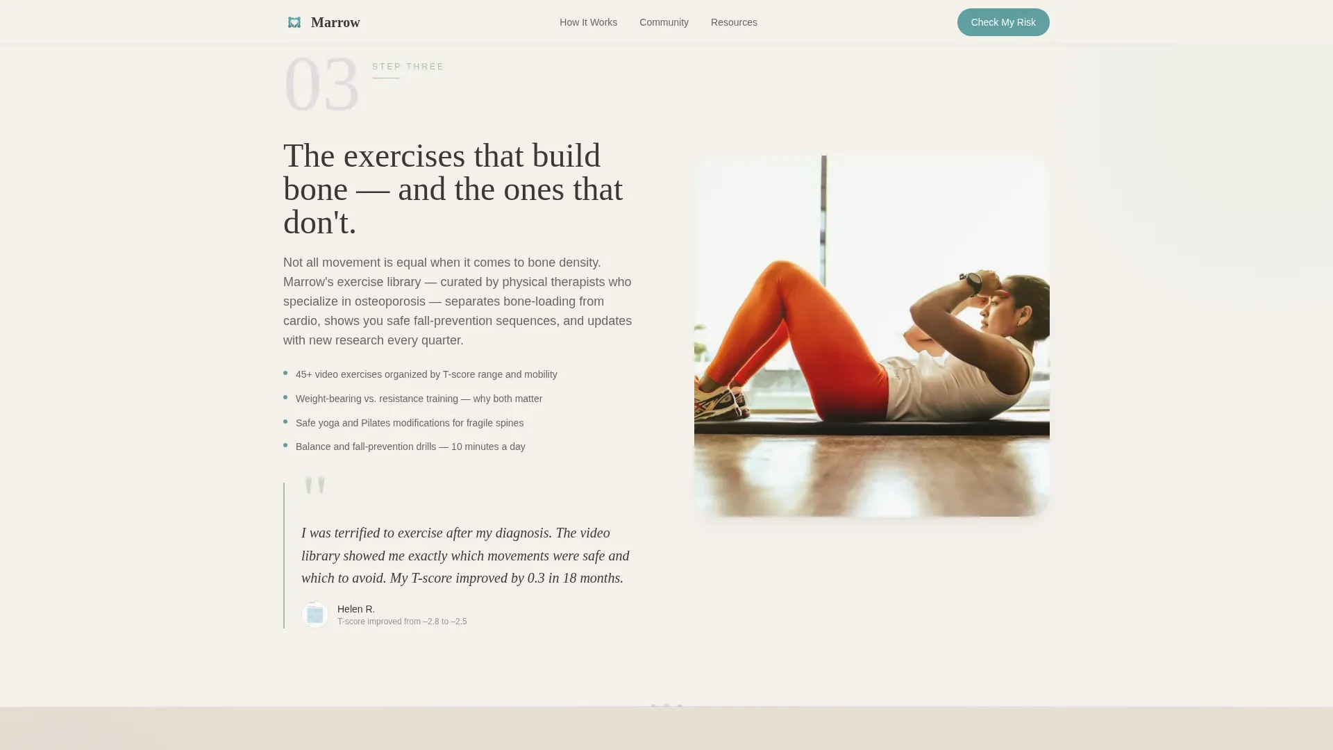
- Four zigzag educational sections pairing process diagrams with member quotes, covering DEXA interpretation, nutrition, exercise, and community
- An eight-question progressive bone health risk quiz that delivers a personalized risk tier and a tailored resource packet
Feature list
This template ships with purpose-built components that match the specific needs of a bone health support community. Each one is grounded in the source brief and serves a clear role on the page.
Award Badge Header Row
Four hand-illustrated shield icons sit at the top of the hero section. They display community milestones such as member count, rheumatologist endorsements, and a satisfaction metric, rendered in muted teal on a bone-white background with fine line detail.
Eight-Question Progressive Quiz Modal
The primary conversion tool opens with a single low-friction question and reveals seven more one at a time on individual cards. A sage-colored progress bar fills gently across the top of each card. Results deliver a personalized bone health risk tier with a matched resource packet and a warm group invitation.
Zigzag Alternating Section Layout
Four content sections alternate left-right alignment throughout the scroll. Each section pairs a process element on one side with a human face or member quote on the other, building trust through a rhythm of evidence and story.
Secondary Email Capture Path
Visitors who are not ready to take the quiz can download a free DEXA guide by entering their email address. This secondary call to action captures leads at a lower commitment level without interrupting the primary quiz flow.
Persistent Mobile Bottom Bar
On mobile devices, the primary call to action stays visible as a fixed bottom bar throughout the scroll. This ensures the quiz entry point is always one tap away for older users browsing on phones or tablets.
Scroll-Reveal Animation System
Section content enters the viewport through staggered scroll reveals. Badge icons animate in with a staggered entry sequence and quiz card transitions are smooth, keeping the experience calm rather than busy.
Page sections overview
| Section | Purpose |
|---|---|
| Hero with Badges | Establish trust and present the primary quiz call to action |
| Step 1: Understand Your Score | Explain DEXA scan results alongside a real member quote |
| Step 2: Nutrition & Supplements | Present calcium and vitamin D guidance with specialist endorsement |
| Step 3: Exercise & Movement | Preview the video library and show a member transformation story |
| Step 4: Community & Specialists | Introduce peer matching and the specialist Q&A schedule |
| Footer | Provide single-row links and secondary navigation |
Design & branding system
The visual identity follows a Soft Mist color system built to feel like early light through sheer curtains. Nothing on this page is clinical, alarming, or cold.
- Color palette uses morning fog white (#F4F1EB) and warm bone (#E8DDD3) for alternating section backgrounds, washed lavender (#C5B9CD) and quiet sage (#A8BDA1) for section transitions, and muted teal (#5F9EA0) for all interactive elements and links; deep warm charcoal (#3B3636) carries all body text
- Typography pairs Fraunces serif for headlines with DM Sans for body copy, giving the page an educational guide feel that reads warmly without feeling like a clinic brochure
- The overall aesthetic is a calm, linen-and-light style with no harsh borders, no clinical grids, and no alarming red tones anywhere on the page
Mobile & speed optimization
The template is built mobile-first because the primary audience skews older and browses most often on phones and tablets. Every layout decision accounts for touch-based interaction and smaller screens.
- Static content sections use server-rendered components to keep initial load light, while the interactive quiz modal is handled client-side to support smooth card transitions
- The persistent bottom call-to-action bar on mobile keeps the quiz entry one tap away without covering content, using a slim fixed strip above the browser chrome
- Typography sizing, button tap targets, and section spacing are all sized for comfortable reading and tapping without zooming
How this template helps you convert
The page is engineered around a single conversion goal: quiz completion. Every design choice supports that path without pressuring the visitor.
- The award badge row at the top of the hero builds immediate credibility before the visitor reads a single sentence of body copy, making the primary call to action feel trustworthy the moment it appears.
- The zigzag walkthrough turns passive scrolling into an active tour of the community's value, so by the time the visitor reaches the quiz prompt again, they have already seen the proof behind each step.
- The secondary email capture for the free DEXA guide provides a lower-commitment path that keeps hesitant visitors in the funnel without competing with the primary quiz conversion.
Other information about this template
This template is localized for a United States audience. All measurements use imperial units, dates follow the MM/DD/YYYY format, and any pricing references would use USD. The page is built in English (US) throughout.
- The quiz modal is designed for progressive disclosure, meaning each of the eight questions appears on its own card so the experience never feels like a long survey
- The Educational Guide theme is intentional: the page teaches before it sells, which aligns with how people process health diagnoses, they need to understand before they trust
- Animation intensity is set to medium: scroll reveals and staggered entries add life to the page without creating distraction or motion discomfort for older users
- The footer uses a linear single-row pattern, keeping the closing section minimal and uncluttered so the page ends as calmly as it begins
Theme
Educational Guide
Creative direction
Transparent Process
Color system
Soft Mist
Style
Zigzag/Alternating
Direction
Quiz/Assessment
Page Sections
Award Badge Hero Header
Eight-question Progressive Quiz
Zigzag Alternating Layout
Secondary Email Capture Path
Persistent Mobile Bottom Bar
Staggered Scroll-reveal Animations
Related questions
Who is this landing page template designed for?
Can I customize the quiz questions for my community?
What does the zigzag layout mean for my content?
Does this template include a secondary lead capture option?
What fonts and colors does this template use?



