Carnivore Diet Food & Dining Specialist Professional Website Template
Marrow is a full-width immersive landing page built for carnivore diet snack brands. It pairs a sensory-driven scroll journey with a Luxe Minimal Parchment and Rust design system, a UGC Photo Wall hero, a tap-friendly flavor selector, and a sticky "Build Your Box" call to action. Every section earns its place, letting honest meat-first ingredients speak louder than any marketing claim.
by Rocket studio
Quick summary
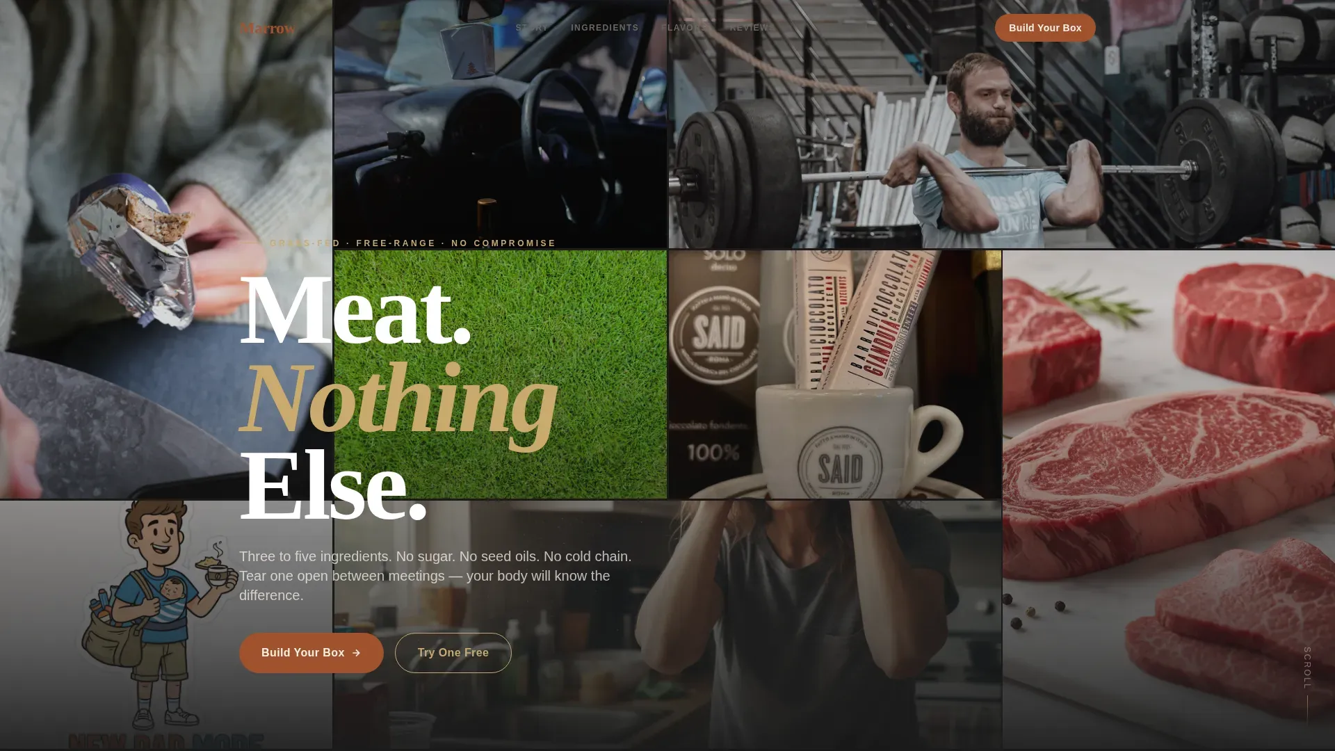
Marrow is a single-page, full-width immersive landing page template built for direct-to-consumer carnivore diet snack brands. It opens with a staggered UGC Photo Wall, scrolls through four full-viewport sensory sections, and closes with a sticky flavor selector and dual call-to-action bar. The design philosophy is Luxe Minimal: ruthless negative space, heritage butcher warmth, and copy that trusts the product to do its own talking.
Who this template is for
This template is built for food entrepreneurs and product teams who want to bring a meat-based snack brand to market without a bloated agency budget. It suits brands whose entire value proposition lives in radical ingredient honesty and sensory quality. If your product has three to five ingredients and a story worth telling through texture, sourcing, and taste, this template is your starting point.
- Carnivore diet snack founders launching a direct-to-consumer beef bar or meat stick brand
- Food brand teams replacing a generic Shopify theme with a conversion-focused, visually immersive landing page
- Creative directors and developers who need a fully structured, mobile-first starting point they can read, adapt, and launch quickly
What problem this template solves
Most food brand landing pages crowd the screen with competing claims, mismatched fonts, and stock photography that could belong to any product on any shelf. The result is a page that fails to feed trust, fails to communicate ingredient quality, and fails to move the visitor toward a purchase. Meat-focused snack brands face a particular challenge: their product is sensory, animal, primal, and the standard e-commerce layout was not built to communicate that.
- Visitors cannot read the ingredient quality through a cluttered page, so they leave before they trust the brand
- Generic templates do not necessarily provide the right conversion architecture for a multi-SKU snack brand with a low-barrier "Try One Free" entry point
- Brands lose buyers at the point where design and product story disconnect, turning curiosity into hesitation rather than a purchase
What you get with this template
You get a structured, ready-to-customize landing page with every section pre-built, pre-sequenced, and pre-styled to match the Marrow brand system. The template is not a blank canvas. It is a deliberate, opinionated layout designed to bring visitors from first glance to checkout with as little friction as possible. Every component exists for a reason, and every section is ready for your copy, images, and product data.
- A complete Parchment and Rust design system with four defined color tokens, Fraunces serif display type, and DM Sans body type, ready to read across every screen size
- Seven pre-built content sections covering the hero, sensory scroll, ingredients billboard, flavor selector, testimonials, scrolling ticker, and footer
- A dual conversion architecture combining a sticky "Build Your Box" primary call to action with a "Try One Free" secondary path, both included in the layout
Feature list
This template includes a focused set of high-impact components. Each one was chosen because it directly serves the conversion goal and the sensory storytelling strategy of a carnivore diet snack brand landing page.
UGC Photo Wall Hero with Staggered Color Bloom
The hero section fills the full viewport with a mosaic of user-generated content photo tiles. Each tile loads in a slightly desaturated state. As the visitor scrolls, color blooms outward from the center of the grid using an Intersection Observer trigger. The effect communicates authenticity before a single line of copy appears, letting real people and real food do the persuading. No studio lighting, no styled props, just phones held over real lives.
Four-Part Sensory Scroll Journey
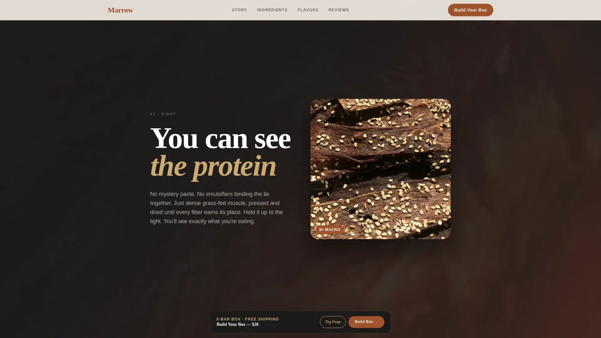
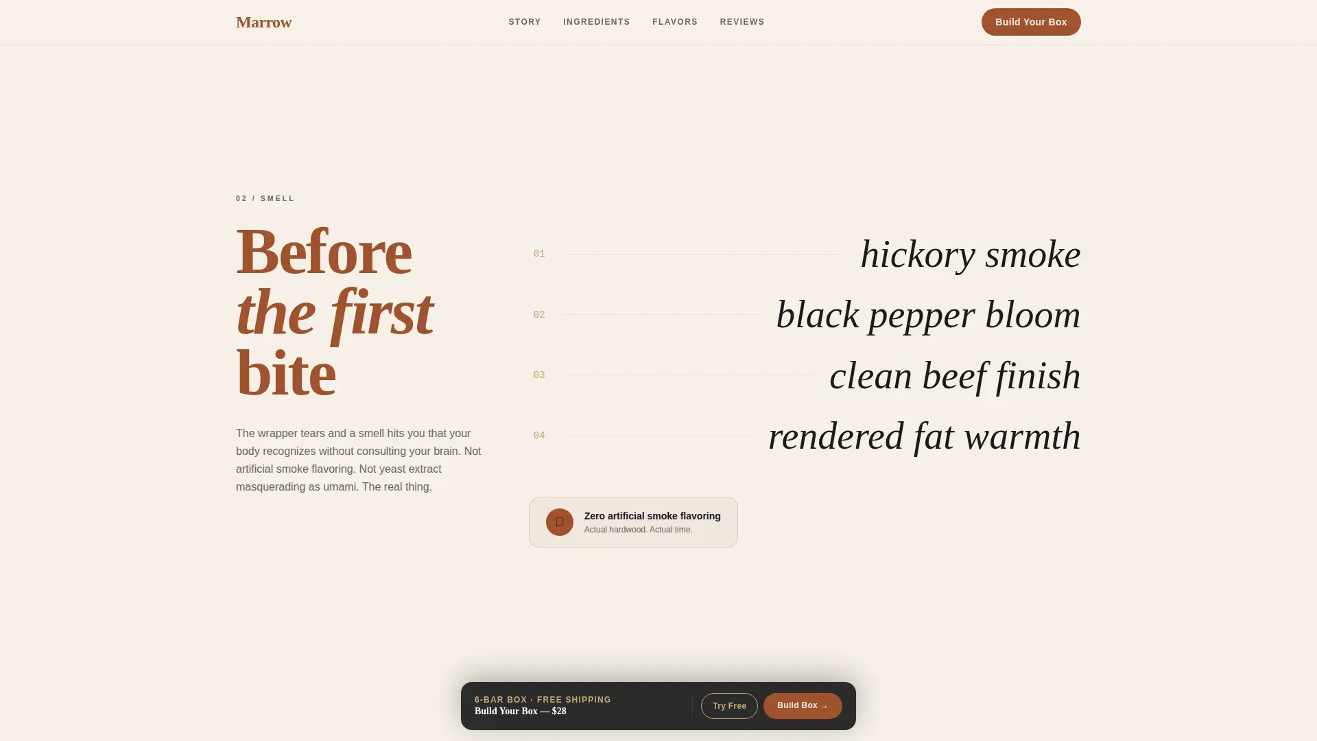
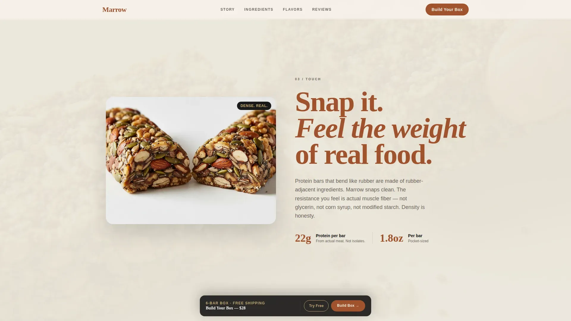
The body of the page is organized into four full-viewport sensory sections: SIGHT, SMELL, TOUCH, and TASTE. Each section occupies the entire screen and lets its hero asset, macro photography, tasting-note typography, slow-motion video, or a flavor comparison panel, carry the narrative weight before copy enters. The sequence builds purchase confidence in a way that a standard product grid never could. Visitors who read through the full sensory sequence are far more primed to act than visitors who hit a static product listing.
Ingredients Billboard and Sourcing Map
The ingredients panel is blown up to near-billboard scale so that every line is legible and unapologetic. Beneath it, a sourcing map traces each animal product back to its origin ranch. This section is designed to reward the visitor who reads with care, specifically the carnivore-curious shopper who scans every ingredient list before buying. Highlighting quality sourcing claims like grass-fed and zero-sugar in this way builds the kind of trust that short testimonials alone cannot establish.
Tap-Friendly Flavor Selector
The inline flavor selector opens from the sticky "Build Your Box" call to action and presents each stock-keeping unit as a large tap-friendly card. Each card shows the bar image, a two-word flavor name, and a protein-per-bar count. The layout is designed for mobile use first, where a CrossFitter grabbing a snack between sets or a developer eating at a standing desk can make a selection in three taps. The grid is scannable, fast, and removes every unnecessary decision from the purchase path.
Sticky Dual Conversion Bar and "Try One Free" Path
A sticky bottom bar appears after the first scroll, anchoring the "Build Your Box" call to action in persistent view throughout the page. A secondary "Try One Free" option sits alongside it, targeting first-time visitors with a single-stick sample offer that requires only a shipping address and email. This dual architecture serves two distinct visitor intents: the committed buyer ready to build a custom box and the curious newcomer who needs one low-risk taste before committing.
Scrolling "What's NOT Inside" Ticker
A marquee-style scrolling ticker carries the brand's zero-claim message across the full page width. It lists everything the product does not contain: zero sugar, zero soy, zero seed oils, zero compromise. The ticker reinforces the ingredient story at a glance without requiring any reading effort from the visitor. It is a fast, repeating signal that the brand has nothing to hide and everything to prove.
Page sections overview
| Section | Purpose |
|---|---|
| UGC Photo Wall | Builds immediate trust through real customer imagery with a staggered color bloom on scroll |
| Sight Sensory Panel | Opens the sensory journey with extreme macro photography of meat texture and muscle fiber grain |
| Smell Sensory Panel | Delivers tasting-note typography describing hickory smoke, black pepper bloom, and clean beef finish |
| Touch Sensory Panel | Plays slow-motion video of a bar snapping in half to reveal its dense, unprocessed interior |
| Taste Comparison Panel | Pairs each SKU against the ultra-processed snack food it replaces with a side-by-side layout |
| Ingredients Billboard | Displays the ingredient panel at near-billboard scale alongside a ranch-level sourcing map |
| Flavor Selector Grid | Opens inline from the sticky bar to let visitors choose three to six flavors using tap-friendly cards |
| Testimonials Section | Rotates social proof cards with gold star ratings from real customers, focused on taste and health |
| NOT Inside Ticker | Scrolls zero-sugar, zero-soy, zero-seed-oil claims across the full page width as a repeating marquee |
| Sticky Conversion Bar | Anchors "Build Your Box" and "Try One Free" in persistent view after the first scroll |
| Footer Pattern | Closes the page with a horizontal flow footer layout |
Design & branding system
The design system reads like a heritage butcher shop that hired a Scandinavian architect. Every color token, every type choice, and every spacing decision has been made to bring a specific sensory mood to the screen without visual clutter getting in the way. Minimalist branding focuses on simplicity and clarity in design and messaging, and this template makes that principle concrete rather than theoretical. A minimalist approach can help brands stand out in a crowded market by reducing visual clutter, and the Parchment and Rust palette does exactly that for a meat snack brand competing against loud, over-designed food packaging.
- Four color tokens form the complete system: aged bone white (#F5F0E8) for open backgrounds, dried-blood rust (#A0522D) for headlines and primary buttons, charred black (#1A1A1A) for body text, and rendered-tallow gold (#C9A96E) for hover states, badges, and star ratings
- Fraunces, a variable serif display font, handles all headlines and section openers; DM Sans, a clean grotesque, handles all body text and labels, creating a pairing that is highly legible at every size
- Negative space is used deliberately throughout, giving each product image, each piece of tasting copy, and each ingredient claim room to breathe and register before the next element arrives
Mobile & speed optimization
The template is designed mobile-first, reflecting the reality that the primary buyers, CrossFitters on the gym floor, remote developers at standing desks, and mothers scanning labels mid-aisle, all reach for their phones first. The layout prioritizes touch-friendly tap targets, vertically stacked content sections, and full-viewport imagery that reads clearly on a small screen without requiring a pinch or a zoom.
- All animations use native CSS scroll-behavior and Intersection Observer API triggers, keeping the color bloom and scroll-linked reveal effects lightweight without adding heavy JavaScript dependencies
- The sticky conversion bar, the flavor selector cards, and the testimonial rotator are all built with mobile touch interactions in mind, so every core action can be completed with a thumb
- Full-viewport sensory sections are structured so that the image or video asset loads and occupies the screen before any copy overlay appears, keeping perceived load time low and visual impact high
How this template helps you convert
The page is built around the insight that a carnivore diet snack brand does not win buyers through persuasion alone. It wins them through proof: proof of ingredients, proof of sourcing, proof of real people eating the product in real situations. Every layout decision is a step toward removing the hesitation between curiosity and purchase.
- The UGC Photo Wall builds social proof at the very first moment of contact, before any claim is read, letting real customer images bring authenticity to the brand faster than any headline could
- The sensory scroll sequence escalates ingredient trust section by section, from macro photography through tasting notes through the ingredients billboard, so that by the time the sticky call to action comes into view, the visitor has already been persuaded through experience rather than through argument
- The dual conversion architecture serves both committed buyers and first-time visitors at the same point on the page, so the template captures revenue from people ready to buy a full box and people who only need a single sample to cross the threshold
Other information about this template
The Marrow Luxe Minimal Carnivore Snack Brand Landing Page Template sits at a specific and growing intersection in the food and beverage world. The carnivore diet is gaining popularity among those seeking high-protein, low-carb meal options, and the rise of this dietary movement has created genuine demand for snack products that read clean on the label. Carnivore diet adherents often seek snack options that align with their dietary preferences, focusing on meat-based snacks with minimal processing and zero filler ingredients. Many people on the carnivore diet report increased energy levels and other benefits from their dietary choices, which creates a motivated, engaged buyer who does not necessarily need heavy discounting to convert. They need trust, and this template is built to deliver it.
The design of a minimalist landing page for a brand in this space should blend "less is more" aesthetics with the raw nature of the product, and this template does that at every level. Effective minimalist branding often uses a limited color palette to create a strong visual identity, and the four-token Parchment and Rust system here does exactly that. Brands that adopt minimalist strategies often emphasize storytelling through their visuals and messaging, which is precisely why the sensory scroll sections lead with imagery before copy. Minimalist branding can enhance user experience by making navigation and interaction more intuitive, and the removal of a traditional navigation bar keeps visitor attention locked on the product from the first scroll to the final tap.
From a food brand positioning standpoint, this template is not trying to compete with mass-market snack layouts. It is built for a brand that knows its buyer reads every label, tracks every macro, and does not drink sugar-sweetened drinks or reach for processed food out of convenience. This buyer is also a person who appreciates a product that does not need to over-explain itself, in the same way that a well-sourced wine, a plate of slow-roasted mushrooms, or a simple preparation of quality meat needs no elaborate menu description to communicate its value. The brand can bring that same quiet confidence to the screen through this layout.
The sensory copy framework in the template also supports the kind of food storytelling that works beyond meat snacks. A brand selling fermented drink products, mushroom-based food supplements, or even high-end meat appetizers could adapt the sensory scroll sections to their own product story. The structure is flexible enough to feed a range of carnivore-adjacent and animal-based food brands without losing the visual integrity of the original system. Whether the product is a jerky bar, a meat stick, or a tallow-based food topper, the page sections bring the same credibility to the ingredient story.
- The template includes a scrolling ticker component that can be updated with any zero-claim or sourcing statement the brand wants to repeat at scale
- Social proof is built in through the UGC Photo Wall, rotated testimonial cards with gold star ratings, and the ingredient billboard, giving buyers multiple read points to confirm their trust in the brand
- The "Try One Free" secondary call to action is pre-built into the sticky conversion bar, making it easy to run a sample offer alongside the main box-builder without adding a separate page or flow
- Effective product packaging design and landing page design share the same principle here: the color scheme, the typography, and the use of high-quality images of meat products all work together to differentiate the brand in a crowded market
- People who discover the brand through social media or influencer content will land on a page that matches the visual register they expect from a premium product, keeping the experience consistent from first touch to purchase
Theme
Luxe Minimal
Creative direction
Sensory Appeal
Color system
Parchment & Rust
Style
Full-Width Immersive
Direction
Marketplace/Multi
Page Sections
UGC Photo Wall with Color Bloom Effect
Four-part Full-viewport Sensory Scroll
Ingredients Billboard and Ranch Sourcing Map
Tap-friendly Inline Flavor Selector
Sticky Dual Conversion Bar
Scrolling Zero-claim Marquee Ticker
Related questions
Can I use this template for a snack brand that sells products beyond beef bars?
Does the template include both the 'Build Your Box' and 'Try One Free' conversion paths?
Is the UGC Photo Wall designed for real customer photos or styled stock imagery?
How does the flavor selector handle a brand launching with only one or two products?
Is this landing page template optimized for mobile use?



