Osteoporosis Care Professional Website Template
Marrow is a split-screen landing page template built for osteoporosis clinical trial matching platforms. It pairs animated credibility stats with a scroll-driven expert panel to move bone density patients from anxiety to action. The Forest Trust color system, Fraunces typography, and a single amber call-to-action button guide visitors toward a trial-matching questionnaire with zero friction.
by Rocket studio
Quick summary
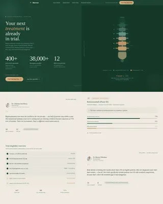
Marrow is a single-page, click-through landing page template for osteoporosis clinical trial finders. It opens with a split 50/50 hero that pairs counting statistics with a stylized DEXA spine illustration. Five scrolling expert panels build medical authority progressively. The warm amber "Find Trials Near You" button moves visitors to a guided intake questionnaire, with no form fields on the page itself.
Who this template is for
This template is built for health platforms, research institutions, and clinical trial recruitment teams focused on bone density patients. It is ideal for anyone who needs to earn trust quickly from a medically cautious audience and drive them toward a qualifying questionnaire.
- Patient recruitment teams running osteoporosis clinical trials at research hospitals
- Health technology platforms matching bone density patients with next-generation treatment studies
- Adult children or caregivers researching post-fracture options for aging parents
What problem this template solves
Bone density patients arrive at clinical trial pages confused and skeptical. Generic layouts that rely on stock photography of smiling seniors do nothing to signal real medical expertise. Marrow fixes that by anchoring every section in data, specialist voices, and institutional credibility before asking for any click.
- Visitors with a recent dual-energy X-ray absorptiometry scan result need immediate evidence that the platform understands their diagnosis
- A single misplaced form field early in the flow causes drop-off; this template holds all intake questions on the next page
- Without progressive expert authority, fear never pivots into the curiosity needed to complete a matching questionnaire
What you get with this template
Marrow delivers a fully structured, scroll-optimized landing page built around five distinct content zones. Each zone has a defined role in moving the visitor from first impression to a confident button click.
- A split-screen hero with animated counting stats on the left and a stylized bone density spine illustration on the right
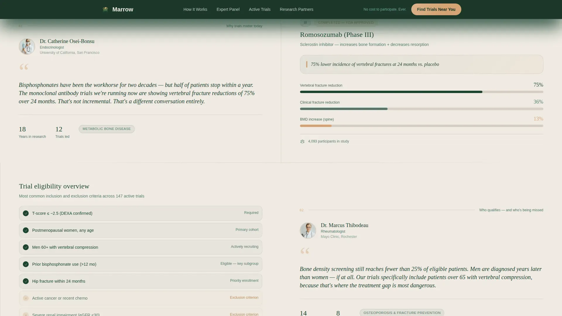
- Five alternating expert panels that introduce named endocrinologists, rheumatologists, and clinical researchers alongside phase III data
- A persistent mobile call-to-action bar, institutional trust logos, and the reassurance line "No cost to participate. Ever." placed above every call-to-action instance
Feature list
This template is built around prompt-backed components that serve a medically sensitive audience. Each feature has a specific job in the page flow.
Animated Statistics Hero
The left panel counts up three live figures: 400 or more active osteoporosis trials nationwide, 38,000 or more participants currently enrolled, and an average distance of 12 miles to the nearest trial. The counting animation starts on page load and establishes immediate data credibility before a single word is read.
DEXA Spine Illustration
The right panel displays a stylized, abstracted silhouette of a spine with bone density zones color-mapped from warm amber to deep evergreen. It replaces stock photography with a medically grounded visual that resonates directly with patients who review their own scan results regularly.
Scroll-Driven Expert Panels
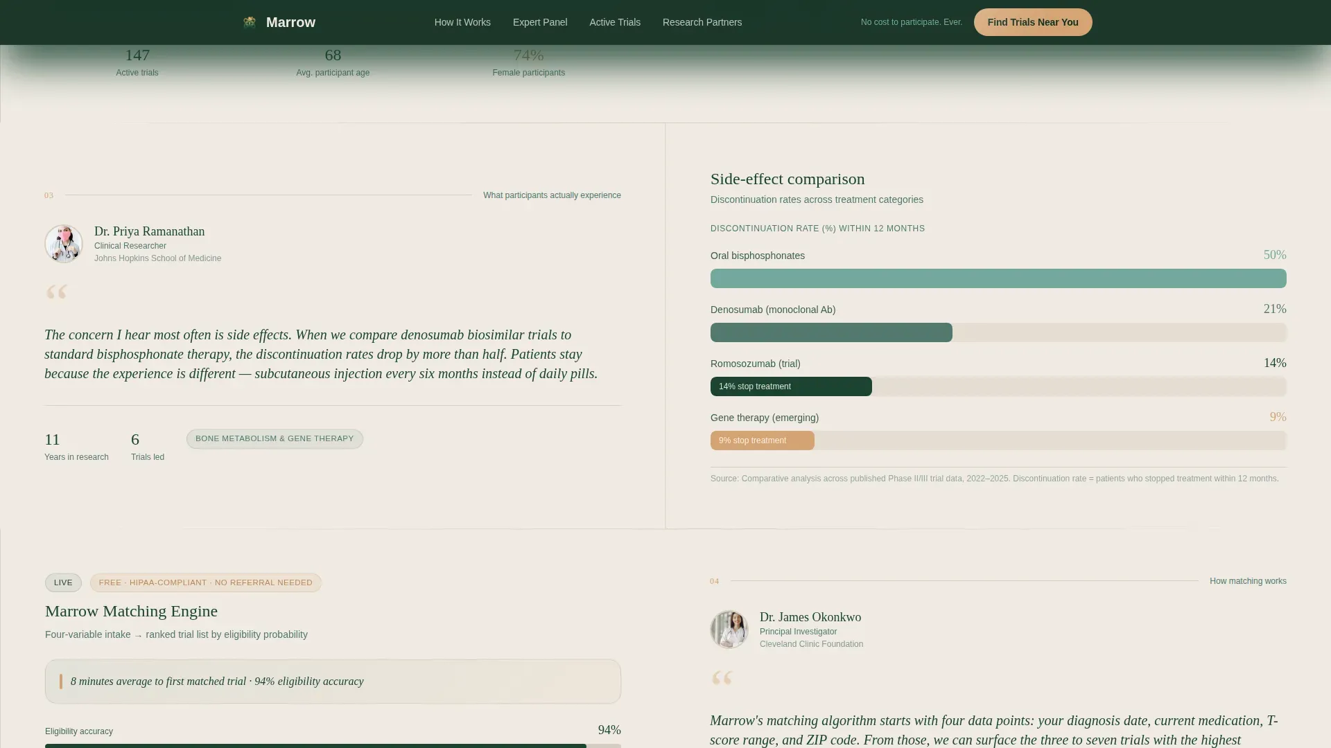
Five specialist panels alternate left and right as the visitor scrolls. Each panel pairs a named expert quote or brief video testimonial with a supporting data view such as a phase III result, a trial eligibility breakdown, or a side-effect comparison chart. The rhythm escalates from "why trials matter" through to "how matching works."
Amber Call-to-Action System
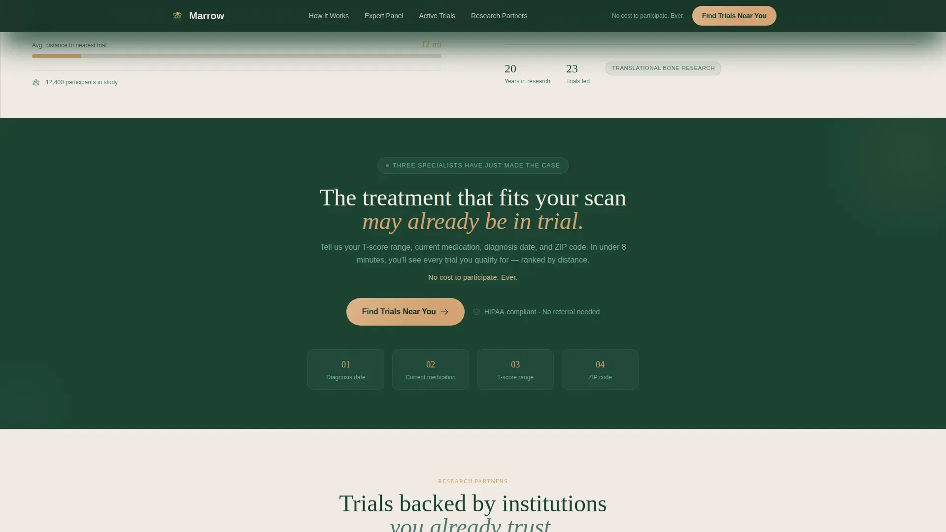
The primary "Find Trials Near You" button appears three times: at the hero, after the third expert panel, and as a persistent bottom bar on mobile. Warm amber is reserved exclusively for this button and progress indicators, so the eye is always drawn to the next step.
Zero-Form Page Design
No intake fields appear on this landing page. The amber button routes visitors to a separate, guided questionnaire that collects diagnosis date, current medication, T-score range, and zip code in a defined sequence. This separation keeps the landing page light and trust-focused.
Institutional Trust Section
A dedicated section displays participating research hospital logos alongside the line "No cost to participate. Ever." This section closes the expert panel sequence and provides the final push of credibility before the footer call-to-action.
Page sections overview
| Section | Purpose |
|---|---|
| Stats/Metrics Hero | Opens with counting numbers and a DEXA spine illustration to establish data credibility instantly |
| Expert Panel One | Pairs an endocrinologist quote with a phase III romosozumab result to anchor clinical relevance |
| Expert Panel Two | Alternates sides, placing a trial eligibility breakdown opposite a rheumatologist quote |
| Expert Panel Three | Shows a side-effect comparison chart beside a clinical researcher quote, then delivers the midpage call-to-action |
| Trust and Institutions | Displays hospital logos and the "No cost. Ever." line above the final call-to-action |
| Linear Footer | Single-row footer closes the page cleanly with minimal distraction |
Design & branding system
Marrow uses a Forest Trust color system built to feel like a sunlit consultation room rather than a clinical white box. The palette and type choices work together to signal both warmth and medical seriousness.
- Deep evergreen (#1B4332) anchors backgrounds and primary typography; soft fern (#52796F) softens section dividers and secondary text; birch bark cream (#F0EBE3) breathes open space across the layout
- Warm amber (#D4A373) is reserved strictly for call-to-action buttons and progress indicators, keeping visual hierarchy clean and intentional
- Fraunces serif handles all headings to bring gravitas and warmth; DM Sans handles body copy for a clean, clinical reading experience
Mobile & speed optimization
The template is built desktop-first, which matches the research-oriented context of its target audience. Mobile is handled through a focused set of adaptations rather than a full redesign.
- A persistent bottom call-to-action bar stays visible on mobile throughout the scroll, so the "Find Trials Near You" button is never more than a thumb-reach away
- Scroll-linked panel reveals and counting-number animations are separated into client-side components, while static expert panels use server-side rendering to keep initial load lean
- The split-screen layout collapses gracefully on smaller screens so the stats, spine illustration, and expert content stack in a readable single-column sequence
How this template helps you convert
Marrow is built as a click-through page with one job: move a cautious, medically informed visitor to a trial-matching questionnaire. Every structural decision serves that conversion goal.
- Progressive expert authority is introduced one specialist at a time across five panels, so by the bottom of the page the visitor feels they have attended a private medical briefing rather than read a marketing page.
- The amber call-to-action button appears at three precise moments, each preceded by the "No cost to participate. Ever." reassurance line, reducing the perceived risk of clicking before any personal information is requested.
- The zero-form page design removes all commitment anxiety from the landing experience; visitors click knowing the intake process starts gently with a guided questionnaire, not an immediate data dump.
Other information about this template
Marrow is part of the Healing Space theme family, making it a strong fit for platforms that want medical authority without clinical coldness. A few additional details are worth noting for teams evaluating this template.
- The template style is Split Screen (50/50), which makes the hero feel balanced and deliberate rather than image-heavy or text-heavy
- The header concept is Stats/Metrics, a pattern well suited to clinical trial platforms because numbers convey scale and legitimacy faster than any headline
- The creative direction follows an Expert Panel approach, which builds layered credibility through named voices rather than anonymous testimonials
- The landing page direction is Click-Through, meaning the entire page is designed around a single outbound action with no competing exits or lead-capture forms on the page itself
- The osteoporosis clinical trial finder niche sits within the Health and Medical category under Osteoporosis Care, so all design and copy decisions assume a patient or caregiver audience with moderate to high health literacy
Theme
Healing Space
Creative direction
Expert Panel
Color system
Forest Trust
Style
Split Screen (50/50)
Direction
Click-Through
Page Sections
Animated Statistics Hero Panel
DEXA Spine Bone Density Illustration
Scroll-driven Expert Panel Sequence
Precision Amber Call-to-action System
Zero-form Landing Page Structure
Institutional Trust Closing Section
Related questions
Who is the target audience for this landing page template?
Does this template include a patient intake form?
How many call-to-action placements does the template include?
Can the expert panel content be customized for different specialists?
What makes this template different from a general medical landing page?



