Authentic Asian Grocery Landing Page Template
Mart is a modular card-grid landing page built for authentic Asian grocery stores. It pairs a bold search-led header with a scroll-reveal comparison journey, a three-step pantry quiz, and a subscription box preview. The Neo-Retro Lavender Dream palette gives every section a warm, nostalgic feel that still drives clicks toward your core conversion goal.
by Rocket studio
Quick summary
Mart is a single-page, card-grid landing page template designed for authentic Asian grocery retailers. It opens with an oversized search hero, flows through a product comparison journey, and closes with a personalized pantry subscription builder. The Neo-Retro visual system makes it feel inviting and discovery-led from the first scroll.
Who this template is for
This template is built for retailers who stock what mainstream supermarkets simply do not carry. It speaks directly to shoppers and the businesses that serve them.
- Asian grocery store owners who want an online presence that matches the depth of their physical shelves
- Specialty food retailers targeting second-generation home cooks, food bloggers, and restaurant buyers
- Subscription pantry brands launching a curated monthly box for adventurous eaters
What problem this template solves
Generic e-commerce templates flatten specialty food into a plain product grid. They give no context, no story, and no reason to choose the authentic ingredient over the familiar substitute. Mart fixes that.
- Shoppers land and immediately feel the range is serious, with a search hero promising 12,000-plus products from 19 countries
- The comparison journey shows exactly why settling for a supermarket substitute is the wrong choice
- The pantry quiz removes decision fatigue and turns browsing intent into a committed subscription
What you get with this template
Mart delivers a complete, ready-to-customise landing page built around card-grid modules. Every section is purposeful and conversion-oriented.
- A search-led hero section with hand-illustrated ingredient icon animations and a clear value line
- Paired comparison card grids that contrast generic grocery options against authentic specialty alternatives
- A three-step pantry quiz, a personalized box preview grid, and a Premium Pantry upgrade toggle
Feature list
Mart ships with purposeful components that serve both the shopper experience and the retailer's conversion goals.
Oversized Search Hero
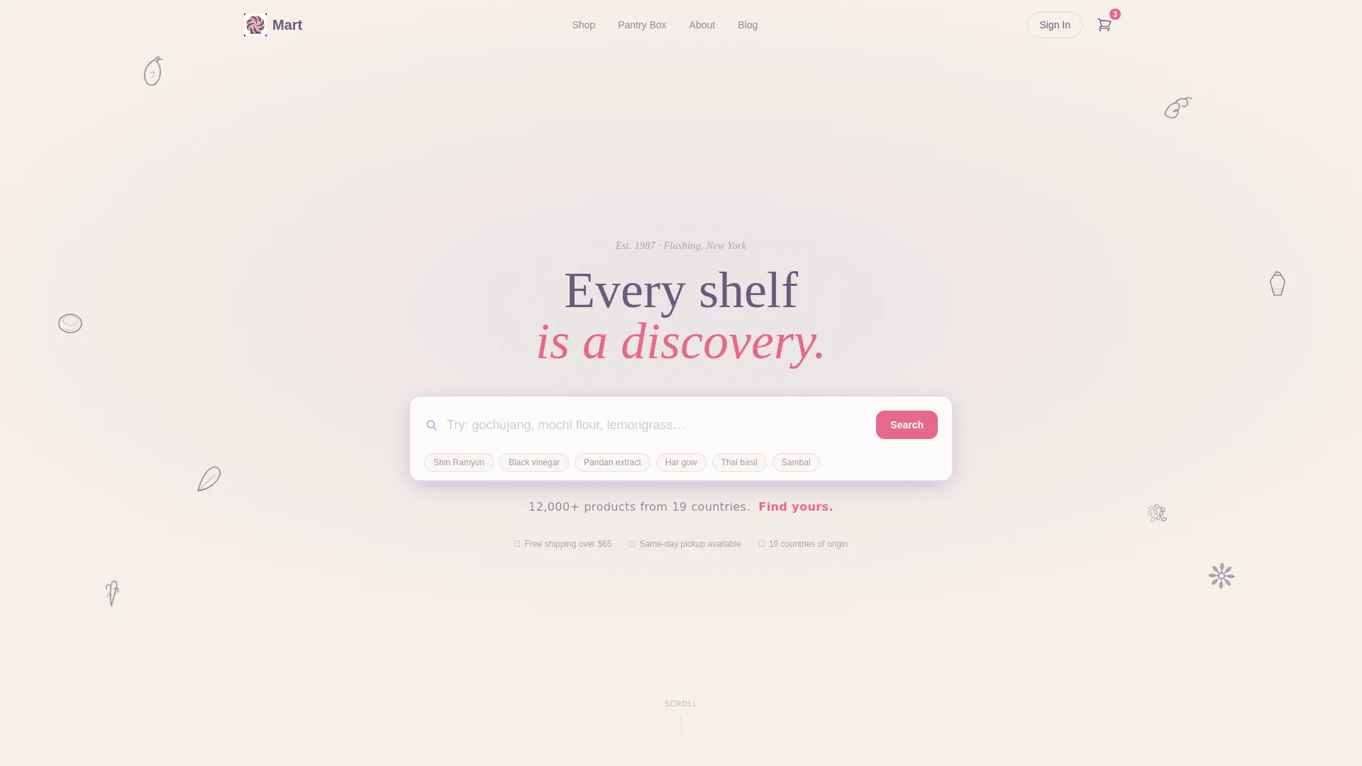
The header centres an oversized search box on a warm cream background. Ghost text cycles through real product examples. A wisteria-type tagline below the field states the store's full range promise, making the search field the visual and functional hero of the page.
Hand-Illustrated Ingredient Icons
Plum line-art icons of ingredients float gently around the search field. The bobbing animation creates a sense of warmth and discovery without competing with the search interaction. Every icon reinforces the store's authentic, multi-cuisine identity.
Comparison Card Grid Journey
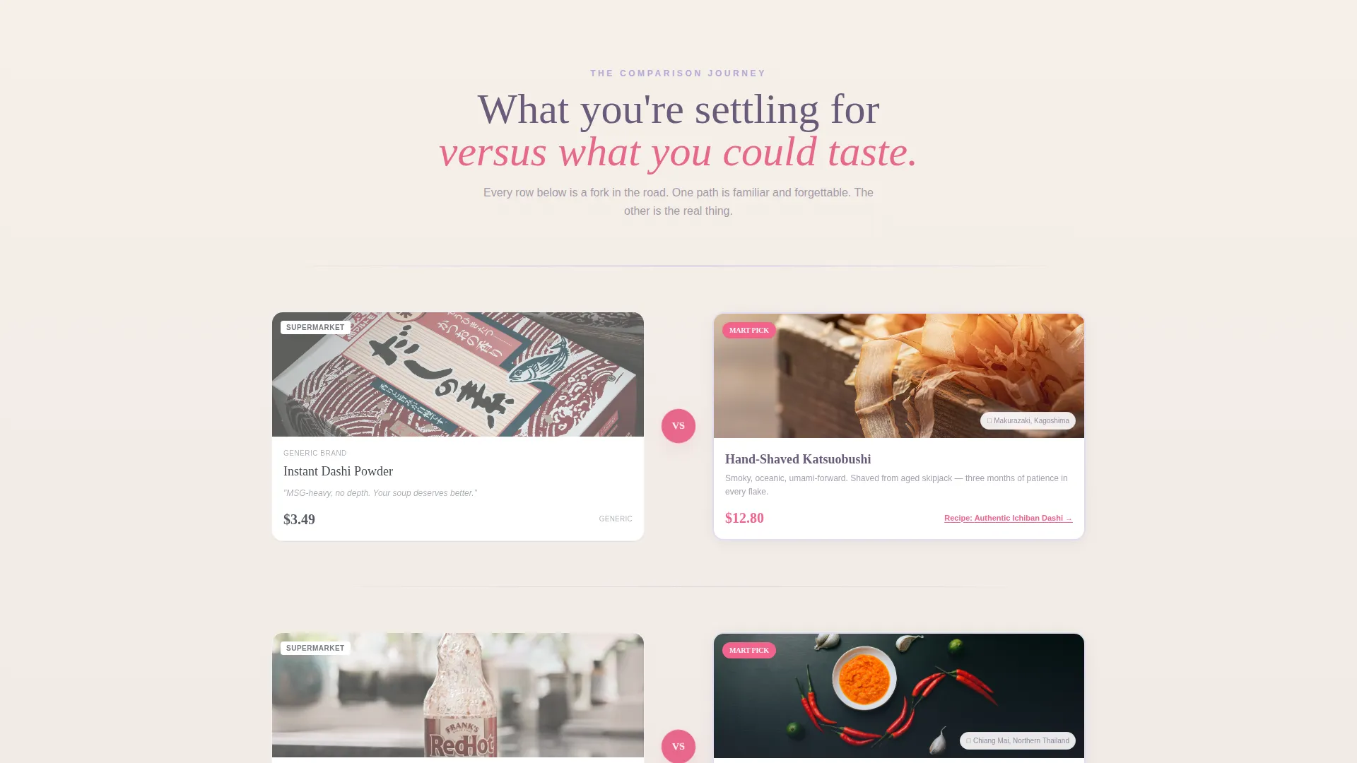
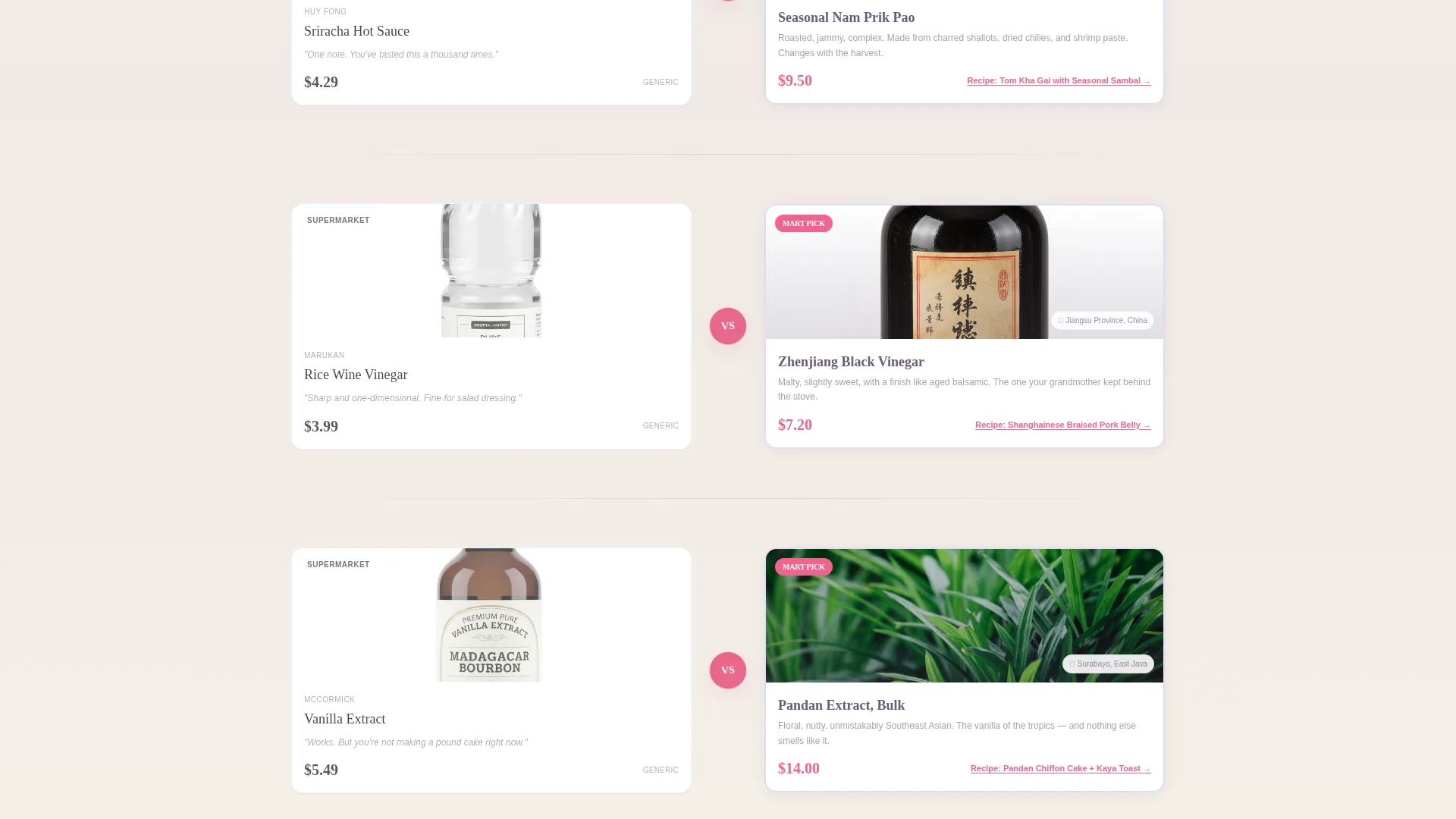
Paired card grids scroll-reveal side by side. The left card shows a generic supermarket product in a deliberately flat style. The right card shows the authentic alternative with its origin story, tasting notes, and a recipe link. The contrast builds appetite for the upgrade with every row.
Three-Step Pantry Quiz
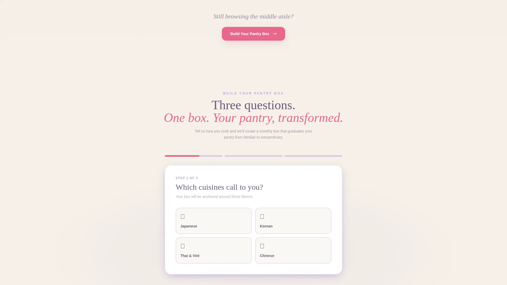
Three quick-tap questions covering cuisine preference, heat tolerance, and household size generate a personalised pantry box preview rendered as its own card grid. Shoppers see exactly what arrives before committing, which reduces hesitation and increases sign-up confidence.
Premium Pantry Upgrade Toggle
Once the base subscription box is assembled, a single toggle reveals the Premium Pantry tier. Rare imports and seasonal exclusives appear as additional cards. The toggle keeps the upsell moment lightweight and low-pressure after the comparison journey has already done the persuading.
Modular Card Grid Layout
Every content block is built from a consistent card module. Origin stories, product comparisons, quiz results, and subscription previews all share the same grid structure. This makes the page easy to scan and straightforward to customise for different product ranges or seasonal campaigns.
Page sections overview
| Section | Purpose |
|---|---|
| Search Hero | Establishes range and invites product discovery |
| Ingredient Icon Field | Adds warmth and signals multi-cuisine authenticity |
| Comparison Grid: Supermarket | Shows the familiar, generic starting point |
| Comparison Grid: Authentic | Reveals the upgraded, origin-backed alternative |
| Pantry Quiz Steps | Captures preference data across three quick taps |
| Box Preview Grid | Displays personalised subscription contents visually |
| Premium Pantry Toggle | Presents the upsell tier with a single interaction |
| Primary call to action Block | Drives sign-up for the Build Your Pantry Box subscription |
Design & branding system
The Lavender Dream palette sits at the heart of every visual decision in this template. It takes cues from a 1970s Hong Kong movie poster, balancing nostalgia with appetite.
- Warm rice-paper cream (#F5F0E8) dominates backgrounds, soft wisteria (#B4A7D6) washes over card borders and dividers, and faded plum ink (#6B5B7B) handles all body text
- Punchy pickled-ginger pink (#E8668B) fires on every price tag, badge, hover state, and clickable element to guide the eye toward action
- The Neo-Retro theme carries through in hand-illustrated icons, pastel card surfaces, and the overall feeling of a well-loved neighbourhood shop reimagined for the screen
Mobile & speed optimization
The modular card grid structure means every section stacks cleanly on smaller screens. Scroll-reveal behaviour keeps the page feeling intentional rather than overwhelming on mobile.
- Card modules reflow into single-column stacks on narrow viewports without losing visual hierarchy
- The quiz component uses large tap targets across its three steps, making it comfortable to complete on a phone
- Lightweight plum line-art icons keep the hero section visually rich without adding heavy asset overhead
How this template helps you convert
Every design and structural decision in Mart is oriented toward a specific conversion outcome. The page earns trust before it asks for a commitment.
- The search hero establishes credibility instantly by anchoring on range and specificity, making first-time visitors feel they have arrived at the right place
- The comparison journey reframes the shopper's existing habits as a missed opportunity, so the subscription box call to action arrives at the exact moment motivation is highest
- The personalised quiz preview shows shoppers their actual box contents before sign-up, removing uncertainty and turning a browse into a confident first purchase
Other information about this template
Mart belongs to the Retail and E-Commerce category with a focus on East Asian Specialty Retail. It is designed as a click-through landing page in a scroll-reveal progressive style.
- The template follows a Neo-Retro creative theme and uses the Lavender Dream color system throughout, distinct from a standard Dopamine Pop palette
- The intersection context for this template aligns with specialty East Asian retail, making it a strong fit for stores carrying Japanese, Korean, Chinese, Thai, and Southeast Asian grocery ranges
- The card-grid structure can support product ranges spanning pantry staples, fresh produce, frozen goods, and specialty imports without requiring a redesign
Theme
Neo-Retro
Creative direction
Unboxing Experience
Color system
Dopamine Pop
Style
Scroll Reveal (Progressive)
Direction
Click-Through
Page Sections
Oversized Search Hero with Ghost Text
Floating Ingredient Icon Animation
Scroll-reveal Comparison Card Grids
Three-step Personalised Pantry Quiz
Premium Pantry Upgrade Toggle
Modular Card Grid Structure
Related questions
Can I use this template for a store that sells multiple Asian cuisines?
Is the pantry quiz functional out of the box?
Can I remove the subscription section if I only sell individual products?
How do I update the comparison card content?
Who is this landing page template designed for?



