Marketing Mastermind Group Landing Page Template
Mastermind is an editorial magazine landing page built for a peer mastermind group serving mid-career marketing professionals. It scrolls like a longform feature, opening with a cinematic team photo and a founder origin story, then moving through member transformation vignettes, a format breakdown, and a single click-through call to action that drives qualified marketers to apply for a seat at the table.
by Rocket studio
Quick summary
Mastermind is a click-through landing page template designed for a marketing professionals mastermind group. It reads like an editorial magazine feature, not a sales page. The scroll moves through a founder story, three member vignettes, and a format section before landing on a single call to action that sends qualified visitors to an application page.
Who this template is for
This template is built for founders or organizers running a peer mastermind community for experienced marketing professionals. It speaks directly to the person building a curated, invitation-style group where credibility and trust matter more than conversion volume.
- Marketing directors, brand strategists, and growth leads with five to twelve years of experience
- Heads of growth at scaling startups who feel intellectually isolated at their companies
- Community organizers running a paid, application-only mastermind for senior marketers
What problem this template solves
Mid-career marketing professionals outgrow general conferences and networking events fast. They run seven-figure ad budgets but rarely find peers who speak their language. A standard sign-up page cannot carry the weight of that emotional truth. This template solves that gap.
- Most landing pages lead with features; this one leads with a story that makes the right reader feel seen
- Generic community pages fail to pre-qualify members; the editorial format earns trust before asking for anything
- A form-first layout would break the intimacy this audience expects; the click-through structure preserves it
What you get with this template
You get a fully structured, single-page editorial layout built around emotional proof and narrative momentum. Every section has a clear job. The design system is pre-set and ready to adapt to your group's identity.
- A hero section with a cinematic team photo header and a serif editorial headline overlay
- Three member vignette sections with pull quotes, inline portrait placeholders, and variable column widths
- A format breakdown section explaining what actually happens at the monthly table
- A click-through call to action ("See If There's A Seat") placed strategically after the third member story and again at the close
- An ultra-minimal footer using a horizontal flow pattern
Feature list
This section covers the specific built-in capabilities and design choices that make this template work for a marketing mastermind community page.
Cinematic Hero with Editorial Headline
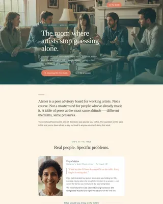
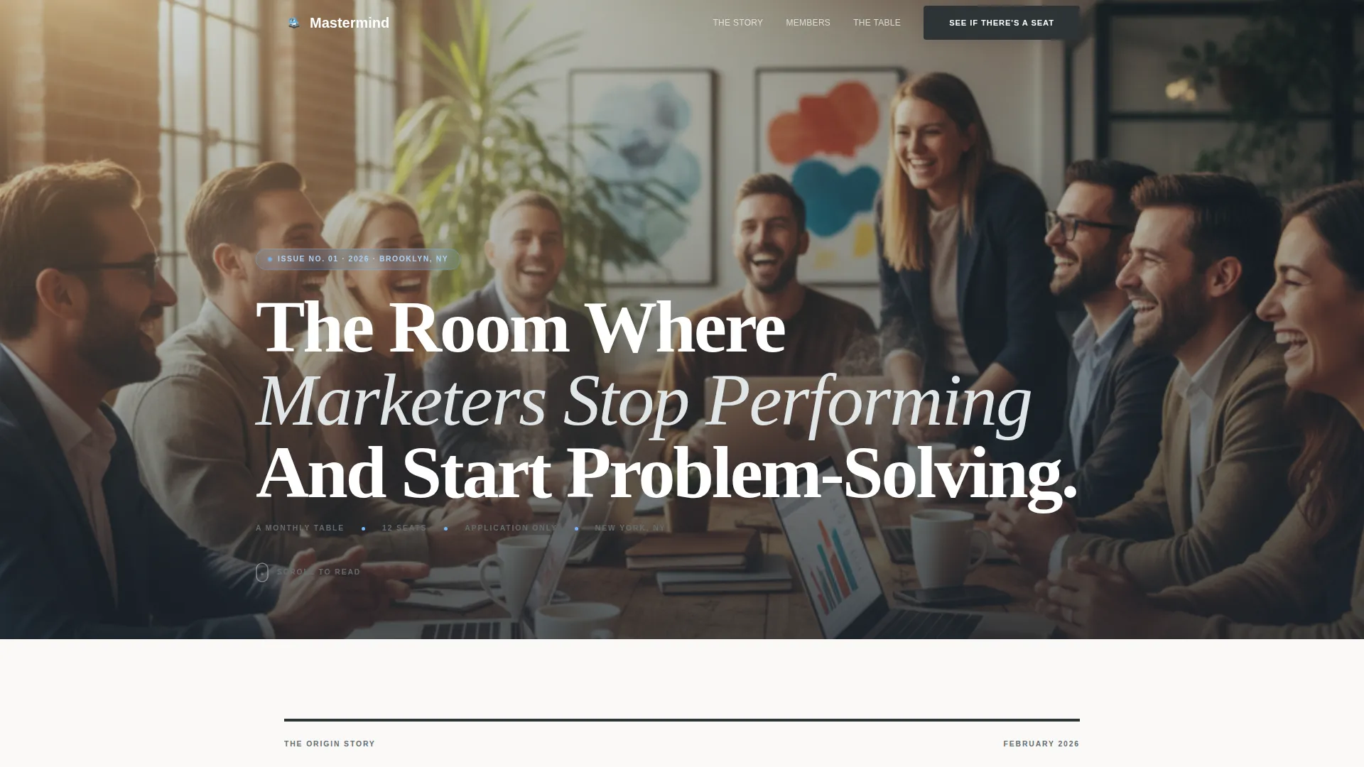
The header opens on a warm, candid team photo shot from the perspective of an empty chair at the table. A large serif headline overlays the image directly, establishing tone and voice before the reader scrolls a single pixel.
Origin Story Scroll Structure
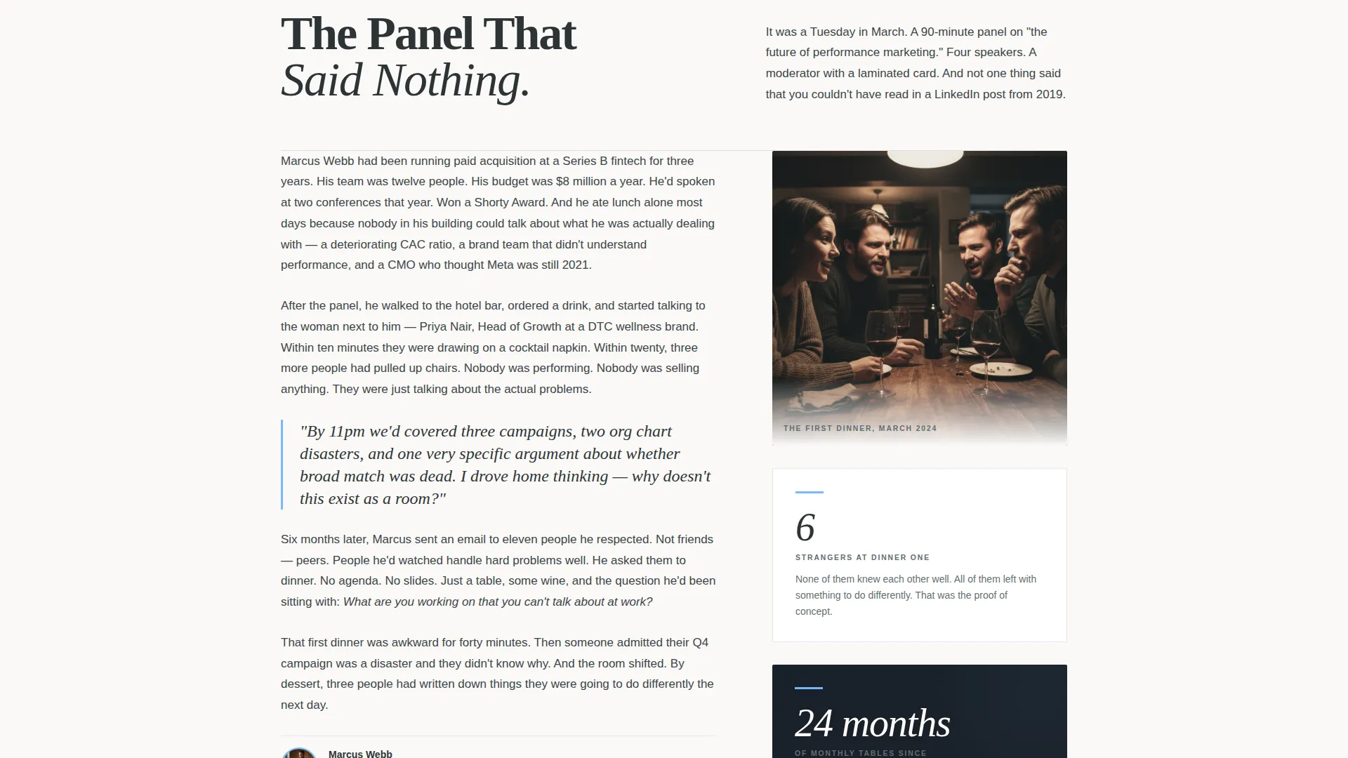
The page unwinds like a longform magazine feature. It opens with the founder's moment of frustration, moves into the first dinner with six strangers, and then expands into member stories. This narrative arc keeps readers reading rather than skimming.
Member Vignette Sections with Pull Quotes
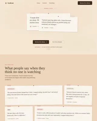
Three dedicated member story sections include pull quote typesetting, inline portrait image blocks, and intentionally varied column widths. The layout keeps the eye moving and the emotional stakes rising with each story.
Strategic Click-Through Call to Action
The primary call to action appears twice: once after the third member vignette and once at the close of the page. There is no form. Every click lands on a separate application page, protecting the quality of the member pipeline.
Scroll-Reveal and Pull Quote Animation
The template includes medium-intensity scroll-reveal animations and staggered pull quote entrance effects. Member card hover states and a magnetic call to action button add interactivity without distracting from the editorial reading experience.
Community Hearth Design System
The full Slate and Sky color palette is pre-configured: deep editorial charcoal for typography-heavy sections, warm slate gray for pull quotes and attributions, open sky blue for interactive moments and link hovers, and quiet dawn white for breathing room between story blocks.
Page sections overview
| Section | Purpose |
|---|---|
| Hero Photo Header | Opens with candid team image and serif editorial headline overlay |
| Founder Origin Story | Longform magazine-style narrative of the founding moment |
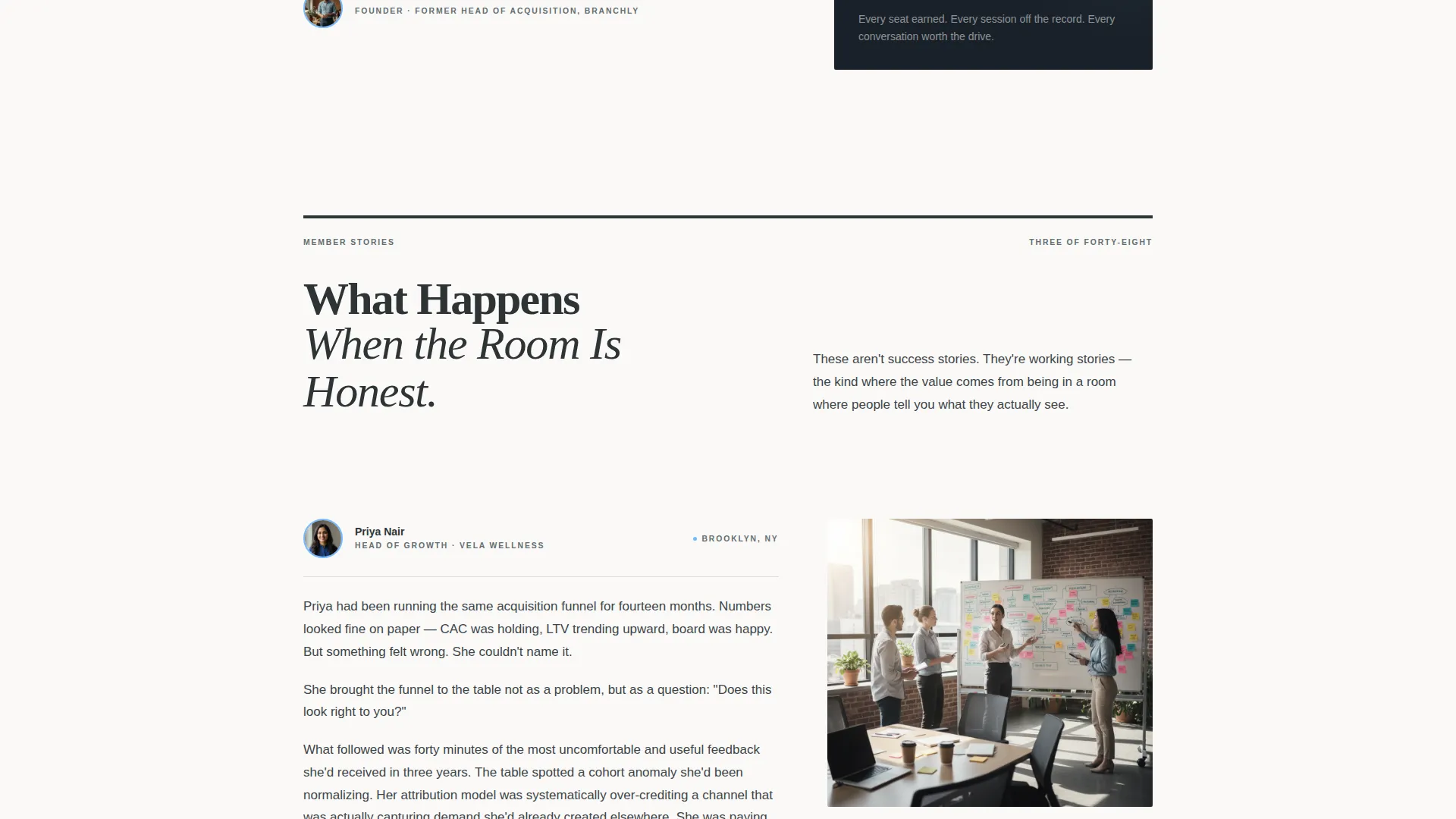
| Member Vignette One | First transformation story with pull quote and inline portrait |
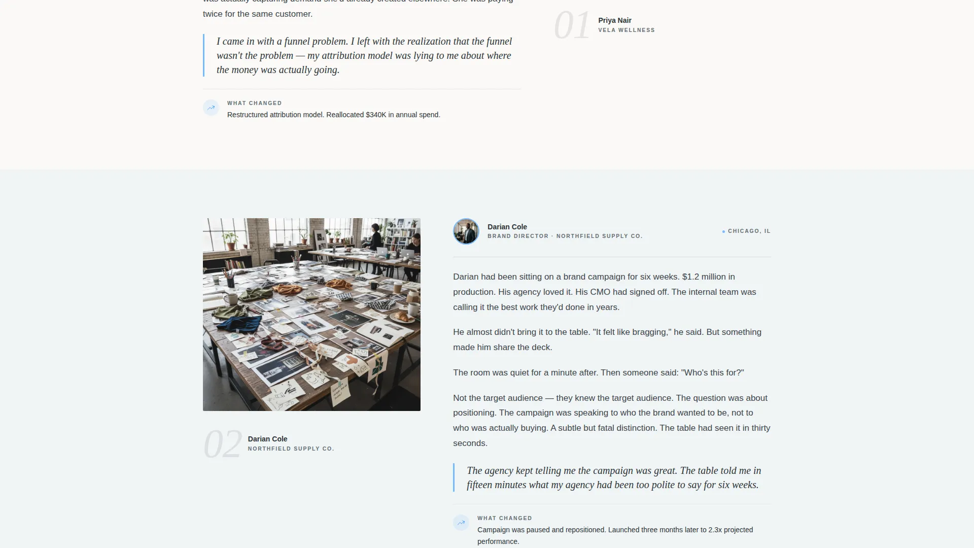
| Member Vignette Two | Second member story with variable column layout |
| Member Vignette Three | Third member story leading into the first call to action |
| First Call to Action | "See If There's A Seat" button after emotional proof builds |
| The Format Section | Explains the monthly table, campaign teardowns, and honest critique |
| Closing Call to Action | Final emotional close with repeated click-through button |
| Minimal Footer | Ultra-minimal horizontal flow footer pattern |
Design & branding system
The visual identity follows a Community Hearth theme built on the Slate and Sky color system. The palette feels intentional and editorial without being cold. Typography pairs a classic serif for headings with a clean sans-serif for body text and interface elements.
- Colors: deep charcoal (#2D3436) for editorial body, warm slate (#636E72) for pull quotes and attributions, sky blue (#74B9FF) for interactive elements and hovers, and dawn white (#DFE6E9) for background breathing room
- Typography: Fraunces serif for all headings and editorial display text; DM Sans for body copy and interface labels
- Visual style: longform journalism aesthetics with dinner-table intimacy, variable column widths, inline portraits, and staggered pull quote layouts
Mobile & speed optimization
The template is built desktop-first to honor the editorial longform reading experience this audience expects. The layout is fully responsive and adapts cleanly to smaller screens without losing the magazine feel.
- Static page architecture with server components keeps the build lean and render-ready
- Optimized image handling supports the large team photo hero without slowing the initial load
- Scroll-reveal and parallax animations are scoped to avoid layout shift on mobile viewports
How this template helps you convert
This template earns the click rather than demanding it. By the time a reader reaches the call to action, they have read three stories from people who sound exactly like them. The question is no longer whether the group is worth it. The question is whether they belong.
- The origin story section builds founder credibility immediately, positioning the mastermind as the answer to a problem every reader already knows they have
- Three member vignettes provide named, specific, story-driven social proof that speaks to the exact peer a qualified applicant wants to sit next to
- The click-through structure removes friction and positions the application page as the natural next step for a self-selecting, high-intent audience
Other information about this template
This template sits at the intersection of community-led growth and editorial design. It was built specifically for the marketing professionals community niche, where trust is currency and peer credibility drives every decision.
- Template style: Editorial and Magazine, suitable for longform narrative community pages
- Landing page direction: Click-Through, routing visitors to a separate application page rather than collecting leads on-page
- Header concept: Team Photo, using a candid group setting rather than staged or stock imagery
- Creative direction: Origin Story arc, giving the scroll a clear narrative beginning, middle, and emotional close
- Color system: Slate and Sky, a palette designed for rooftop-at-dusk editorial warmth
- Category fit: Community and Nonprofit, with a specific alignment to the Marketing Professionals Mastermind Group niche
- Localization: English language, United States context, with a Brooklyn loft aesthetic referenced throughout the design brief
Theme
Community Hearth
Creative direction
Origin Story
Color system
Slate & Sky
Style
Editorial/Magazine
Direction
Click-Through
Page Sections
Cinematic Hero with Editorial Headline
Longform Origin Story Layout
Member Vignettes with Pull Quotes
Strategic Click-through Call to Action
Scroll-reveal and Interactive Animations
Community Hearth Color and Type System
Related questions
Does this template include a sign-up form or lead capture?
Can I adapt the member vignettes to my own community stories?
Is this template suitable for a paid, application-only mastermind group?
What typefaces does this template use?
Can I use this template for a mastermind group outside the marketing industry?