Multiple Sclerosis Care Complete Professional Website Template
A clinical trial finder landing page built for multiple sclerosis patients and their caregivers. A five-step eligibility form matches visitors to active trials based on their MS subtype, treatment history, and zip code. The page leads with aggregate proof, then narrows to personalized results through a side-by-side comparison table designed for quick, confident decisions.
by Rocket studio
Quick summary
This landing page template connects MS patients to active clinical trials through a guided five-step eligibility form. It opens with a single focused question, builds trust with animated statistics, then delivers matched trial results in a side-by-side comparison table. The design is clinical in structure and human in tone, built for patients who need clarity, not more noise.
Who this template is for
This template is built for health tech teams, patient advocacy organizations, and clinical research coordinators who need to match MS patients with active trials quickly and compassionately.
- Newly diagnosed patients navigating relapsing-remitting MS (RRMS), primary progressive MS (PPMS), or secondary progressive MS (SPMS) for the first time
- Long-term patients whose current disease-modifying therapies (DMTs) are no longer effective and who are actively looking for next steps
- Caregivers searching late at night for trial options that a specialist has not yet surfaced
What problem this template solves
Finding an appropriate clinical trial today means months of phone calls, scattered databases, and neurologist referrals that move slowly. Patients are left to decode dense eligibility criteria on their own, often without knowing which MS subtype qualifies or how far they would need to travel.
- Patients abandon the search because every existing tool feels built for researchers, not people
- Caregivers hit walls of jargon at the exact moment they need a clear, direct answer
- Clinical research teams lose qualified candidates who never made it through the discovery process
What you get with this template
You get a fully structured single-page layout that guides visitors from first question to matched trial results without friction. Every section has a defined job, and the visual hierarchy keeps the experience feeling focused rather than overwhelming.
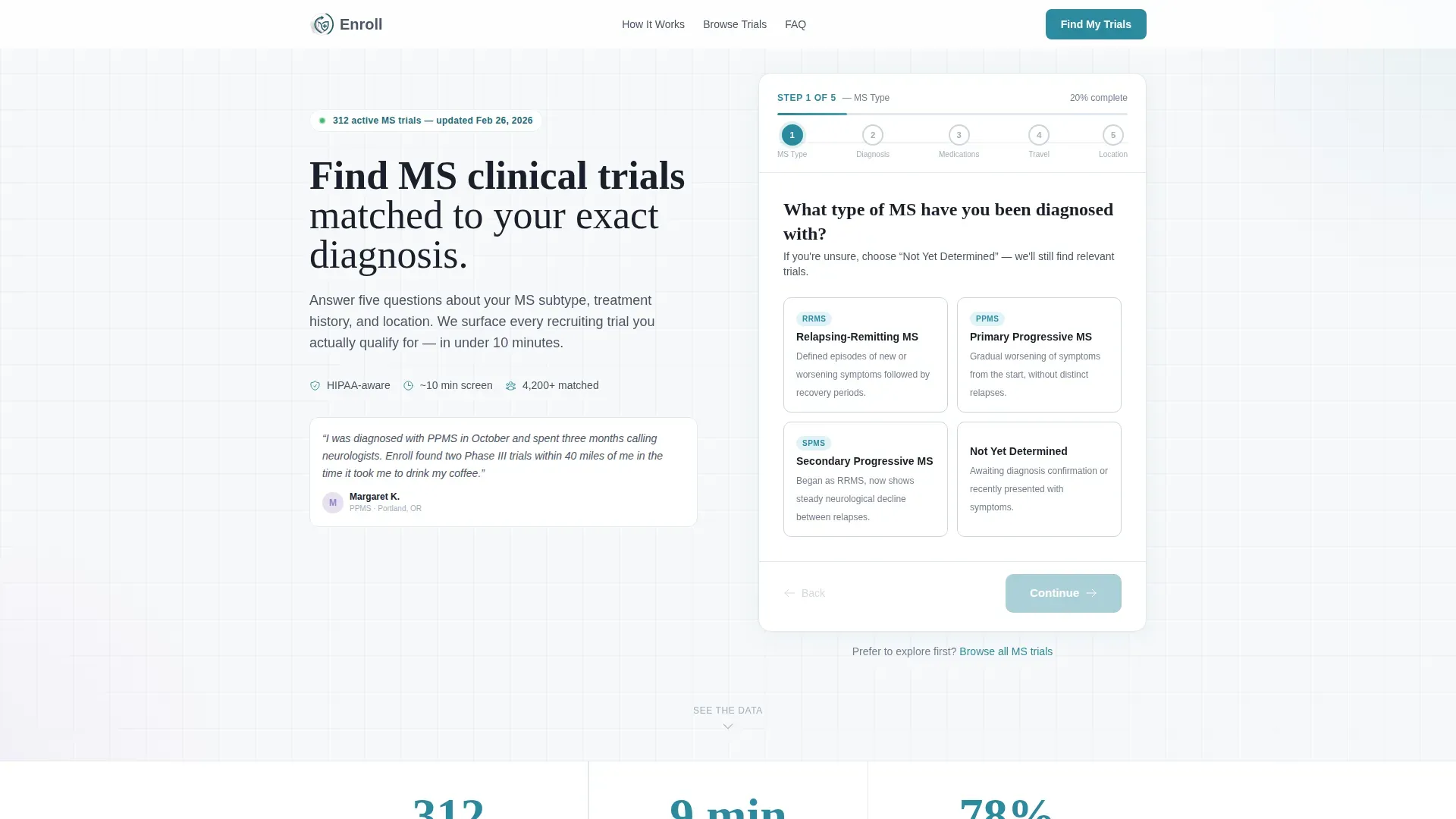
- A five-step eligibility form with a progress bar, single-question screens, and teal-styled MS subtype selection buttons
- An animated statistics block showing active trial counts, average match time, and qualification rates
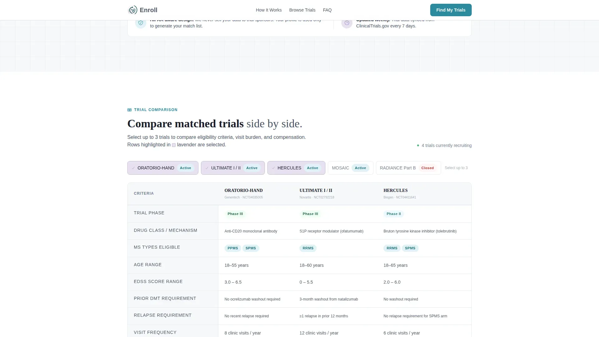
- A side-by-side comparison table with lavender-highlighted rows so visitors can evaluate matched trials clearly
Feature list
This template includes purpose-built components that serve patients at each stage of their decision process.
Five-Step Eligibility Form
The form opens above the fold with no hero image. The first screen asks one question: which MS subtype applies to the visitor. Four labeled buttons handle RRMS, PPMS, SPMS, and "Not Yet Determined." Each subsequent step covers years since diagnosis, current medications, willingness to travel, and zip code. A slim progress bar tracks advancement across all five steps.
Animated Statistics Block
Three large typographic counters appear directly below the form on scroll. Each counter animates upward on entry, displaying the number of active MS trials currently recruiting, the average time to a match, and the percentage of users who qualified for at least one trial. Seeing proof before being asked personal questions builds the trust that drives form completion.
Side-by-Side Trial Comparison Table
After assessment completion, matched trials appear in a structured comparison table. Rows represent trial phase, drug class, and eligibility criteria. Columns allow visitors to compare two or three trials at once. Lavender row highlights keep the active selection visible as the user scans across columns.
Asymmetric How It Works Section
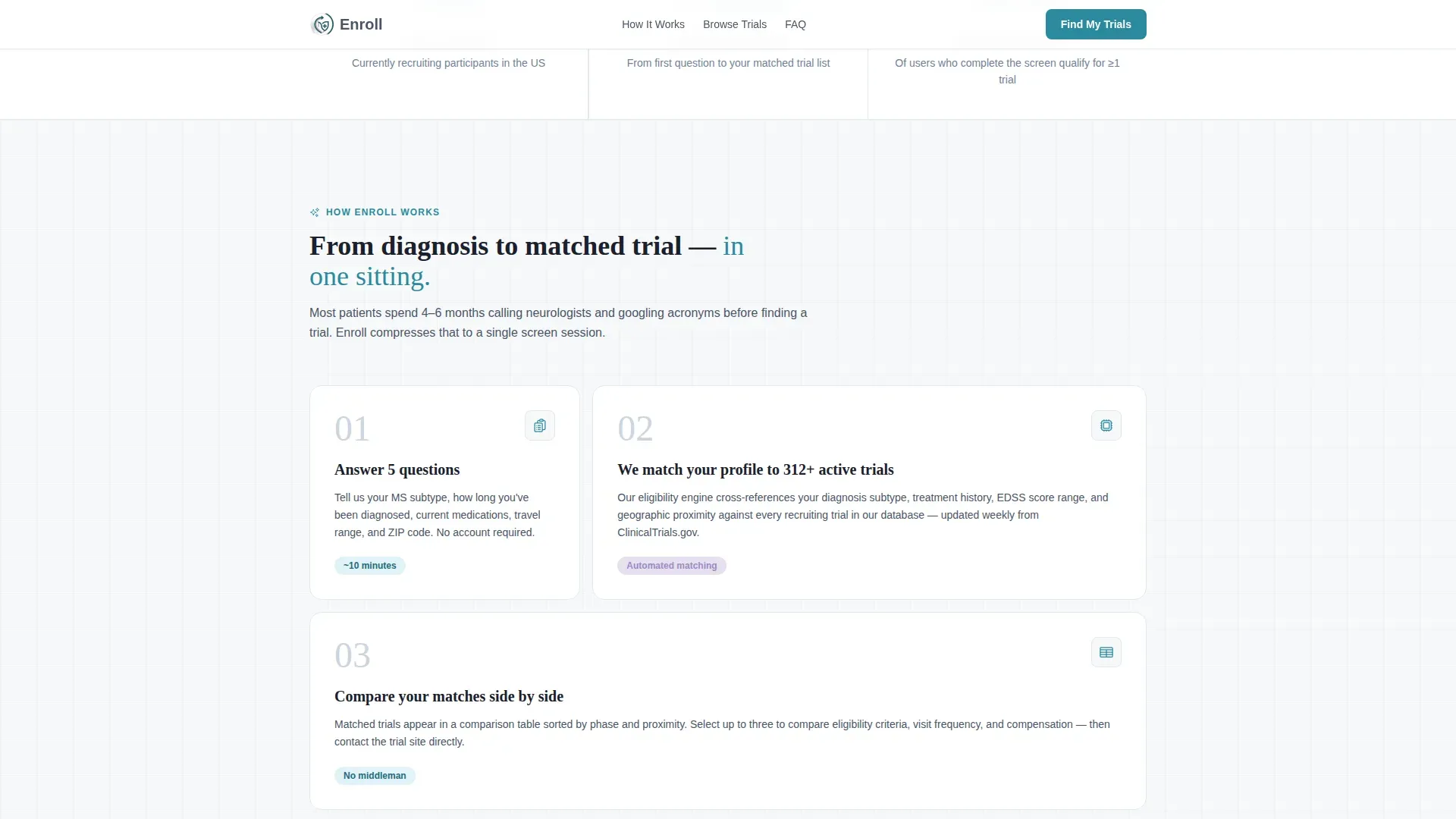
A three-step bento-layout section explains the matching process without a linear timeline. Each step is a distinct card, not a numbered sequence. This keeps the explanation feeling like a conversation rather than a procedure.
Trust and Final Call to Action Section
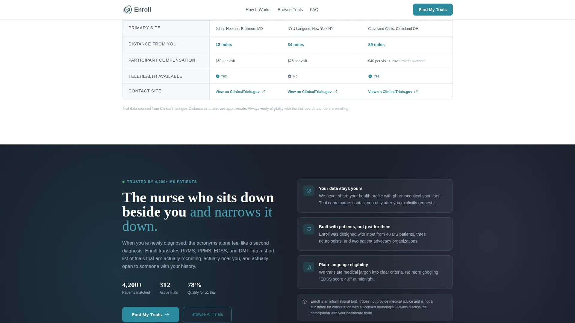
A dark-toned reassurance section closes the main content with a second "Find My Trials" call to action. This section reinforces confidence for visitors who scrolled through the full page before committing. A secondary text link, "Browse All MS Trials," gives hesitant visitors an alternative path that requires no personal information.
Page sections overview
| Section | Purpose |
|---|---|
| Multi-Step Form Header | Capture MS subtype and begin eligibility screening above the fold |
| Animated Stats Block | Build trust with trial count, match time, and qualification rate |
| How It Works | Explain the three-step matching process in a bento card layout |
| Trial Comparison Table | Let users compare matched trials side by side with highlighted rows |
| Trust and Call to Action | Reinforce confidence and present the final "Find My Trials" prompt |
| Footer | Provide single-row navigation and supporting links |
Design & branding system
The visual identity follows a Corporate Precision theme using a Cloud Canvas color system. The palette is clinical enough to feel trustworthy and warm enough to feel human. Fraunces handles display headings and DM Sans handles all body text, pairing a structured serif with a clean geometric sans-serif.
- Backgrounds use clinical white (#F7F8FA), body text uses calm slate (#4A5568), and interactive elements including buttons and progress indicators use reassuring teal (#2B8A9E)
- Soft lavender (#E8E0F0) washes over active states and selected comparison table rows so the user's eye never loses its place
- Teal-outlined cards on the MS subtype selection step signal immediately that this page does something useful rather than just presenting information
Mobile & speed optimization
The template is built desktop-first with a strong mobile fallback. Caregivers searching at midnight on their phones represent a primary use case, and the layout accommodates smaller screens without losing the comparison table's functionality.
- Single-question form screens avoid cognitive overload on small displays, keeping each step clean and easy to tap
- Static page sections use server-side rendering for fast initial loads, while the interactive form and comparison table load as client components to keep the experience responsive
- Scroll-reveal animations and counter tickers are kept at medium intensity so the page feels dynamic without causing delays on mobile connections
How this template helps you convert
Every design decision in this template is built around a single conversion goal: completing the five-step eligibility form and clicking "Find My Trials."
- The form starts above the fold with a single, non-threatening question, lowering the barrier to entry before any personal data is requested. Aggregate statistics appear first, so visitors see proof of value before they commit to sharing their zip code or medication history.
- The comparison table makes matched results feel earned. Visitors who complete the form see their specific trials presented side by side, which shifts the experience from passive browsing to active, personal decision-making.
- The secondary "Browse All MS Trials" text link captures visitors who resist qualification screens, giving them a lower-commitment path that keeps them on the page rather than sending them away.
Other information about this template
This template is categorized under Health and Medical, specifically within the Multiple Sclerosis Care subcategory and the Multiple Sclerosis Clinical Trial Finder niche. It is built for a United States audience using zip codes for geographic proximity matching.
- The template uses Fraunces for display type and DM Sans for body copy, a pairing chosen for clinical warmth that avoids the coldness of purely technical typefaces
- Animation intensity is set to medium: counter tickers, step transitions, scroll reveals, and table row highlights are all included without overwhelming the page
- The intersection match score for this template across its category, subcategory, and niche alignment is 13, reflecting a high degree of specificity to the MS patient-matching use case
- The footer follows a linear single-row pattern, keeping navigation minimal and focused so nothing competes with the primary form conversion
Theme
Corporate Precision
Creative direction
Stats-First Impact
Color system
Cloud Canvas
Style
Comparison Table
Direction
Quiz/Assessment
Page Sections
Five-step Eligibility Form with Progress Bar
Animated Statistics Counter Block
Side-by-side Trial Comparison Table
Asymmetric How It Works Bento Layout
Trust Section with Dual Call to Action
Related questions
Who is this landing page template designed for?
What does the five-step eligibility form ask?
Can visitors skip the form and browse trials directly?
How does the trial comparison table work?
Does this template work well on mobile devices?



