Specialist Telemedicine & Health Tech Comparison Website Template
Enroll is a precision clinical trial matching landing page template built for health tech platforms that connect patients to clinical trials faster. It uses a Problem-to-Solution scroll arc, a side-by-side comparison table, a narrowing funnel visualization, live site metrics, and a guided eligibility quiz to move coordinators, sponsors, and patients from skepticism to action.
by Rocket studio
Quick summary
Enroll is a single-page clinical trial matching template designed for health tech platforms that automate the recruitment process. It walks visitors through a sharp contrast between manual pre-screening and automated trial matching, then routes them into a guided eligibility quiz. The result is a focused conversion path that works for clinical research coordinators, pharmaceutical sponsors, and patients navigating complex study options.
Who this template is for
This template serves three audiences who each face distinct challenges inside the clinical trial recruitment pipeline. Every section is calibrated to speak their language without losing any of the others.
- Clinical research coordinators (CRCs) who manage pre-screening spreadsheets and need tools that cut screening time per eligible patient
- Pharmaceutical sponsors tracking enrollment velocity, diversity benchmarks, and sponsor audit outcomes across participating sites
- Patients with rare diagnoses who have exhausted public databases and need a clearer path to identify trials based on their medical history and condition
What problem this template solves
Approximately 80% of all clinical studies fail to meet their designated enrollment timelines, particularly in oncology. The gap is not a shortage of patients or trials. It is a process problem. Manual pre-screening is slow, error-prone, and makes it hard to find patients who meet specific inclusion and exclusion criteria at scale.
- Coordinators lose hours to manual review of eligibility criteria, cross-referencing medical records against a growing database of open studies
- Sponsors watch timelines slip as screen-failure rates climb and recruitment goals drift further from calendar reality
- Patients cannot connect to the right trials because the matching process is opaque, jargon-heavy, and fragmented across sites
What you get with this template
This template delivers a complete, scroll-driven landing page structured around a Problem-to-Solution arc. Every section builds the case for automated clinical trial matching before presenting the conversion moment.
- Hero section with a portrait-centered coordinator photograph, glassmorphism overlay card, and a headline that leads with specificity
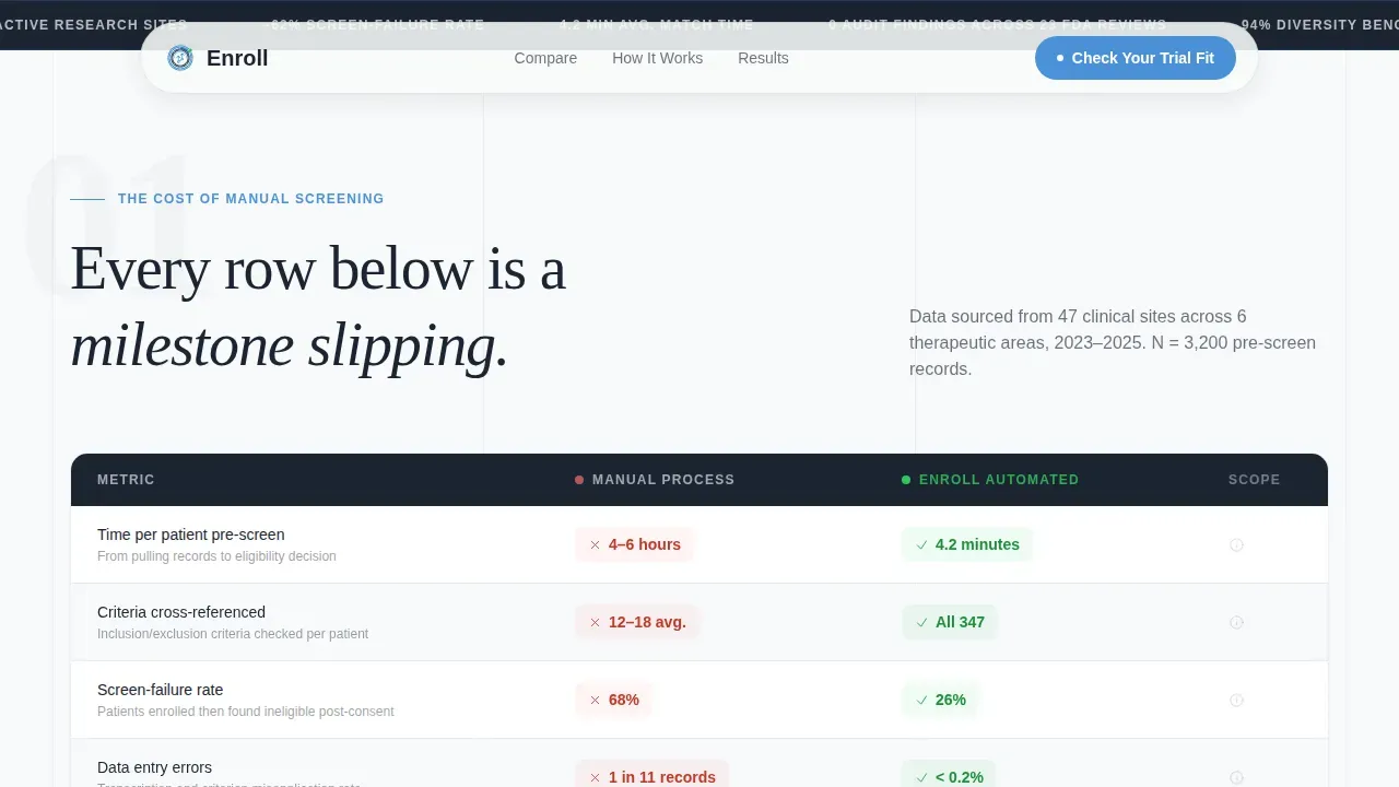
- Comparison table contrasting manual screening workflow versus automated trial matching across time per patient, error rates, and screen-failure percentages
- Matching funnel visualization, site metrics section, and a multi-step quiz modal with match score reveal and lead capture
Feature list
This template includes purpose-built components designed specifically for clinical trial recruitment platforms in the health technology industry.
Side-by-Side Comparison Table
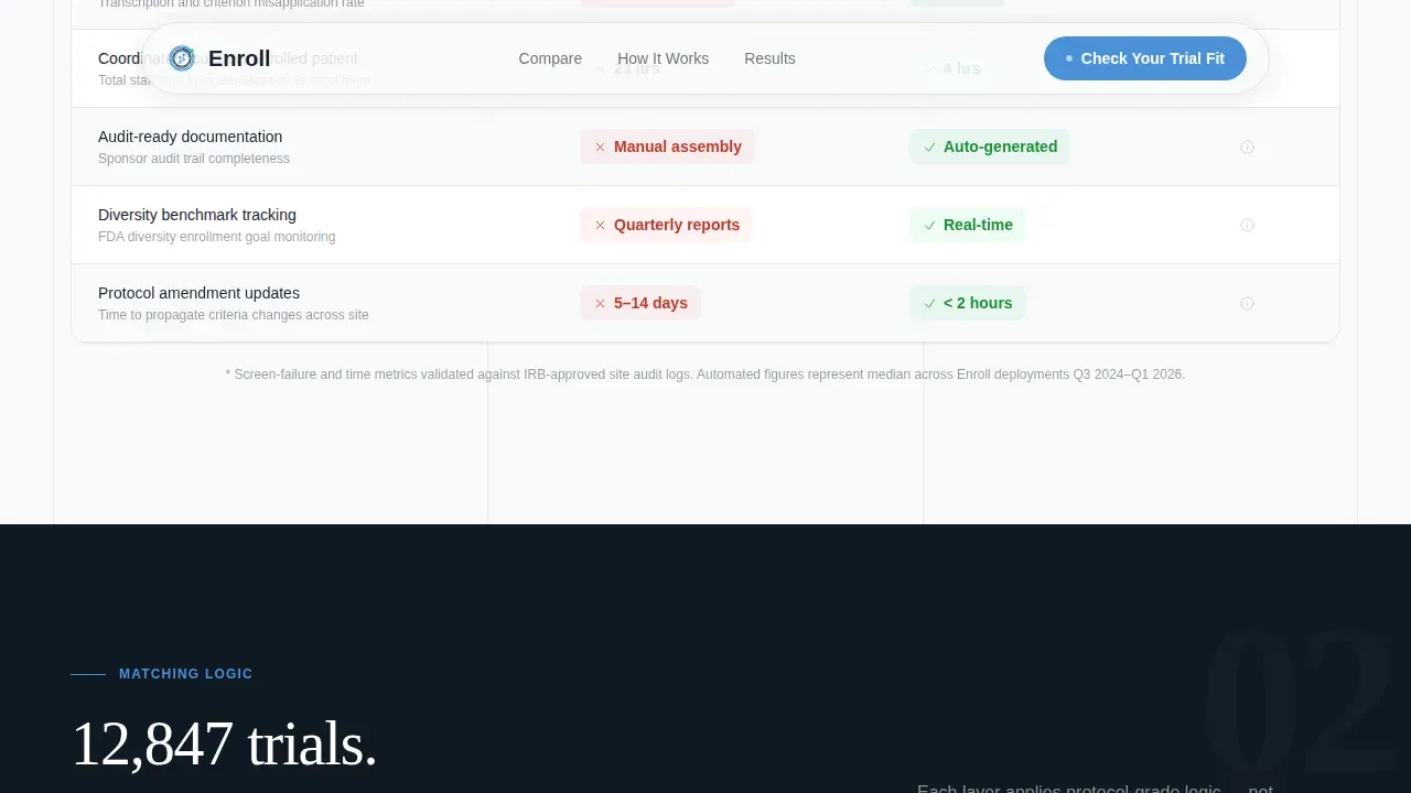
The comparison table is the structural center of the page. It places manual screening workflow directly beside automated trial matching, row by row, covering time investment, error rates, and screen-failure percentages. Each row makes the old process more visibly unsustainable, building pressure toward the quiz call to action.
Guided Eligibility Quiz Modal
The multi-step quiz launches from the primary call to action, "Check Your Trial Fit." It progresses through therapeutic area, condition specificity, biomarker status, prior treatments, and geography. The language mirrors what coordinators already use during pre-screening calls, so potential participants and coordinators alike respond to it as familiar rather than clinical jargon.
Match Score and Lead Capture Flow
After the quiz, visitors receive a match score alongside blinded trial counts. A secondary call to action, "Request Full Match Report," captures institutional email and role title. This two-step structure lets the platform qualify candidates before a sales conversation, separating high-intent researchers and coordinators from casual browsers.
Narrowing Funnel Visualization
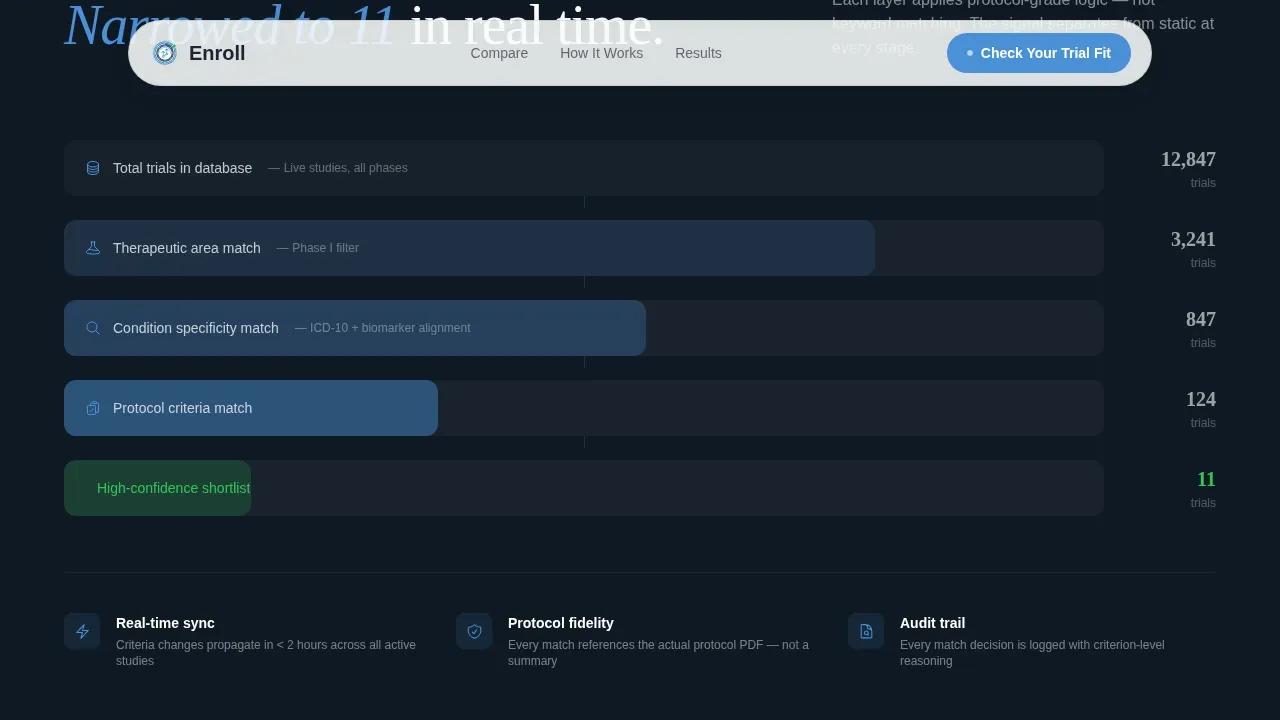
A scroll-triggered funnel shows thousands of open trials filtering down to a shortlist in real time. The animation reinforces how the platform handles inclusion and exclusion criteria systematically, giving investigators and sponsors a visual proof point before they ever read a case study.
Live Site Metrics Section
This section surfaces real deployment data: enrollment velocity, diversity benchmarks reached, and sponsor audit outcomes. Concrete numbers from participating sites give key stakeholders the evidence they need to evaluate the platform against their own recruitment goals.
Portrait-Centered Hero with Scroll Animations
The cinematic hero features a tightly cropped coordinator photograph with ambient monitor glow and a lanyard badge visible. The headline fades in over their shoulder. Scroll-triggered reveals and table-row stagger animations sustain momentum as visitors move through the Problem-to-Solution arc.
Page sections overview
| Section | Purpose |
|---|---|
| Hero with portrait | Establish credibility and introduce the core value of precision trial matching |
| Comparison table | Show manual versus automated screening workflow side by side |
| Matching funnel | Visualize how thousands of trials narrow to a qualified shortlist |
| Site metrics | Present live enrollment and diversity data from real deployments |
| Quiz call to action | Launch the guided eligibility assessment and capture qualified leads |
| Footer (single row) | Provide navigation, compliance links, and privacy policy access |
Design & branding system
The visual identity follows a Corporate Precision theme. Every design decision reinforces clinical accuracy and builds the kind of trust that data-driven medicine demands.
- Color system: Arctic White (#F8FAFB) as the dominant field, instrument-grade charcoal (#1B2432) for primary text, sterile blue (#4A90D9) on interactive elements and table highlights, and verification green (#34C759) reserved exclusively for match-confirmed states
- Typography: DM Sans for body precision and data-dense table rows; Fraunces as an editorial serif accent for headlines and pull quotes, creating contrast without noise
Mobile & speed optimization
The template is built desktop-first because clinical research coordinators and investigators primarily work on desktop screens where data-dense comparison tables are easiest to read. Mobile responsiveness is still addressed so patients searching for treatment options on smartphones can access and complete the pre-screening quiz.
- Static hero image priority load keeps the cinematic portrait entrance fast, with CSS scroll animations handling reveals and funnel motion to minimize JavaScript overhead
- Minimal JavaScript footprint keeps the quiz modal and match score reveal responsive without bloating the page, supporting smooth participation across device types
How this template helps you convert
The page is engineered as a progressive persuasion sequence. Each scroll position removes an objection and adds a reason to act.
- The comparison table creates urgency by quantifying the cost of the manual recruitment process in time, error rates, and screen-failure percentages, giving coordinators and sponsors concrete data to evaluate their current practices against.
- The quiz modal qualifies intent by guiding visitors through protocol-style questions that mirror real pre-screening language, so by the time they reach the match score, they have already mentally enrolled in the process of finding a potential match.
- The two-step lead capture converts curiosity into pipeline by delivering a blinded match score first and then requesting institutional email and role title for the full report, ensuring the platform can connect with the right candidates at the right moment.
Other information about this template
This template is designed for platforms operating in the clinical trial matching space where data interoperability, regulatory compliance, and patient trust are non-negotiable considerations for industry partners.
- Effective trial matching platforms integrate patient characteristics, eligibility criteria, site identifiers, and site operational status to deliver actionable results
- Decentralized clinical trials are reshaping the recruitment landscape, and this template can support messaging for platforms that extend access to patients who live far from traditional research sites, helping develop more regionally and ethnically diverse study populations
- The template structure supports audience selection, so visitors can self-identify as patients or physicians before entering the quiz flow, tailoring the experience to each group
- Artificial intelligence and machine learning techniques are increasingly central to modern trial matching, and the page's funnel visualization and match score components can represent these capabilities when supported by the underlying platform
- The Enroll precision clinical trial matching landing page template is well-suited to platforms that help clinics and hospitals find patients who qualify for studies within their network, including cancer care centers running precision oncology programs
- TriHealth reported a 64% annual increase in patients enrolled in clinical trials, with the Tempus TIME program accounting for 95% of that growth, demonstrating what focused patient matching tools can achieve at the site level
- Aadi Bioscience used a similar approach to accelerate enrollment for its PRECISION 1 trial by using automated tools to identify patients with rare mutations, showing how targeted matching reduces time-to-enrollment even for highly specific study criteria
- Incorporating sponsor logos, Institutional Review Board (IRB) approval badges, and a clear privacy policy link are recommended practices for the landing page, as these serve as trust signals for both patients and investigators
- Training materials and onboarding resources for coordinators using the platform can be linked from the footer or referenced in the quiz flow to support site-level adoption
- The page includes a linear single-row footer pattern with space for compliance links, privacy policy access, and additional information for institutional partners

Theme
Corporate Precision
Creative direction
Problem→Solution Arc
Color system
Arctic White
Style
Comparison Table
Direction
Quiz/Assessment
Page Sections
Side-by-side Screening Comparison Table
Multi-step Eligibility Quiz Modal
Match Score and Two-step Lead Capture
Animated Narrowing Funnel Visualization
Live Deployment Metrics Section
Cinematic Portrait Hero with Scroll Reveals
Related questions
Who is this template designed for?
Does the quiz modal support multi-step eligibility screening?
Can this template handle both patient-facing and physician-facing messaging?
Is the comparison table editable for different trial types?
What conversion path does this template follow?



