Advanced Maxillofacial Surgeon Professional Website Template
Maxilla is a hub and spoke anchor-nav landing page template built for maxillofacial surgery patient portals. It organizes every pre-surgical, day-of, recovery, and follow-up step into numbered checklists patients can trust. A sticky anchor nav, a three-field qualifier form, and a primary download call to action make complex surgical preparation feel clear and navigable from the first scroll.
by Rocket studio
Quick summary
Maxilla is a single-page patient portal landing page designed for maxillofacial surgical practices. It guides referred patients through every phase of their procedure using an anchor-nav hub and spoke structure. Clinical detail builds authority early, and a personalized surgical prep kit download closes the conversion with confidence.
Who this template is for
This template is built for maxillofacial surgical practices that receive referred patients from orthodontists, emergency departments, and oncology teams. It suits practices performing orthognathic surgery, trauma reconstruction, TMJ procedures, and implant work that need a clear patient-facing preparation resource.
- Maxillofacial surgeons managing high-complexity referral pipelines from multiple provider types
- Practices that want to reduce pre-operative phone calls by giving patients a self-serve preparation hub
- Clinics serving patients who arrive anxious and need step-by-step procedural clarity before their first appointment
What problem this template solves
Referred surgical patients often arrive underprepared. Imaging is missing, medication holds are misunderstood, and fasting windows go unread in PDF attachments. This template turns that fragmented experience into a structured, scannable portal that patients actually engage with before surgery day.
- Patients cannot easily find or follow preparation steps scattered across emails and intake forms
- Referring providers lack a fast, reliable pathway to submit imaging and referral records securely
- Practices lose time managing avoidable pre-operative confusion that a well-organized page could prevent
What you get with this template
You get a fully structured hub and spoke landing page with a persistent anchor navigation bar, six clearly defined content spokes, and a conversion hub centered on a three-field qualifier form. Every section is self-contained and immediately legible when a patient jumps directly to it.
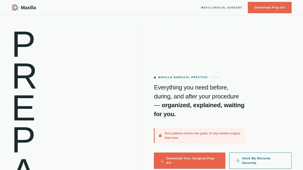
- A hero section with a Stacked Type Tower header, animated SVG grid lines, and an anchor nav bar that pins to the top of the viewport
- Five content spokes covering Pre-Surgical, Day-Of, Recovery, and Follow-Up phases, each opening with a numbered checklist
- A central call-to-action hub with a procedure qualifier form, a primary download action, and a secondary secure records upload pathway
Feature list
This template ships with a focused set of interactive and layout components, each chosen to serve the surgical preparation context directly.
Sticky Anchor Navigation Bar
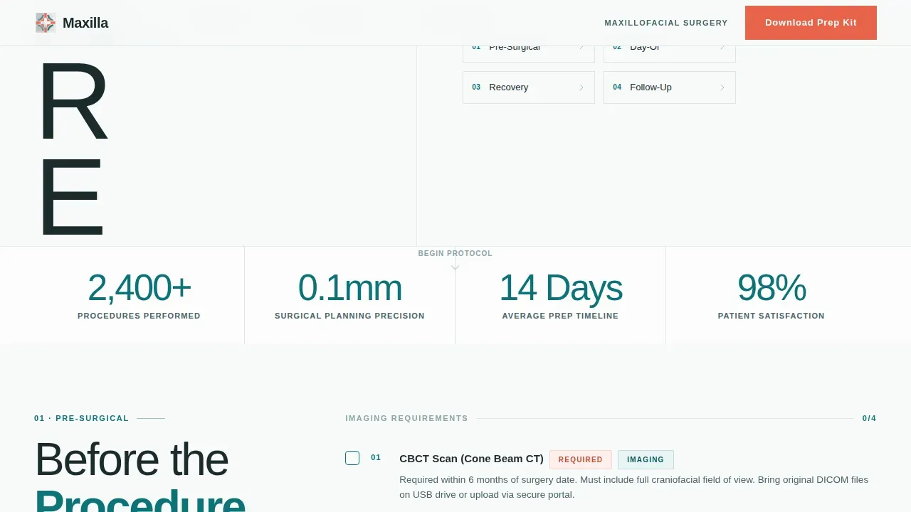
A persistent top navigation bar displays four spoke labels: Pre-Surgical, Day-Of, Recovery, and Follow-Up. It tracks active section state as the visitor scrolls, letting patients jump to any phase instantly without losing context.
Numbered Checklist Sections
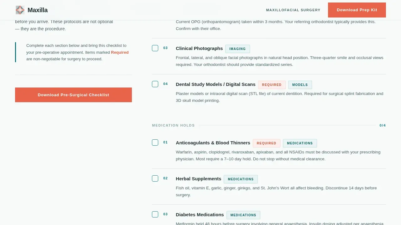
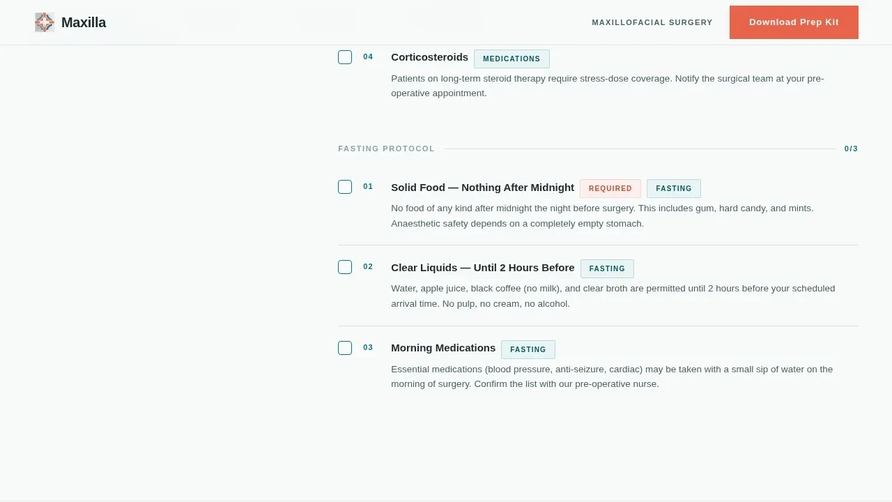
Each spoke opens with a numbered checklist that patients can mentally work through. Items cover imaging requirements, medication holds, fasting windows, compression garment sizing, and post-operative dietary progressions from liquid to soft to full diet.
Three-Field Qualifier Form
The central call-to-action hub includes a short qualifier form with three fields: procedure type, surgery date range, and referring provider. This information shapes the personalized surgical prep kit PDF the patient downloads.
Secure Records Upload Pathway
A secondary call-to-action links to an encrypted upload portal where patients and referring providers can submit imaging files and referral letters. It runs as a distinct pathway from the primary download conversion.
Scroll-Reveal Checklist Animation
Checklist items reveal on scroll using medium-weight animation. SVG grid lines traverse the viewport as the page loads, reinforcing the clinical precision aesthetic without using photography or illustration.
Timeline Card Layout
The Day-Of spoke uses a timeline card layout to map arrival, theatre preparation, and procedural expectations in a linear sequence. It gives patients a clear mental model of exactly what will happen on surgery day.
Page sections overview
| Section | Purpose |
|---|---|
| Hero Tower | Introduces the portal with stacked PREPARE typography, SVG grid animation, and the sticky anchor nav |
| Pre-Surgical Checklist | Covers imaging requirements, medication holds, and fasting protocol in a numbered checklist |
| Day-Of Timeline | Walks patients through arrival, theatre prep, and procedural expectations via timeline cards |
| Recovery Guide | Delivers phased dietary progressions, wound care steps, and compression garment guidance |
| Follow-Up Schedule | Outlines appointment cadence, imaging review milestones, and long-term outcome context |
| Download call to action Hub | Houses the three-field qualifier form, primary prep kit download, and secure records upload |
| Footer | Single-row linear footer with practice information and navigation links |
Design & branding system
The visual identity follows a Medical Clarity theme driven by the Teal Catalyst color system. The palette is intentionally minimal, clinical, and direct. Teal dominates section headers and the anchor nav. Charcoal grounds long-form reading. White breathes between content blocks. Coral appears only where immediate patient attention is required.
- Surgical teal (#0D7377) anchors section headers and the persistent navigation rail; sterile field white (#F7FAFA) provides the page background; deep mandible charcoal (#1C2B2D) carries body text
- Catalyst coral (#E8634A) is reserved exclusively for action states, progress indicators, and incomplete-step alerts, never used decoratively
- Typography runs on DM Sans at ultra-light weight for the hero tower and medium weight for body copy, keeping every line of text functional and legible
Mobile & speed optimization
The template is built desktop-first, prioritizing the wide-viewport CBCT scan aesthetic that suits the clinical content density. Full mobile responsiveness is included, and the component architecture separates static and interactive concerns cleanly.
- Server Components handle static content sections to keep initial load light; Client Components power the sticky anchor nav and qualifier form
- The Stacked Type Tower and checklist layouts reflow for smaller screens without losing their structural clarity
- Animation weight is set to medium, keeping scroll-reveal checklists and SVG grid lines smooth without overloading mobile rendering
How this template helps you convert
The conversion strategy is built on earned authority. By the time a patient reaches the download call to action, the page has already proven how thorough and organized this practice is. The kit download feels like a natural next step in a process the patient has already begun.
- Patients scroll through detailed, phase-specific checklists that build immediate trust in the practice's clinical precision before any action is requested
- The three-field qualifier form personalizes the surgical prep kit to the patient's specific procedure, surgery timeline, and referring provider, making the download feel uniquely relevant
- The secure records upload secondary path captures referring provider engagement and imaging submissions alongside the primary patient conversion
Other information about this template
This template is designed specifically for the maxillofacial surgeon patient portal niche within the broader Health and Medical category. It sits at the intersection of clinical communication design and conversion-focused landing page architecture.
- The Checklist and Audit creative direction drives the scroll rhythm, metabolizing patient anxiety into concrete action items section by section
- The Stacked Type Tower header concept uses pure typography as architecture, with no reliance on medical photography or stock imagery
- The Hub and Spoke anchor-nav template style makes each spoke section independently navigable, supporting patients who jump directly to the phase most relevant to their stage of preparation
- The Content and Resource landing page direction means conversion is earned through demonstrated organizational authority, not aggressive promotion
Theme
Medical Clarity
Creative direction
Checklist & Audit
Color system
Teal Catalyst
Style
Hub & Spoke (Anchor Nav)
Direction
Content/Resource
Page Sections
Sticky Anchor Navigation Bar
Numbered Checklist Sections
Three-field Qualifier Form
Secure Records Upload Pathway
Scroll-reveal Checklist Animation
Day-of Timeline Card Layout
Related questions
Who is this landing page template designed for?
What does the surgical prep kit download involve?
Can referring providers use this page to submit records?
Does the template use medical photography or stock imagery?
Can patients jump directly to a specific phase without reading the full page?



