Flight School Marketing Specialist Booking Website Template
Mayday is a single-page landing page template built for flight schools that specialise in emergency procedures training. It uses an editorial black-and-white visual style, a structured zigzag layout, and a calm, clinical tone to move student pilots, returning flyers, and CFIs toward booking a focused emergency training block.
by Rocket studio
Quick summary
Mayday is a landing page template for flight schools offering emergency procedures training. The layout follows a zigzag alternating structure that mirrors the brief-fly-debrief training cycle. Arctic White editorial styling, amber call-to-action elements, and a transparent process narrative work together to build trust and drive bookings from pilots at every certificate level.
Who this template is for
This template was designed for a specific type of flight training operation. It speaks directly to instructors and students who treat emergency readiness as a skill gap worth fixing, not a checkbox.
- Student pilots in checkride preparation who have failed a stage check on emergency procedures
- Weekend pilots returning after a lapsed medical certificate who need structured rust removal
- Certificated Flight Instructors (CFIs) who want to send students to a programme that drills the startle factor out of them
What problem this template solves
Most flight school pages list services and stop there. They do not show the training process, so prospective students arrive uncertain and leave without booking. Mayday solves that confidence gap.
- Visitors do not understand what emergency training actually looks like minute by minute, so they hesitate to commit
- Generic flight school pages fail to signal that this operation handles high-stakes scenarios differently from a standard lesson
- The booking step feels like a leap of faith when no process has been revealed in advance
What you get with this template
You get a complete, single-page layout that earns the booking before it asks for it. Every section is designed to remove doubt and show exactly how training works.
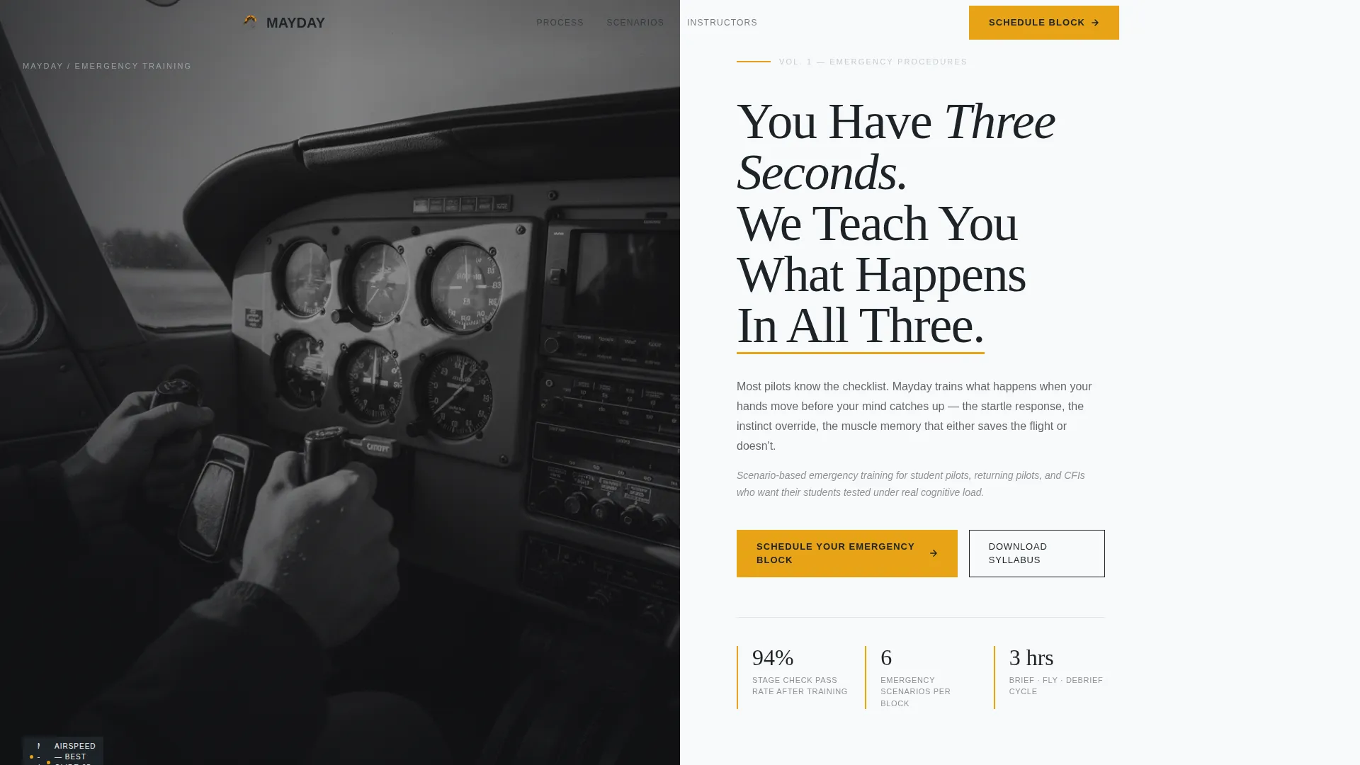
- A half-page photo and text header with editorial headline and byline-style subtext
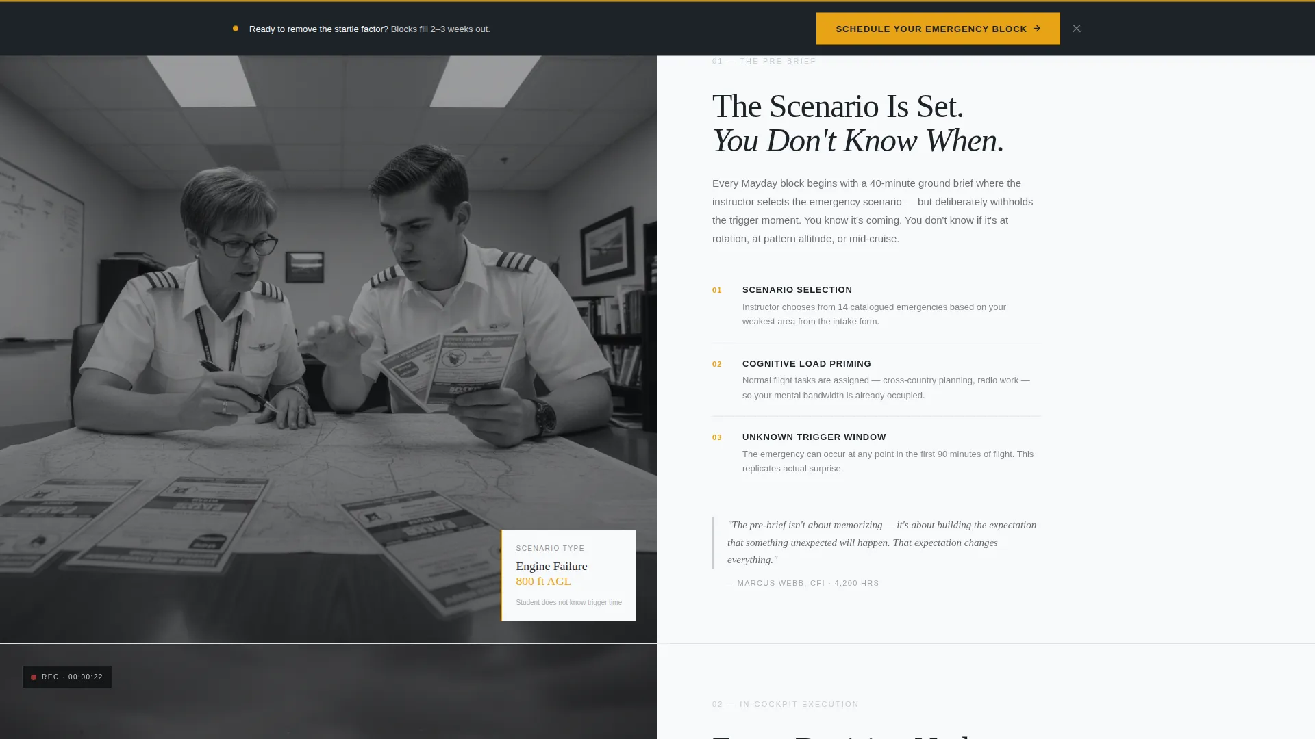
- A zigzag alternating section structure that reveals the pre-brief, in-cockpit execution, and post-flight debrief in sequence
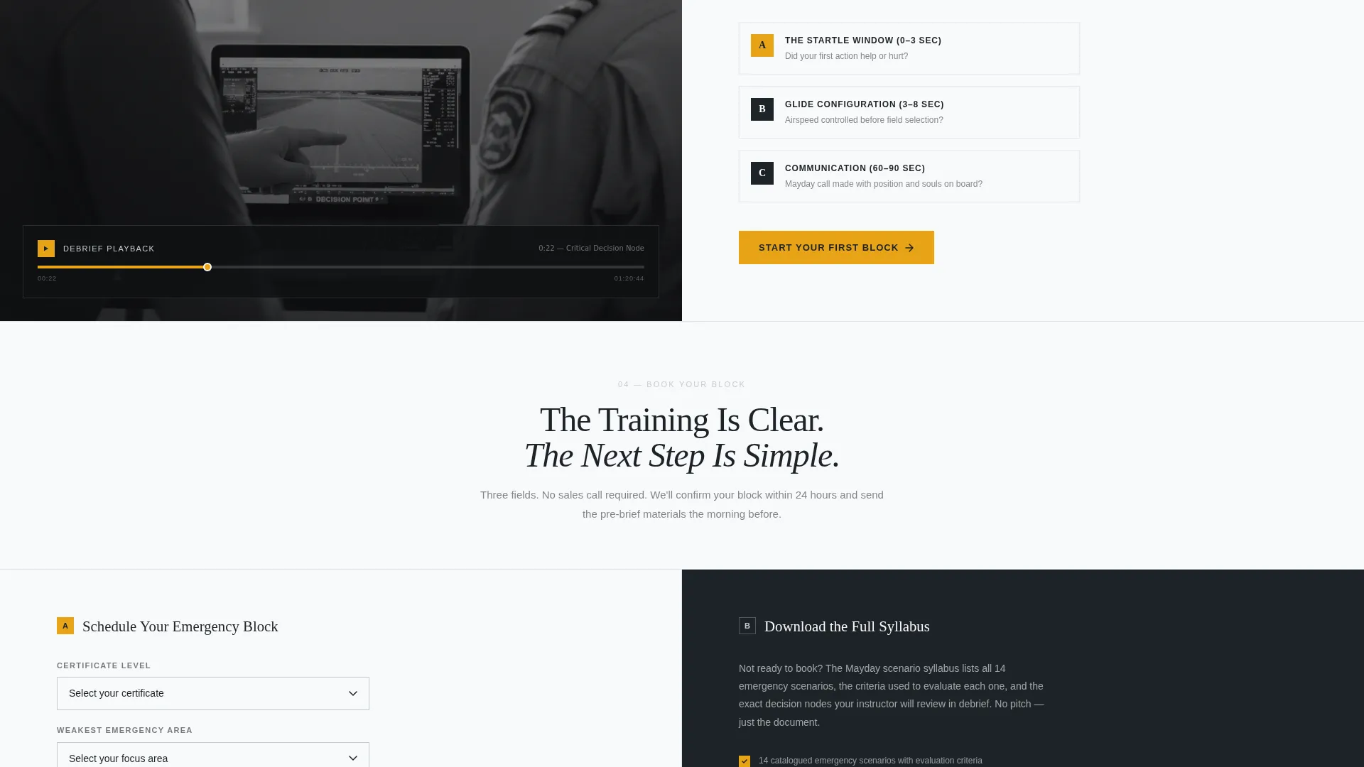
- A booking form with three structured fields and a secondary PDF syllabus download path for browsers who are not yet ready to commit
Feature list
This section covers the core functional and design capabilities built into the Mayday template.
Half-Page Editorial Header
The header splits the viewport into two equal halves. The left side holds a tightly cropped, grain-visible black-and-white cockpit photograph. The right side carries an oversized serif headline and a byline-style subtext block that reads like a magazine feature lede rather than advertising copy.
Zigzag Alternating Layout
Each content section flips the photo and text sides, creating a left-right rhythm across the page. This structure mirrors the brief-fly-debrief cadence of real emergency training and gives every section a clear visual identity without repeating the same composition.
Transparent Process Narrative
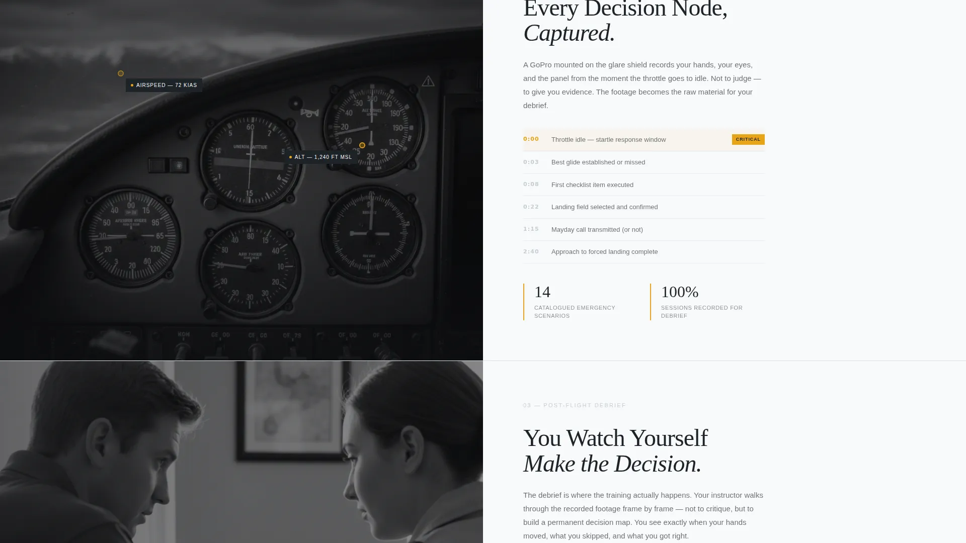
Each alternating section peels back one layer of the training experience. The pre-brief, the in-cockpit moment, and the post-flight debrief are each given their own section, using annotated still frames and instructor-walkthrough framing to show visitors exactly what happens before they book.
Amber Call-to-Action System
The primary call-to-action, labelled "Schedule Your Emergency Block," appears in emergency-annunciator amber beneath the header and again as a sticky element after the third section. Amber is reserved exclusively for calls to action and critical callouts, so the eye always finds the next step.
Structured Booking Form
The booking form collects three fields in a deliberate order: certificate level (Student, Private, or Instrument), weakest emergency area selected from a dropdown, and preferred date range. The sequence mirrors the intake process of a real flight school rather than a generic contact form.
Secondary Syllabus Download Path
A secondary conversion path offers a downloadable syllabus PDF gated behind a single email field. This captures visitors who want to see the full scenario list before committing to a booking, keeping them in the funnel without pressure.
Page sections overview
| Section | Purpose |
|---|---|
| Editorial Header | Introduces the school's identity and core training promise with a split photo-text composition |
| Primary call to action Block | Places the "Schedule Your Emergency Block" button immediately below the header in amber |
| Pre-Brief Section | Explains how scenarios are selected and why students do not know when they will trigger |
| In-Cockpit Section | Shows the execution phase using annotated still frames from a simulated emergency |
| Post-Flight Debrief | Presents the instructor-led debrief video format and decision-node walkthrough |
| Sticky call to action Element | Reintroduces the booking call to action as a persistent element after the third section |
| Booking Form | Collects certificate level, emergency area, and date range across three structured fields |
| Syllabus Download | Offers a PDF scenario list gated by email for visitors not ready to book |
Design & branding system
The visual identity follows an Editorial Magazine theme built on an Arctic White colour palette. Every colour in the system earns its place, and nothing is added for decoration.
- Base palette: vast negative-space white (#F8F9FA), instrument-panel charcoal (#1E2328), and horizon-line silver (#C5CCD3) for all structural and typographic elements
- Amber (#E8A317) is used exclusively for calls to action and critical callouts, functioning like an annunciator light that draws the eye precisely when needed
- Typography uses oversized serif type for headlines and editorial-style subtext for supporting copy, giving the page a clinical and legible quality that matches the seriousness of the subject
Mobile & speed optimization
The Mayday template is structured for clean rendering across screen sizes. The editorial layout adapts to narrower viewports without losing its directional clarity.
- The zigzag sections reflow to a stacked single-column format on smaller screens, preserving the brief-fly-debrief narrative sequence
- The booking form and syllabus download gate are compact by design, using three fields and one field respectively, which reduces friction on mobile devices
How this template helps you convert
The page is designed so that the booking feels like the obvious next step, not a cold ask. Every layout decision works toward that outcome.
- The transparent process structure shows visitors exactly what pre-brief, in-cockpit, and debrief look like, so by the time they reach the booking form they feel they have already begun training
- The amber sticky call-to-action element reappears at the right scroll depth, catching visitors who were engaged by the process sections but needed a second prompt to commit
- The syllabus download provides a lower-commitment entry point, keeping email-only visitors in the funnel so they can be moved toward a full booking later
Other information about this template
This template suits operations that want their marketing to match the discipline of their training programme. The design philosophy, visual restraint, and process-first narrative all reinforce the same message.
- The Editorial Magazine theme and Arctic White colour system create a briefing-room aesthetic that signals professionalism without relying on stock aviation clichés
- The template style is Zigzag/Alternating, suited to any flight school that wants to walk visitors through a multi-stage process in a single scrolling page
- The half-page photo and text header concept works especially well when the school has authentic cockpit or training photography available
- The page is built around a Booking/Scheduling direction, making it well-suited for schools that take appointments for specific training blocks rather than general enquiries
Theme
Editorial Magazine
Creative direction
Transparent Process
Color system
Arctic White
Style
Zigzag/Alternating
Direction
Booking/Scheduling
Page Sections
Half-page Editorial Header
Zigzag Alternating Section Layout
Transparent Process Narrative
Amber Sticky Call-to-action
Three-field Booking Form
Syllabus PDF Download Gate
Related questions
Who is the Mayday template designed for?
What conversion paths does the template include?
Can the booking form be adapted for different certificate levels?
What does the zigzag layout do for the page?
How is the amber colour used in this template?



