Gift & Specialty Store Comparison Website Template
Memento is a bento grid landing page template built for souvenir and tourist shops. It pairs a curated flat-lay hero with a scrollable comparison grid that makes bundle value instantly obvious. The Ink and Paper color system, rubber-stamp serif typography, and kraft-paper texture give every section the warm, tactile feel of a well-loved travel journal, turning browsers into confident buyers before they leave the dock.
by Rocket studio
Quick summary
Memento is a single-page bento grid landing page template designed for souvenir shops, gift retailers, and travel-focused brands. It leads with a cinematic flat-lay hero, walks visitors through a side-by-side comparison of single items versus curated bundles, and closes with a live bundle builder that makes the savings math feel visceral and immediate. The aged parchment palette, postmark red accents, and Fraunces serif headlines give the page the warmth and texture of a stamped travel passport, every section designed to convert jet-lagged browsers into decisive buyers.
Who this template is for
This template is built for retail businesses that sell physical gift and souvenir products to travelers with limited time and specific gifting needs. It is particularly well-suited for shops near cruise terminals, airport retail spaces, and tourist districts where the purchase window is short and the buyer mindset is already primed. The page speaks directly to three types of shoppers: the family that needs twelve gifts in ninety minutes, the solo traveler who wants one meaningful object per city, and the cruise passenger scanning options on a phone at the dock.
Beyond the storefront context, this template works equally well for any small business or independent creator building a curated product bundle page online. Designers, product curators, and boutique brand owners who want to launch a high-converting bundle offer without hiring a full development team will find this template ready to deploy. It is also appropriate for coaches, consultants, and other service-oriented professionals who bundle digital or physical products and need a polished page that communicates value quickly and clearly.
- Souvenir shops, gift boutiques, and travel retail stores that sell curated product bundles
- Independent designers and product creators launching a new bundle offer or limited collection
- Small business owners and retail brands looking to scale their average order value through structured upsell flows
What problem this template solves
Travelers in tourist retail environments face a specific and frustrating problem: they have very little time, a long list of people to buy for, and no clear signal about which products represent the best value. Most souvenir shop web pages present a flat product grid with no pricing context, no bundle logic, and no narrative reason to buy more than one item. The visitor scans the page, feels overwhelmed, and leaves without purchasing. This template solves that failure mode by restructuring the page around a comparison journey that makes the bundle decision feel obvious rather than effortful.
The template also solves a common problem for shop owners and designers who want to launch an effective bundle page quickly. Creating a high-converting landing page for a curated bundle requires focusing on visual storytelling, demonstrating product value, and building trust to increase average order value. Doing that from scratch takes significant time and design skill. This template provides a structured, ready-to-deploy framework so any business can launch a polished bundle page without rebuilding those systems from the ground up.
- Visitors leave before buying because the page offers no clear reason to choose a bundle over a single item
- Shop owners struggle to communicate savings and bundle value in a way that feels intuitive rather than salesy
- Designers and business owners spend excessive time building comparison layouts and mobile-optimized bundle flows from scratch
What you get with this template
This template delivers a complete, single-page bento grid layout structured around five purpose-built sections. Each section serves a specific conversion role, from first impression through final call to action. The design system, typography pairing, and layout logic are all built in and ready to customize. You are not starting from a blank canvas; you are starting from a tested page structure with a clear narrative arc.
The template includes all layout components, section configurations, animation cues, and visual hierarchy decisions needed to present a curated bundle offer convincingly. Every design choice, from the flat-lay hero to the crossed-out price cells in the comparison grid, is intentional and grounded in how travelers actually make purchase decisions under time pressure. The page is designed to function as a complete conversion system, not just a visual shell.
- A five-section bento grid page covering the hero reveal, comparison journey, bundle builder, traveler testimonials, and final call to action strip with a linear single-row footer
- Full Ink and Paper design system including the aged parchment background, fountain-pen black headlines, postmark red accents, and pencil-graphite gray secondary text
- Fraunces serif headline typography paired with DM Sans body and interface text, configured across all page sections
Feature list
This template is built around a specific set of designed features, each directly described in the project brief. Every feature below reflects what the template is structured to deliver.
Cinematic Flat-Lay Hero Section
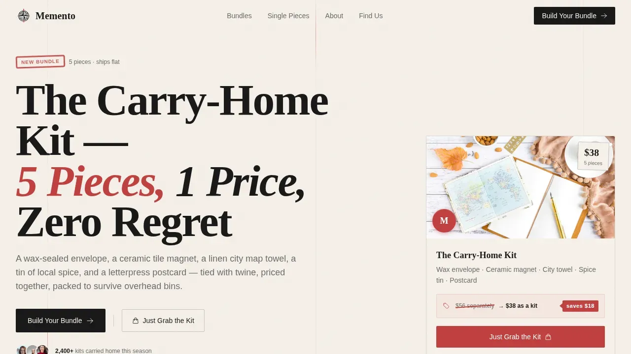
The hero opens with an overhead flat-lay shot of five curated souvenir objects arranged on brown kraft paper. A wax-sealed envelope, a ceramic tile magnet, a linen tea towel, a tin of local spice, and a letterpress postcard are tied loosely with twine and anchored by a hand-lettered price tag. The headline "The Carry-Home Kit, 5 Pieces, 1 Price, Zero Regret" is set in a rubber-stamp-style Fraunces serif. A scroll-blur cinematic background and glassmorphic price tag overlay add depth to the above-the-fold experience, ensuring the bundle value proposition is visible immediately without scrolling. Above-the-fold content includes the headline, subheadline, hero image, price, and the primary call to action, all the essential elements that drive engagement from the first second.
Bento Grid Comparison Journey
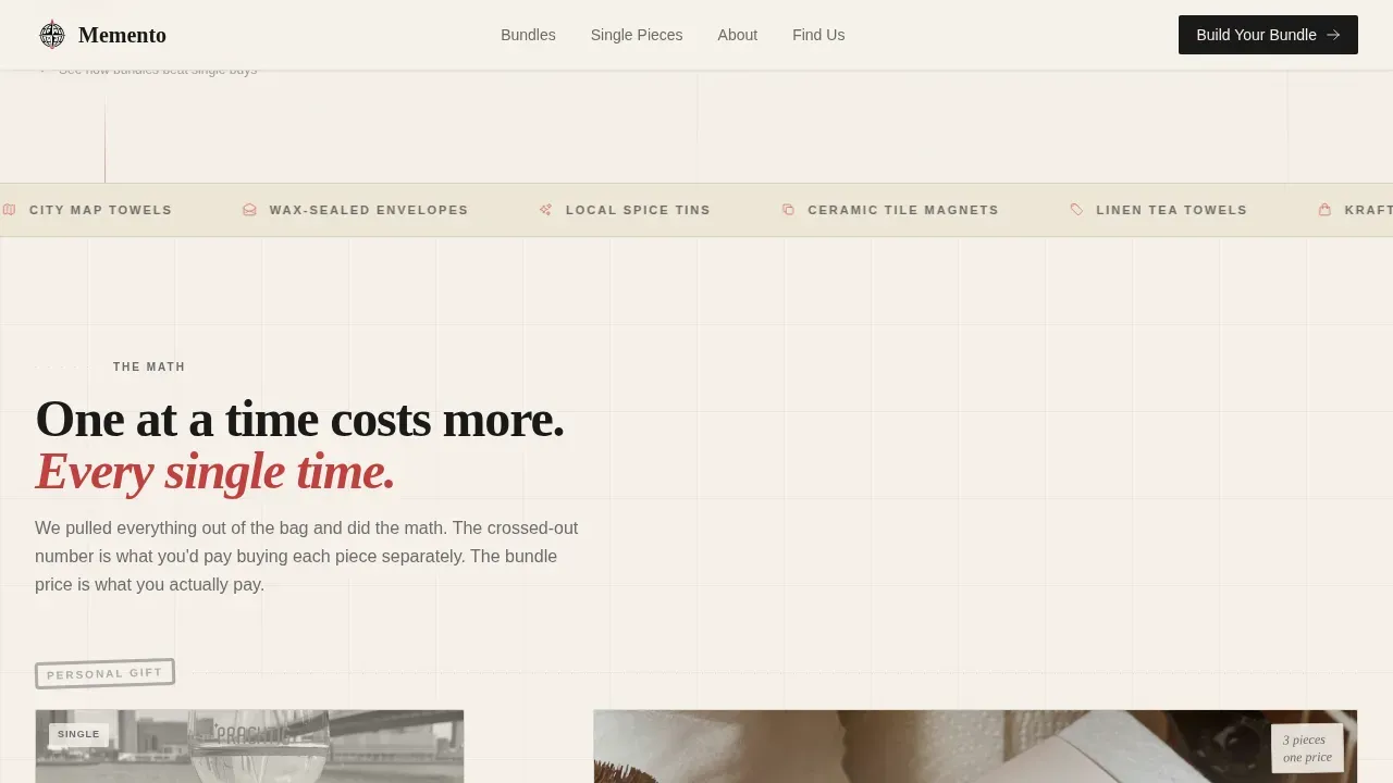
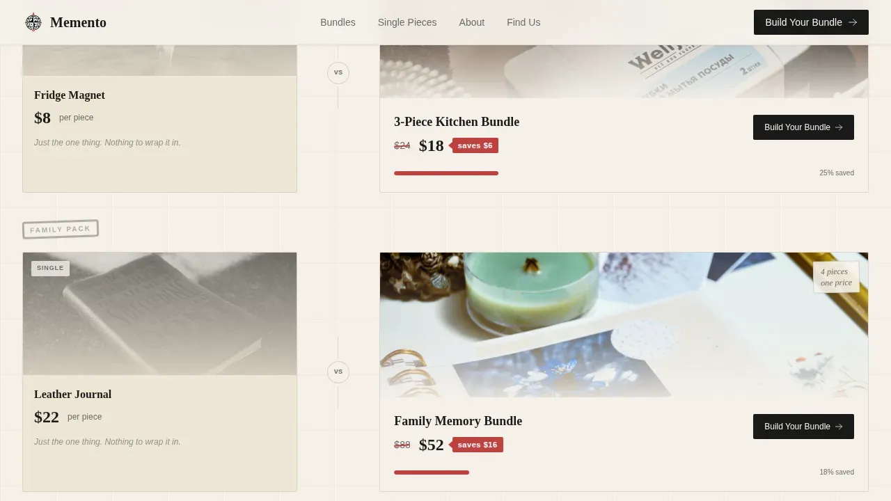
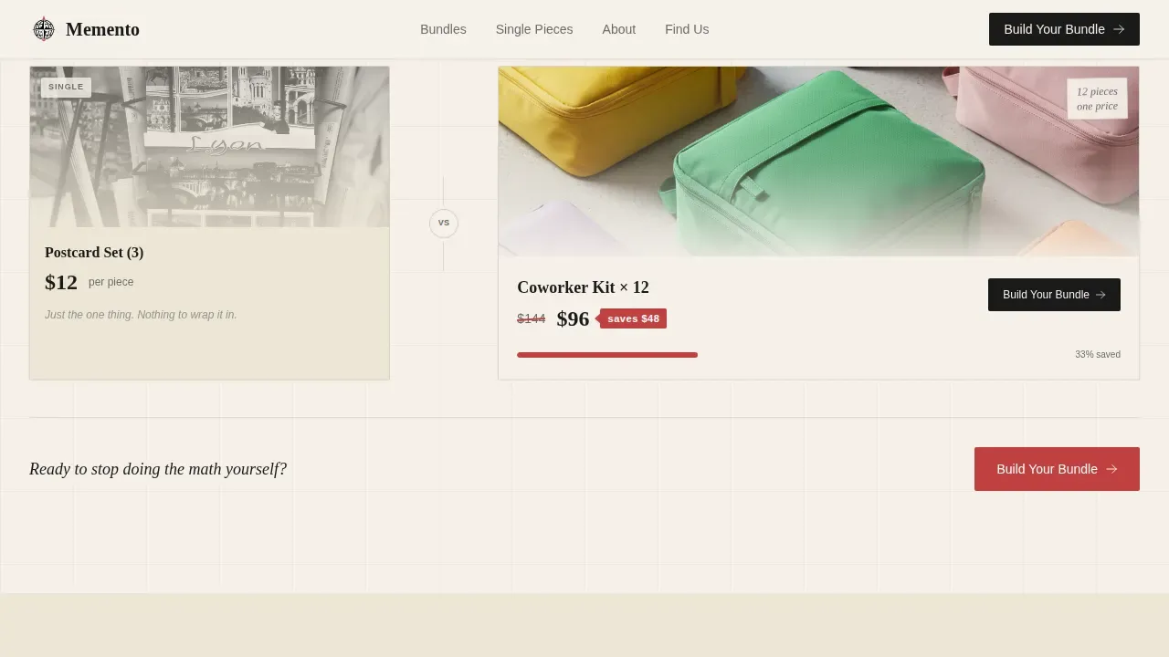
The comparison section unfolds as a scrollable bento grid that contrasts single-item pricing against curated bundle pricing row by row. Each row escalates the offer: personal gifts, family packs, and office-drop bundles for twelve coworkers. Individual cells alternate between large hero images of unwrapped bundles and tight single-product shots annotated in a handwritten style. Every comparison cell shows the single-item total crossed out in red beside the bundle price, and a postmark-red "saves $X" tag torn like a ticket stub makes the savings impossible to ignore. The scroll rhythm is designed to feel like browsing a market stall, unhurried but purposeful, keeping the visitor's context anchored to the value story at every step. A dedicated section structure like this, with high-quality product imagery and benefit-driven descriptions, is a proven driver of user engagement and higher average order value.
Interactive Bundle Builder
The bundle builder section gives visitors two clear conversion paths. The primary path, "Build Your Bundle," opens a visual builder where visitors drag items into a kraft-paper bag illustration and watch the price and savings update live. The secondary path, "Just Grab the Kit," directs visitors to the pre-curated bundles shown in the hero. The "Build Your Bundle" call to action appears at the end of each comparison row and is pinned as a floating button on mobile, ensuring the next step is always accessible as users scroll. This dual-path structure captures both decisive buyers and exploratory shoppers without forcing either group through the wrong flow.
Traveler Testimonials with City Context
The testimonials section presents social proof through spotlight cards that include real traveler quotes and specific city or cruise trip context. This grounding in real-world travel scenarios adds credibility that generic review cards cannot. Spotlight card hover animations give the section a tactile, interactive quality that fits the overall Ink and Paper aesthetic. The testimonials are positioned after the comparison grid, where they reinforce the bundle value story at the exact moment a visitor might hesitate. Strong call-to-action buttons are repeated after this section, consistent with best practices for high-converting landing page templates.
Floating Mobile Call to Action and Final Strip
The final section is a full-width "Build Your Bundle" call to action strip that closes the page with a clear, singular directive. On mobile, the primary call to action button is pinned as a floating element so it remains accessible throughout the entire scroll. This sticky call-to-action approach ensures that the next step is never more than a tap away, regardless of where the visitor is on the page. The footer follows a Pattern 1 Linear Single-Row layout, keeping the bottom of the page clean and uncluttered so the call to action strip carries full visual weight.
Page sections overview
| Section | Purpose |
|---|---|
| Hero Flat-Lay | Communicates the bundle value proposition above the fold with a cinematic flat-lay reveal and glassmorphic price tag |
| Comparison Bento Grid | Walks visitors through single-item versus bundle pricing row by row, with crossed-out prices and red savings tags |
| Bundle Builder | Offers two conversion paths: a live drag-to-bag builder and a pre-curated kit shortcut |
| Traveler Testimonials | Reinforces bundle value with spotlight cards anchored to real city and cruise trip contexts |
| Final Call to Action | Closes the page with a full-width "Build Your Bundle" strip and a floating mobile button |
| Linear Footer | Provides a clean single-row footer that keeps the bottom of the page minimal and focused |
Design & branding system
The design system follows a Directory and Discovery theme expressed through the Ink and Paper color palette. Every color decision is intentional: the aged parchment background feels like the cream pages of a well-stamped passport, the fountain-pen black sets authoritative headlines, and the postmark red functions exactly as a customs stamp would, catching the eye at critical decision moments. Pencil-graphite gray handles secondary text and dividers without competing with the primary hierarchy. The overall effect is warm, trustworthy, and tactile, the visual equivalent of emptying a tote bag onto a hotel bed and spreading out everything you found.
Typography reinforces this personality at every level. Fraunces serif headlines carry the rubber-stamp quality that gives the page its handmade authority. DM Sans handles body copy and interface elements cleanly, keeping the reading experience fast and clear even when the design is rich. Kraft paper textures, hand-lettered price tags, wax-seal motifs, and ticket-stub torn edges are all built into the visual language of the template, giving every section a coherent and immersive brand identity.
- Color system: aged parchment (#F5F0E8) background, fountain-pen black (#1A1A1A) headlines, postmark red (#C04040) accents and savings tags, pencil-graphite gray (#6B6B6B) secondary text and dividers
- Typography: Fraunces serif for headlines (rubber-stamp feel), DM Sans for body copy and interface elements across all page sections
- Texture and motif language: kraft paper backgrounds, hand-lettered price tags, wax-seal details, ticket-stub torn edges, and twine-tied product arrangements
Mobile & speed optimization
This template is built mobile-first, which is the correct priority for its target audience. Cruise passengers browsing during a ninety-minute dock stop are almost always on a phone, not a desktop. The layout adapts to a single-column flow on mobile, with large tap targets on every call to action button. The floating "Build Your Bundle" button stays pinned at the bottom of the screen throughout the scroll, ensuring the primary conversion action is always one tap away regardless of scroll position. Mobile-first design with a single-column layout and large, easy-to-hit tap targets is a foundational requirement for any landing page serving high-intent, time-limited mobile shoppers.
Speed matters directly on this page. A one-second load time can convert up to three times higher than a five-second load time. The template uses lazy-loaded images and CSS scroll-timeline for the hero blur effect to keep the initial render fast even on a mobile connection at the dock. Fast loading speeds reduce bounce rates and protect the conversion window that the rest of the page works hard to create.
- Mobile-first single-column layout with large, easy-to-hit tap targets on all call to action buttons and interactive elements
- Lazy-loaded images across the bento grid and hero section to keep page load fast on mobile connections
- Pinned floating "Build Your Bundle" button on mobile so the primary call to action is always accessible during scroll
How this template helps you convert
This template is built around a specific conversion logic: make the bundle math so visible and intuitive that choosing the single item feels like leaving money on the table. Every layout decision reinforces that logic, from the first scroll to the final call to action. The page does not just list products; it sells the curated experience through a cohesive narrative that explains why these items belong together and frames the bundle as a complete solution to the traveler's gifting problem. Curated storytelling of this kind is one of the most reliable drivers of higher average order value in retail landing page design.
- The hero section front-loads the value proposition: the headline, subheadline, hero image, bundle price, and primary call to action are all visible above the fold, so visitors understand the offer before they scroll a single pixel. A high-impact hero shot that shows all items together conveys immediate value and sets the savings context for everything that follows.
- The comparison bento grid makes the upgrade decision visceral: every row shows the crossed-out single-item total beside the bundle price, and the red savings tag makes the discount feel concrete rather than abstract. Prominently displaying a clear savings breakdown is one of the strongest tools for converting a hesitant browser into a buyer, and this template builds that logic into the core page structure.
- The dual call-to-action architecture captures both buyer types: decisive visitors tap "Just Grab the Kit" while exploratory shoppers use the bundle builder to customize. Strong, contrasting call-to-action buttons are repeated after the comparison grid and after the testimonials section, ensuring the next step is always within reach regardless of where the visitor is in their decision process.
Other information about this template
This section covers additional context about the template's technical design decisions, ecosystem compatibility, and broader platform considerations that are useful for designers, developers, and business owners evaluating whether this template fits their project.
The template is implemented with a high-animation specification. Scroll-linked blur on the hero, stagger reveal animations on the bento grid cells, spotlight card hover effects on the testimonial section, and a ticker marquee are all part of the animation layer described in the project brief. These interactions are intended to create the feeling of a living, tactile page rather than a static product catalog. Designers who need to customize or extend these animations will find the animation architecture logical and well-structured, built around CSS scroll-timeline and standard web animation frameworks.
For teams working within broader digital business ecosystems, it is worth understanding how this template fits within larger metadata and data management contexts. Enterprise-scale digital business operations often rely on metadata systems to manage context about their products, collections, and content across platforms. Egeria defines the open metadata standard schema for over 600 types needed by enterprises to manage context about their digital business. Egeria automates the capture, analysis, search, and management of metadata and context through its specialist servers. Egeria's open connectivity enables a peer-to-peer metadata highway offering open metadata exchange, linking, and federation between heterogeneous metadata repositories. Egeria uses open formats to implement application programming interfaces (APIs), frameworks, connectors, and interchange protocols to enable tools and repositories to actively interoperate using these open standards. For a template like this one, that metadata infrastructure context matters when the page is part of a larger digital business operation that needs to capture, search, and manage product data across multiple systems and platforms.
Web page quality tools are also relevant for any team deploying this template at scale. Lighthouse is an open-source, automated tool that helps you improve the quality of web pages. You can run Lighthouse on any web page, whether public or requiring authentication. Lighthouse has audits covering performance, accessibility, and other quality dimensions. It generates a report on how well the page performed after running a series of audits. Each audit in Lighthouse includes a reference that explains why the audit matters and how to fix it. You can use Lighthouse CI to prevent regressions on your sites over time. Lighthouse provides relevant and actionable advice depending on the tools used to build web pages, and Lighthouse plugins allow domain experts to extend its functionality for their community's specific needs. Running Lighthouse as part of your deployment process is a straightforward way to protect page quality and catch regressions before they affect real visitors.
For teams using AI-powered tools during the build or customization process, this template is well-suited to that workflow. AI-powered tools can help users build and customize web applications without extensive coding knowledge. No-code platforms allow users to create applications using natural language prompts, and AI-powered application development tools can handle backend integrations and deployment steps automatically. Users can build full, production-ready applications using AI-powered application development platforms. This template's clean component structure makes it straightforward for AI-assisted workflows to read, modify, and extend. AI-powered application development tools are particularly valuable for teams that want scalable and maintainable products without proportionally scaling their development overhead.
From an open source and community perspective, the frameworks and repositories that underpin modern web templates are well-documented and widely supported. Open source tools and open source repositories provide access to the community knowledge, update cycles, and peer review that keep templates reliable across environments and browser contexts. Chrome is one of the primary environments where bento grid layouts and scroll-timeline animations are tested and refined. Chrome DevTools and the broader Chrome developer ecosystem give teams direct access to performance analysis, rendering data, and layout debugging that support the kind of high-animation, bento grid page this template delivers.
The template is also relevant to a broad range of creator types and digital business models. A creator launching a new product collection, a brand building its first direct-to-consumer bundle page, or a business developing a new market strategy can all use this template as a starting point. The template supports teams at different levels of technical maturity: designers who want full visual control, developers who need a structured starting framework, and business owners who want to launch quickly using AI-assisted tools or no-code platforms. Partners and clients across the retail, gift, and travel market will recognize the page's visual language as credible and conversion-focused.
On the topic of scale, this template is built to support a growing digital business. The bento grid layout can accommodate additional bundle rows, new product categories, and expanded comparison logic without breaking the visual hierarchy. The modular section structure means teams can add, reorder, or remove sections as their business and their collection evolves. Effective landing pages are essential for scaling a business online, and this template provides the structural foundation that makes that scaling practical rather than theoretical.
- This template is implemented with high-animation interactions including scroll-linked hero blur, stagger reveal, spotlight card hover, and ticker marquee
- Open source tools such as Lighthouse support ongoing web page quality analysis, performance auditing, and regression prevention via Lighthouse CI
- AI-powered tools and no-code platforms are compatible with this template's component structure, supporting build, customization, and deployment workflows
- Metadata management systems such as Egeria can provide the data infrastructure context that supports enterprise-scale digital business operations using templates like this one
- The bento grid section structure is modular and can scale with an expanding product collection or growing bundle catalog
- Chrome and other modern browser environments are the primary testing contexts for the scroll-timeline and bento grid functionality implemented in this template
- Open source frameworks and repositories used in modern web development provide community-maintained support and update cycles that keep templates reliable across environments
Theme
Directory & Discovery
Creative direction
Comparison Journey
Color system
Ink & Paper
Style
Bento Grid
Direction
Upsell/Upgrade
Page Sections
Cinematic Flat-lay Hero Section
Bento Grid Comparison Journey
Interactive Live Bundle Builder
Traveler Testimonials with City Context
Ink and Paper Design System
High-animation Scroll Interactions
Related questions
Who is this landing page template best suited for?
Can I customize the bundle items and pricing shown in the comparison grid?
How does the mobile layout handle the floating call to action button?
Is this template appropriate for businesses outside of travel retail?
What makes this template different from a standard product grid page?



