Marriage Counselor Specialist Professional Website Template
Mend is a single-column landing page built for marriage counselors who want to reach couples between sessions. It opens mid-conversation with a gentle assessment, then walks visitors through three psychoeducation phases. The result is a personalized couple pattern delivered instantly, paired with an email capture that feels like an invitation rather than a form.
by Rocket studio
Quick summary
Mend is a marriage counselor patient education landing page designed around one quiet idea: that couples need to feel understood before they feel helped. It guides two partners through a multi-step engagement flow, three phased learning sections, and a five-question couple pattern assessment, all in a single, unhurried column that reads like a conversation.
Who this template is for
This template is built for marriage counselors and couples therapists who want a digital space that does real work between sessions. It speaks directly to couples who are still in it but struggling to find the words.
- Therapists running psychoeducation programs or structured couples workshops
- Counselors who want a guided self-assessment to qualify and warm up new clients
- Practices offering between-session resources, worksheets, or micro-lessons to existing couples
What problem this template solves
Most therapy websites are clinical, cold, and built for the practitioner rather than the couple arriving at 1 a.m. with a phone and a quiet fear. Couples in distress do not need a list of credentials. They need to feel immediately recognized.
- Generic therapy pages do not speak to both partners at once
- Standard contact forms create distance instead of connection
- Couples rarely know how to describe what is wrong, so they leave before asking for help
What you get with this template
This template delivers a complete single-column landing page experience built specifically for marriage counseling patient education. Every section is purposeful, every interaction is warm, and nothing escalates urgency.
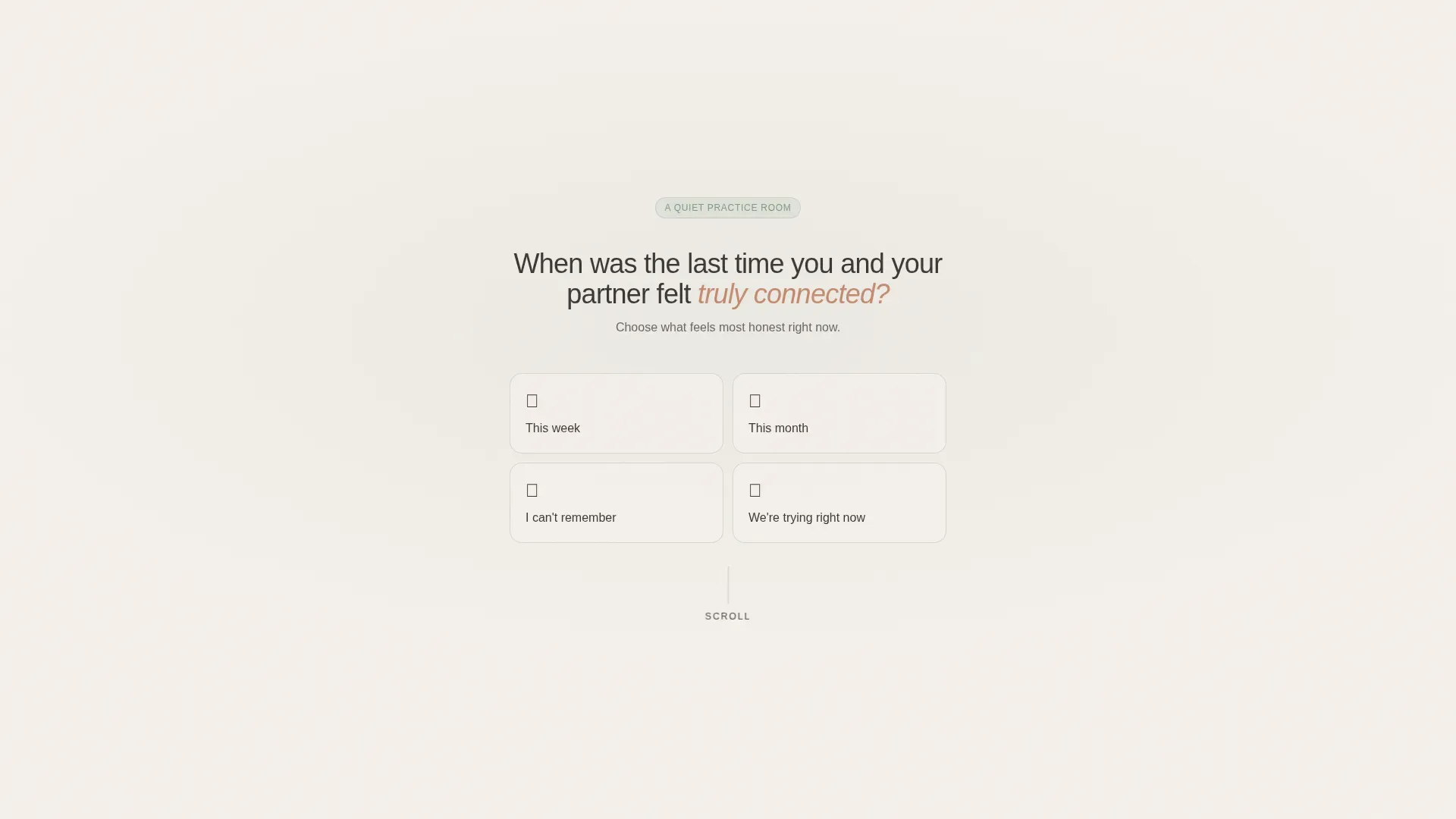
- A mid-conversation hero form with four response cards that open the visitor into the page
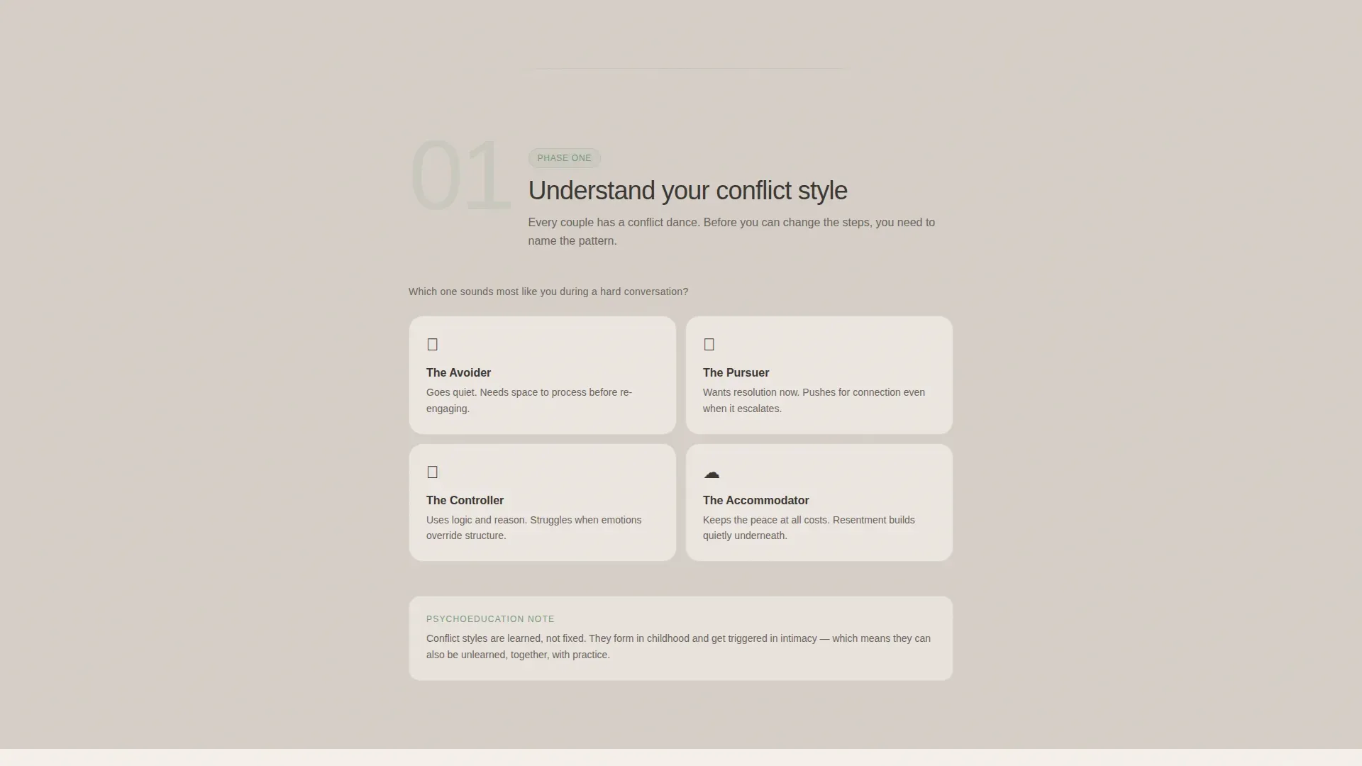
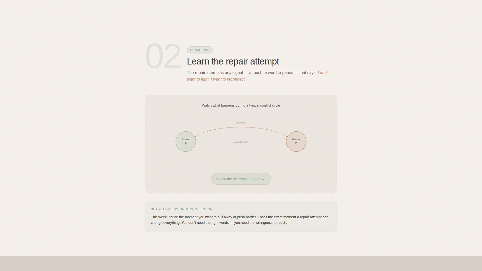
- Three sequential phase sections covering conflict style, repair attempts, and between-session practice
- A five-question quiz assessment that closes with a personalized couple pattern name and email capture
Feature list
Mid-Conversation Hero Form
The page opens with a single floating question against warm linen, with no logo, no navigation, and no stock photography. Four hand-lettered-style response cards invite the visitor to answer honestly. Each card has a sage border that warms to clay on hover, creating an immediate sense of presence rather than pitch.
Three-Phase Education Journey
Scroll sections reveal three named phases in sequence: understanding conflict style, learning the repair attempt, and practicing between sessions. Large, light sage numerals act as chapter markers. Each phase contains one interactive element so the visitor stays engaged without feeling overwhelmed.
Five-Question Couple Pattern Assessment
A sequential quiz asks about connection frequency, conflict style, repair comfort, unspoken concerns, and preferred learning format. Each answer receives a single micro-validation sentence. The final result is a personalized pattern name delivered immediately on the page.
Perspective Toggle Card
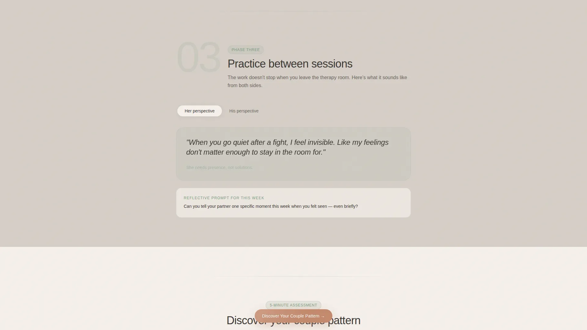
Phase three includes a toggleable card that lets visitors switch between two viewpoints within the same reflection exercise. This design choice acknowledges both partners directly without requiring them to sit together at a screen.
Persistent Clay Call-to-Action Button
After the visitor scrolls past phase two, a soft clay button labeled "Discover Your Couple Pattern" remains accessible. It reappears naturally so the invitation is always within reach without feeling pushy.
Intimate Testimonial Display
Social proof appears as rotated card layouts with specific, real-sounding couple quotes. The format feels personal rather than promotional, reinforcing trust at the moment visitors are deciding whether to complete the assessment.
Page sections overview
| Section | Purpose |
|---|---|
| Hero Form | Opens with a single question and four response cards to draw the visitor in immediately |
| Phase One | Introduces conflict style identification through an interactive card selector |
| Phase Two | Explains repair attempts using an animated communication pattern diagram |
| Phase Three | Offers a perspective toggle exercise for between-session reflection practice |
| Quiz Assessment | Delivers a five-question sequential flow and an instant personalized couple pattern result |
| Testimonial Block | Builds trust with rotated intimate couple quotes before the final call to action |
| Footer | Displays social icons and copyright in a centered, minimal layout |
Design & branding system
The visual identity follows an Organic Flow theme built on a Soft Mist palette. Every color choice is intentional: warm and unhurried, never clinical.
- Backgrounds alternate between warm linen (#F5F0EB) and morning fog gray (#D6CFC7), with deep charcoal (#3B3734) for body text
- Still-water sage (#A3B5A6) marks growth moments: completed steps, progress rings, and phase numerals
- Warm clay (#C4896D) is reserved exclusively for interactive elements, hover states, and progress indicators
Mobile & speed optimization
The template is built mobile-first because the most important visits happen on a phone in a quiet moment. Layout, type, and interactive elements are all sized for thumb navigation and one-handed reading.
- Single-column flow means no reflow issues between screen sizes
- Interactive elements including the response cards, perspective toggle, and quiz steps are designed for touch interaction
- Medium animation weight uses clip-in reveals rather than heavy libraries, keeping the experience smooth on mobile connections
How this template helps you convert
Every design and copy decision moves the visitor toward one action: completing the couple pattern assessment and sharing their email to receive the full guide.
- The mid-conversation hero form bypasses resistance by starting with empathy rather than a sales pitch, making the first click feel safe
- The three-phase education journey builds progressive trust so visitors arrive at the quiz feeling understood rather than targeted
- The immediate pattern result paired with the "Send My Full Pattern Guide" email capture creates a natural, low-pressure moment to exchange contact details
Other information about this template
This template was designed at the intersection of wellness design and guided patient education. It is suited to practices that want something more considered than a standard therapy website template.
- Typography uses DM Sans throughout, a warm and readable sans-serif that feels approachable without being informal
- Animation is set to medium intensity with clip-in section reveals and sage-colored progress indicators that reinforce forward movement
- The footer follows a centered minimal layout with social icons and copyright, keeping the close of the page as calm as the opening
- The template does not use clinical diagnostic language anywhere in its copy or interface labels
- Couples already in therapy can use this page as a between-session companion resource, not only as a first-contact tool
Theme
Organic Flow
Creative direction
Step-by-Step Guide
Color system
Soft Mist
Style
Single Column Flow
Direction
Quiz/Assessment
Page Sections
Mid-conversation Hero Form
Three-phase Education Journey
Five-question Couple Pattern Quiz
Perspective Toggle Exercise
Persistent Assessment Call to Action
Intimate Rotated Testimonial Cards
Related questions
Is this template suitable for counselors who already have a main website?
Can both partners use this page independently?
Does the template include the quiz questions and copy?
What kind of counselor benefits most from this template?
Is the page design customizable to match a practice's branding?



