Virtual Physical Therapy Landing Page Template
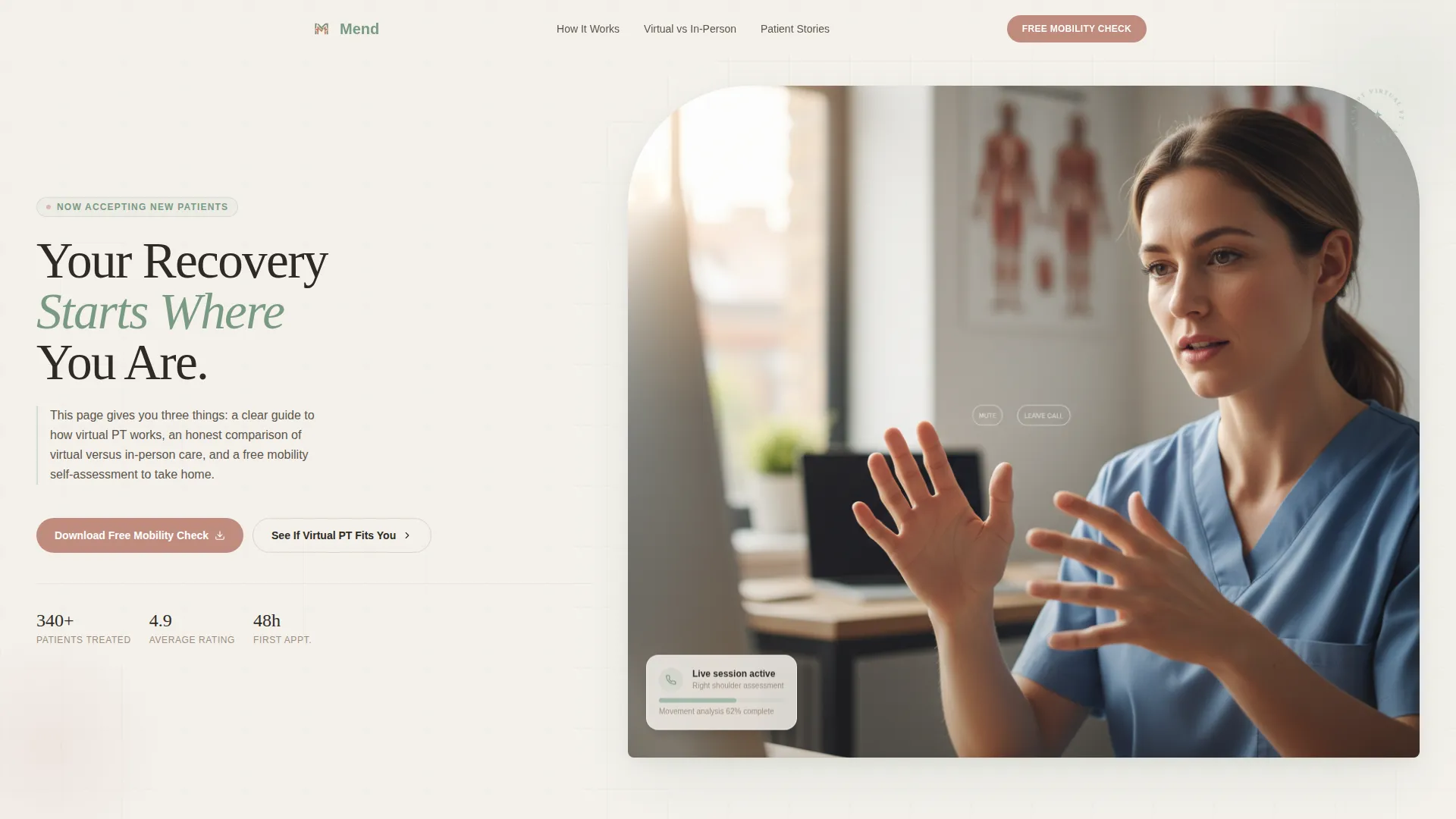
Mend is a single-page landing page template built for virtual physical therapy practices. It walks visitors through how online consultations work, presents an honest virtual-versus-in-person comparison table, and captures leads with a free mobility self-assessment download. The design is warm and organic, built for patients who need real answers before they book.
by Rocket studio
Quick summary
Mend is a landing page template for virtual physical therapy practices. It leads with a half-page photo-and-text hero, then guides visitors through a four-step consultation process, an eight-dimension comparison table, and social proof before offering a free mobility self-assessment download. The layout earns trust by giving genuine clinical value before asking for anything.
Who this template is for
This template is designed for physical therapists and telehealth practices offering virtual consultations. It works best when your audience needs education before they book, not just a contact form.
- Virtual physical therapy providers serving patients across wide geographic areas
- Solo practitioners and small clinics launching or expanding a telehealth offering
- Practices targeting weekend athletes, remote workers, or post-surgical patients in underserved rural areas
What problem this template solves
Many people researching virtual physical therapy are skeptical. They want to know whether online care is as effective as in-person treatment before they commit. A generic service page does not answer that question. This template is built specifically to address it.
- Visitors leave without booking because they do not understand how virtual PT works or what it actually delivers
- Potential patients cannot compare virtual and in-person options side by side, so they default to doing nothing
- Practices struggle to generate leads without feeling pushy, because they lack a low-commitment entry point
What you get with this template
You get a fully structured, single-page layout that moves a skeptical visitor from curiosity to conversion. Every section is intentionally ordered to build confidence before making any ask.
- A hero section, four-step process guide, honest comparison table, social proof zone, and a lead capture section with a secondary quiz call to action
- A warm organic visual identity using a Soft Mist color palette with Fraunces serif headings and DM Sans body text
- A mobile-first layout with scroll reveal animations, a marquee conditions ticker, and hover states on the comparison table
Feature list
This template is built around specific, prompt-defined components. Each one serves a clear purpose in the visitor journey.
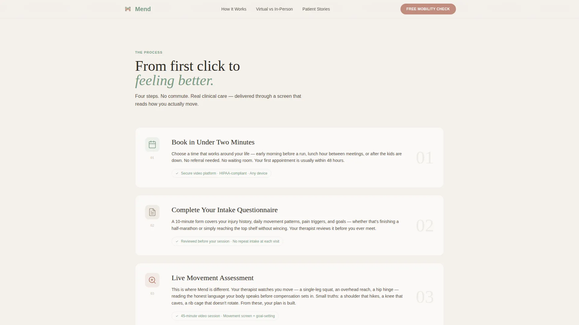
Four-Step Process Guide
The How It Works section walks visitors through the full arc of a virtual consultation. Each numbered step includes a short narrative paragraph and a small looping illustration, from booking through intake questionnaire, live video movement assessment, and personalized exercise programming.
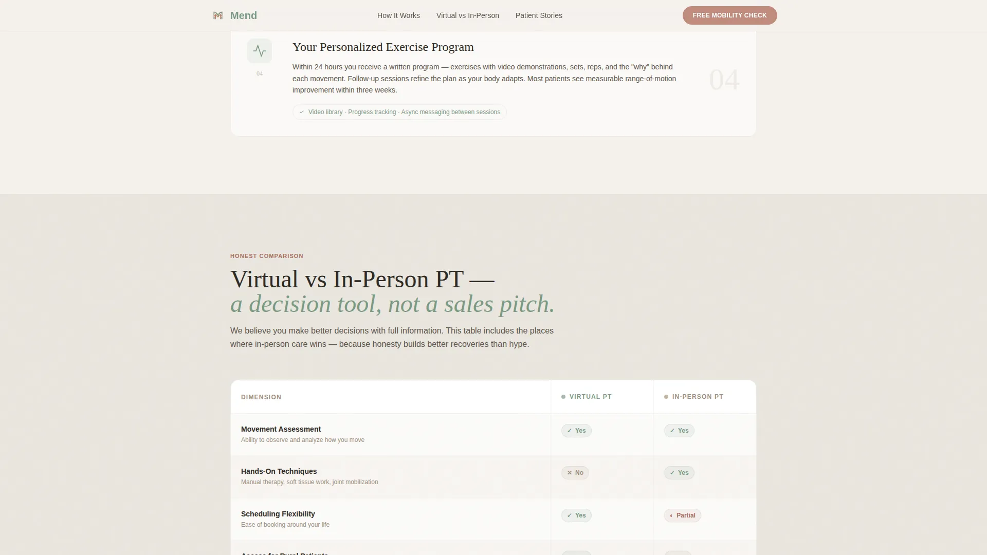
Honest Comparison Table
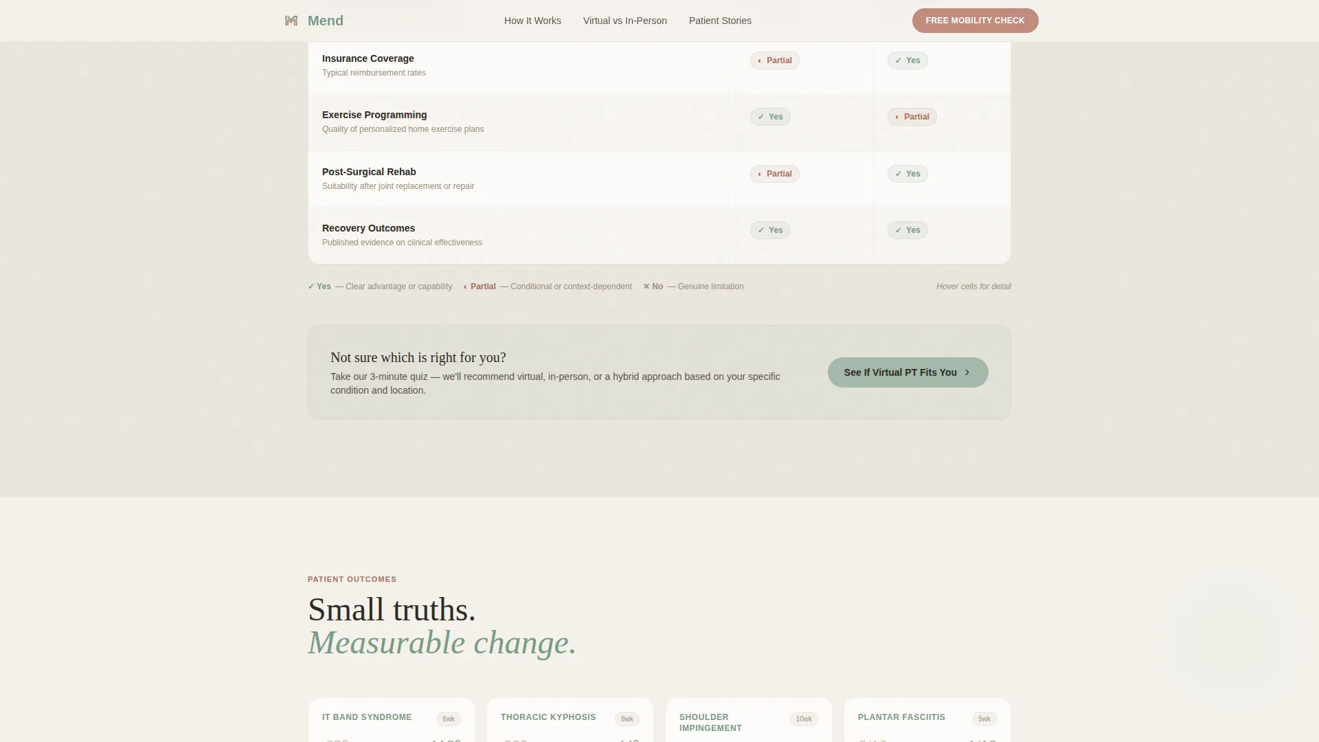
A structured eight-dimension table compares virtual and in-person physical therapy across factors like hands-on techniques, scheduling flexibility, insurance coverage, and recovery outcomes. It is presented as a decision tool, not a sales argument, and it acknowledges where in-person care wins.
Lead Capture with Free Resource
The primary call to action asks only for a first name and email in exchange for a free mobility self-assessment download. It appears after the comparison table and again in the footer, keeping the ask low-friction and well-timed.
Secondary Quiz Path
A second conversion path, labeled "See If Virtual PT Fits You," links to a short interactive quiz. The quiz recommends virtual, in-person, or hybrid care based on visitor responses, serving undecided visitors who are not yet ready to download.
Social Proof Zone
Below the comparison table, the template includes anonymized before-and-after range-of-motion data, short patient video testimonial cards filmed in natural home settings, and a scrolling ticker of conditions treated virtually.
Organic Flow Visual System
The Soft Mist palette uses morning fog white for backgrounds, eucalyptus green for headings and icons, warm stone for body text, and clay rose exclusively for interactive elements and call-to-action states. Typography pairs Fraunces serif headings with DM Sans body copy for a clean, warm, clinical feel.
Page sections overview
| Section | Purpose |
|---|---|
| Hero Split | Introduce the practice and state the three things the page delivers |
| How It Works | Walk visitors through the four-step virtual consultation process |
| Comparison Table | Let visitors evaluate virtual versus in-person care across eight dimensions |
| Social Proof | Build trust with outcome data, patient video cards, and a conditions ticker |
| Lead Capture | Collect first name and email for the free mobility self-assessment download |
| Quiz Call to Action | Direct undecided visitors to a short care-path recommendation quiz |
| Footer | Provide secondary navigation and a repeated download call to action |
Design & branding system
The template follows an Organic Flow design theme. The visual language is warm and clinical-clean, avoiding anything cold or institutional. Every color decision has a specific role in the layout.
- Fog white (#F4F1EC) washes across all backgrounds; eucalyptus green (#A3B9AA) anchors headings and iconography; warm stone (#C4B5A2) carries body text; clay rose (#C08B7E) appears only on buttons and interactive states
- Fraunces serif handles all headings for a grounded, human quality; DM Sans handles body copy for clean readability
- Animations are set to medium intensity: scroll reveals on section entries, staggered element loads, marquee ticker motion, and hover states on the comparison table rows
Mobile & speed optimization
The template is built mobile-first, reflecting the reality that many patients browse between appointments or from rural locations on a phone. Layout decisions prioritize legibility and tap targets on small screens.
- Section stacking, font scaling, and image cropping are all optimized for narrow viewports before wider ones
- Static server components handle non-interactive content to keep JavaScript load minimal, with interactive elements like the lead form and quiz call to action scoped carefully
How this template helps you convert
This template is structured as a content and resource destination. It gives visitors something genuinely useful before making any ask, which makes the eventual conversion feel earned rather than forced.
- The process guide and comparison table make the visitor smarter about virtual physical therapy, so they arrive at the call to action with informed confidence rather than doubt
- The two-path conversion model serves both ready and undecided visitors: the download form captures leads quickly, while the quiz guides slower decision-makers toward a recommendation that feels personalized
Other information about this template
This template is categorized under Health and Medical, with a specific focus on the physical therapist virtual consultation niche. It is built for direct-to-consumer telehealth practices that want a content-led approach to lead generation.
- The footer uses a horizontal flow pattern with a repeated download call to action and secondary navigation
- The hero uses a half-page photo-and-text split layout, with the photograph on the left and headline copy on the right
- Localization defaults are set for English (United States), with date formatting in MM/DD/YYYY and currency in USD
- The conditions ticker is a scrolling marquee component listing the range of conditions the practice treats virtually, giving undecided visitors quick reassurance about scope of care
Theme
Organic Flow
Creative direction
Step-by-Step Guide
Color system
Soft Mist
Style
Comparison Table
Direction
Content/Resource
Page Sections
Four-step Virtual Consultation Guide
Eight-dimension Comparison Table
Free Resource Lead Capture Form
Care-path Recommendation Quiz
Social Proof Section with Conditions Ticker
Organic Flow Visual and Animation System
Related questions
What kind of practice is this landing page template designed for?
What does the comparison table section actually show?
How does the lead capture work on this page?
Can this template support visitors who are unsure which type of care is right for them?
Is this a single-page layout or a multi-page website?



