Marriage Counselor Professional Website Template
Mend is a hub and spoke landing page built for marriage counseling practices. It guides anxious couples through every question they carry before asking for anything in return. A sticky anchor navigation, warm visual identity, and a clear problem-to-solution flow move visitors from hesitation to action, with "Download the First Session Guide" as the primary conversion.
by Rocket studio
Quick summary
Mend is a single-page marriage counselor new patient welcome template. It uses a hub and spoke anchor navigation to walk couples through four honest questions they arrive with. The design feels warm and unhurried, the content arc moves from fear to familiarity, and the primary call to action earns its click before it ever asks for an email address.
Who this template is for
This template is built for couples therapy practices that need more than a contact page. It speaks directly to the person on their phone at 1 a.m. who just searched for help and needs to feel understood, not sold to.
- Marriage counselors and couples therapists launching or refreshing a new patient welcome page
- Practices that use structured therapeutic approaches and want to explain them clearly before the first session
- Therapists who want a content-led conversion path rather than a hard-sell booking page
What problem this template solves
Most therapy websites lose visitors because they ask too much too soon. A couple in crisis does not book an appointment on a page that feels cold, clinical, or vague. They need answers before they trust anyone with their relationship.
- Visitors arrive anxious and full of unspoken questions; this template answers every one of them in order
- Practices struggle to explain their therapeutic approach in plain, accessible language; this template structures that explanation naturally
- The gap between "I found this page" and "I booked a session" is filled with warmth, specificity, and social proof
What you get with this template
You get a fully structured, single-page layout with a sticky side navigation, five distinct content sections, and two conversion paths. Every section is designed to reduce doubt and build trust progressively.
- A testimonial hero card, four anchor-linked spoke sections, and a minimal footer
- A primary call to action for a downloadable first session guide, plus a secondary scheduling widget link
- An email capture form asking only for a first name and email address, appearing at the bottom of each spoke and floating at page end
Feature list
A brief overview of what makes this template work as a patient-facing conversion tool.
Sticky Anchor Side Navigation
A side navigation bar stays fixed as the visitor scrolls. Each link is labeled with a plain-language patient question. Active states pulse gently in dusty rose so the visitor always knows their position on the page.
Testimonial Hero Card
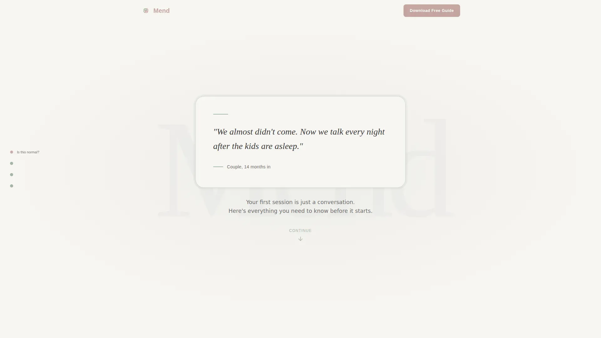
The page opens with a single oversized card centered on screen. It displays an anonymous couple quote in a generous serif typeface, a soft sage border, and a discreet label below the quote. No photo, no name. Just the words.
Problem to Solution Spoke Sections
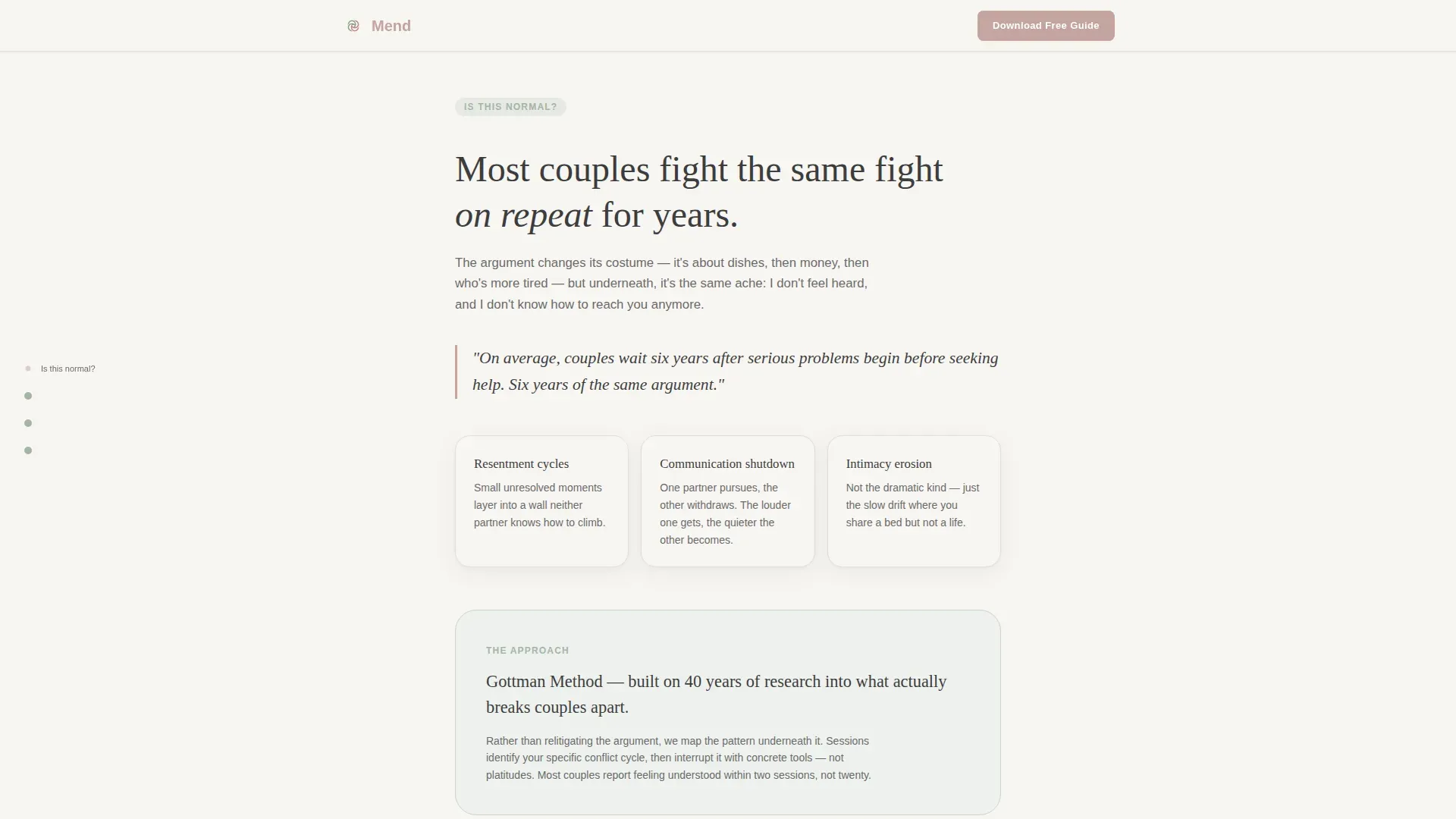
Each of the four anchor sections opens with two honest sentences naming a real problem, then resolves into the specific therapeutic approach used to address it. The arc moves from resentment and communication shutdown through to a clear picture of what session one looks like.
First Session Guide Download
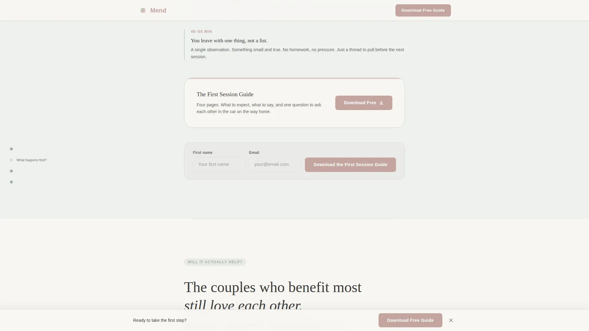
The primary conversion is a downloadable guide. A dusty rose button appears at the bottom of each spoke and floats at page end. The form asks only for a first name and email address, keeping the barrier low and the value clear.
Embedded Scheduling Widget Link
A secondary call to action labeled "See Available Times" connects visitors to a scheduling widget. It provides a direct booking path for visitors who are ready to move faster than the guide flow.
Transparent Pricing Section
One dedicated spoke addresses cost directly. A pricing clarity card presents information without hesitation or vague language, treating the visitor as someone who deserves a straight answer before committing to anything.
Page sections overview
| Section | Purpose |
|---|---|
| Testimonial Hero Card | Opens with an anonymous couple quote to create immediate emotional safety |
| Sticky Side Navigation | Keeps all four patient questions visible and navigable throughout the scroll |
| Is This Normal | Frames resentment cycles and communication shutdowns as common and treatable |
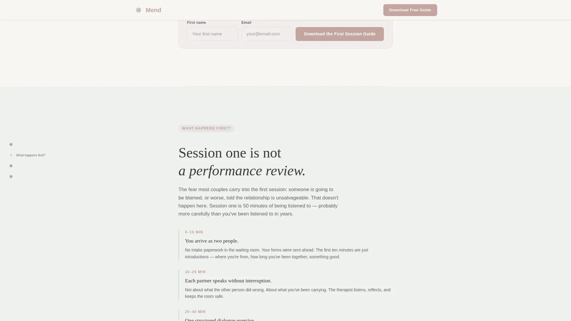
| What Happens First | Walks through the first session step by step and presents the guide download |
| Will It Actually Help | Delivers anonymous outcome quotes and therapeutic method context |
| What Does It Cost | Presents pricing clearly with a transparency-first card layout |
| Minimal Footer | Single row with copyright, privacy link, and terms link |
Design & branding system
The visual identity follows a Medical Clarity theme with a palette described as a linen-bound journal left open on a therapist's side table. Every color choice is deliberate and calm.
- Warm white (#F7F5F2) and palest sage wash alternate as section backgrounds; charcoal (#3D3D3D) carries all body text; dusty rose (#C4A4A0) is reserved exclusively for buttons and pull-quotes
- Fraunces serif is used for headlines and quotes; DM Sans handles body copy and interface elements
- Rounded corners, soft drop shadows, and a sage border on the hero card give the layout a tactile, unhurried quality that feels deliberately un-clinical
Mobile & speed optimization
The template is built mobile-first, designed for the primary visitor who is on a phone late at night. Layout decisions prioritize legibility and tap comfort at small screen sizes.
- Section reveals use IntersectionObserver with cubic-bezier easing for smooth, unobtrusive transitions as the visitor scrolls
- The sticky side navigation adapts for smaller screens and the floating call-to-action button remains accessible without crowding the reading area
- Static sections use server-side rendering; the navigation active state and email capture form are handled client-side for responsiveness without unnecessary load
How this template helps you convert
The conversion strategy is built on answering every anxious question before asking for anything. By the time a visitor reaches the download button, the guide feels like the next natural step.
- The hub and spoke structure mirrors the exact questions couples carry when they first search for help, so each section feels like a direct, personal response rather than a sales pitch
- The primary call to action appears multiple times at low friction points, asking only for a first name and email, while the secondary scheduling path serves visitors who are ready to book immediately
- The progressive emotional arc, moving from "is this normal" through to transparent pricing, builds enough trust that the final conversion feels earned rather than forced
Other information about this template
This template is part of a broader category of healthcare and wellness landing pages designed to serve high-stakes, emotionally sensitive niches. A few additional details worth knowing before you build with it.
- The template is localized for English (United States) audiences, uses USD pricing references, and formats time in 12-hour notation
- Animation intensity is set to medium, using gentle float effects and pulsing navigation dots that add life without distraction
- The footer follows a minimal single-row pattern with copyright, privacy policy, and terms of service links only
Theme
Medical Clarity
Creative direction
Problem→Solution Arc
Color system
Cloud Canvas
Style
Hub & Spoke (Anchor Nav)
Direction
Content/Resource
Page Sections
Sticky Anchor Side Navigation
Testimonial Hero Card
Problem to Solution Spoke Sections
First Session Guide Download
Transparent Pricing Clarity Card
Embedded Scheduling Widget Link
Related questions
Can I use this template for a solo therapist practice or is it only for multi-therapist clinics?
Is the download call to action connected to an email platform out of the box?
Can I edit the spoke questions to match the language my patients actually use?
Does the template include the actual First Session Guide document?
How many sections does this landing page include?



