Recovery Movement Program Booking Landing Page
Mend is a comparison table landing page built for a recovery-focused movement program. It guides outpatient counselors, sober living managers, and individuals in early recovery through fear-dissolving questions answered in soft, side-by-side tables. A low-friction booking form and a gentle secondary contact path make it easy to take the first step.
by Rocket studio
Quick summary
Mend is a single-page booking template for a recovery movement program. It uses FAQ-driven comparison tables to dissolve common fears before asking for anything. The page moves from emotional safety to physical programming to clinical context, ending with a simple session booking form that asks for only three things.
Who this template is for
This template was designed for people and organizations working at the intersection of recovery support and physical wellness. It speaks clearly to those who need reassurance before commitment.
- Outpatient counselors who refer patients and need a credible, calm referral destination
- Sober living house managers filling afternoon program schedules with structured group activity
- Individuals in early recovery who need a safe, judgment-free outlet for new physical energy
What problem this template solves
People in early recovery carry real hesitation about joining any fitness program. Traditional gym marketing does not answer their actual questions. This template is built around those questions specifically.
- Fear of judgment, comparison, and performance pressure keeps people from showing up
- Generic booking pages ask for commitment before offering any reassurance or context
- Program managers and counselors need a referral page that earns trust before asking for a booking
What you get with this template
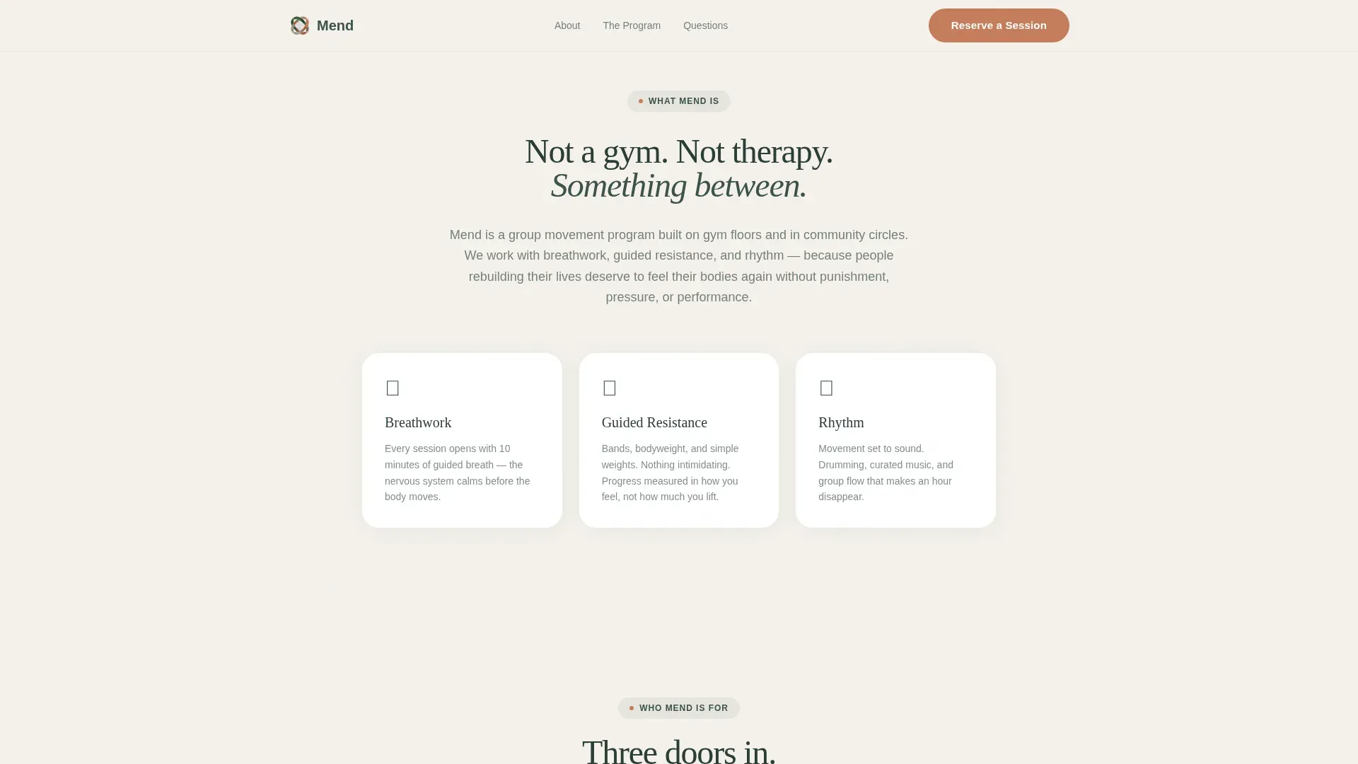
You get a complete, ready-to-customize single-page layout organized around honest answers and quiet design. Every section does a specific emotional and functional job.
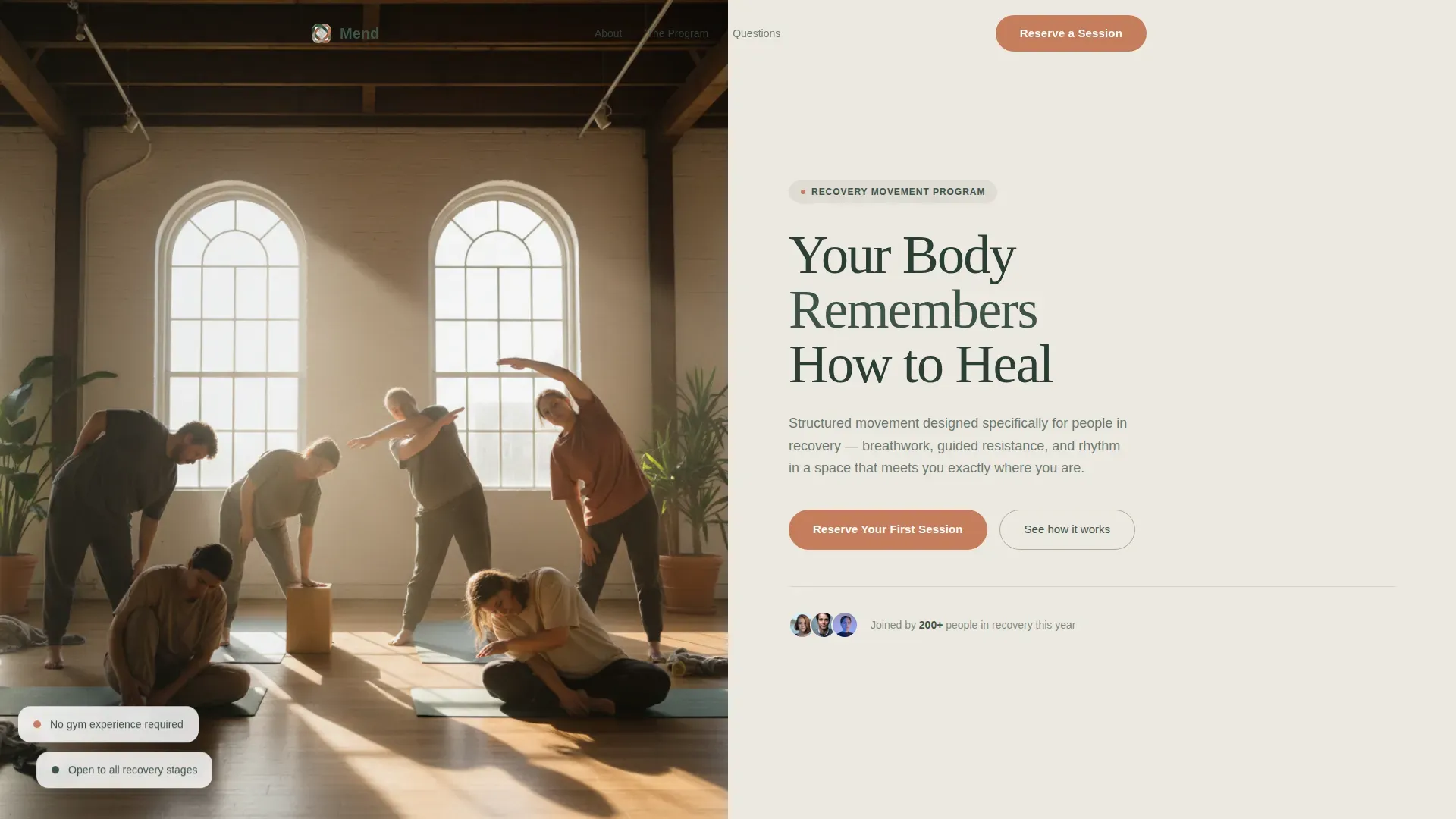
- A half-page photo and text hero that sets tone before a word is read
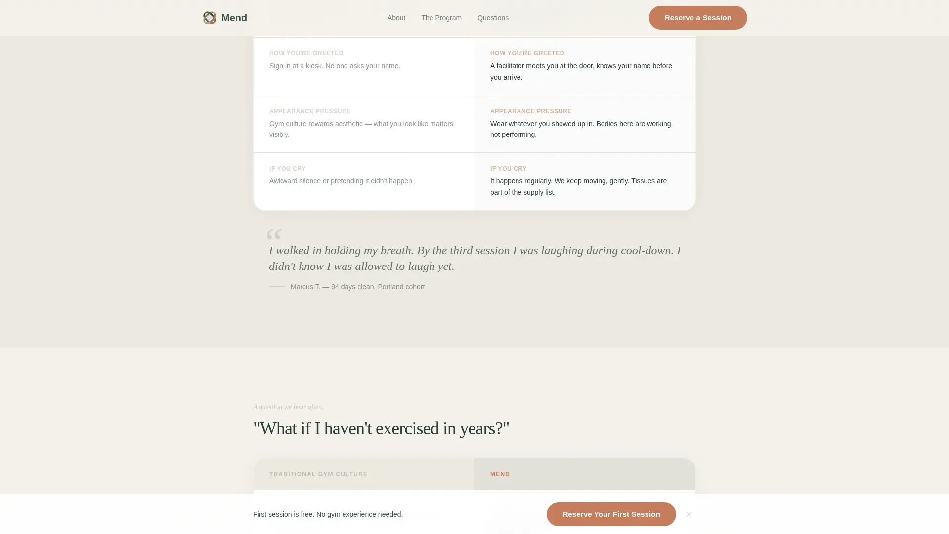
- Three soft-bordered comparison tables addressing emotional safety, physical readiness, and medication context
- A primary booking form and a secondary "Talk to Us First" message path built into the page
Feature list
This template is built around a clear set of functional and visual components drawn directly from the program brief.
Half-Page Hero Split
The header divides into a left photograph and a right text panel. The photo shows a small group stretching in natural light, bodies unhurried and real. The right panel carries a serif headline and a single subline naming the program's promise.
FAQ-Driven Comparison Tables
Three full-width comparison tables anchor the page scroll. Each table answers one real question from early recovery: judgment, fitness history, and medication safety. Rows contrast traditional gym culture with what this program offers, so reassurance arrives in a format that is easy to scan.
Testimonial Quote Weave
Quiet testimonial quotes appear between the comparison tables. They are placed to punctuate emotional beats without overwhelming the layout, reinforcing trust at the moments it matters most.
Low-Friction Booking Form
The primary call to action asks only for a first name, preferred location or virtual attendance, and a date selection from the next two weeks of open group sessions. The minimal field count reduces friction for people who are still building courage.
Secondary Contact Path
A "Talk to Us First" option opens a simple message field for visitors not ready to book. It sits alongside the booking form, offering a softer on-ramp that does not require any commitment upfront.
Pinned Session call to action
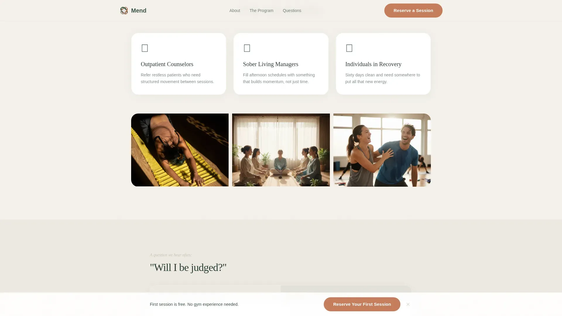
"Reserve Your First Session" appears after the third comparison table and is gently pinned at the bottom of the viewport. It stays visible without being intrusive, making the booking action available at any scroll point.
Page sections overview
| Section | Purpose |
|---|---|
| Hero split header | Sets emotional tone and names the program promise |
| Comparison Table 1 | Addresses fear of judgment and emotional safety |
| Testimonial quote | Reinforces trust after the first table |
| Comparison Table 2 | Covers physical readiness and beginner-friendly programming |
| Testimonial quote | Adds peer voice before the clinical section |
| Comparison Table 3 | Answers medication safety and clinical context |
| Booking form | Captures session reservations with minimal fields |
| Secondary contact path | Offers a lower-commitment message option |
| Page footer | Closes with horizontal flow layout and program context |
Design & branding system
The visual identity follows an Organic Flow theme. Every design decision pulls toward calm and away from clinical. The color system is called Cloud Canvas, and it behaves like a morning meadow after rain.
- Background surfaces alternate between fog white (#F4F1EB) and a faint warm stone wash (#B5A898), keeping the page soft and breathable
- Body text and headlines live in deep moss (#3B5249), while terra cotta (#C67D5B) appears only on buttons and active states, acting as a single warm ember in a calm room
- Typography pairs Fraunces serif for headlines with DM Sans for body text, creating unhurried authority without clinical stiffness
Mobile & speed optimization
The template is built mobile-first, which reflects how the primary audience actually moves through the world. People booking recovery sessions are often on their phones, between appointments or at home.
- The booking form, comparison tables, and hero all reflow cleanly for smaller screens without losing layout intent
- Gentle fade-ins and soft scroll reveals use medium animation weight, avoiding jarring motion that could feel abrupt or clinical
- The static-first build with minimal JavaScript keeps the page responsive and load-friendly across varied connection conditions
How this template helps you convert
The page earns the booking before it asks for one. Every section is sequenced to reduce hesitation progressively.
- The comparison tables answer the three fears most likely to stop someone from booking, moving from emotional safety through physical readiness to medication context, so by the third table the visitor already feels seen
- The pinned call to action and secondary message path work together, giving people two ways to engage based on where their courage is that day, which means fewer people leave without taking any action
Other information about this template
This template is categorized under Health & Medical, specifically within the Addiction and Recovery Care subcategory. It is built for the addiction and recovery exercise program niche, where design tone and content framing carry as much weight as layout structure.
- The Intersection Match Score for this template is 13, reflecting strong alignment between the niche, creative direction, and template style
- The template style is Comparison Table, paired with FAQ-Driven creative direction, which is an intentional combination for trust-building in sensitive health service contexts
- The landing page direction is Booking and Scheduling, making conversion the clear terminal goal while keeping the path to that goal gentle and unhurried
Theme
Organic Flow
Creative direction
FAQ-Driven
Color system
Cloud Canvas
Style
Comparison Table
Direction
Booking/Scheduling
Page Sections
Faq-driven Comparison Tables
Half-page Hero Split
Low-friction Booking Form
Secondary Contact Path
Pinned Session Call to Action
Woven Testimonial Quotes
Related questions
What kind of program is this template designed for?
Can outpatient counselors use this page as a referral destination?
Do I need to rewrite all the comparison table content?
What if a visitor is not ready to book a session?
Who is the primary audience this landing page speaks to?



