Cancer Recovery Care Specialist Reviews Website Template
Mend is a cancer recovery support group landing page built around emotional storytelling and quiet design. It guides post-treatment survivors and caregivers toward joining a peer circle, using a split-screen layout, seven raw testimonials, and a warm Forest Trust color palette to earn trust before the first click.
by Rocket studio
Quick summary
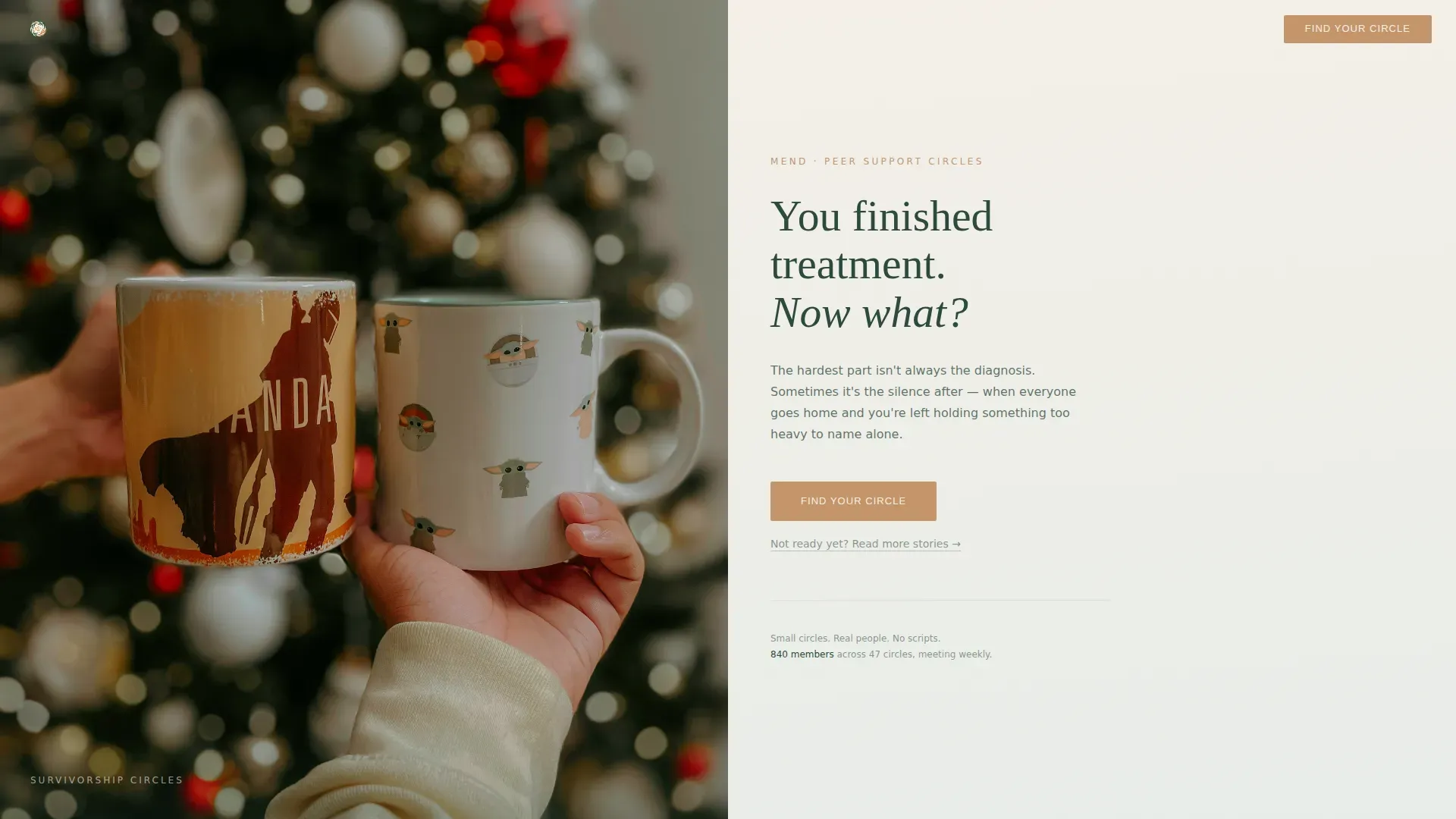
Mend is a single-page, click-through landing page for a cancer recovery support group. It pairs a half-page photo and text hero with an alternating testimonial mosaic to move visitors from isolation toward connection. Every design choice, from generous white space to quiet amber buttons, is built to make a frightened survivor feel welcome before they commit to anything.
Who this template is for
This template is made for community organizers, healthcare advocates, and peer support groups who need to reach people at the most vulnerable point in their cancer journey. It speaks to two audiences at once, without asking either to perform strength they do not have.
- Post-treatment cancer survivors who are weeks or months out of active treatment and unsure what comes next
- Caregivers and spouses who spent months holding things together and now need their own space to land
- Support group coordinators who want a warm, trustworthy first impression before asking anyone to fill out a form
What problem this template solves
The silence after cancer treatment ends is one of the least-discussed parts of survivorship. Clinics discharge patients, schedules clear, and the world expects relief. But many survivors describe that quiet as the hardest part. This template gives a support community a digital front door that names that silence directly, without clinical detachment.
- Most healthcare pages feel sterile or transactional, which is exactly wrong for someone in emotional recovery
- Caregivers are rarely addressed as people who also need support, so they bounce before they ever ask for help
- Generic call-to-action pages lose hesitant visitors the moment they feel pressured; this template keeps them inside the experience instead
What you get with this template
You get a fully structured, single-page layout built specifically for a cancer recovery support community. Every section is pre-designed with intentional pacing, so the emotional arc from isolation to connection to purpose is already mapped out for you.
- A split-screen hero section with a half-page photo slot and warm serif headline copy
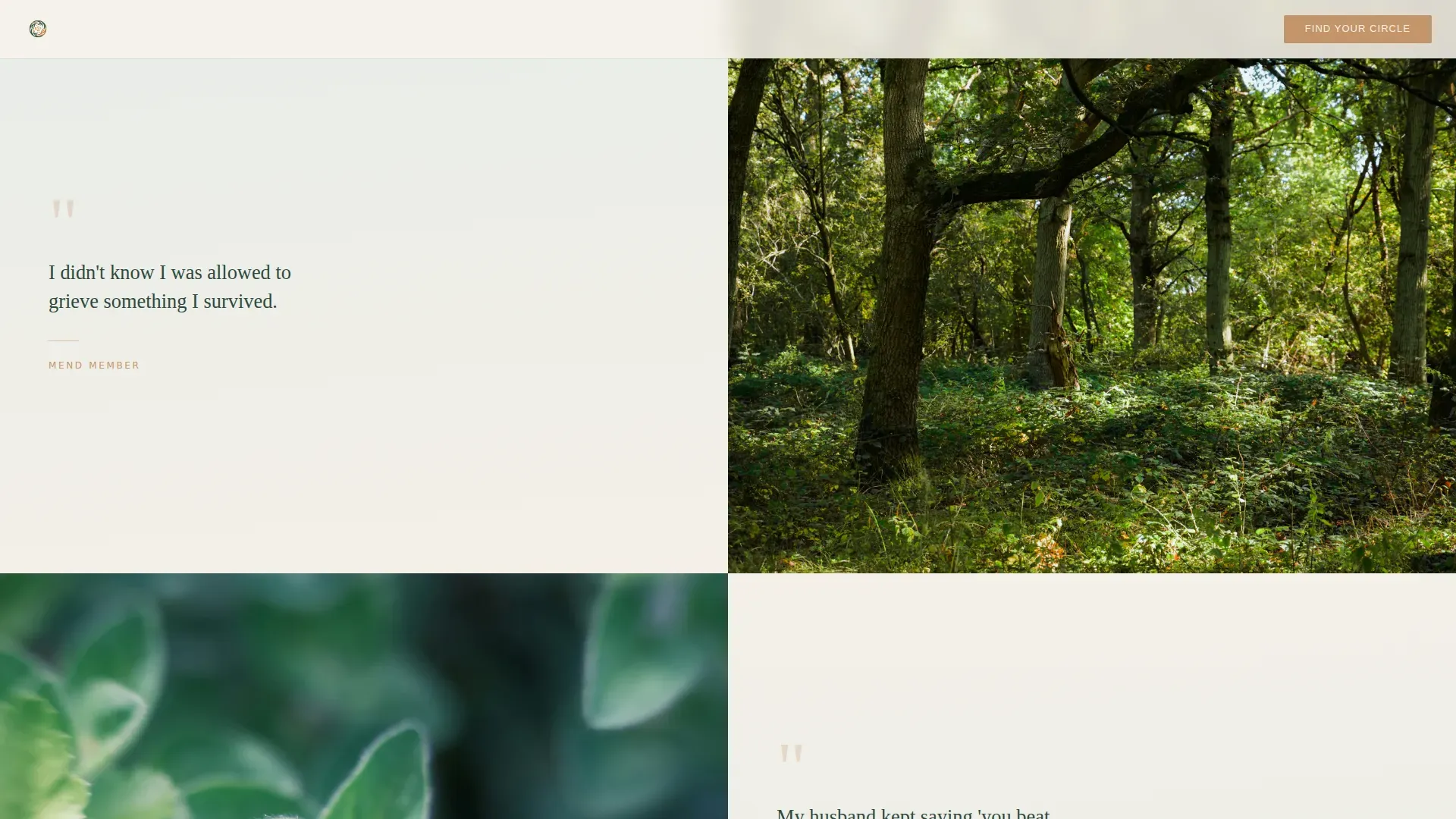
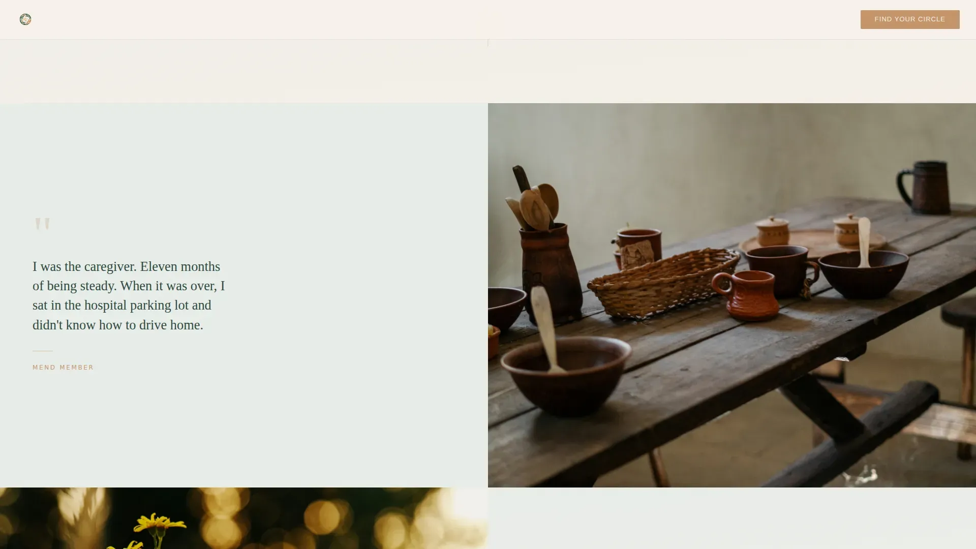
- A seven-story testimonial mosaic that alternates sides down the page, building from raw isolation to shared purpose
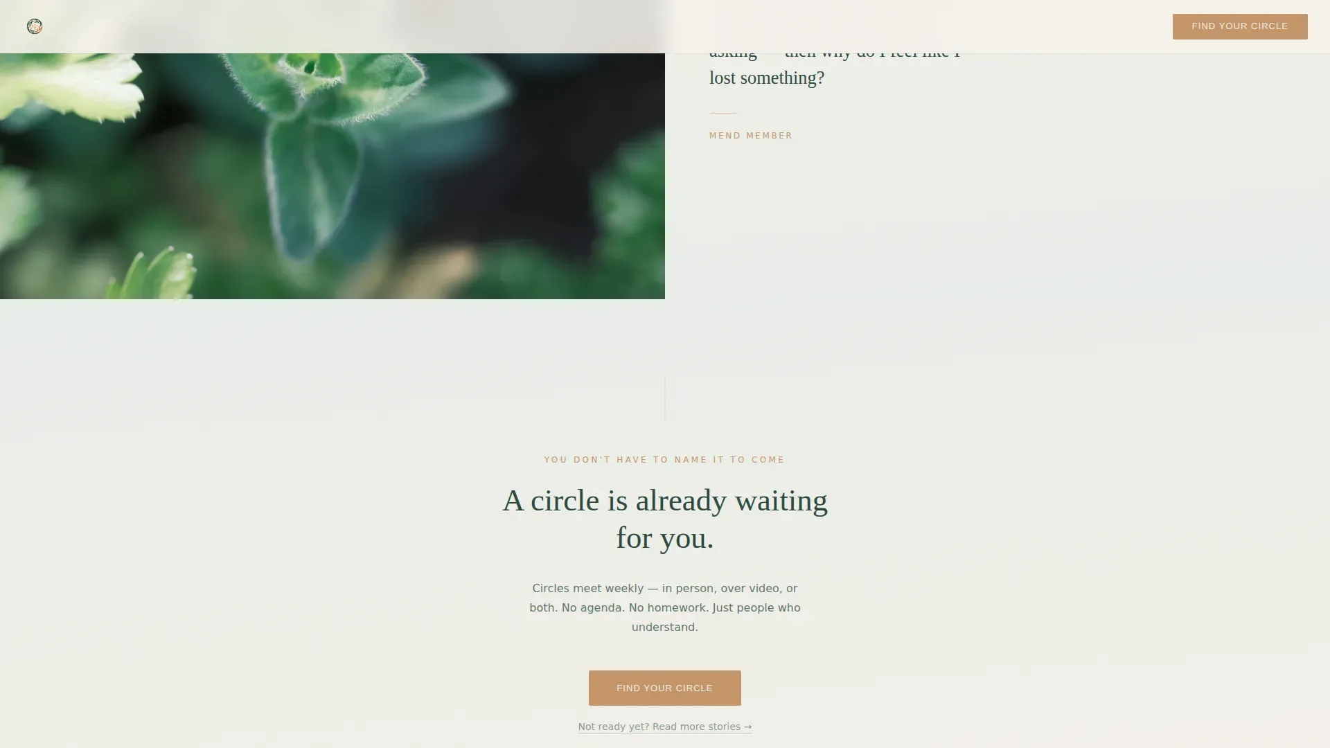
- Repeated amber call-to-action placements that appear after every third testimonial, plus a secondary text link for visitors who are not ready yet
Feature list
A paragraph describing the feature list section introduces how this template's components work together. Each feature below is a discrete, prompt-backed capability included in the layout.
Split-Screen Hero Section
The hero divides the viewport equally between a softly lit photograph slot and a text panel. The left side holds a close-cropped image of two hands over ceramic mugs with a shallow depth-of-field blur. The right side carries a warm serif headline and a single amber call-to-action button.
Alternating Testimonial Mosaic
Seven unsigned member stories are laid out in alternating left-right panels, each pairing text with a textured abstract or nature-close-up image. The sequence moves deliberately from isolation through connection to a final three-voice chorus, so the emotional arc builds with every scroll.
Repeating Amber Call-to-Action Placement
The primary "Find Your Circle" button appears in the hero and returns after every third testimonial. It sits in amber on birch bark, consistent and quiet, so it feels like an open invitation rather than a demand. No form exists on this page; the click earns itself through accumulated emotional proof.
Secondary Retention Link
A text link reading "Not ready yet? Read more stories" appears alongside the call-to-action interludes. It keeps hesitant visitors moving through the page instead of leaving, preserving the emotional journey for people who need more time before committing.
GSAP ScrollTrigger Reveal Animations
Sections animate into view as the visitor scrolls, using staggered text reveals and subtle image parallax. Motion is intentionally moderate, unhurried, and never aggressive, so the pacing matches the emotional tone of the content.
Forest Trust Color System
The entire page uses a four-color palette of deep moss, morning fog, birch bark cream, and quiet amber. Backgrounds drift between fog and cream in soft vertical gradients. Amber is reserved exclusively for buttons and gentle highlights, preserving its weight as a signal rather than decoration.
Page sections overview
| Section | Purpose |
|---|---|
| Hero Split Screen | Introduce the community with a warm photo and headline that names the loneliness of survivorship |
| Testimonial Rows 1 and 2 | Open with raw isolation stories alternating left and right to build emotional recognition |
| Call-to-Action Interlude 1 | First "Find Your Circle" placement after early testimonials |
| Testimonial Rows 3 through 5 | Shift tone toward connection as stories become less afraid |
| Call-to-Action Interlude 2 | Second amber call-to-action placement mid-page |
| Final Chorus Block | Three overlapping voices shown together as a closing crescendo |
| Bottom Call-to-Action | Last "Find Your Circle" button before footer |
| Minimal Footer | Horizontal footer strip, clean and unobtrusive |
Design & branding system
The visual identity uses the Forest Trust color system, built to feel like early light filtering through old-growth trees onto a forest floor. Every color choice is deliberate, and white space is treated as silence rather than emptiness.
- Four-color palette: deep moss (#2D4A3E) for text, morning fog (#E8EDE9) and birch bark cream (#F5F0E8) for backgrounds, and quiet amber (#C4956A) reserved for buttons and gentle highlights only
- Typography pairing: Fraunces serif for headlines to carry warmth and weight, and DM Sans for body text to keep reading easy and unforced
- Backgrounds use soft vertical gradients drifting between fog and cream, with generous white space treated as an intentional design element throughout
Mobile & speed optimization
The template is designed desktop-first, with a graceful mobile stack that preserves emotional impact when split panels reflow into a single column. Pacing and visual hierarchy are maintained across screen sizes.
- Split-screen panels stack vertically on smaller screens so photo and text remain readable without crowding
- GSAP ScrollTrigger animations are kept at a moderate intensity, avoiding aggressive motion that could feel jarring on mobile devices
- Server Components are used for static content sections, keeping page delivery clean and consistent across devices
How this template helps you convert
This template does not rely on urgency tactics or heavy form friction. Instead, it builds trust slowly and steadily through emotional recognition, so that by the time a visitor reaches the bottom, the decision to click feels natural.
- The testimonial mosaic places seven stories in sequence, each one slightly less afraid than the last, so visitors find their own experience reflected back at them before any ask is made
- The primary call-to-action appears three times at measured intervals, always in the same quiet amber, so it registers as a standing invitation rather than a hard sell
- The secondary text link catches hesitant visitors who are not ready to click the main button, keeping them inside the page and inside the emotional journey rather than sending them away
Other information about this template
This template is built for the cancer recovery support group niche within the broader Health and Medical category. It is specifically designed for the cancer recovery care subcategory, where emotional tone is as important as layout structure.
- The click-through flow leads to a separate registration or intake page; no data collection happens on this landing page itself
- The header concept is a Half-Page Photo and Text split, a deliberate choice to lead with human intimacy rather than brand messaging or statistics
- The creative direction is a Testimonial Mosaic, meaning the page's persuasive core is built entirely from peer voices rather than organizational claims
- The template style is a 50/50 split screen throughout, giving equal visual weight to image and word at every stage of the scroll
- The Soft Gradient theme governs background transitions, keeping the visual tone consistent with the organic warmth of the Forest Trust color system
Theme
Soft Gradient
Creative direction
Testimonial Mosaic
Color system
Forest Trust
Style
Split Screen (50/50)
Direction
Click-Through
Page Sections
Split-screen Hero Section
Alternating Testimonial Mosaic
Repeating Amber Call-to-action
Secondary Retention Text Link
GSAP Scrolltrigger Animations
Forest Trust Color System
Related questions
Does this template include a sign-up form?
Can I replace the testimonials with my own community's stories?
What happens to the split-screen layout on a phone?
Do I need coding experience to edit this template?
Is the call-to-action button text editable?



