Acupuncture Pain Clinic Landing Page Template
Meridian is a sidebar companion landing page built for acupuncture pain clinics. It pairs a fixed interactive body diagram with scroll-driven expert sections to build clinical trust and capture leads. The "Find Your Treatment Plan" intake form and a gated evidence guide PDF turn first-time visitors into booked consultations, without relying on emotional persuasion.
by Rocket studio
Quick summary
Meridian is a precision-built landing page for acupuncture pain clinics targeting chronic pain sufferers. It combines a sticky sidebar body diagram, scroll-triggered expert panel sections, and an intake-style lead form. The design is clinical yet warm, refined serif type on linen white, anchored by deep teal. Evidence accumulates as visitors scroll, earning trust before asking for a commitment.
Who this template is for
This template is built for acupuncture practitioners and pain clinics that want to convert skeptical, research-minded visitors into booked consultations. It works best when your clinic treats persistent conditions and needs to communicate clinical credibility without feeling cold or transactional.
- Clinics specializing in back pain, migraine relief, and joint pain treatment
- Practitioners who want to present peer-reviewed evidence alongside their credentials
- Healthcare marketers building a lead generation page for a pain management practice
What problem this template solves
Chronic pain patients have usually tried several treatments before finding acupuncture. They arrive skeptical. Generic clinic pages with stock photography and vague wellness language do not convert this audience. Meridian is designed to meet them where they are, with specificity, mechanism-level explanations, and a form that feels like an intake conversation rather than a sales pitch.
- Visitors leave generic clinic pages because nothing speaks to their specific pain type
- Skeptical patients need accumulating evidence, not emotional copy, to take the next step
- A one-size lead form fails chronic pain sufferers who want to feel individually assessed
What you get with this template
You get a fully structured single-page layout with a persistent sidebar, a multi-section expert panel flow, and two distinct lead capture paths. Every section has a defined role in the trust-building sequence, and the design system is consistent from hero to footer.
- A fixed sidebar with a clickable body diagram that dynamically updates the main content column
- An expert panel scroll flow with practitioner profiles, mechanism explanations, and peer-reviewed study cards
- A dual lead capture system: an intake-style booking form and a gated PDF evidence guide
Feature list
Clickable Body Diagram Sidebar
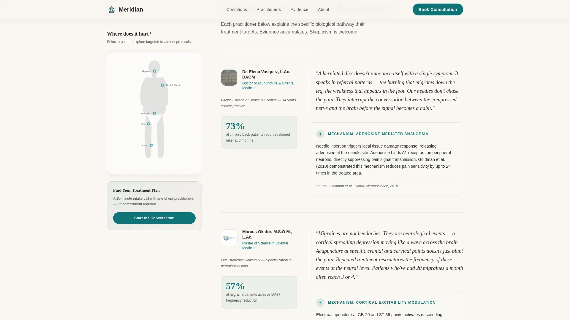
The sidebar stays fixed as visitors scroll, displaying a simplified body diagram with glowing teal interaction points on the shoulders, lower back, knees, and temples. Visitors click a pain point to self-select their condition, and the main content column updates to match. This interaction mirrors a real intake experience and keeps the visitor engaged throughout the scroll.
Expert Panel Scroll Sections
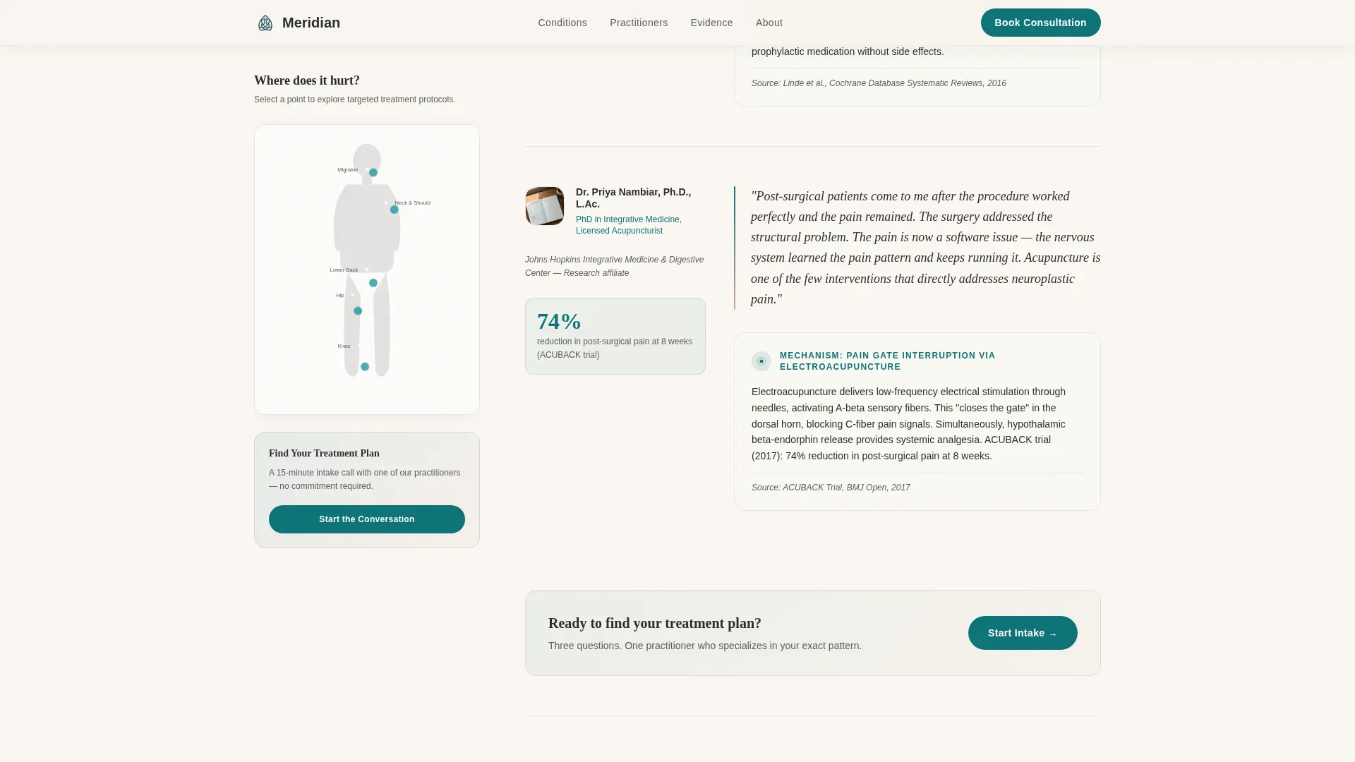
Each scroll section introduces either a practitioner profile or a published study. Explanations go mechanism-deep, covering concepts like adenosine release from needle stimulation and electroacupuncture pain-gating interruption. Evidence accumulates section by section, building clinical credibility without relying on emotional language.
Intake-Style Lead Form
The "Find Your Treatment Plan" form appears both in the sticky sidebar and after the third expert section. It asks for pain location via a dropdown that mirrors the body diagram, duration of pain, and a free-text field asking what the visitor has already tried. This sequence feels like a practitioner's intake conversation, not a contact form.
Gated PDF Evidence Guide
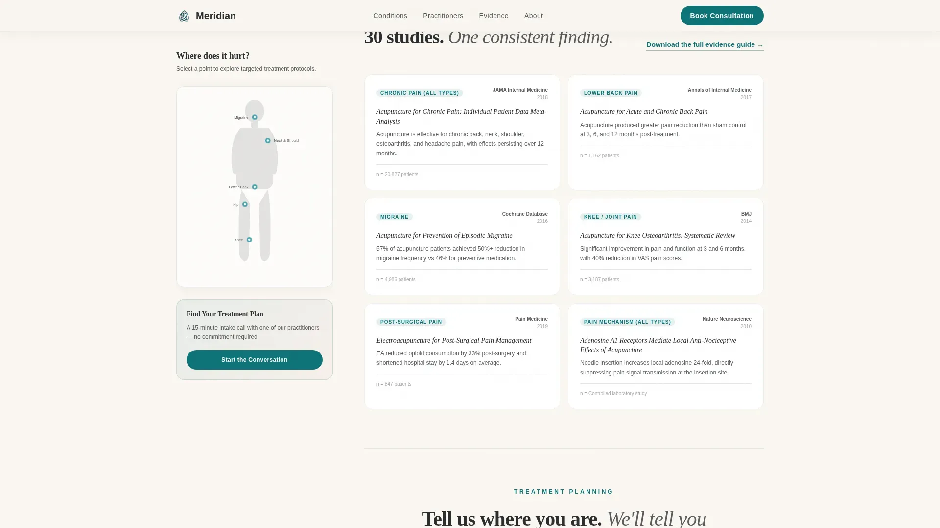
A secondary lead capture path offers a downloadable document titled "The Evidence Guide: 30 Peer-Reviewed Studies on Acupuncture for Pain." It is gated behind a simple email field. This captures visitors who are not yet ready to book but are still researching their options.
Giant Headline Hero Section
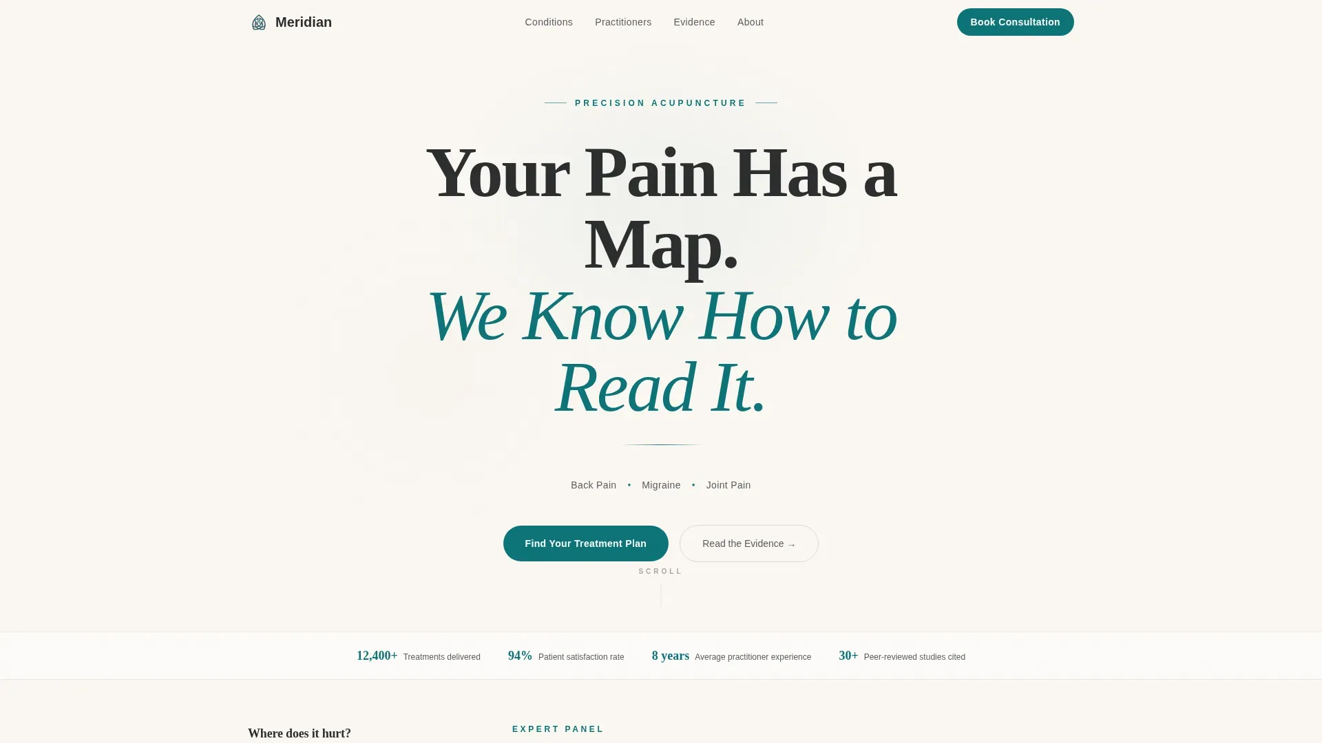
The hero opens with a stark centered headline in refined serif type: "Your Pain Has a Map. We Know How to Read It." A single thin teal SVG line runs beneath it, styled as a meridian pathway. Three pain types, back, migraine, joint, appear below as a one-line subhead with needle-point dot separators. No imagery competes with the headline.
Practitioner Profile Cards
Three practitioner profiles are built into the template, each pairing credentials and specializations with a specific mechanism or treatment outcome explanation. These profiles function as social proof anchors within the expert panel flow, reinforcing that the clinic's approach is grounded in training and evidence.
Page sections overview
| Section | Purpose |
|---|---|
| Hero Headline | Establish precision positioning with stark serif headline and meridian line |
| Fixed Sidebar Diagram | Let visitors self-select pain type via interactive body diagram |
| Expert Panel Scroll | Build clinical trust through mechanism explanations and study references |
| Practitioner Profiles | Anchor social proof through credentials and specialization detail |
| Evidence Study Cards | Accumulate peer-reviewed credibility across the scroll journey |
| Intake Lead Form | Convert ready visitors through an assessment-style booking form |
| PDF Evidence Gate | Capture research-stage visitors with a gated downloadable guide |
| Footer | Close with a clean single-row linear footer layout |
Design & branding system
The design system is named Teal Catalyst and follows an Educational Guide theme. Every color choice is deliberate: the palette feels like a practitioner's office, still water walls, warm light, clinical confidence without fluorescent harshness.
- Deep treatment-room teal (#0D7377) for primary actions, interactive dots, and the meridian SVG line
- Calm linen white (#FAF7F2) as the page background, giving the layout room to breathe
- Warm blush (#D4A59A) as an accent for subtle warmth, and charcoal ink (#2B2D2F) for body text
- Fraunces serif for headlines at large scale; DM Sans for body copy and form fields
Mobile & speed optimization
The template is built desktop-first because the sidebar layout requires a wide viewport to function properly. On smaller screens, the sidebar collapses into a top accordion so visitors can still self-select their pain type before reading the main content.
- Sidebar converts to a collapsible accordion on mobile, preserving the self-selection flow
- Interactive components, the body diagram and lead form, are isolated as client-side elements; the rest of the page is static-first for fast initial load
- Scroll-triggered reveals and smooth section transitions are included at a medium animation level, keeping the page lively without slowing it down
How this template helps you convert
The conversion architecture is designed around the specific psychology of chronic pain patients: they are skeptical, research-oriented, and have been let down before. Every layout decision serves the goal of making visitors feel understood and assessed rather than marketed to.
- The clickable body diagram creates immediate personal relevance, the page feels like it is already responding to the visitor's specific condition before they have filled in anything.
- The intake form sequence mirrors a real clinical intake conversation, asking pain location, duration, and prior treatments in order. This removes the "sales form" feeling and replaces it with the sense of being professionally evaluated.
- The gated PDF provides a second conversion path for visitors not ready to book, capturing their email with a high-value evidence resource and keeping the clinic's credibility in their inbox.
Other information about this template
Meridian is categorized under Health & Medical, with a specific focus on the Pain Management subcategory and the acupuncture for pain niche. The template style is Sidebar Companion, meaning the persistent sidebar is a structural requirement, not a decorative choice. The intersection match score for this niche and template combination is 13, indicating a strong alignment between the acupuncture pain clinic use case and the lead generation layout direction.
- Template style: Sidebar Companion with a desktop-first layout and mobile accordion fallback
- Creative direction: Expert Panel, where credibility builds through accumulating practitioner and study evidence
- Lead generation direction: dual-path capture combining a booking intake form and a PDF email gate
- The footer uses a Pattern 1 linear single-row layout for a clean, minimal close to the page
Theme
Educational Guide
Creative direction
Expert Panel
Color system
Teal Catalyst
Style
Sidebar Companion
Direction
Lead Generation
Page Sections
Clickable Body Diagram Sidebar
Expert Panel Scroll Flow
Intake-style Lead Form
Gated PDF Evidence Download
Giant Headline Hero Section
Practitioner Profile Cards
Related questions
Who is this landing page template designed for?
What are the two ways this template captures leads?
How does the sidebar body diagram work?
Does this template include actual peer-reviewed study content?
Can this template work for a clinic focused on a single pain type?



