Luxe Peruvian Meal Kit Landing Page Template
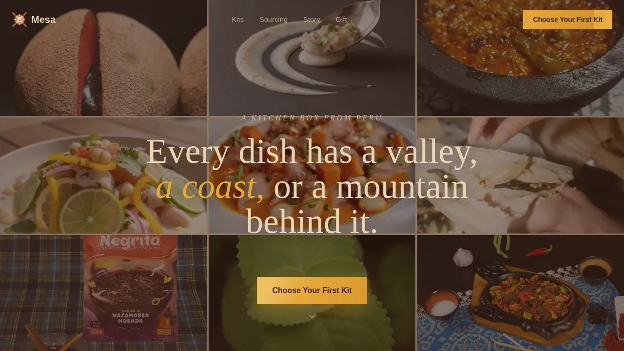
Mesa is a Luxe Minimal gallery and detail landing page built for a premium Peruvian meal kit delivery service. It moves visitors through a five-sense scroll journey, from a nine-tile photo mosaic header to scent, texture, kit gallery, and provenance sections, ending at a high-contrast "Choose Your First Kit" call to action. No forms, no friction, pure craving architecture.
by Rocket studio
Quick summary
Mesa is a single-page, gallery-led landing page template designed specifically for a premium Peruvian meal kit service. It guides visitors through an immersive sensory scroll, building appetite before building intent. Every section deepens the craving. By the time a visitor reaches the kit gallery, they are already hungry, already convinced, and already reaching for the call-to-action button.
Who this template is for
Mesa was crafted for food founders, DTC (direct-to-consumer) meal kit operators, and culinary entrepreneurs who want their landing page to feel as considered as the food itself. It is not a generic food template. Every layout decision, every color choice, and every interaction reflects the specific world of high-provenance Peruvian cooking delivered to the home cook.
- Home cook brands targeting customers who have eaten ceviche or lomo saltado at a restaurant and want to recreate those dishes on a weeknight
- Expat-facing Peruvian food businesses serving customers who crave anticuchos, causa, or tiradito without sourcing ingredients all day
- Adventurous couples and food-forward households who treat weeknight cooking as a shared experience worth investing in
What problem this template solves
Most food landing pages front-load logistics and bury the emotion. They lead with delivery windows, subscription fine print, and box contents before the visitor has any reason to care. The result is a page that informs but never seduces. Mesa inverts that entirely.
The template solves the core conversion problem for premium food brands: getting a visitor to feel the product before they read about it. By the time Mesa shows pricing or kit options, the visitor has already smelled the box opening, felt the texture of crispy chicharrón skin, and heard the sizzle of a lomo saltado wok. That emotional progress is what transforms browsing into buying.
- Eliminates the cold, logistics-first page experience that causes high bounce rates on premium food sites
- Replaces generic product photography layouts with a sensory-sequence scroll that builds appetite section by section
- Solves the trust gap by placing a single-line guarantee and rotating real customer review snippets exactly where doubt tends to arise
What you get with this template
Mesa delivers a fully structured, visually rich landing page ready to be populated with your own photography, copy, and kit details. Every section is purpose-built for a Peruvian meal kit context. The template includes seven distinct sections, each with a specific sensory or conversion role. The design work is done. The interaction logic is defined. You populate, publish, and watch visitors scroll all the way to the call to action.
- A nine-tile Photo Grid Mosaic hero with hover-reveal ingredient names, a fading centered headline, and a primary "Choose Your First Kit" call-to-action button placed immediately below the fold
- Five thematic scroll sections covering sight, aroma, texture, kit gallery with expandable recipe panels, and a provenance sourcing strip, followed by a minimal footer
- A sticky bottom call-to-action bar that appears after the third scroll section, a rotating three-word review strip, and a single-line guarantee that builds trust without clutter
Feature list
Mesa includes a focused set of interactive and visual features, each designed to serve the sensory-led, click-through goal of the template. Every feature listed here is grounded in the original design brief.
Nine-Tile Photo Grid Mosaic Hero
The hero fills the entire viewport with nine square tiles, each a tightly cropped overhead ingredient shot against a linen background. Thin sand-colored gutters breathe between tiles. On hover, each tile lifts with a subtle shadow and reveals the ingredient name in a spare serif typeface. After a brief beat, a single centered headline fades in over the mosaic. This approach places a professional, high-resolution visual of the product world above the fold immediately, triggering an emotional response before a single word of copy is read. A high-contrast "Choose Your First Kit" call-to-action button, rendered in ají yellow, appears directly beneath the mosaic. High-contrast buttons with action-oriented text are essential on a high-converting landing page, and this template delivers that from the very first scroll position.
Five-Section Sensory Scroll Journey
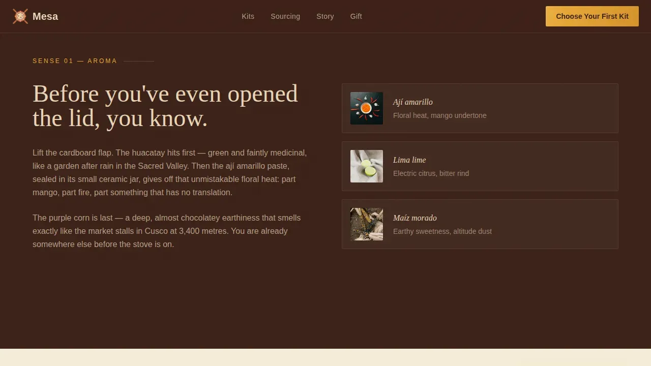
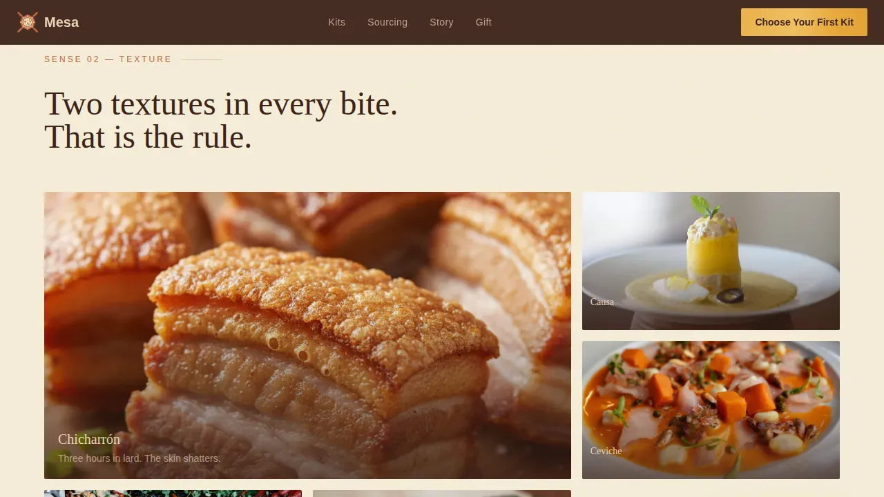
The page progresses through five senses in deliberate sequence: sight in the mosaic, aroma as the next section describes what you smell when the box opens, texture through macro-shot close-ups of chicharrón skin and silky causa layers, taste through the kit gallery with SVG flavor-profile wheels, and finally sound via a short ambient audio clip of a sizzling lomo saltado wok. Using emotive language to describe flavors, textures, and origins is a proven method for enhancing sensory appeal on food landing pages, and this template structures that principle as the entire editorial spine of the page. Each section deepens the craving rather than delivering a logistics briefing. By the midpoint of the scroll, the visitor is hungry, not merely informed.
Kit Gallery with SVG Flavor Wheels and Expandable Panels
The Kit Gallery section presents three kit cards, each featuring an SVG flavor-profile wheel with animated stroke-dashoffset rendering. Each card also includes an expandable detail panel containing recipe instructions and sourcing notes. Keeping surface presentation minimal while allowing depth on demand is a key pattern for premium food e-commerce. This approach supports the best practice of including step-by-step instructions and ingredient provenance while keeping the primary page surface clean and visually dominant. Pricing can be added to each card to help qualify buyers early, following the "Buy Box" best practice of clearly indicating price per serving.
Sticky Bottom Call-to-Action Bar
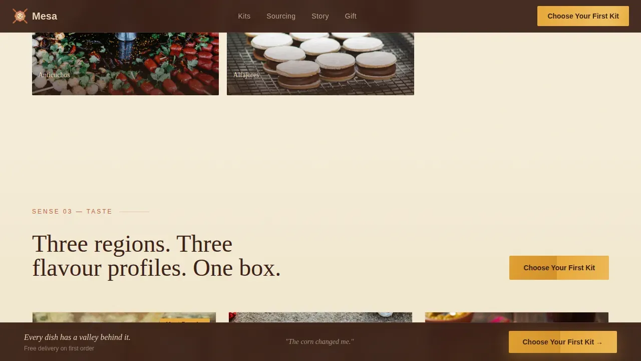
After the visitor scrolls past the third section, a sticky bottom bar locks into place at the base of the viewport. It carries a prominent "Choose Your First Kit" button rendered in ají yellow. This ensures a clear call-to-action is present at every point in the scroll journey without interrupting the sensory narrative above it. A prominent button that directs users toward kit selection, with actionable text such as "Order Your Kit" or "View Menu," is essential for reducing drop-off on food landing pages. This template makes that button persistent and visible from the midpoint of the page onward.
Rotating Review Strip and Single-Line Guarantee
Social proof is handled with precision rather than volume. A marquee-style rotating strip cycles through three-word reviews pulled from real orders, such as "Better than abuela's," "Ceviche in twelve minutes," and "The corn changed me." Directly below the strip, a single-line guarantee reads: "If your ají doesn't bloom in the pan, we reship it." Including three to five customer reviews and a clear trust signal is a proven practice for building credibility on meal kit landing pages. This template delivers both in a format that adds trust without adding visual noise.
Provenance Sourcing Origins Strip
The Provenance section presents a sourcing origins strip that maps key ingredients to their geographic source: ají amarillo paste from Cañete, purple corn dried at Cusco altitude, and ingredients from the Sacred Valley. The "Origin" section approach, which shares the story of ingredients to deepen customer connection, is well established in premium food e-commerce. This section gives the brand a moment to demonstrate that its sourcing is intentional and traceable, which builds the kind of long-term credibility that drives both first purchases and repeat orders.
Page sections overview
| Section | Purpose |
|---|---|
| Hero Mosaic Grid | Nine ingredient tiles fill the viewport; hover reveals names; headline fades in; primary call to action appears below |
| Aroma Box Open | Sensory copy describes what the box smells like on arrival; ingredient close-up photography |
| Texture Macro Grid | Asymmetric grid of macro shots; chicharrón skin, causa layers, tiradito ribbons |
| Kit Gallery Cards | Three kit cards with SVG flavor wheels, expandable recipe panels, and pricing callouts |
| Provenance Origins Strip | Geographic sourcing map linking ingredients to Cañete, Cusco, and the Sacred Valley |
| Sticky call to action Bar | Persistent bottom bar carrying the "Choose Your First Kit" button after scroll section three |
| Review and Guarantee | Rotating three-word review marquee and single-line reship guarantee |
| Minimal Footer | Horizontal flow footer pattern, minimal links, no visual noise |
Design & branding system
Mesa uses the Sunset Mesa color system, a warm Luxe Minimal palette that evokes the last twenty minutes of golden hour on an Andean plateau. The typography pairing anchors the editorial tone in both display weight and body clarity. Every color choice and typeface decision is deliberate and tied directly to the tactile, "wooden crate" feel described in the original design brief.
- Color palette: sun-baked terracotta (#C1613D) as the primary surface tone, desert sand (#E8D5B7) for background and gutters, deep adobe shadow (#3B2117) for text and depth, and bright ají yellow (#E8A838) reserved exclusively for buttons, price callouts, and hover states
- Typography: Fraunces serif for all display headings and editorial moments; DM Sans for body copy, labels, and interface text
- Visual texture: grain overlay, scan-line animation, and linen-background ingredient photography give the page a tactile editorial warmth that feels handcrafted rather than templated
Mobile & speed optimization
Mesa is built desktop-first because the nine-tile mosaic hero is a viewport-filling experience designed for larger screens. However, the template includes full mobile responsiveness, meaning every section reflows correctly and every interactive element remains usable on smaller devices. The sticky call to action bar and expandable kit panels are especially important on mobile, where vertical scroll behavior mirrors how the template's sensory journey was designed to work.
- Desktop-first mosaic hero reflows into a stacked or reduced-tile layout on mobile without losing the visual impact of the ingredient photography
- Client-side components, including the ambient audio toggle, sticky call to action bar, and accordion panels, are scoped so they load and function independently from static server-rendered sections
- The rotating review marquee and grain overlay animations are structured to maintain visual continuity across device sizes without blocking the primary call-to-action
How this template helps you convert
Mesa is a click-through landing page. Its only conversion goal is moving a visitor from the page to the kit selection page, already committed and already craving. Every structural and visual decision serves that single purpose. There are no forms, no distractions, and no dead ends.
- The sensory scroll builds emotional investment before any purchase decision is requested. By the time the visitor sees kit pricing, they have already experienced sight, smell, texture, taste, and sound. The call-to-action arrives at peak appetite, not cold. A high-converting landing page for a Peruvian meal kit requires a strong, benefit-driven headline, high-quality imagery, and a clear "Order Now" style call to action, and this template delivers all three in deliberate sequence.
- Trust signals are placed with surgical precision. The rotating three-word review strip and single-line guarantee appear after the sensory journey but before the final call to action push. Social proof through customer reviews and testimonials is critical for building trust, and Mesa deploys that proof at the exact moment when a visitor is most receptive, right after appetite has been built and right before a decision is asked.
- The sticky call to action bar ensures the "Choose Your First Kit" button is always visible from scroll section three onward. Clear calls-to-action like "Order Now" or "Get Started" should be prominently featured above the fold and maintained throughout the scroll. Mesa satisfies both requirements: the primary call to action appears immediately below the hero, and the sticky bar keeps it present for every section that follows.
Other information about this template
Mesa is a purpose-built template and not a general-purpose food website builder. Understanding its scope helps you decide whether it is the right starting point for your project. The following details cover practical context, deployment considerations, and broader positioning that buyers and developers commonly ask about.
The mesa luxe peruvian meal kit landing page template is the specific product described on this page. It is a single landing page, not a multi-page website. It does not include a checkout page, a subscription management portal, or a recipe archive. Its role is to capture intent and forward visitors to a separate kit selection page. The click lands on a menu selector pre-filtered to the most popular box, as specified in the design brief.
The template is built with a clear process visualization in mind. A simple, visual breakdown of the service works as follows: visitors choose a dish from the kit gallery, receive their gram-portioned ingredients at the door, then cook and enjoy. This three-step clarity is added to the page's structural logic so that even first-time visitors understand the service within a single scroll. Including an infographic-style breakdown of the physical kit showing pre-portioned, fresh ingredients helps customers visualize the process, and Mesa supports that approach through its kit cards and expandable panels.
AI-powered tools can simplify the process of building and launching pages like Mesa for non-technical users. If you are an entrepreneur using an AI-assisted platform to deploy this template, AI tools can enhance the efficiency of setup by automating various tasks such as populating kit cards, adjusting copy, and resizing imagery. AI can assist in personalizing meal kit offerings by helping you test different headline variants and kit descriptions. Using AI tools can reduce the time required to launch your service, making it easier for first-time founders to go from brief to live page in a single day. AI-powered platforms can also help users generate meal kit ideas based on dietary preferences and restrictions, which may be useful during the content planning phase before deploying this template.
Landing pages built on sensory-led food templates like Mesa benefit from A/B testing different elements, including headline copy, kit card order, and call to action button color, to identify the most effective combination for a specific audience. Incorporating a subscription model can enhance customer retention once the initial click-through converts, and the kit selection page that Mesa links to can support that model downstream.
This template has been designed with a global food audience in mind. Premium meal kit culture has grown in major food cities across multiple continents. Home cooks in cities like San Diego, panama city, and coastal metros in the United States have shown strong appetite for restaurant-quality ingredients delivered to their countertops. Beyond North America, the global meal kit market has seen significant progress in cities like rio de janeiro, madrid, and other urban centers where food culture intersects with convenience. Countries such as germany and japan have well-established meal kit markets, where scientific research into consumer behavior has shown that sensory-led marketing significantly improves conversion rates for premium food products. Markets in the Caribbean and Latin America, including aruba, have also seen growing interest in authentic regional cuisine kits. Whether your audience is in San Diego ordering a Tuesday night ceviche kit or in a city abroad recreating the flavors of Lima in a hotel apartment kitchen, Mesa's design system travels well.
From a historical perspective, Peruvian cuisine has had a remarkable century of international recognition, growing from regional tradition to a globally celebrated culinary identity over the course of the last century. The region's ingredients, from the purple corn of Cusco to the ají amarillo of Cañete, carry the weight of that history in every dish. Mesa's design language respects that legacy. The deep adobe shadow (#3B2117) and sun-baked terracotta (#C1613D) palette reference the clay walls and earth tones that have defined Andean architecture for centuries.
The roc of any strong food brand is the ability to make a stranger hungry with a single image. Mesa was designed with that principle at its core.
- This template is a single landing page, not a multi-page website; a separate kit selection page is required for the full purchase flow
- Service areas, delivery schedules, and payment method logos can be added to the footer or an appended info bar to help avoid user frustration and reassure customers of secure transactions
- The template supports pricing callouts at the kit card level, helping you clearly indicate price per serving and qualify buyers early in the scroll
- Scientific research into sensory marketing supports the use of emotive, multi-sense page structures for premium food conversion, and Mesa's five-section scroll is built on that principle
- The template's sensory architecture and Luxe Minimal design system make it equally appropriate for food brands targeting hotel concierge gift programs, corporate gifting pages, or premium subscription box launches
- Progress through the page is tracked by the sticky call to action bar, which only appears once scroll engagement has been demonstrated, ensuring the purchase prompt arrives at the right moment
- The end result of deploying Mesa is a landing page that feels handcrafted, premium, and deeply specific to its culinary subject, without requiring a custom design engagement
Theme
Luxe Minimal
Creative direction
Sensory Appeal
Color system
Sunset Mesa
Style
Gallery + Detail
Direction
Click-Through
Page Sections
Nine-tile Photo Grid Mosaic Hero
Five-section Sensory Scroll Journey
Kit Gallery with SVG Flavor Wheels
Sticky Bottom Call-to-action Bar
Rotating Review Strip and Guarantee Line
Provenance Origins Strip
Related questions
Does Mesa include a checkout or payment page?
Can I add my own kit photography and copy?
How does the sticky call-to-action bar work?
Is this template suitable for a non-Peruvian meal kit brand?
What happens when a visitor clicks the primary call-to-action button?



