Mesa — Meal Delivery Subscriptions Landing Page Template
Mesa is a gallery-plus-detail landing page template built for anti-inflammatory frozen food brands. It pairs a UGC masonry photo wall with expandable meal cards, an ingredient story section, a customer symptom timeline, and an inline booking widget. The Sunset Mesa color system and Luxe Minimal design make the food sell first and the science confirm second.
by Rocket studio
Quick summary
Mesa is a single-page booking landing page template designed for direct-to-consumer anti-inflammatory frozen food brands. It opens with a user-generated content photo wall, moves through a plated food gallery with expandable ingredient detail panels, shares real customer symptom timelines, and closes with an inline scheduling widget. The design feels warm, editorial, and purposeful from the first scroll to the final booking step.
Who this template is for
This template was built for food brands that sit at the intersection of culinary craft and functional health. If your product is a frozen meal that does real work in the body, this design gives it the visual authority it deserves. The layout is particularly strong for brands making food choices that interact directly with how customers feel day to day.
- Anti-inflammatory frozen meal brands selling direct to consumer through a subscription or delivery model
- Food entrepreneurs targeting autoimmune patients, post-operative recovery cases, or parents managing children with food sensitivities
- Health-focused food businesses ready to lead with appetite appeal and confirm with ingredient science
What problem this template solves
Selling functional frozen food online is hard. Most frozen food landing page templates are built for mass-market grocery shelves, not for brands whose value proposition lives at the ingredient level. The typical design fails to communicate why the food matters, what is inside each meal, or why a customer who has tried dozens of options should trust this one enough to schedule a first box. The result is high bounce rates and low booking numbers.
Mesa solves this by sequencing appetite before evidence. The design earns the booking rather than demanding it. Visitors interact with real customer photography, explore ingredient stories, and review symptom timelines before the calendar ever appears. That sequence reduces friction and raises intent.
- Visitors arrive skeptical; the photo wall and food gallery build sensory trust before any claim is made
- Ingredient panels and symptom timelines handle the "does this actually work" question without clinical coldness
- The booking flow appears only after desire and trust are already in place, making conversion feel natural rather than forced
What you get with this template
Mesa delivers a complete, conversion-focused landing page for a premium anti-inflammatory frozen food brand. Every section is designed to serve a specific role in the buyer journey, from first impression through final scheduling step. The template is production-ready and built for a mobile-first audience making food decisions on phones during Sunday evening meal-prep sessions.
- A five-section single-page layout: UGC photo wall, meal gallery, ingredient stories, symptom timeline, and inline booking widget with footer
- A Sunset Mesa color system with sandstone backgrounds, saguaro green headlines, fired clay calls to action, and plum hover states
- Fraunces serif display type paired with DM Sans body copy for a warm, editorial typographic feel
- Expandable meal cards, an allergen chip-select row, meal plan size options, and an email capture path for visitors not yet ready to book
Feature list
This section describes what is built into the Mesa template and what each component is designed to do.
UGC Masonry Photo Wall Header
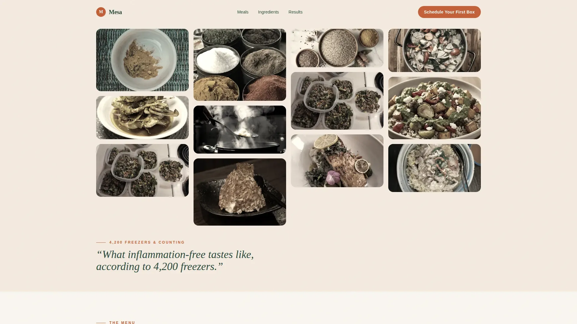
The header is a masonry grid of real customer photography. Images are slightly desaturated to align with the mesa palette, making amateur snapshots read as editorial. Hands peeling back packaging, golden curry in white ceramic bowls, and a freezer stacked with six meals neatly in a row: the wall communicates authenticity before a single word of copy runs. A single saguaro-green editorial line sits below the grid, making the social proof the headline rather than an afterthought.
Expandable Meal Gallery with Ingredient Panels
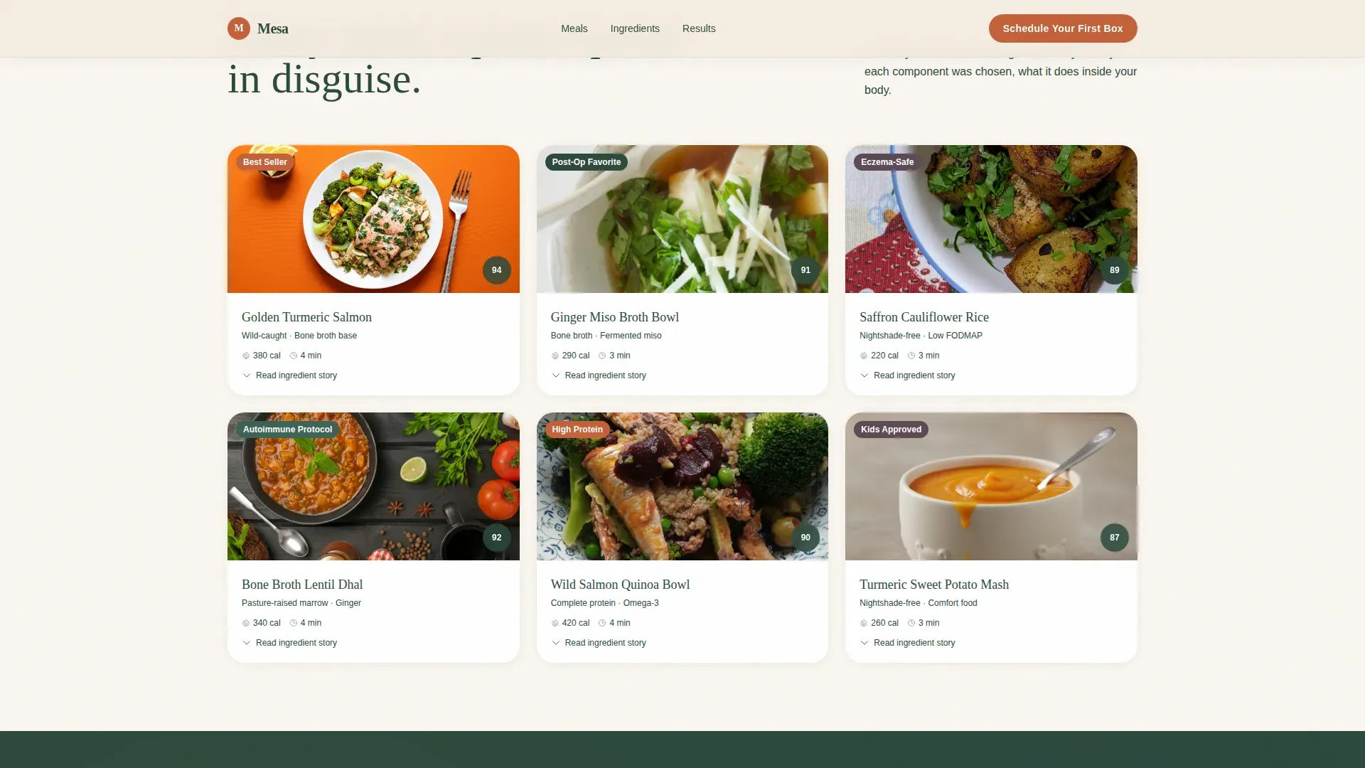
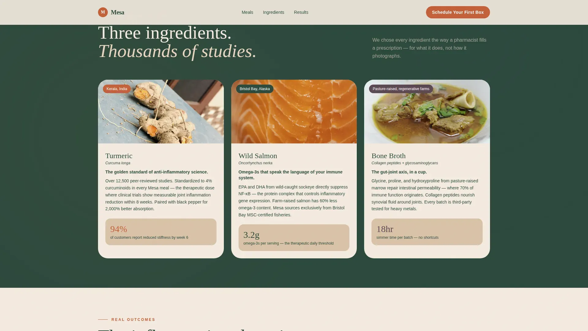
The food gallery loads as tight-crop plated photography, showing visible texture in every grain and glaze. Clicking any meal card expands a detail panel that explains the ingredient story: why ginger root, why pasture-raised marrow, why black pepper alongside turmeric. This design transforms a food product page into an educational experience. Visitors who interact with multiple cards spend more time on the page and arrive at the booking section with a much clearer understanding of what makes the food different.
Customer Symptom Timeline
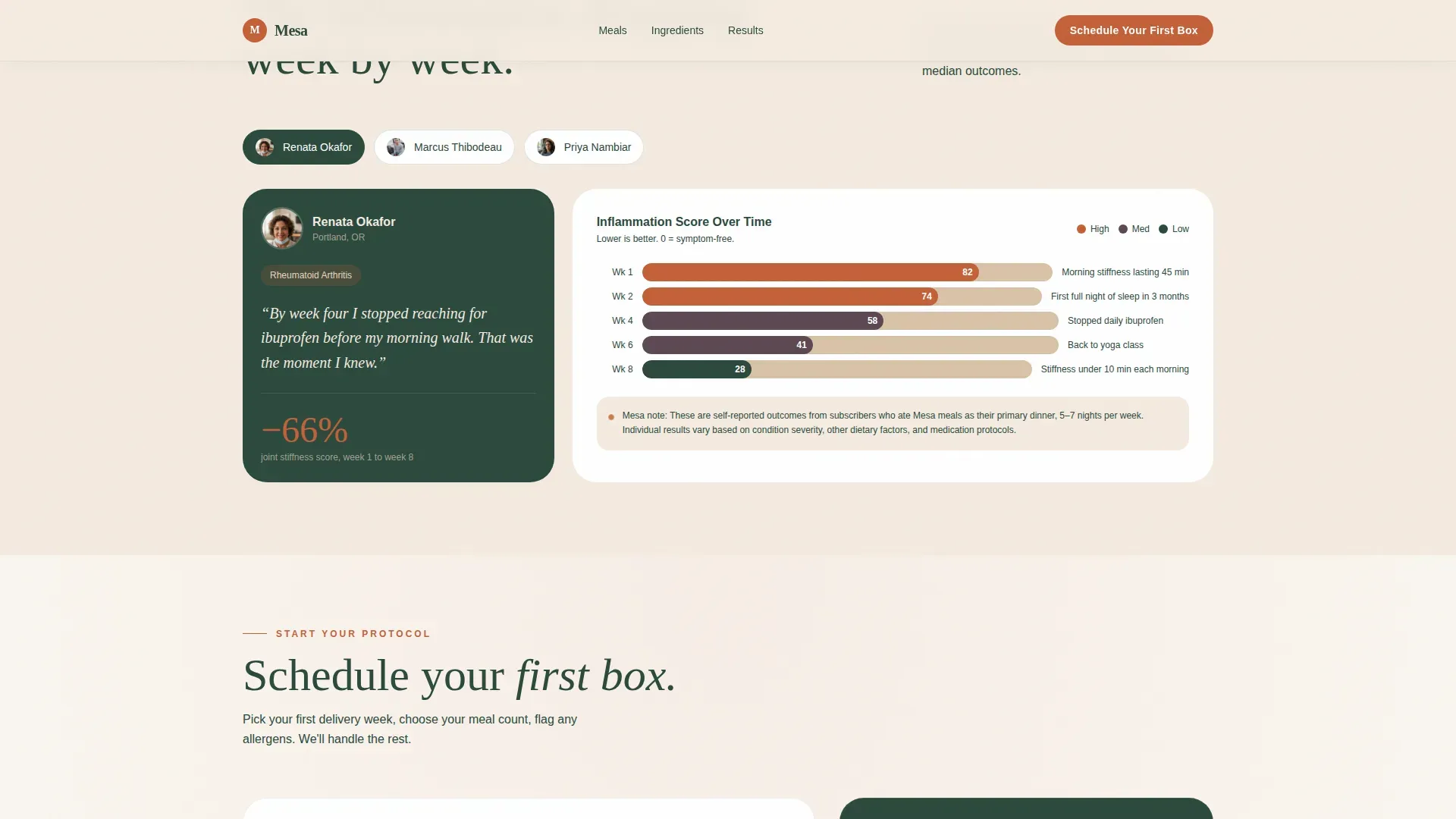
Below the gallery, the design shifts from appetite to evidence. Real customer data showing joint stiffness scores dropping week over week is presented visually, turning clinical numbers into something visceral and relatable. This section is the trust anchor. It gives autoimmune patients, post-op cases, and health-conscious parents the peer-level confirmation they need before committing. The rhythm of appetite then evidence is deliberate: by the time visitors reach this section, wanting the food and trusting the food become the same impulse.
Inline Booking and Scheduling Widget
The primary call to action, "Schedule Your First Box," opens an inline calendar widget. Visitors pick their first delivery week, select a meal plan size of 7, 14, or 21 meals, and flag allergens from a chip-select row. The booking process is simplified into three clear steps: order online, delivery, and heat and enjoy. Guest ordering is supported without forcing account creation, which keeps the path frictionless for first-time buyers. Trust signals are positioned near the booking button to build confidence at the moment of decision.
Secondary Email Capture Path
Not every visitor is ready to schedule. The secondary path, "Send Me the Ingredient List," captures email addresses from high-intent visitors who want to evaluate the food more before committing. This expands the brand's ability to lead those visitors back to the booking flow through follow-up communication, reducing the risk of losing warm prospects entirely.
Sunset Mesa Design System
The full Sunset Mesa color system is built in: sun-bleached sandstone at hex E8D5C0 for backgrounds, deep saguaro green at hex 2C4A3E for headlines and navigation, fired clay at hex C4613A for every clickable surface, and quiet dusk plum at hex 5E4955 reserved for hover states and micro-interactions. The palette evokes golden hour hitting a desert kitchen window. Every design decision serves the sensory appeal direction without overpowering the food photography.
Page sections overview
| Section | Purpose |
|---|---|
| UGC Photo Wall | Opens with customer photography to build social trust immediately |
| Meal Gallery Grid | Showcases plated food photography with expandable ingredient detail panels |
| Ingredient Stories | Explains why each hero ingredient was chosen, making science sensory |
| Symptom Timeline | Shares real customer joint and inflammation data week over week |
| Booking Call to Action | Inline calendar, meal plan size selector, and allergen chip-select |
| Footer | Horizontal flow pattern with brand navigation and secondary links |
Design & branding system
The Mesa template uses a Luxe Minimal design language built around the Sunset Mesa color system. Every design choice is made to feel warm without trying and rich without shouting. The editorial food photography and desaturated UGC imagery interact to create a unified visual story that feels curated rather than assembled.
- Color system: sandstone backgrounds, saguaro green headlines, fired clay calls to action, plum hover and micro-interaction states
- Typography: Fraunces serif for display headings gives the page warmth and authority; DM Sans body copy keeps body text clean and readable at all sizes
- Animation: scroll reveals, image desaturation on hover, expandable card panels, and a staggered grid load add motion without distracting from the food
Mobile & speed optimization
More than 60 percent of food orders occur on smartphones. Mesa is designed mobile-first, making sure every section feels clean, fast, and easy to navigate on a phone screen. The Sunday evening meal-prepper reaching for a first box is almost certainly on a phone, and this template accounts for that reality from the first design decision.
- Lazy loading and image optimization keep the masonry photo wall and food gallery responsive across connection speeds
- The inline booking widget, allergen chip-select, and email capture are all touch-friendly and sized for thumb navigation
- CSS scroll behavior and staggered grid animations are calibrated for mobile without reducing the visual quality of the experience
How this template helps you convert
A high-converting landing page for a premium anti-inflammatory frozen meal service must blend high-end, health-conscious branding with a frictionless, booking-focused user experience. Mesa is built to do exactly that. The page earns each micro-commitment before asking for the next one, making the final booking step feel like a natural conclusion rather than a sudden ask.
- The photo wall and food gallery activate appetite and build sensory trust before any pricing or scheduling information appears, reducing the risk that visitors bounce before they connect with the product
- The ingredient story panels and symptom timeline answer the "does this work" question with peer-level evidence, making skeptical visitors feel informed rather than sold to
- The inline booking widget appears after trust is established, and the simplified three-step process along with trust signals near the button keeps the checkout path short and frictionless for first-time buyers
Other information about this template
Mesa was built for a specific intersection: food brands whose value proposition lives at the ingredient level and whose customers have been searching for real answers for decades. These are not casual grocery shoppers. They are people managing chronic conditions, following surgeon-prescribed protocols, or making every food decision with their child's health in mind. The design respects that. It communicates convenience, health benefits, and premium quality without talking down to anyone.
Frozen food landing page templates in this category can help create a professional one-page design for frozen meals, sides, and similar food products. Users making food business websites often seek templates that allow for online booking or ordering directly within the page, and Mesa delivers exactly that capability.
A transparent pricing structure, including a breakdown of costs and potential first-order discounts, can be incorporated into the booking section without disrupting the visual flow. The template supports clear display of key benefit claims: anti-inflammatory formulation, gluten-free and dairy-free ingredients, no refined sugar, and prominent source transparency for every hero ingredient including turmeric, ginger, leafy greens, and omega-3 rich fish.
The design system is ready to share across team members and brand stakeholders. Because the color tokens, typography scale, and component states are all defined within the Sunset Mesa system, making brand updates requires changing values in one place rather than hunting through individual elements. This flattens the learning curve for anyone building on the template and reduces the number of design decisions required from scratch.
- This template is appropriate for food brands ready to communicate their full ingredient source story and share it as a core part of the sales experience
- It suits cases where the food brand needs to interact with a health-conscious, research-driven audience that evaluates claims carefully before booking
- The secondary email capture path is useful for cases where visitors need more time and the brand wants to feed them ingredient and nutritional information before a follow-up booking
- The design system makes it straightforward to share the template across collaborators, keeping brand consistency intact as the team scales
- Including nutritional information and ingredient transparency can appeal to health-conscious consumers and is fully supported within the expandable meal card design
- A subscription model and first-box discount structure can be effectively promoted through the booking widget and pricing area without disrupting page flow
- For food businesses worried about the risk of losing warm leads, the secondary email capture path gives those visitors a lower-commitment way to stay connected
- The booking button placement and trust signal positioning follow the principle that reducing perceived risk at the decision point leads to higher conversion in meal delivery cases
- Brands that have spent decades building ingredient sourcing relationships will find the ingredient story panels a natural home for that knowledge
- The template supports user testimonials displayed through the UGC photo wall and symptom timeline, reinforcing credibility for new visitors who need social proof before making a food purchase decision
- The brain of the design is the sensory appeal creative direction: it sequences sight, then understanding, then evidence, so visitors experience the food emotionally before they evaluate it rationally
- The blood of the page is the food itself: the photography, the ingredient stories, and the customer timelines all serve to keep the food front and center at every scroll depth
- This is specifically the Mesa Luxe Anti Inflammatory Frozen Meal Booking Landing Page Template, built for brands that want a design system as intentional as their ingredient list
Theme
Luxe Minimal
Creative direction
Sensory Appeal
Color system
Sunset Mesa
Style
Gallery + Detail
Direction
Booking/Scheduling
Page Sections
UGC Masonry Photo Wall
Expandable Meal Cards with Ingredient Panels
Customer Symptom Timeline
Inline Booking and Allergen Selection Widget
Secondary Email Capture Path
Sunset Mesa Design System
Related questions
Can I customize the color system and typography in Mesa?
Is this template suited for brands with multiple frozen food products?
Does the booking widget support allergen flagging?
What if a visitor is not ready to book on their first visit?
Is Mesa a single-page template or a multi-page website?



