Bold Veteran-Owned Diner Landing Page Template
Mess is a bold, veteran-owned diner landing page built around a modular card grid, a UGC photo wall header, and an interactive meal-finder quiz. The Neo-Retro design system pairs electric mustard, dress-blue navy, and diner-booth cherry to create a page that feels lived-in and purposeful. It guides every visitor from first scroll to a personalized meal recommendation.
by Rocket studio
Quick summary
Mess is a single-page diner landing page built for a veteran-owned restaurant. It opens with a photo-wall mosaic, moves through an animated card grid of menu categories, and closes the deal with a three-question meal-finder quiz. The Neo-Retro visual system keeps the page grounded and electric at the same time.
Who this template is for
This template is built for restaurant owners who want a page that does real work. It suits veteran-owned diners, short-order breakfast spots, and neighborhood comfort-food counters that rely on regulars and word-of-mouth discovery.
- Veteran restaurateurs who want their story front and center without being sentimental about it
- Diner and brunch spot owners who need a bold, opinionated page that fits a strong personality
- Food and beverage operators replacing a generic template with something that actually reflects how their kitchen runs
What problem this template solves
Most restaurant pages waste the first scroll. They show a hero banner, a phone number, and a menu PDF that nobody opens. Mess solves the problem of a page that looks busy but converts nobody.
- Visitors arrive without a clear path and leave without ordering or engaging
- The brand story gets buried under stock photography and boilerplate taglines
- There is no mechanism to turn a curious first-time visitor into a committed regular
What you get with this template
You get a fully structured single-page layout built around three core ideas: a story-first header, an unboxing-style card grid, and a quiz-driven call to action. Every section is designed to move visitors forward, not just impress them visually.
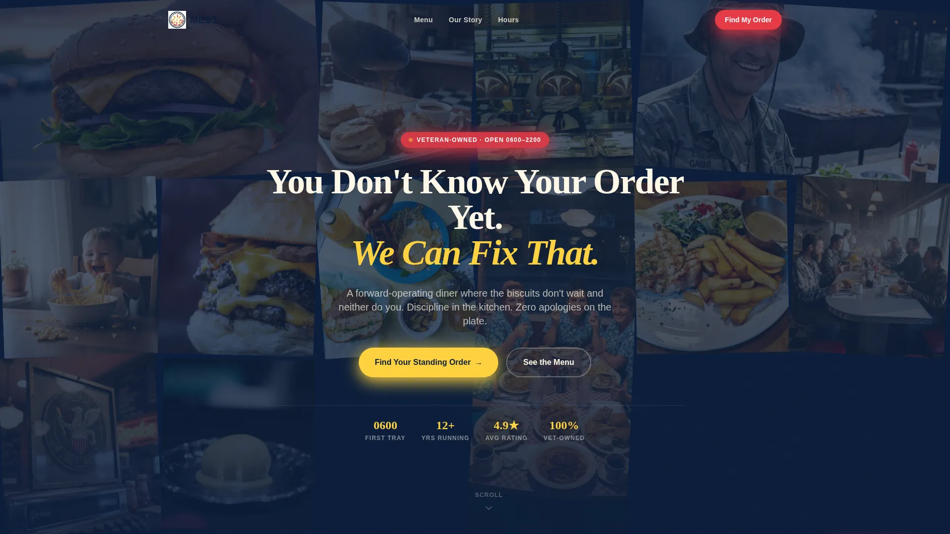
- A UGC-style photo wall header with a typed headline and real-feeling snapshots at random angles
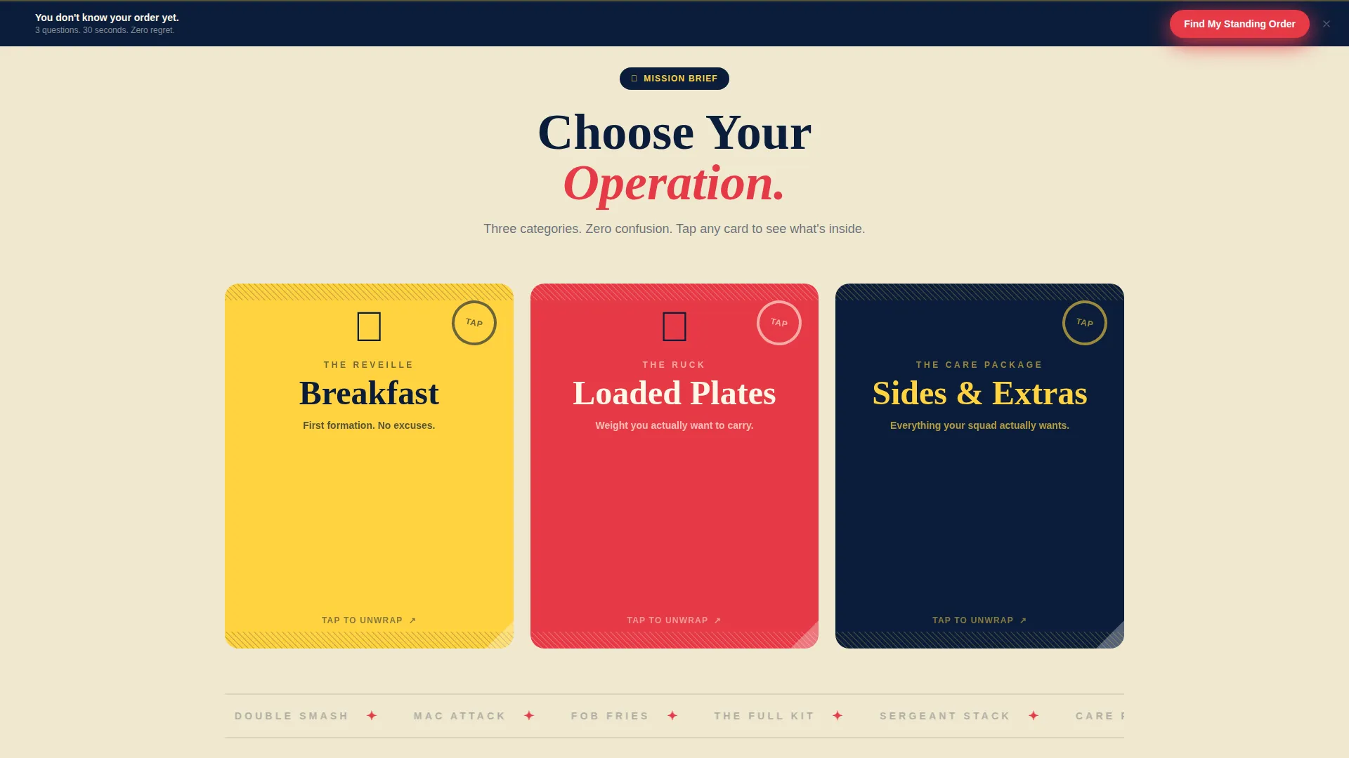
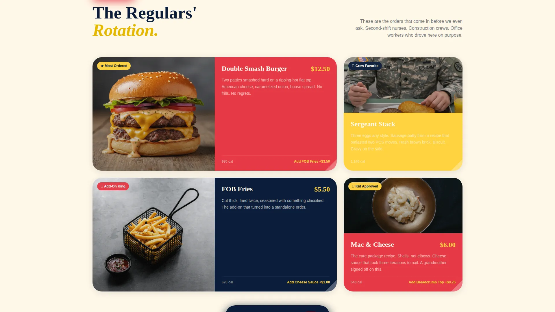
- A modular card grid with flip, slide, and peel animations revealing menu categories, food photos, and one-line stories
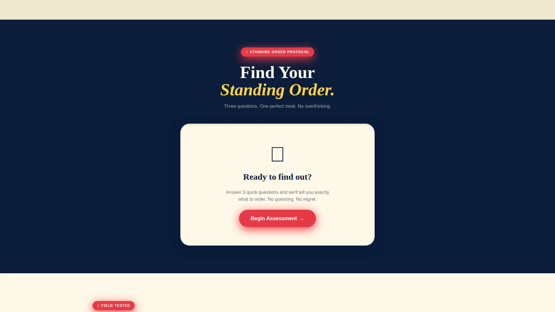
- A "Find Your Standing Order" quiz with illustrated questions, a dog-tag result card, and an email or phone capture field
Feature list
This section covers the core components built into the Mess landing page template.
UGC Photo Wall Header
The header is a full-width mosaic of slightly rotated photo tiles, styled like polaroids pinned to a corkboard. It includes a self-typing headline layered over the wall. Every tile is designed to look like a real customer photo, not a stock image.
Animated Card Grid
The card grid is the backbone of the page. Cards flip, slide, or peel open on scroll or tap to reveal a food photo, a short story line, and a popular add-on tag. Menu categories are presented as sealed packages that unwrap as you engage.
Meal-Finder Quiz
The primary conversion tool is a three-question visual quiz. Visitors tap illustrated answers for wake-up time, hunger level, and flavor preference. The quiz produces a dog-tag result card with a meal name, photo, and calorie count.
Dog-Tag Result Card
Each quiz result is styled as a military dog tag. It shows a personalized meal recommendation and connects directly to a secondary call to action linking to the full menu.
Sticky Quiz Call to Action Bar
A persistent bottom bar keeps the "Find Your Standing Order" prompt visible throughout the entire scroll. It reappears after the first card row and stays anchored as the visitor moves through the page.
Phone Number Capture Field
Below the quiz result, a single-field phone number input lets visitors request their order before they arrive. The friction is minimal because the quiz already identified their preference.
Page sections overview
| Section | Purpose |
|---|---|
| Photo Wall Header | Opens the page with real-feeling snapshots and a self-typing headline |
| Typed Headline | Delivers the brand voice immediately on load |
| Menu Card Grid | Presents breakfast, loaded plates, and sides as animated unboxing cards |
| Meal-Finder Quiz | Converts curiosity into a personalized meal recommendation |
| Dog-Tag Result | Shows the quiz output as a branded, styled result card |
| Secondary call to action | Links from the result to the full menu brief |
| Phone Capture Field | Collects a phone number to reduce walk-in friction |
| Dessert Card Row | Closes the grid with letter-style unfolding animation cards |
| Sticky Bottom Bar | Keeps the quiz call to action visible throughout the scroll |
| Footer Block | Anchors the page with brand context and contact information |
Design & branding system
The visual identity follows a Neo-Retro theme built on a Dopamine Pop color palette. The four-color system is disciplined but never boring. It alternates rhythm across the card grid so the page feels collected, not overdesigned.
- Electric mustard (#FFD23F) covers card backgrounds and hover states; deep dress-blue navy (#0B1D3A) grounds the header and all primary typography
- Diner-booth cherry (#E63946) punches through on badges, buttons, and star icons to create urgency without noise
- Warm cream (#FFF8E8) softens every text block, reading like a paper menu left in afternoon light
Mobile & speed optimization
The card grid is modular and stacks cleanly on smaller screens. Tap interactions replace hover states so the flip and peel animations work just as well on a phone as on a desktop.
- Cards reflow into a single-column layout on mobile without losing the unboxing animation sequence
- The sticky quiz bar remains anchored at the bottom on all screen sizes, keeping the primary call to action reachable with one thumb
How this template helps you convert
The Mess template is built around a single conversion idea: reduce the distance between "I just found this place" and "I already know what I want." Every section moves the visitor one step closer to that outcome.
- The photo wall and typed headline build trust and curiosity in the first few seconds, replacing generic hero imagery with something that feels personal and specific
- The animated card grid creates a sensory pull that turns passive scrolling into active exploration, so visitors stay longer and engage more deeply
- The quiz captures preference, delivers a personalized result, and then offers two exits: a menu link for browsers and a phone field for people ready to commit
Other information about this template
This template is designed specifically for the veteran-owned food and beverage niche. The military-coded language, unit-patch visual references, and dog-tag interface elements are structural, not decorative. They signal authenticity to the audience that matters most.
- The template style follows a Gallery plus Detail approach, combining a visual-first card grid with individual card depth on interaction
- The intersection match score for this template is rated at 9 out of 10 for the veteran-owned business subcategory within retail and food service
- The creative direction is an Unboxing Experience layered over a Quiz and Assessment flow, which is an unusual combination that suits a restaurant with a strong personality and a loyal, returning customer base
Theme
Neo-Retro
Creative direction
Curated Collection
Color system
Sunset Gradient
Style
Gallery + Detail
Direction
Quiz/Assessment
Page Sections
UGC Photo Wall Header
Animated Unboxing Card Grid
Three-question Meal-finder Quiz
Dog-tag Result Card
Sticky Bottom Call to Action Bar
Single-field Phone Capture
Related questions
Can I change the menu category names and card content?
Does the quiz work without a backend or special setup?
Is this template only for veteran-owned restaurants?
How does the sticky quiz bar behave on mobile?
Can the dessert card animations be adjusted?



