Fitness Studio Pre-Launch Website Template
Pulse is a data-driven fitness studio coming soon landing page template built around a dashboard aesthetic. It uses a dark slate and sky blue color system to present health metrics, studio programming, and a founding-member waitlist in a bold, numbers-first layout. Ideal for fitness studios that want their pre-launch page to feel urgent, credible, and conversion-ready.
by Rocket studio
Quick summary
Pulse is a coming soon landing page template for fitness studios that want to open with momentum. The design uses a Data Command theme, presenting health metrics and studio details through a dashboard grid layout. A persistent call-to-action bar, a three-field waitlist form, and a two-path conversion model give studio owners a clear system for collecting qualified leads before opening day.
Who this template is for
This template is built for fitness studio owners and operators who are mid-launch and need a page that does real work before the doors open. It speaks directly to a health-aware audience that responds to data over hype.
- Fitness studio founders preparing a pre-launch waitlist campaign
- Personal trainers or coaching teams opening their first physical location
- Health and wellness entrepreneurs targeting lapsed gym members, postpartum returners, and desk workers with measurable health goals
What problem this template solves
Most coming soon pages for gyms and fitness studios feel generic. They use stock photography, vague motivational copy, and a single email field that gives visitors no real reason to sign up. Pulse replaces that approach with a diagnostic, data-led experience.
- Visitors see their own health metrics reflected back at them, which creates immediate personal relevance
- The Problem to Solution Arc moves people from recognition to motivation without relying on empty promises
- The freemium conversion path gives the studio a strong reason to follow up and gives leads a tangible reward for signing up
What you get with this template
Pulse delivers a complete single-page layout structured around a data dashboard visual identity. Every section is purpose-built to move a cold visitor toward a founding-member sign-up.
- A minimal Logo Bar header with a live countdown clock and a founding member counter, both rendered in sky blue digits
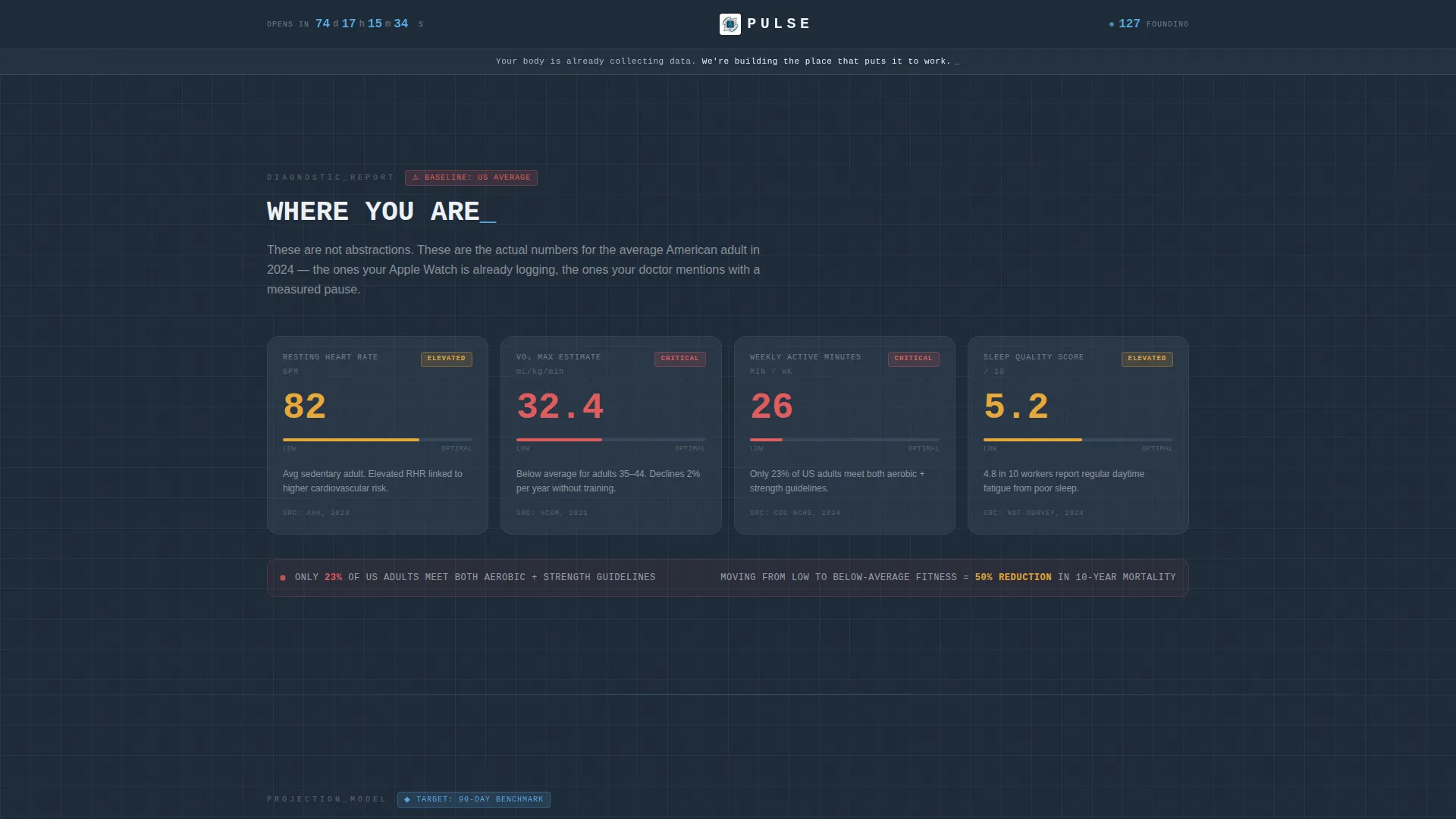
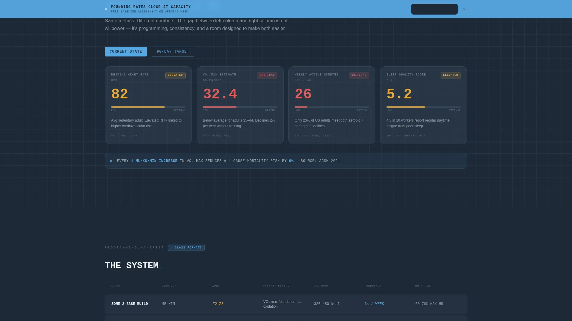
- A health metrics data grid showing current versus target stats, with status indicators that shift from red-amber to sky blue as the narrative progresses
- A three-field sequential waitlist form, a persistent bottom call to action bar, and a secondary nurture path for visitors who are not ready to commit
Feature list
This template includes the following built-in capabilities based on its design and layout structure.
Live Countdown and Member Counter Header
The header displays the studio name in monospaced type on a deep charcoal slate background. A live countdown clock on the left and a founding member count on the right update in sky blue digits, making the page feel active from the first second.
Health Metrics Dashboard Grid
Two data grids anchor the core narrative. The first presents average health benchmarks as dashboard cards with red-amber status indicators. The second displays target metrics with sky blue indicators and achievable timelines attached. The visual contrast between the two grids communicates the studio's value without a single marketing claim.
Problem to Solution Arc Layout
The page scroll follows a diagnostic report structure. Each section builds on the last, guiding visitors from recognizing a problem in their own health data to understanding the studio's programming as the solution. This arc is built into the section order and cannot be accidentally disrupted.
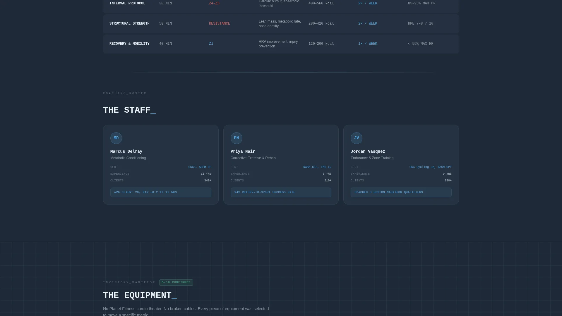
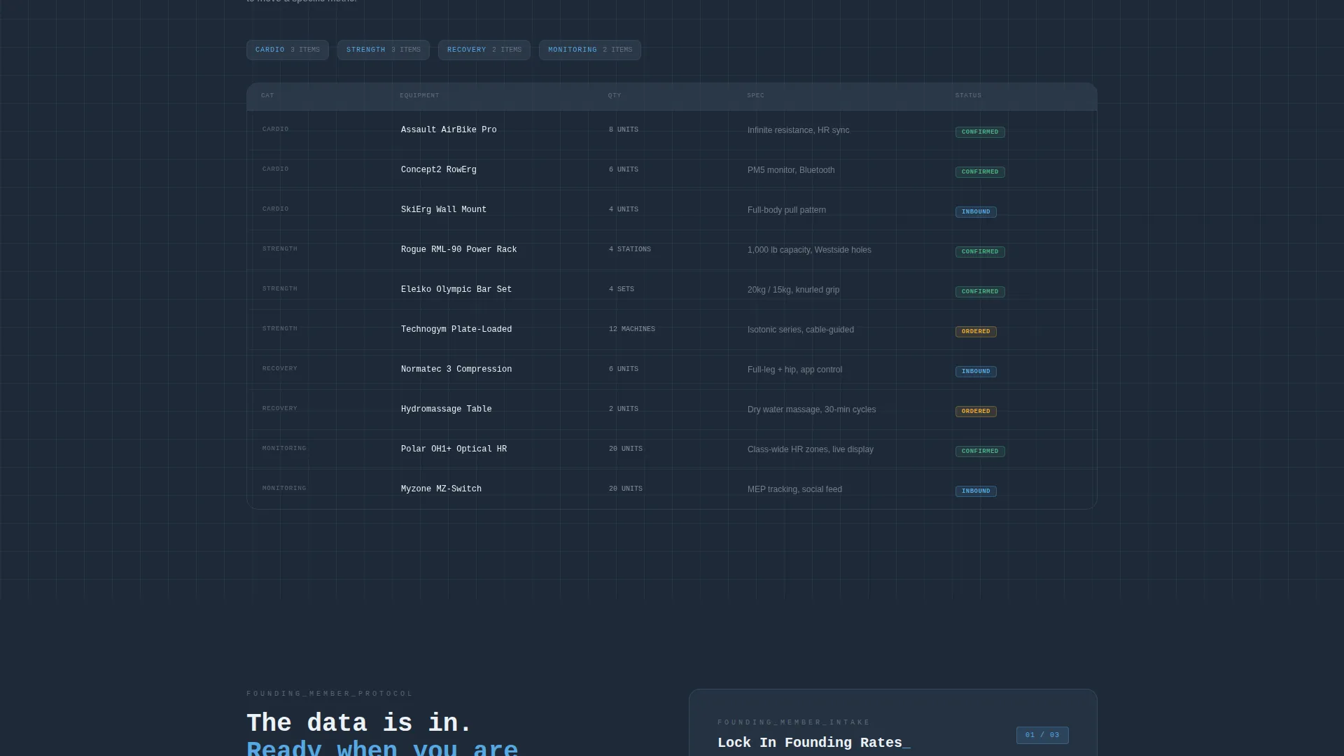
Studio Programming and Equipment Grid
Class formats appear as data rows. Coach credentials are laid out as stat cards. Equipment is presented as an inventory-style grid. The result is a studio overview that feels like a product spec sheet rather than a brochure.
Persistent Founding-Rate call to action Bar
After the first scroll, a sky blue call to action bar locks to the bottom of the viewport and stays visible throughout the session. It carries the primary call to action, keeping the sign-up path in view at all times.
Two-Path Conversion Model
Visitors who are ready to commit can fill in the three-field form to lock in founding rates and earn a free Baseline Assessment session. Visitors who need more context can tap a secondary link to receive a pre-launch email series covering the science behind each class format.
Page sections overview
| Section | Purpose |
|---|---|
| Logo Bar Header | Establishes data-first brand identity with countdown and member counter |
| Brand Positioning Line | Sets tone with a single-line data-led value statement |
| Current Metrics Grid | Shows average health stats with red-amber warning indicators |
| Target Metrics Grid | Flips the same cards to sky blue with achievable benchmarks |
| Programming Data Rows | Displays class formats as structured data rows |
| Coach Credential Cards | Presents coaching team as stat-style profile cards |
| Equipment Inventory Grid | Lists studio equipment in a clean inventory format |
| Waitlist Sign-Up Form | Captures email, primary goal, and zip code in sequence |
| Persistent call to action Bar | Keeps founding-rate sign-up visible after first scroll |
| Secondary Nurture Path | Offers a no-commitment data email series to softer leads |
Design & branding system
The visual identity follows a Data Command theme built on a Slate and Sky color system. The palette is designed to feel like a heart rate monitor in a dim room: the dark background recedes, and every data point in sky blue pulses forward with quiet urgency.
- Deep charcoal slate (#1E2A38) forms the primary background; mid-gunmetal (#3B4D61) surfaces card backgrounds and grid lines; clinical sky blue (#56A8E2) drives all active data points, calls to action, progress bars, and hover states; and sharp white (#EDF2F7) handles all typography and metric readouts
- Typography uses clean monospaced type throughout to reinforce the data and diagnostics aesthetic
- Color roles are strictly assigned: sky blue owns interaction and attention states, while slate holds structural elements in disciplined silence
Mobile & speed optimization
The dashboard grid layout is structured to translate cleanly from desktop to smaller screens. Data cards, inventory rows, and form fields are each designed as self-contained blocks that stack without losing their visual hierarchy.
- The persistent call to action bar remains functional and visible at the bottom of the viewport on mobile devices
- The sequential three-field form reduces cognitive load on small screens by showing one input at a time
How this template helps you convert
Pulse is designed around two conversion goals: collecting founding-member leads before opening day and building a warm audience through a secondary nurture path. Every structural decision on the page supports one of those two goals.
- The health metrics grid creates personal recognition early in the scroll, which increases the likelihood that visitors stay on the page and see the call to action
- The persistent call to action bar and the free Baseline Assessment reward give visitors a specific, low-friction reason to submit the waitlist form before the studio opens
Other information about this template
Pulse is categorized under fitness studio website templates and is designed specifically for the coming soon phase of a studio launch. It is built as a single-page layout, not a multi-page site, which keeps the visitor's attention focused on one action.
- The template style is Dashboard and Data Grid, making it a strong fit for studio owners who want to differentiate from standard gym website aesthetics
- The Freemium and Trial landing page direction means the primary conversion offer costs the visitor nothing upfront, reducing sign-up friction significantly
- The template is well suited for studios whose target audience includes health-aware individuals already tracking data through wearables or fitness apps
Theme
Data Command
Creative direction
Problem→Solution Arc
Color system
Slate & Sky
Style
Dashboard/Data Grid
Direction
Freemium/Trial
Page Sections
Live Countdown and Member Counter Header
Health Metrics Dashboard Grid
Problem to Solution Arc Layout
Studio Programming and Equipment Grid
Persistent Founding-rate Call to Action Bar
Two-path Conversion Model
Related questions
Is this template designed for a single page or a full website?
Can I change the studio name, colors, and metric values in the template?
What does the two-path conversion model include?
Who is this template's target visitor?
Does the template include the countdown clock and member counter?


