Mid-Century Modern Architecture Blog Website Template
Midcentury is a masonry-style realtor landing page built for mid-century modern specialists. It combines an editorial Ink and Paper aesthetic with a browsable property archive, hover-reveal cards, and a targeted lead generation form. Buyers, sellers, and architects all find a clear path forward, guided by a visual identity that speaks the language of post-and-beam architecture before a single word is read.
by Rocket studio
Quick summary
Midcentury is a single-page realtor template designed for the architecture-literate niche. It presents a curated property archive in a masonry grid, filtered by decade, architect, and structural style. The lead generation form qualifies buyers by preference and invites sellers to request an Architectural Value Assessment. Every section earns the visitor's trust before asking for the click.
Who this template is for
This template is built for real estate professionals whose expertise goes well beyond standard market comps. It suits anyone whose practice is rooted in the craft and history of mid-century modern homes.
- Design-obsessed buyers hunting post-and-beam homes, clerestory light, and atrium layouts
- Sellers who own architecturally significant homes and need an agent who can price pedigree
- Architects and preservationists scouting restorable structures worth saving
What problem this template solves
Generic real estate templates flatten every listing into a price-per-square-foot transaction. That approach fails the specialist audience completely. Architecture-literate clients expect a realtor who understands what they care about, and a bland template undermines that credibility before the conversation starts.
- Buyers cannot filter properties by architect, decade, or structural feature on standard listing pages
- Sellers with architecturally valuable homes receive no signal that the agent understands design merit
- The visual identity of most realtor sites communicates nothing about niche expertise or curatorial taste
What you get with this template
This template delivers a fully composed, single-page layout with distinct sections for every stage of the buyer or seller journey. The design system, typography, and interactive behaviors are all defined and ready to apply.
- A masonry property archive with blueprint-to-photograph hover transitions and inline micro-maps
- A two-path lead generation form covering both buyer matching and seller assessments
- An editorial hero section, three-audience bento block, pull-quote testimonials, and a structured footer
Feature list
This template ships with a focused set of interactive and editorial features, each grounded in the mid-century modern real estate use case.
Blueprint-to-Photo Hover Cards
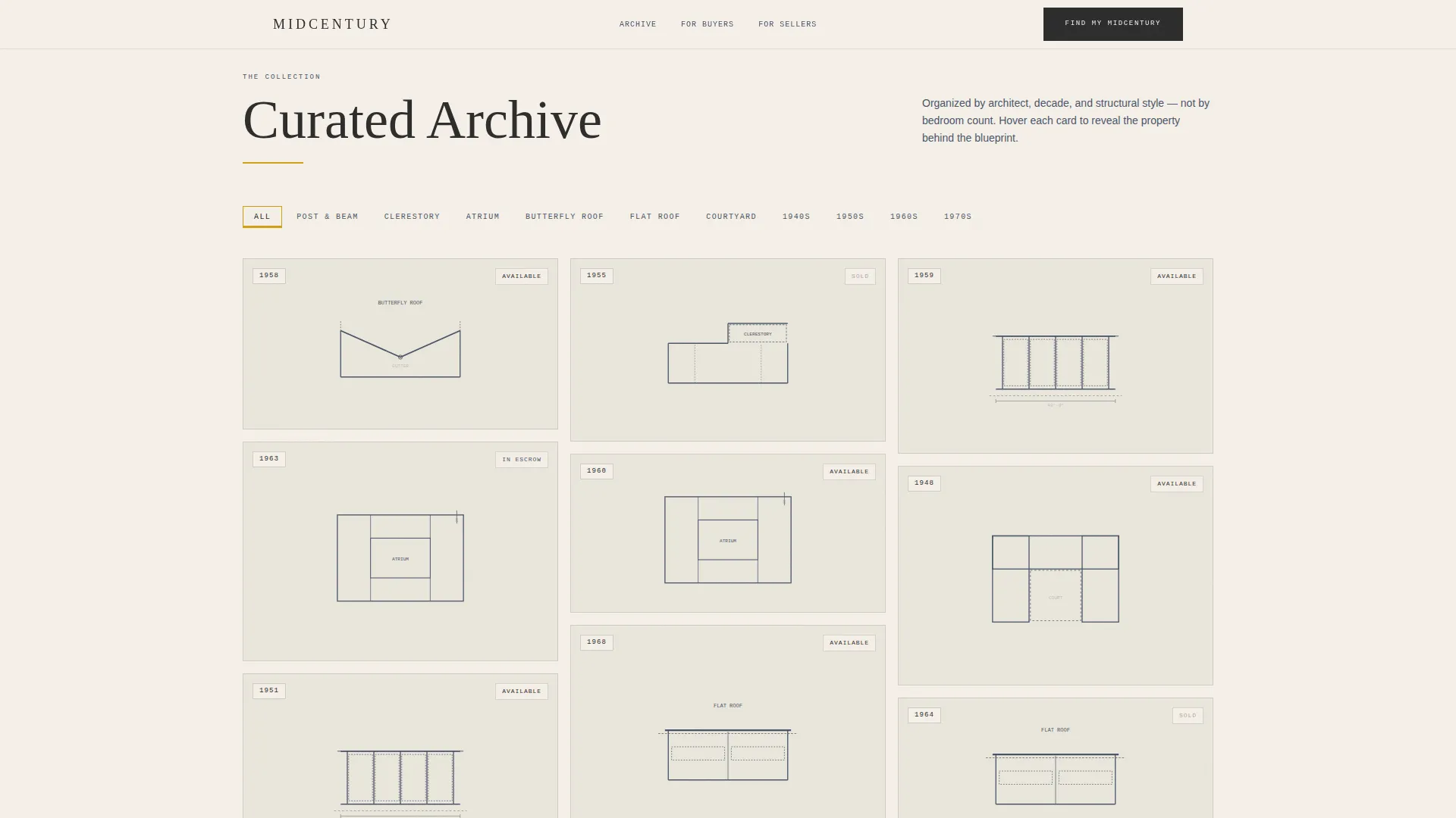
Each property card in the masonry grid opens with a blueprint sketch illustration. On hover, the sketch dissolves into a contemporary photograph. Square footage and the original architect's name appear in typewriter mono beneath the image, giving every listing an instant sense of provenance.
Decade and Style Filter Tabs
The property archive is organized by architect, decade, and structural style rather than by price or bedroom count. Filter tabs let visitors narrow the grid to exactly the era or structural type they are searching for, turning the archive into a genuinely useful research tool.
Inline Micro-Maps with Pulse Animation
Each property card includes a small embedded neighborhood map. The map pin pulses when a visitor pauses over the card, inviting exploration of the surrounding area without leaving the page.
Two-Path Lead Generation Form
The primary form asks visitors to select their preferred decade range, must-have architectural feature, and zip code radius. A secondary path lets homeowners submit their property for a complimentary Architectural Value Assessment, positioning the realtor as an authority on design merit.
Editorial Hero with Type Over Image
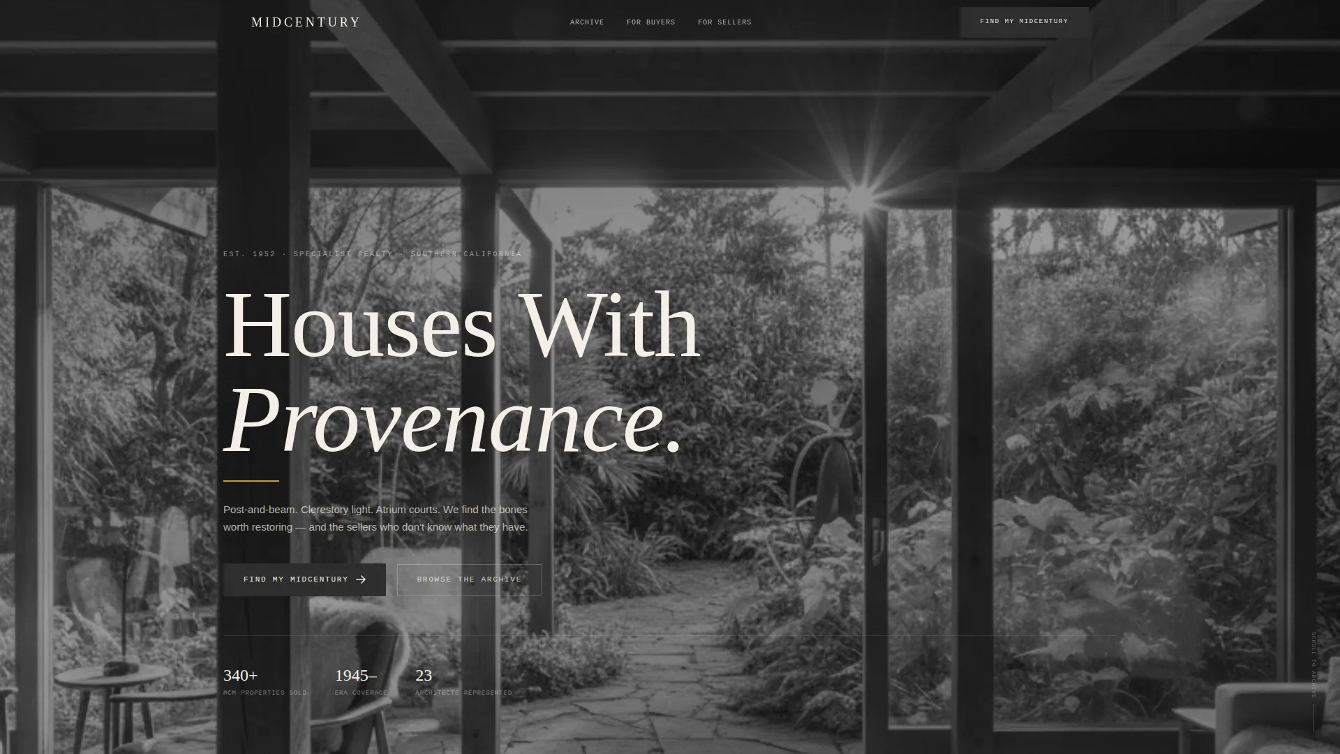
The hero section layers a large serif headline over a high-contrast black-and-white interior photograph. A thin ochre rule sits beneath the headline text, grounding the composition in the Ink and Paper aesthetic from the very first scroll position.
Asymmetric Three-Path Bento Block
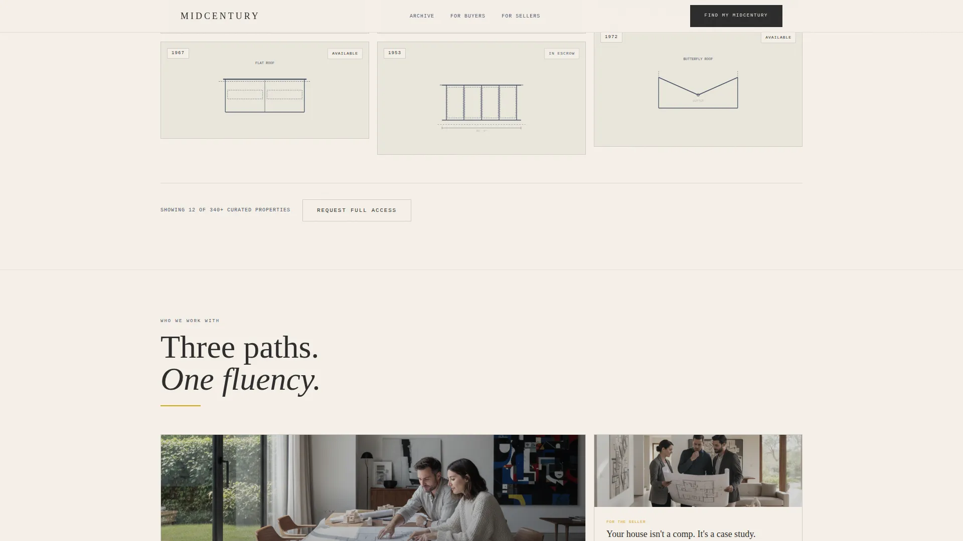
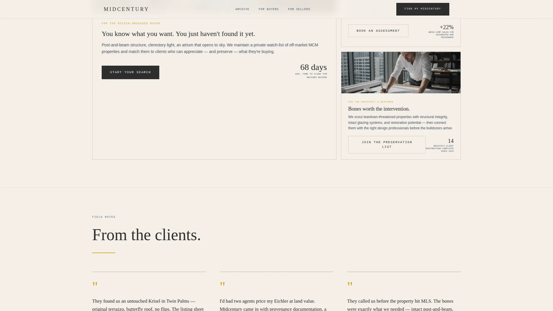
A bento-style layout below the archive presents three distinct paths for buyers, sellers, and architects. The asymmetric grid gives each audience a dedicated visual lane, keeping the page relevant to every visitor type without crowding the layout.
Page sections overview
| Section | Purpose |
|---|---|
| Hero with Headline | Establishes editorial tone and mid-century specialist identity |
| Property Archive Grid | Browsable masonry archive filtered by architect, decade, and style |
| Three Paths Bento | Directs buyers, sellers, and architects to their relevant journey |
| Lead Generation Form | Qualifies buyers and collects seller assessment requests |
| Testimonials Block | Builds trust through editorial pull-quote client stories |
| Footer | Closes the page with structured contact and navigation options |
Design & branding system
The visual identity follows an Ink and Paper theme built around the Cloud Canvas color system. Every color and type choice references the tactile quality of a mid-century case study monograph, where the architecture itself provides the visual richness.
- Warm parchment (#F5F0E8) as the page background, typewriter charcoal (#2C2C2C) for body text, and faded blueprint indigo (#4A5568) as a supporting tone
- Mustard ochre (#D4A017) used exclusively for interactive hotspots, hover states, and the hero ochre rule
- Fraunces editorial serif for headlines paired with JetBrains Mono for property data and typewriter-style detail text
Mobile & speed optimization
The template is designed desktop-first to serve a design-conscious audience who primarily browses on large screens. It is also built to remain fully usable on smaller devices.
- The masonry grid and bento layout reflow responsively for tablet and mobile viewports
- Images are lazy-loaded to reduce initial page weight, and animations are implemented using CSS wherever possible to limit rendering overhead
How this template helps you convert
The page is structured to build credibility steadily before presenting any call to action. By the time a visitor reaches the lead form, the template has already demonstrated the realtor's fluency in architectural language.
- The property archive lets visitors explore thirty curated cards filtered by their specific preferences, proving niche expertise before the form appears
- The two-path form structure separates buyers and sellers cleanly, so each audience receives a conversion path that feels relevant and specific to their situation
- The Architectural Value Assessment offer reframes the seller conversation around design merit, which is a more compelling entry point than a standard market appraisal pitch
Other information about this template
This template suits real estate professionals who operate at the intersection of architecture and property sales. A few additional details are worth noting for anyone evaluating it.
- The scroll-linked card reveal animation creates a sense of gradual discovery, rewarding visitors who explore the full archive
- The footer uses a split layout pattern that separates contact information from navigation clearly
- The template is localized for English-language use with United States date formats and USD pricing context
- Testimonials are presented as editorial pull-quote cards with architectural context rather than generic star ratings, reinforcing the specialist positioning throughout
Theme
Ink & Paper
Creative direction
Interactive Explorer
Color system
Cloud Canvas
Style
Masonry/Pinterest
Direction
Lead Generation
Page Sections
Blueprint-to-photo Hover Cards
Decade and Style Filter Archive
Two-path Lead Generation Form
Inline Micro-maps with Pulse
Editorial Type Over Image Hero
Asymmetric Three-path Bento
Related questions
Who is this template designed for?
Can I customize the property filters and decade ranges?
Does the template support both buyer and seller leads?
What makes the masonry grid different from a standard property listing layout?
Is the template suitable for both desktop and mobile use?



