E-Commerce Consulting Advanced Booking Website Template
Migrate is a single-page comparison table landing page built for e-commerce digital transformation consultants. It combines an Executive Suite visual theme with a Testimonial Mosaic layout to guide VP-level retail decision makers toward booking a diagnostic call. The template includes a dark full-bleed header, structured comparison tables, client proof cards, a sticky booking bar, and a mid-page lead capture offer.
by Rocket studio
Quick summary
Migrate is a high-converting comparison table landing page designed for e-commerce digital transformation consultants. It targets VP-level decision makers at mid-market retailers whose legacy tech stacks are eroding margins. The page builds a case through structured comparisons and client proof cards, then drives visitors toward a diagnostic call booking or a mid-page checklist download.
Who this template is for
This template is built for consultants who sell complex, high-stakes digital transformation engagements to senior buyers. It works best when your prospect already feels the pain but has not yet committed to a solution.
- E-commerce transformation consultants advising mid-market retailers on platform migration and operations modernization
- Boutique digital strategy firms presenting structured methodology to VP-level and C-suite decision makers
- Independent advisors who need a credible, evidence-led page to convert cold traffic into booked discovery calls
What problem this template solves
Mid-market retailers making a $500K-plus technology decision do not respond to generic agency pages. They need structured evidence, clear methodology, and a frictionless path to a conversation. Most consultant websites fail on all three counts.
- Legacy portfolio pages bury the methodology and lead with agency story, not client outcomes
- No comparison architecture means prospects cannot quickly see the gap between their current state and a transformed one
- Weak or absent booking flows add unnecessary steps between interest and a scheduled call
What you get with this template
This template gives you a complete, section-led single-page layout ready to present a transformation case and capture high-intent leads. Every section earns its place and moves the visitor forward.
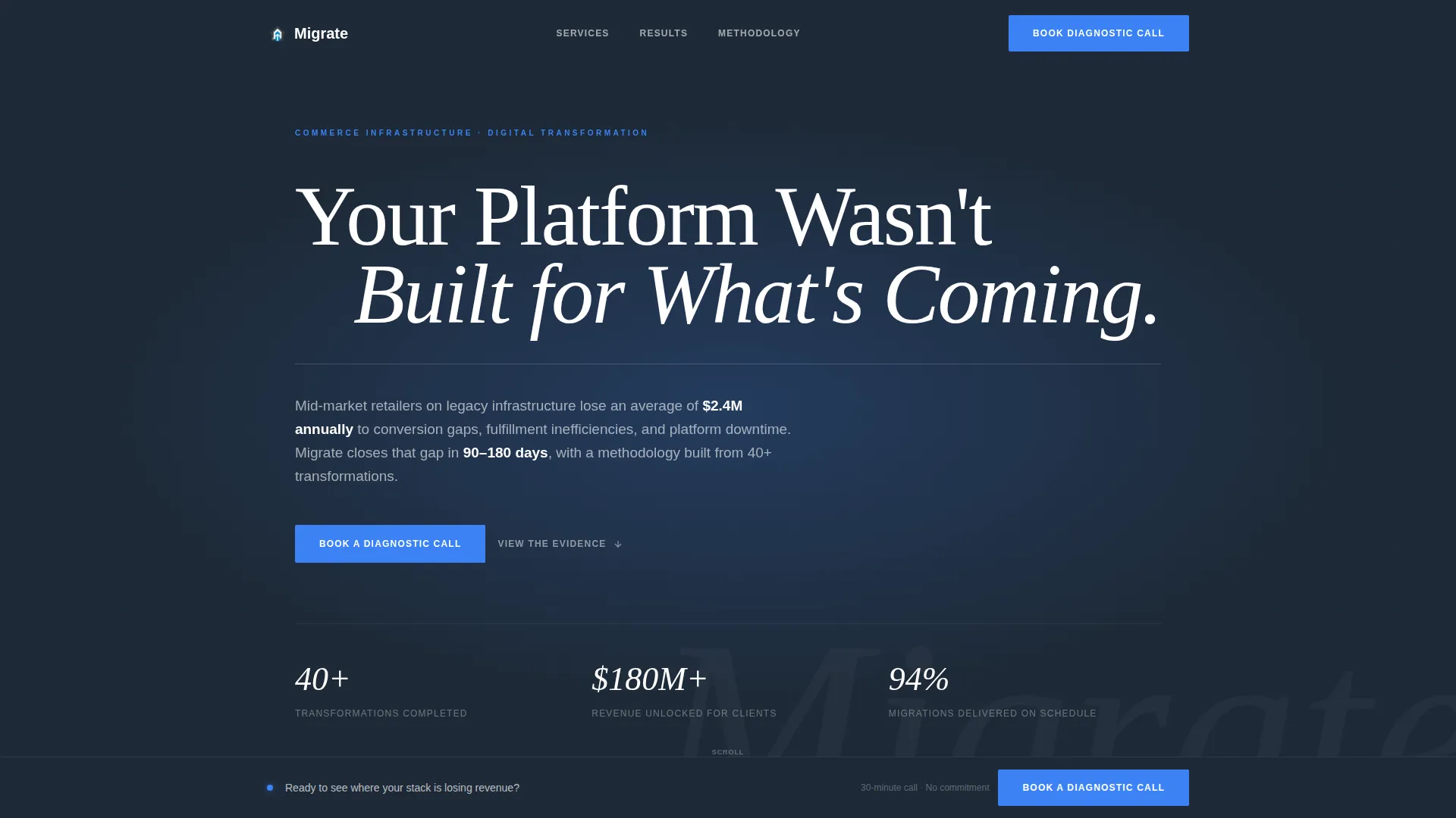
- A dark full-bleed header with radial glow effect, wide-tracked headline, animated rule, and a single subheadline carrying the specific promise
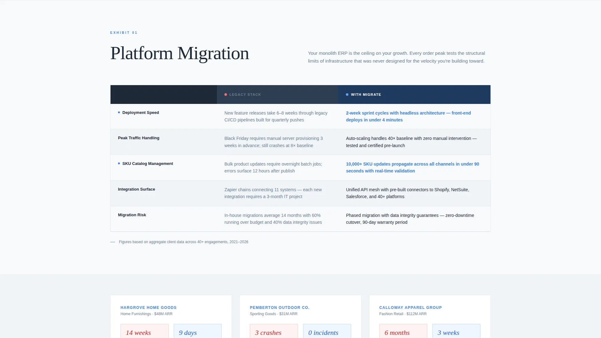
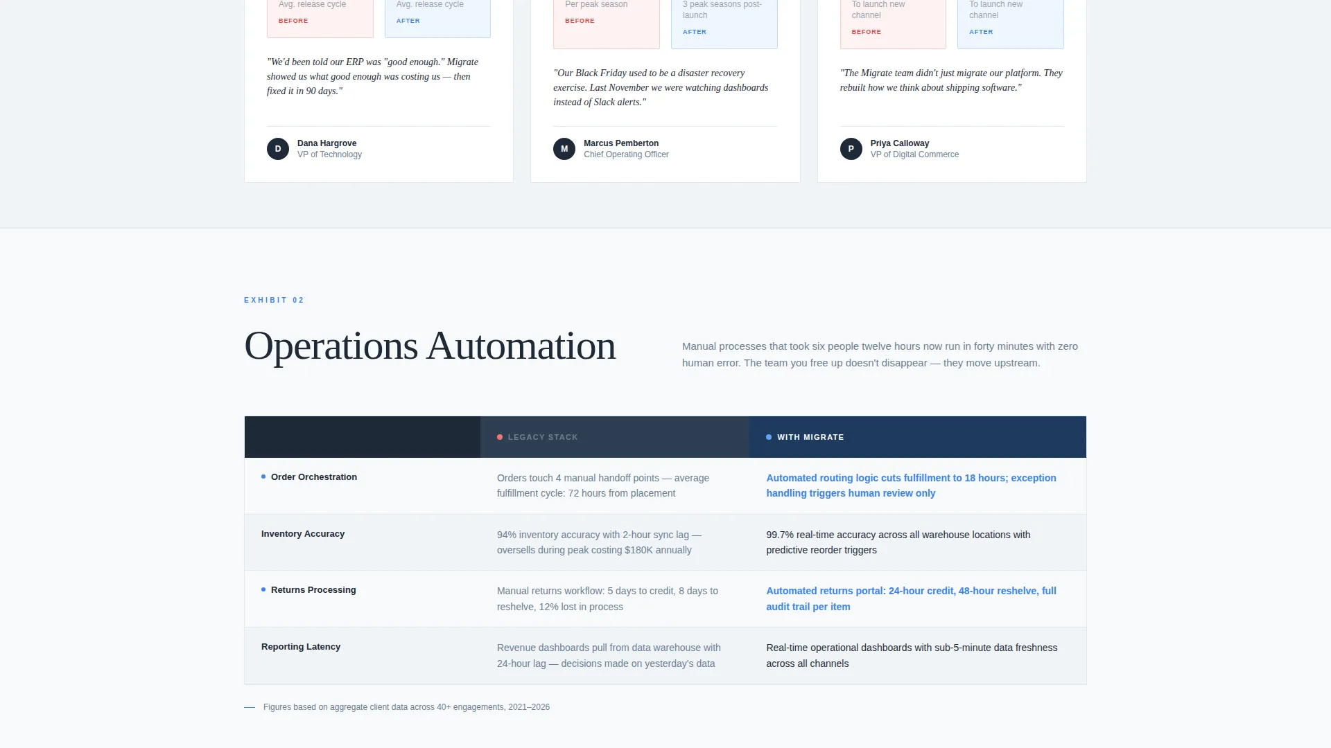
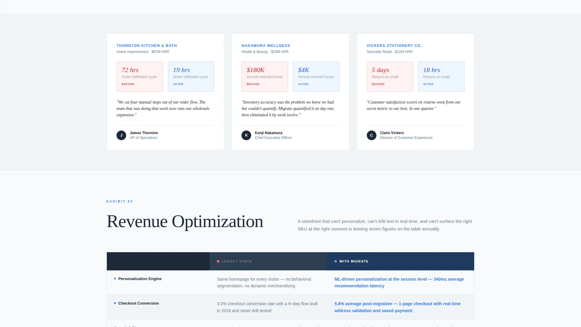
- Three comparison table sections covering Platform Migration, Operations Automation, and Revenue Optimization, each followed by a mosaic grid of three client transformation cards
- A sticky bottom booking bar that activates after the first comparison table scrolls into view, plus a mid-page checklist download offer for lower-commitment lead capture
Feature list
This template ships with purpose-built components aligned to a high-stakes professional services sales flow.
Dark Full-Bleed Header with Radial Glow
The viewport opens in deep charcoal with a soft electric blue glow radiating from center-screen. A wide-tracked arctic white headline holds the frame, followed by a thin horizontal rule animation and a fading subheadline that states revenue impact, timeline, and methodology in one line.
Structured Comparison Table Architecture
Three dedicated comparison sections cover Platform Migration, Operations Automation, and Revenue Optimization. Each table uses charcoal boardroom gray headers, pale frost alternating rows, and electric blue data highlights to make the before-and-after contrast immediately readable.
Testimonial Mosaic Client Cards
Each comparison section is immediately followed by a grid of three client proof cards. Every card shows a before-state metric, an after-state metric, and one sentence in the client's voice. The mosaic layout turns social proof into cumulative evidence rather than isolated quotes.
Sticky Booking Bar with Embedded Scheduler
A persistent bottom bar activates after the first comparison table enters view. Clicking it opens an embedded Calendly-style scheduler with fields for company name, annual digital revenue range via dropdown, and a single open-text field labeled "What's breaking first?"
Mid-Page Lead Capture Off-Ramp
A secondary call to action appears mid-page offering a downloadable Migration Readiness Checklist. It captures an email address before the visitor is ready to book a call, providing a lower-commitment conversion path that keeps prospects in the funnel.
Executive Suite Color and Typography System
The entire page uses a deliberately austere palette: glacial white as the dominant field, charcoal for text and headers, pale frost for dividers and alternating rows, and electric blue reserved exclusively for interactive elements and data highlights. Nothing is decorative. Every visual choice signals authority.
Page sections overview
| Section | Purpose |
|---|---|
| Dark Glow Header | Opens with headline, animated rule, and promise subhead |
| Platform Migration Table | Compares legacy versus modern platform capabilities |
| Migration Client Mosaic | Shows three before-and-after client proof cards |
| Operations Automation Table | Compares manual versus automated operations workflows |
| Automation Client Mosaic | Reinforces automation claims with client outcome cards |
| Revenue Optimization Table | Compares revenue performance before and after transformation |
| Revenue Client Mosaic | Closes the evidence arc with revenue-focused client stories |
| Checklist Download Section | Mid-page email capture via Migration Readiness Checklist offer |
| Sticky Booking Bar | Persistent scheduler trigger activated after first table scrolls |
| Embedded Scheduler Modal | Captures company name, revenue range, and open diagnostic question |
Design & branding system
The visual identity follows an Executive Suite theme. Every design decision mirrors the restraint and authority of a premium strategy presentation rather than a marketing website.
- Color palette: glacial white (#F8FAFB) as the dominant field, charcoal boardroom gray (#1E2A38) for primary text and table headers, pale frost (#E2E8F0) for alternating rows and dividers, and electric blue (#3B82F6) used exclusively for interactive elements and data highlights
- Typography: wide-tracked, large headline in arctic white for the header; clean body type in charcoal throughout; no decorative typefaces or ornamental elements
- Layout: austere single-column flow with deliberate whitespace, table-driven content blocks, and mosaic grid cards that break the scroll rhythm without disrupting the logical argument
Mobile & speed optimization
The template is structured for fast rendering and clear readability across device sizes. The comparison table layout and mosaic grids are designed to remain scannable without horizontal scrolling.
- Comparison tables adapt to narrower viewports so key before-and-after columns remain visible and readable on mobile screens
- The sticky booking bar and mid-page checklist offer are designed to function cleanly on touch interfaces without obscuring content
- The minimal decorative layer and restrained color palette reduce visual load, keeping the page focused and performant on mobile connections
How this template helps you convert
The page is structured to move a skeptical VP-level buyer from first impression to booked call without friction or false urgency.
- The full-bleed dark header and animated headline create an immediate tone of authority, signaling that this is not a typical agency page and earning the scroll before a word of methodology is read.
- The repeating pattern of comparison table followed by client mosaic builds cumulative evidence across three transformation categories, making the case feel conclusive rather than promotional by the time the visitor reaches the booking section.
- The two-call to action system, a sticky booking bar for ready buyers and a mid-page checklist download for earlier-stage visitors, captures leads at two different commitment levels without diluting the primary booking intent.
Other information about this template
This template is designed specifically for the e-commerce consulting and digital transformation advisory market. It suits consultants whose deal sizes justify a dedicated, high-trust sales page rather than a general portfolio site.
- The comparison table format is well suited to engagements involving headless commerce migration, ERP modernization, or SKU-scale operations upgrades where the technical and business tradeoffs need to be made visible to a non-technical executive buyer
- The Testimonial Mosaic creative direction is intentionally structured to feel like a legal brief or strategy deck, building an airtight evidentiary case rather than relying on isolated endorsements
- The booking flow, including the revenue range dropdown and the open diagnostic field, is designed to pre-qualify leads and set the context for a productive first call, reducing wasted discovery time on both sides
- The template can support brand customization by replacing placeholder headline copy, client card metrics, and checklist offer details with your actual client outcomes and proprietary methodology language
Theme
Executive Suite
Creative direction
Testimonial Mosaic
Color system
Arctic White
Style
Comparison Table
Direction
Booking/Scheduling
Page Sections
Dark Full-bleed Header with Radial Glow
Three-section Comparison Table Architecture
Testimonial Mosaic Client Proof Cards
Sticky Booking Bar with Scheduler
Mid-page Checklist Lead Capture
Executive Suite Visual Identity System
Related questions
Can I replace the placeholder client cards with my own case studies?
Does the sticky booking bar work with any scheduling tool?
Can I adapt the three comparison table sections to fit my actual service scope?
Who is this landing page designed to persuade?
What makes this different from a standard consultant portfolio page?



