Interior Design Studio Specialist Professional Website Template
A full-width immersive landing page for a minimalist modern interior design studio. Built around a scroll-driven origin story, it guides visitors from the problem of clutter to a curated philosophy of restraint. The Playful Geometric theme, Cloud Canvas palette, and animated abstract header create a quiet, confident space where every element earns its place and buying feels like a natural conclusion.
by Rocket studio
Quick summary
This landing page template is built for a minimalist modern interior design studio. It opens with an animated full-viewport header, then scrolls visitors through a founder origin story before introducing products and purchase paths. The Cloud Canvas color system and Playful Geometric theme give it a distinct visual identity that feels warm, deliberate, and quietly confident.
Who this template is for
This template suits studios and independent designers who need a landing page that sells a philosophy as much as a product. It speaks directly to buyers who already feel the weight of too much and are ready to simplify.
- Minimalist interior design studios and independent creative practitioners
- Design-forward product sellers offering curated, single-option pieces or bundled starter sets
- Remote workers, young professionals, or design-literate homeowners who want a focused, story-led shopping experience
What problem this template solves
Generic product pages present a catalog. This template presents a conviction. Visitors arrive with vague discomfort about their cluttered spaces, and the page gives that discomfort a name, a cause, and a solution, in that order.
- Most landing pages show products before buyers understand why they need them, leading to low trust and abandoned interest
- Visitors with design intent need to feel understood before they feel sold to
- Offering too many variants and choices undermines the minimalist brand promise before a single item ships
What you get with this template
You get a complete, single-page layout designed to walk a visitor from emotional recognition through brand philosophy and into a confident purchase decision. Every section is intentional and sequenced.
- An animated abstract geometric header with a typewriter-style headline reveal
- A scroll-driven origin story structure moving from visual overwhelm through a moment of clarity to product introduction
- Two conversion paths: a direct "Start With One Piece" call to action and a curated "Get the Starter Kit" bundle offer
Feature list
This template packages several purpose-built features into one cohesive layout. Each feature serves the direct sales direction and the restraint-first brand identity.
Animated Abstract Geometric Header
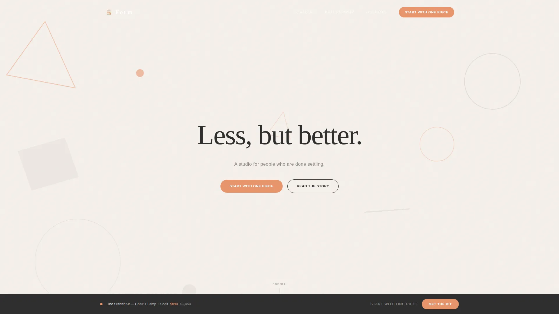
The header fills the full viewport with slowly drifting soft-edged triangles, offset circles, and floating parallelograms. Shapes appear in misted gray and apricot against the cloud-white ground, casting faint paper-cutout shadows. After a two-second pause, the headline "Less, but better." types out letter by letter while the geometry parts to frame it.
Scroll-Driven Origin Story Layout
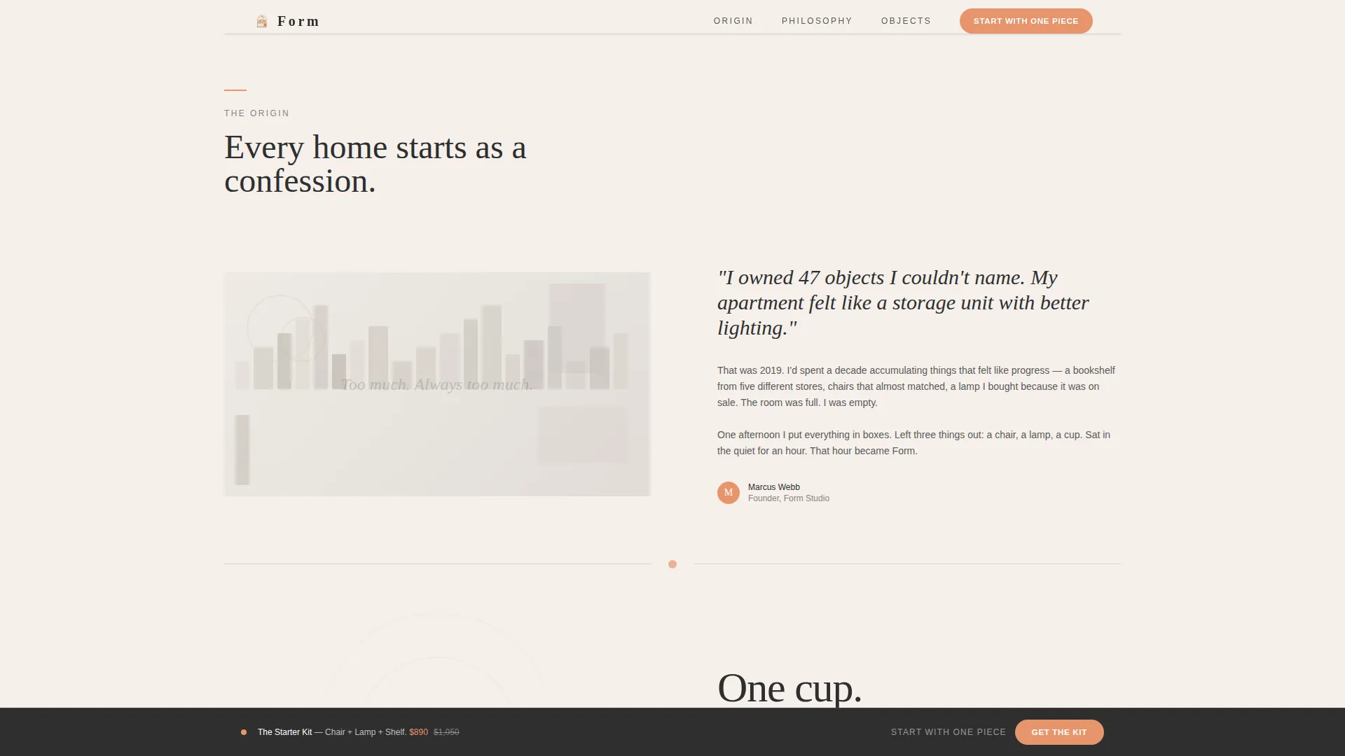
Scrolling pulls the visitor through a three-act narrative. It opens with a visually dense, overwhelming collage paired with a short confession. It transitions to a single object on a white plane, then crystallizes into philosophy before products ever appear. By the time the shop section loads, the visitor has already internalized the worldview.
Geometric Philosophy Animations
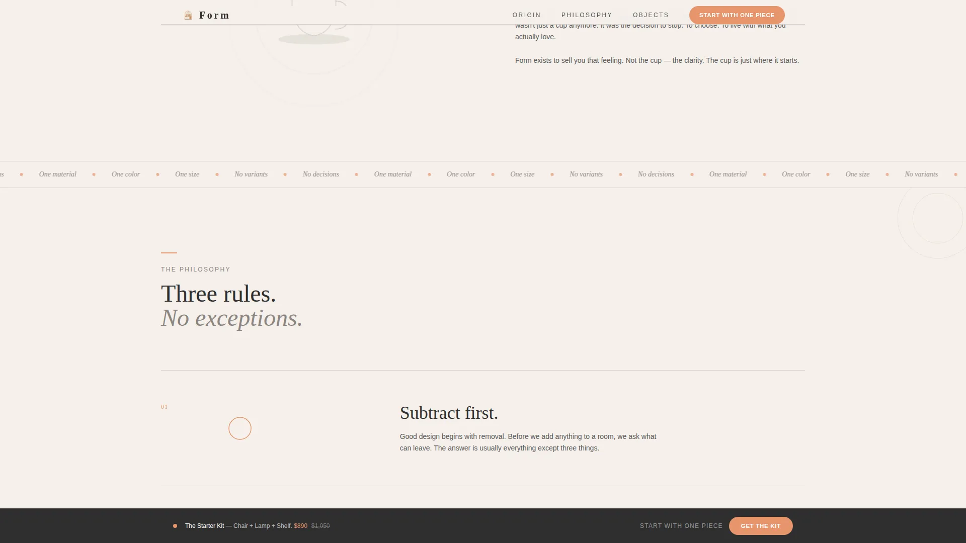
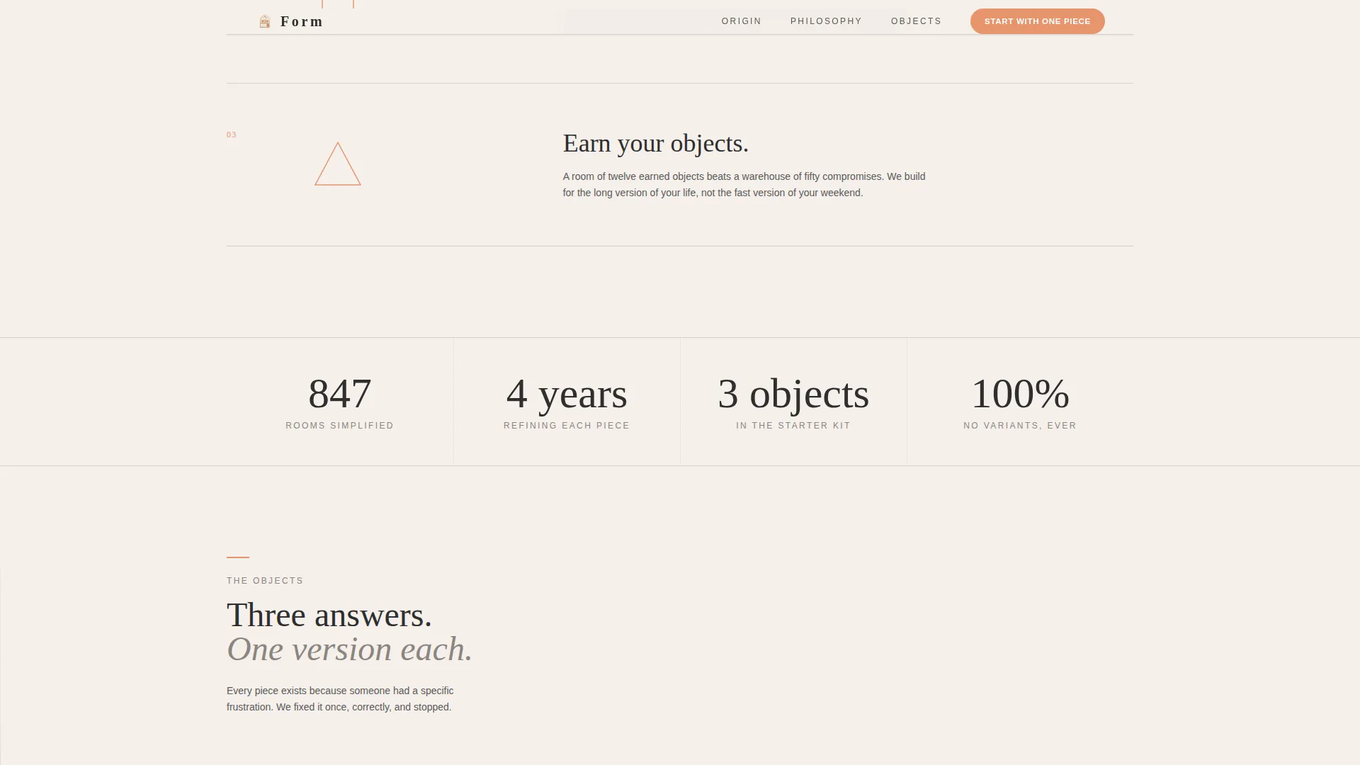
Each brand principle is illustrated by a bespoke geometric animation that builds detail and then subtracts it until only the essential shape remains. This visual metaphor reinforces the minimalist philosophy through motion rather than words alone.
Single-Option Product Cards
Every product card is designed around the one material, one color, one size principle. Each card includes a single-click "Add to Cart" button with no variant selector, removing decision friction and keeping the buying experience consistent with the brand's restraint ethos.
Dual Conversion Paths
The template provides two purchase entry points. The primary call to action, "Start With One Piece," appears after the origin story resolves and again as a persistent bottom bar once products are visible. The secondary path, "Get the Starter Kit," offers a curated three-piece bundle at a bundled price for visitors who prefer a decision-free start.
Persistent Bottom Bar Call to Action
Once the product section enters the viewport, a persistent bottom bar locks into place carrying the primary call to action. This keeps the conversion prompt visible without interrupting the scroll narrative that precedes it.
Page sections overview
| Section | Purpose |
|---|---|
| Animated geometry header | Establishes mood and reveals the core headline |
| Cluttered collage section | Surfaces the visitor's lived problem through visual contrast |
| Clarity moment section | Shows the emotional shift from overwhelm to simplicity |
| Philosophy principles section | Builds trust through geometric animations and brand convictions |
| Product introduction section | Presents pieces as answers to specific frustrations |
| Product cards grid | Enables single-click purchase with no variant friction |
| Starter Kit bundle section | Offers a decision-free curated entry point at a bundled price |
| Persistent bottom bar | Maintains the primary call to action throughout scroll |
Design & branding system
The Cloud Canvas color system is the foundation of the visual identity. Every color decision is deliberate, and the palette holds together because each tone has a single job to do.
- Soft warm white (#F5F0EB) fills all backgrounds; misted gray (#D6D1CA) marks sectional divides; charcoal graphite (#2E2E2E) anchors all body and heading typography
- Apricot (#E8956D) appears exclusively on interactive elements and geometric accents, functioning as a precise visual signal rather than a decorative flourish
- The Playful Geometric theme uses soft-edged triangles, offset circles, and parallelograms to add rhythm and warmth without cluttering the visual field
Mobile & speed optimization
The full-width immersive layout is structured to translate cleanly across screen sizes. The design relies on geometry, space, and typography rather than heavy photography, which keeps the visual weight manageable on smaller devices.
- Full-viewport header and section layouts are built to reflow gracefully for tablet and mobile viewports
- Animations and geometric elements are designed as lightweight motion accents rather than resource-heavy video or large image assets
- The single-column product card structure adapts naturally to narrow screens without requiring additional layout logic
How this template helps you convert
The entire layout is engineered around one idea: earn the sale before you ask for it. The scroll sequence is a conversion funnel disguised as a story.
- The origin story builds emotional identification early, making visitors feel seen before they see a product, which increases the chance they stay engaged through to the purchase section.
- Single-option product cards and a persistent bottom bar reduce the number of decisions a buyer must make, lowering the dropout rate at the point of purchase.
- The Starter Kit bundle path gives hesitant visitors a clear, confident entry point that feels curated rather than commercial.
Other information about this template
This template sits at the intersection of the Architecture and Design category and the Interior Design Studio subcategory, with a niche focus on minimalist and modern design. It was built with the Full-Width Immersive template style in mind, pairing an Origin Story creative direction with a Direct Sales landing page direction.
- The template style is Full-Width Immersive, meaning every section stretches edge to edge and uses generous vertical breathing room
- The intersection match score for this template across category, subcategory, and niche alignment is 13, indicating a strong contextual fit for minimalist interior design studio use cases
- The Playful Geometric theme and Cloud Canvas color system are matched intersection context fields, meaning the visual identity was selected to serve this specific niche and creative direction simultaneously
- This template is designed as a single-page layout and is not a multi-page website structure
Theme
Playful Geometric
Creative direction
Origin Story
Color system
Cloud Canvas
Style
Full-Width Immersive
Direction
Direct Sales
Page Sections
Animated Abstract Geometric Header
Scroll-driven Origin Story Layout
Geometric Philosophy Animations
Single-option Product Cards
Dual Conversion Path Structure
Persistent Bottom Bar
Related questions
Can I change the color palette to match my existing brand?
Does this template work for a studio that sells services, not products?
How many products can I display in the product section?
Can I use my own photography in the product cards?