Culinary FAQ & Reference Landing Page Template
Mise is a single-page culinary reference landing page built for chefs, cooks, and food students who need fast, trustworthy answers. It pairs an authoritative editorial layout with structured comparison tables covering knife skills, cooking methods, mother sauces, and protein temperatures. The design earns reader trust before asking for a click.
by Rocket studio
Quick summary
Mise is a culinary reference landing page template built around comparison tables and editorial authority. It targets cooks at every level who need reliable kitchen knowledge fast. The Monochrome Steel palette and Editorial Magazine theme give the page a professional, print-inspired feel that immediately signals depth and credibility.
Who this template is for
This template suits anyone building a chef or cook resource hub that needs to feel both authoritative and approachable. The design is calibrated for knowledge-first audiences who scan before they commit.
- Line cooks and culinary students looking for fast, structured reference content
- Home cooks who need clear side-by-side comparisons of techniques and temperatures
- Food educators and culinary content creators building a trusted FAQ and resource page
What problem this template solves
Most culinary resource pages feel either too casual or too academic. They lose readers before earning their trust. This template solves the credibility gap by leading with visual authority and delivering dense, useful content before ever asking for a click.
- Cooks land on the page searching for one specific answer and immediately find structured, scannable tables
- The logo wall section establishes institutional trust in a single horizontal band, removing hesitation
- The rhythm of comparison tables alternating with breathing space keeps readers moving through the page
What you get with this template
You get a fully structured single-page layout designed to function as a culinary FAQ and reference hub. Every section has a clear job, and the page flows from trust-building to content delivery to a low-friction call to action.
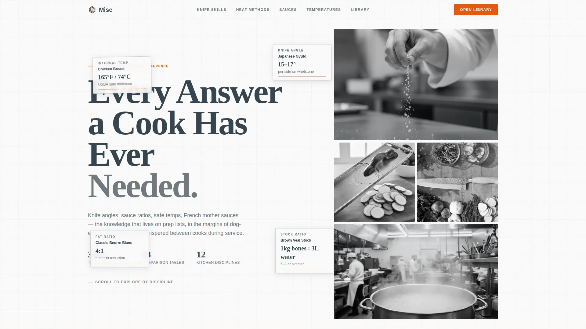
- A giant headline header with editorial black-and-white photography mosaic occupying the right viewport
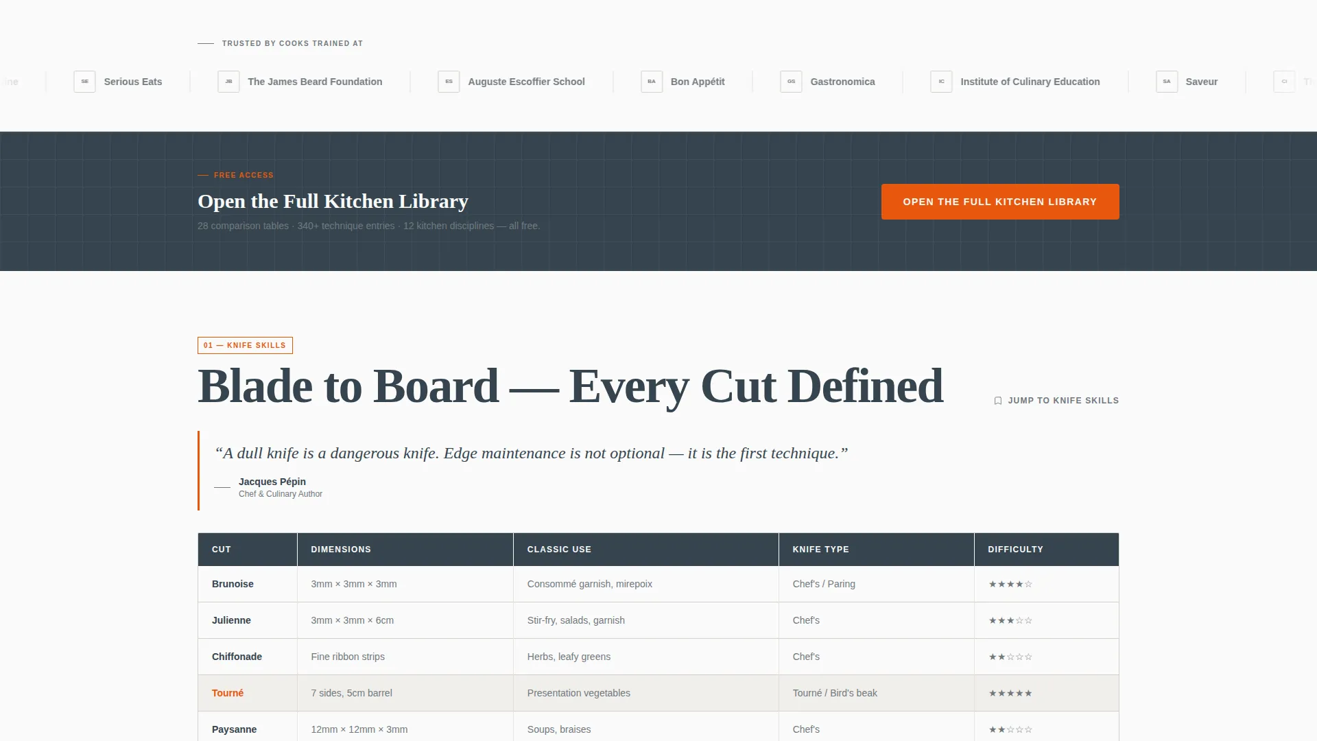
- A horizontal logo wall band for culinary institutions, restaurant groups, and food publications
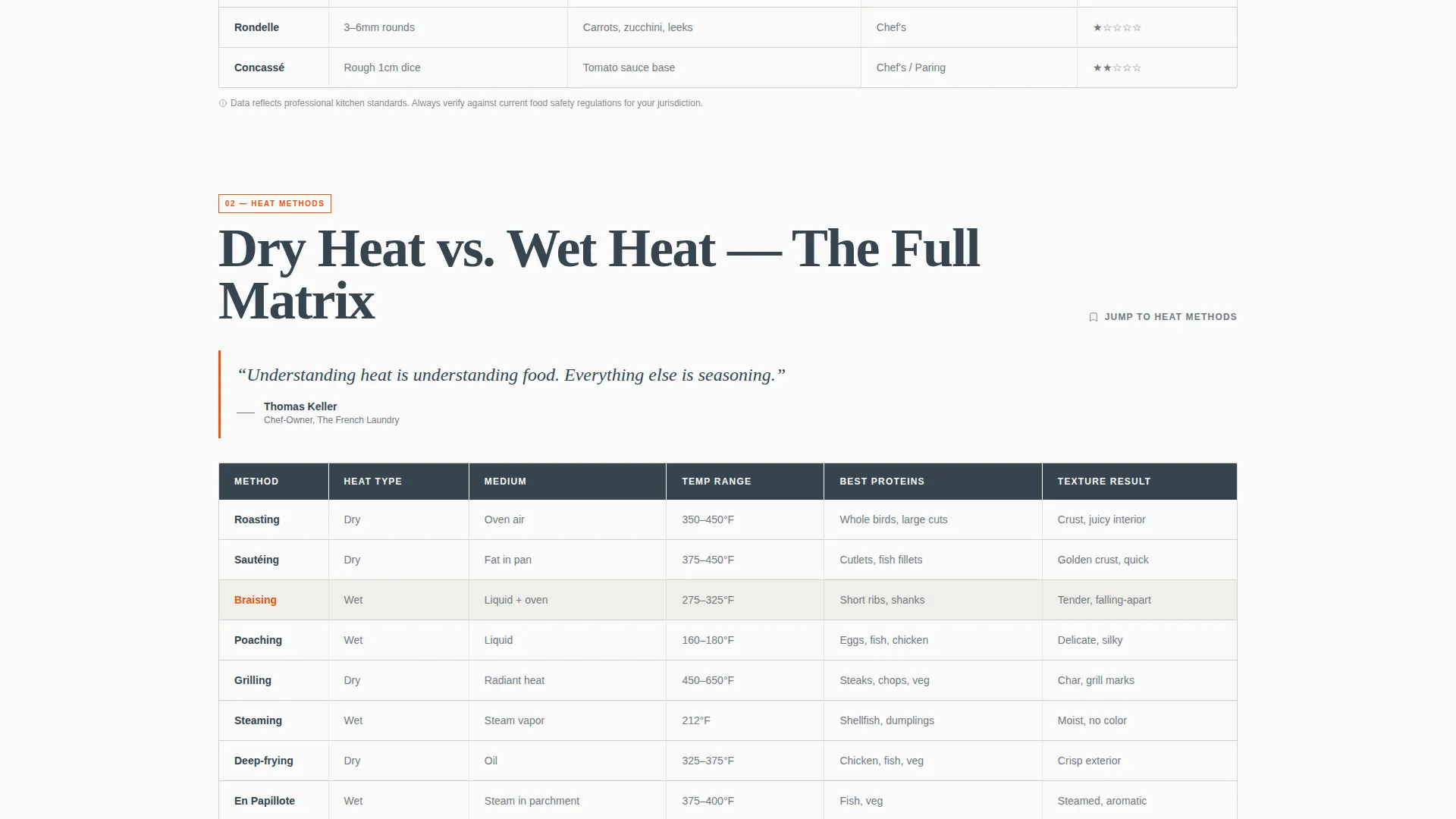
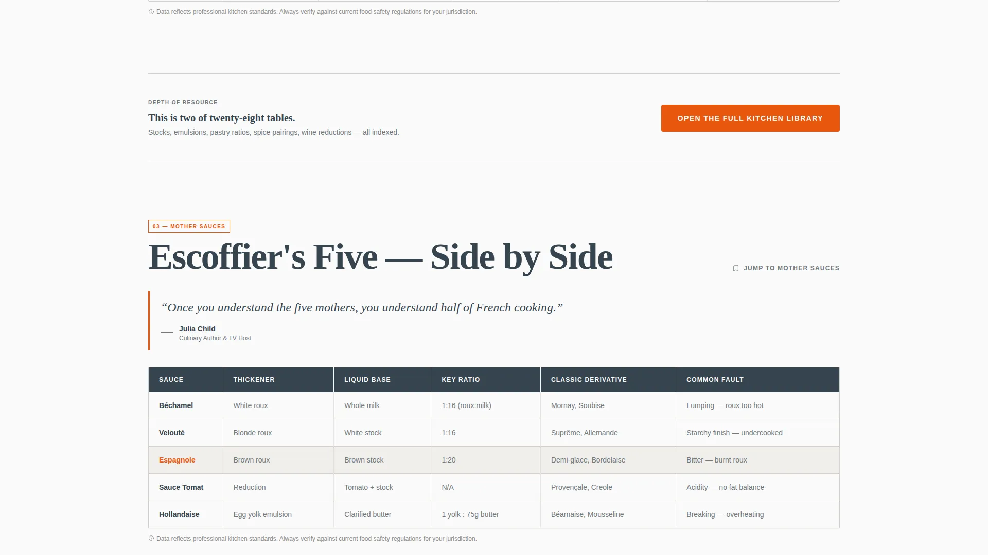
- Multiple comparison table sections covering knife skills, cooking methods, mother sauces, and protein doneness temperatures
Feature list
This template includes a carefully sequenced set of layout features drawn directly from the source brief.
Giant Headline Left Header
The header fills the viewport with a massive, tightly kerned serif headline set flush-left in deep charcoal against bright white. The right forty percent holds a vertical mosaic of editorial-style black-and-white photography. No buttons appear above the fold, letting authority and craft do the opening work.
Logo Wall Authority Band
Immediately below the header, a horizontal band displays monochrome logos from culinary institutions, restaurant groups, and food publications. This single band establishes trust before the reader reaches any comparison content.
Discipline-Organized Comparison Tables
The core of the page is a series of comparison tables organized by kitchen discipline. Topics include knife skills versus techniques, dry-heat versus wet-heat methods, mother sauces side by side, and doneness temperatures for every protein. Each table is scannable and designed to feel sortable at a glance.
Editorial Pull-Quote Blocks
Between comparison tables, pull-quotes from named chefs punctuate the content rhythm. These blocks act as breathing space between dense reference sections, echoing the feel of a magazine feature spread moving into its index.
Repeating Flame Orange Call to Action
The primary call to action reads "Open the Full Kitchen Library" in kitchen flame orange. It appears first after the logo wall and repeats after every second comparison table, creating a consistent conversion prompt without interrupting the content flow.
Section Anchor Text Links
A secondary text link reading "Jump to [Topic]" anchors at the top of each table section. These links reduce friction for readers who arrived from search with a specific question in mind, letting them skip directly to the relevant table.
Page sections overview
| Section | Purpose |
|---|---|
| Giant Headline Header | Opens with authority and editorial photography |
| Logo Wall Band | Builds institutional trust immediately |
| Primary call to action Block | First conversion prompt after trust is established |
| Knife Skills Table | Compares knife techniques side by side |
| Cooking Methods Table | Contrasts dry-heat and wet-heat approaches |
| Mother Sauces Table | Presents all mother sauces in parallel |
| Protein Temperatures Table | Lists doneness temps for every protein |
| Pull-Quote Breaks | Adds editorial rhythm between dense tables |
| Repeating call to action Blocks | Reinforces the click prompt after every two tables |
Design & branding system
The template uses an Editorial Magazine theme built on a Monochrome Steel color system. The palette is disciplined and professional, modeled on the atmosphere of a commercial kitchen after service.
- Core tones are brushed steel (#71797E), deep charcoal (#36454F), and bright pass-lamp white (#FAFAFA) for all body and structural elements
- Kitchen flame orange (#E8570E) is reserved strictly for calls to action and pull-quote rules, functioning as the single warm accent across an otherwise cool palette
- Typography uses a large, tightly kerned serif for headings, reinforcing the print-editorial authority of the layout
Mobile & speed optimization
The layout is structured with mobile readers in mind. Line cooks searching for a technique at 1 AM are often on a phone, and the template accounts for that context.
- Comparison tables are built to remain scannable on small screens without requiring horizontal scrolling
- The giant headline and photography mosaic adapt to narrower viewports while preserving the editorial weight of the header
- Section anchor links are especially useful on mobile, letting readers jump to relevant tables without scrolling through the full page
How this template helps you convert
The page earns the click by proving its depth first. The conversion strategy is deliberately sequenced to build trust before presenting any call to action.
- The logo wall and comparison tables demonstrate knowledge density early, so by the time the first call to action appears, readers already trust that the full library behind the button is worth their time.
- The repeating "Open the Full Kitchen Library" prompt in flame orange creates gentle, consistent momentum without disrupting the reference content flow.
- Section anchor links lower the entry barrier for high-intent visitors who arrived with a specific question, increasing the likelihood they stay and eventually click through.
Other information about this template
This template is designed for the Chef and Cook Online Presence category, sitting at the intersection of professional services and culinary education content. It is well suited for chefs building authority online and for culinary content publishers who want a reference hub that reflects the seriousness of professional kitchen culture.
- The template style is a Comparison Table layout, making it a strong fit for any knowledge-dense culinary niche where side-by-side clarity adds real value
- The no-form design philosophy means the page focuses entirely on delivering value before asking for commitment, which suits audiences who are skeptical of gated content
- The Editorial Magazine theme and Monochrome Steel palette can be adapted to fit a range of culinary voices, from fine-dining authority to approachable home-cook resource
Theme
Editorial Magazine
Creative direction
Logo Wall Authority
Color system
Monochrome Steel
Style
Comparison Table
Direction
Click-Through
Page Sections
Giant Headline Left Header
Logo Wall Authority Band
Discipline-organized Comparison Tables
Editorial Pull-quote Breaks
Repeating Flame Orange Call to Action
Section Anchor Jump Links
Related questions
Who is this template designed for?
Does this template include a contact form or sign-up field?
Can I customize the comparison table topics for my own content?
What makes the call to action placement effective on this page?
Is the design suitable for a mobile audience?



