Restaurant Consulting Landing Page Template
Mise is a single-column landing page template built for restaurant compliance consultants. It uses a dark, authoritative visual identity, a tension-driven FAQ scroll structure, and two focused conversion paths. The design moves visitors from emotional recognition through practical trust-building to a clear call to action, helping consultants turn late-night searchers into qualified leads.
by Rocket studio
Quick summary
Mise is a single-column landing page template for restaurant consulting professionals. It opens with a cinematic dark kitchen header, guides visitors through a FAQ-driven scroll that mirrors real operational anxiety, and closes with a dual conversion system. The design is confident, the tone is authoritative, and every section earns the next click.
Who this template is for
This template is built for consultants who operate at the intersection of restaurant operations, labor compliance, and hospitality law. It speaks directly to practitioners whose clients need more than advice; they need someone who can stand in the dining room at midnight and explain what is actually broken.
- Independent restaurant consulting professionals offering operations and compliance services
- Hospitality advisors who work with multi-unit operators, franchise groups, or restaurants facing audits
- Compliance-focused consultants who need to qualify leads by size, urgency, and legal exposure before the first call
What problem this template solves
Independent restaurant owners and operators rarely search for help until something has already gone wrong. They type panicked questions into search engines at 1 a.m. and land on generic service pages that do not speak their language. A consultant needs a landing page that answers those questions with authority before asking for anything in return.
- Visitors leave generic pages because the content does not reflect the specific, high-stakes problems they are facing
- Consultants lose qualified leads because their page cannot distinguish between a single-unit owner and a multi-unit decision-maker worth a direct outreach call
- The absence of a structured audit intake form means most inbound interest goes cold before it can be qualified
What you get with this template
This template delivers a complete single-column landing page layout with every structural and visual component already in place. You receive a ready-to-customize design that handles the full visitor journey, from the emotional hook of the header to the practical confidence of the conversion form.
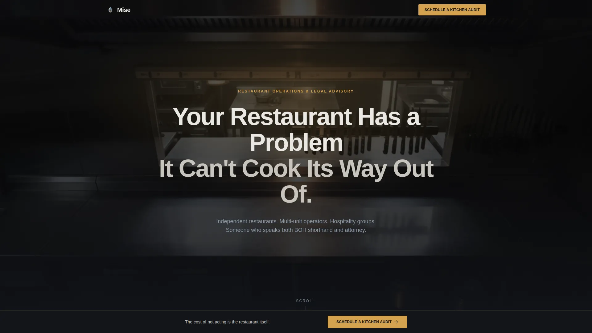
- A dark full-bleed header with a cinematic kitchen image, a timed headline fade-in, and no premature call-to-action pressure
- A FAQ-driven scroll body with stat callout blocks in amber, placed at every third FAQ interval to reinforce urgency
- Two conversion paths: a primary "Schedule a Kitchen Audit" form with a dropdown qualifier, and a secondary lead magnet gated behind an email and role field
Feature list
This section covers the key structural and design features built into the Mise landing page template.
Dark Full-Bleed Header Section
The header uses an overhead kitchen-after-close photograph as its full-bleed background. A single warm pendant glow defines the mood. The headline "Your Restaurant Has a Problem It Can't Cook Its Way Out Of" fades in over three seconds with no button, allowing the emotional weight of the image and copy to land before any ask is made.
FAQ-Driven Scroll Structure
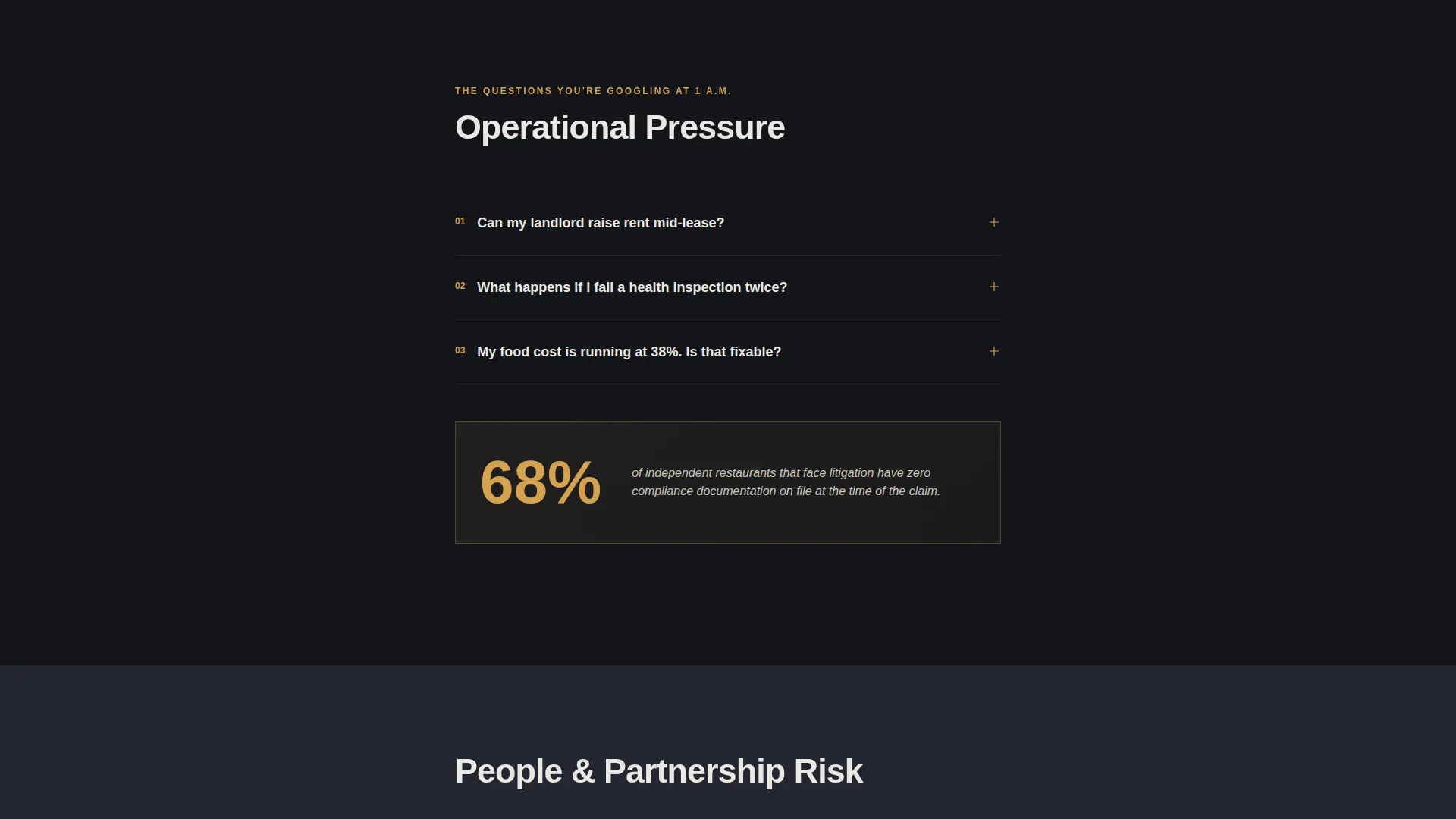
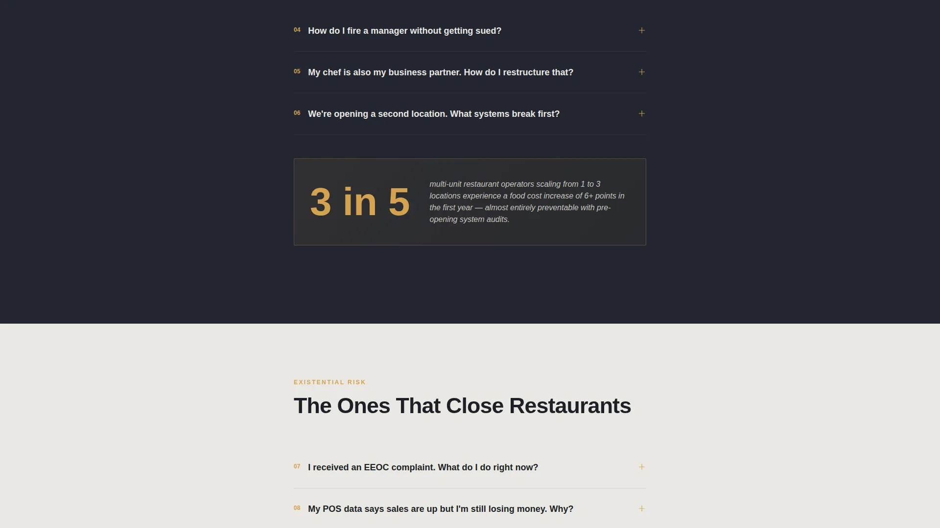
The scroll body is organized as a descending sequence of real-world questions restaurant owners search for at night. Questions cover lease disputes, failed health inspections, manager termination risk, and more. Each answer is concise and authoritative, demonstrating fluency across operations, compliance, and hospitality finance simultaneously.
Amber Stat Callout Blocks
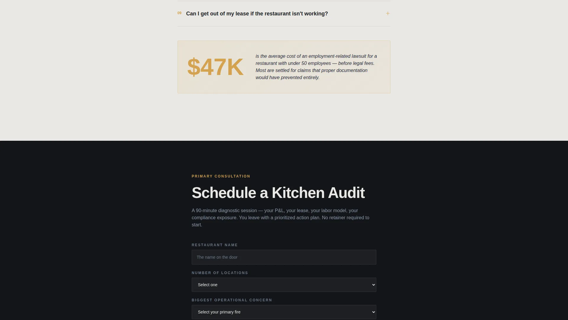
Every third FAQ is followed by a single-stat callout rendered in warm amber against the dark background. These blocks interrupt the reading rhythm intentionally, landing a credibility-building fact that raises the perceived cost of inaction. They function as visual punctuation between tension and resolution.
Dual Conversion Path System
The primary conversion path is a "Schedule a Kitchen Audit" form that captures restaurant name, number of locations, and a dropdown field for the single biggest operational concern. The secondary path offers a downloadable checklist gated behind an email and a role qualifier, helping the consultant identify single-unit owners versus multi-unit decision-makers.
Sticky Bottom Call-to-Action Bar
After a visitor reaches 60 percent scroll depth, a sticky bottom bar appears with the primary call to action. This keeps the audit scheduling option visible without interrupting the FAQ reading experience in the earlier sections of the page.
Background Transition System
The page background shifts from deep charcoal through the first three folds to cloud white in the FAQ and lower sections. This transition is intentional: the visual metaphor mirrors the moment clarity arrives after confusion, reinforcing the consultant's role as the calm presence who helps owners finally see the full picture.
Page sections overview
| Section | Purpose |
|---|---|
| Dark Header Fold | Establishes emotional tone with a cinematic kitchen image and a timed headline fade-in |
| Opening FAQ Block | Delivers the first set of operational questions with authoritative, concise answers |
| First Stat Callout | Interrupts with an amber-highlighted compliance fact after the third FAQ |
| Mid-Page FAQ Block | Escalates to legal exposure questions, raising stakes for the reader |
| Second Stat Callout | Reinforces urgency with a second amber callout block |
| Primary call to action Form | Collects restaurant name, location count, and operational concern via dropdown |
| Late FAQ Block | Covers existential risk questions, completing the tension arc |
| Third Stat Callout | Final amber stat before the background transition to cloud white |
| Lead Magnet Section | Offers a downloadable checklist gated by email and role field |
| Sticky call to action Bar | Appears at 60 percent scroll depth and persists through the remainder of the page |
Design & branding system
The visual identity follows a Legal Shield theme built on the Cloud Canvas color system. The palette is controlled and intentional, designed to feel serious enough for a litigation conversation and warm enough for a passion-driven hospitality professional.
- Deep charcoal (#1C1F26) dominates the background through the first three folds; cloud white (#EAE8E3) takes over in the lower sections as a deliberate metaphor for clarity emerging
- Muted steel blue (#6B7B8D) handles secondary text and iconography, keeping supporting details readable without competing with the primary message
- Warm amber (#D4A24E) appears exclusively on calls to action, pull-quote callouts, and hover states, making every conversion moment visually distinct
Mobile & speed optimization
The single-column layout is inherently suited to mobile viewing. Every structural choice, from the stacked FAQ blocks to the sticky bottom bar, translates cleanly to smaller screens without requiring a separate mobile design pass.
- The full-bleed header image and timed headline are structured to render correctly on portrait-oriented screens without cropping the key visual elements
- The sticky call-to-action bar is designed to sit above the mobile browser navigation without obscuring content, keeping the audit scheduling prompt accessible throughout the scroll
How this template helps you convert
The conversion architecture is built around the reality that restaurant owners do not trust quickly. Every structural decision delays the ask until enough trust has been established to make the ask feel reasonable.
- The FAQ scroll mirrors real search behavior, so visitors feel understood before they feel sold to, which increases the likelihood they will complete the audit intake form at the fold where it appears
- The dual conversion path captures leads at two different commitment levels, ensuring that visitors who are not ready to schedule a call can still enter the funnel through the checklist download and role qualifier
Other information about this template
Mise is designed specifically for the restaurant compliance consultant niche, where the buyer is often a stressed owner or operator who needs to feel the consultant already understands their situation before they reach out.
- The template style follows a comparison table approach in its FAQ structure, positioning the consultant's knowledge against the cost of unguided decision-making
- The lp direction is optimized for booking and scheduling, with the primary form designed to qualify leads by operational concern and business size before the first conversation
- The header concept draws on award-level visual confidence, using a composed, atmospheric kitchen image rather than stock photography clichés
- The creative direction uses a logo wall authority structure adapted into a stat-callout authority format, building credibility through data rather than client logos alone
- The theme is Legal Shield, which means the entire tone, structure, and visual system is designed to reassure visitors that the consultant is capable of protecting their business, not just advising it
Theme
Legal Shield
Creative direction
Logo Wall Authority
Color system
Cloud Canvas
Style
Comparison Table
Direction
Booking/Scheduling
Page Sections
Dark Full-bleed Header with Timed Headline
Faq-driven Scroll Body
Amber Stat Callout Blocks
Dual Lead Conversion System
Sticky Bottom Call-to-action Bar
Background Transition From Dark to Light
Related questions
Who is this landing page template designed for?
Can I customize the FAQ questions and stat callouts for my own practice?
What does the primary audit scheduling form collect?
How does the secondary conversion path work?
Does this template work for consultants who specialize in one area, such as food cost control?



