Cooking School Coupon & Discount Landing Page Template
Mise is a single-column landing page template built for cooking schools that want to turn casual browsers into enrolled students. It pairs a manifesto-style header, documentary instructor portraits, and hand-issued discount ticket graphics with a lead-capture form and a downloadable class calendar. The result feels personal, editorial, and genuinely persuasive.
by Rocket studio
Quick summary
Mise is a single-column flow landing page template designed for cooking schools running coupon and discount campaigns. It opens with a bold serif manifesto, introduces instructors through documentary-style portraits, and weaves discount offers between each profile like hand-stamped invitations. A focused lead-capture form and a PDF calendar gate give visitors two clear paths forward.
Who this template is for
This template is built for cooking school owners and marketers who need a landing page that feels human rather than promotional. It suits anyone selling experiential culinary classes to gift buyers, couples, and career explorers.
- Cooking school operators promoting discounts and limited-time class offers
- Culinary marketing teams who want instructor-led storytelling to drive sign-ups
- Independent chef educators launching a coupon or discount campaign for the first time
What problem this template solves
Generic discount pages make culinary classes look like commodity products. A coupon buried in a grid of percentage badges does not tell a student why they should book, who will teach them, or why this school is worth their evening. That disconnect kills conversions.
- Visitors leave without booking because they feel no personal connection to the school
- Discount offers look algorithmic rather than hand-picked and credible
- There is no secondary path for visitors who want more information before committing
What you get with this template
You get a fully structured single-page layout built around the rhythm of instructor introductions and discount reveals. Every component is designed to make the offer feel endorsed by a real person, not generated by a system.
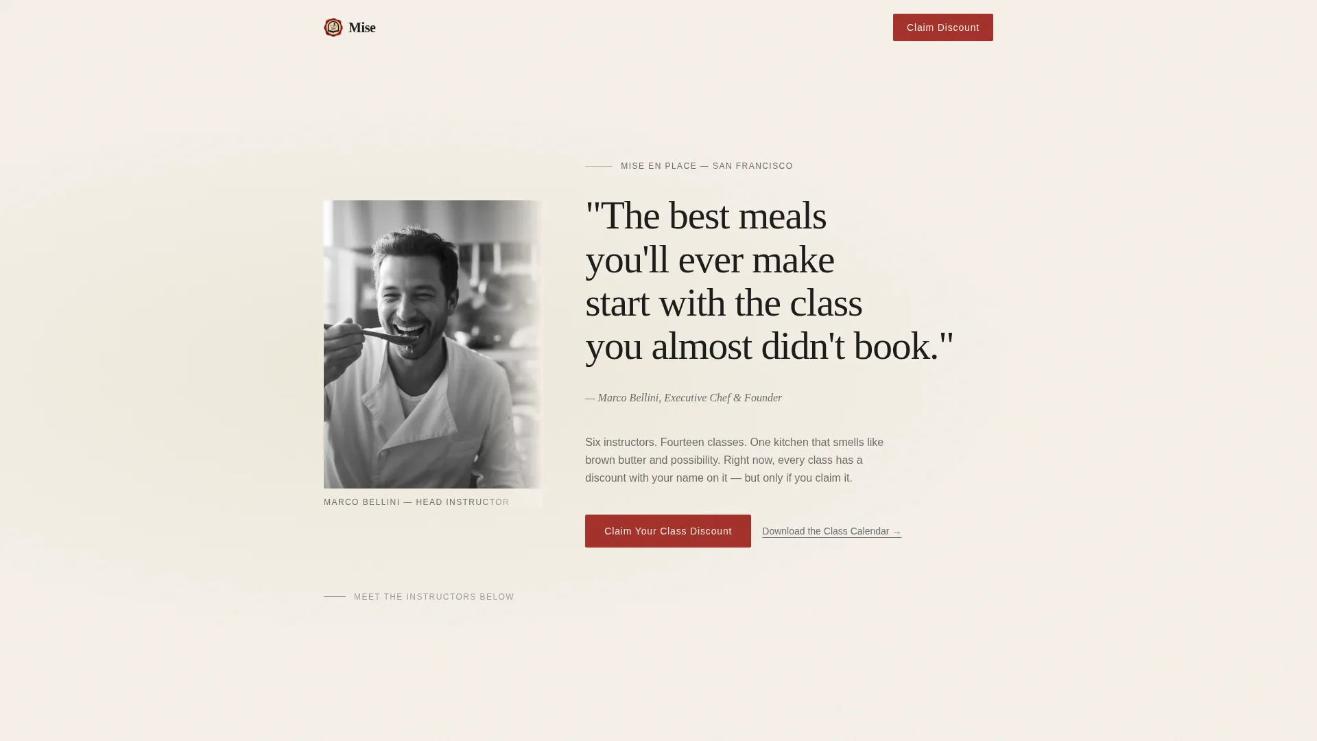
- A quote-and-manifesto header with a candid instructor portrait bleeding into the left margin
- Alternating instructor profile cards and torn-ticket discount graphics down the full page length
- A dual-conversion section with a lead-capture form and a downloadable class calendar PDF gate
Feature list
This template is built around a deliberate set of components that work together to generate leads and build trust at the same time.
Quote and Manifesto Header
The page opens with a single line of oversized serif type set against aged parchment cream. A graphite italic attribution line names the head instructor, and a candid black-and-white portrait bleeds into the left margin. It reads like the opening page of a memoir rather than a promotional banner.
Alternating Instructor and Offer Rhythm
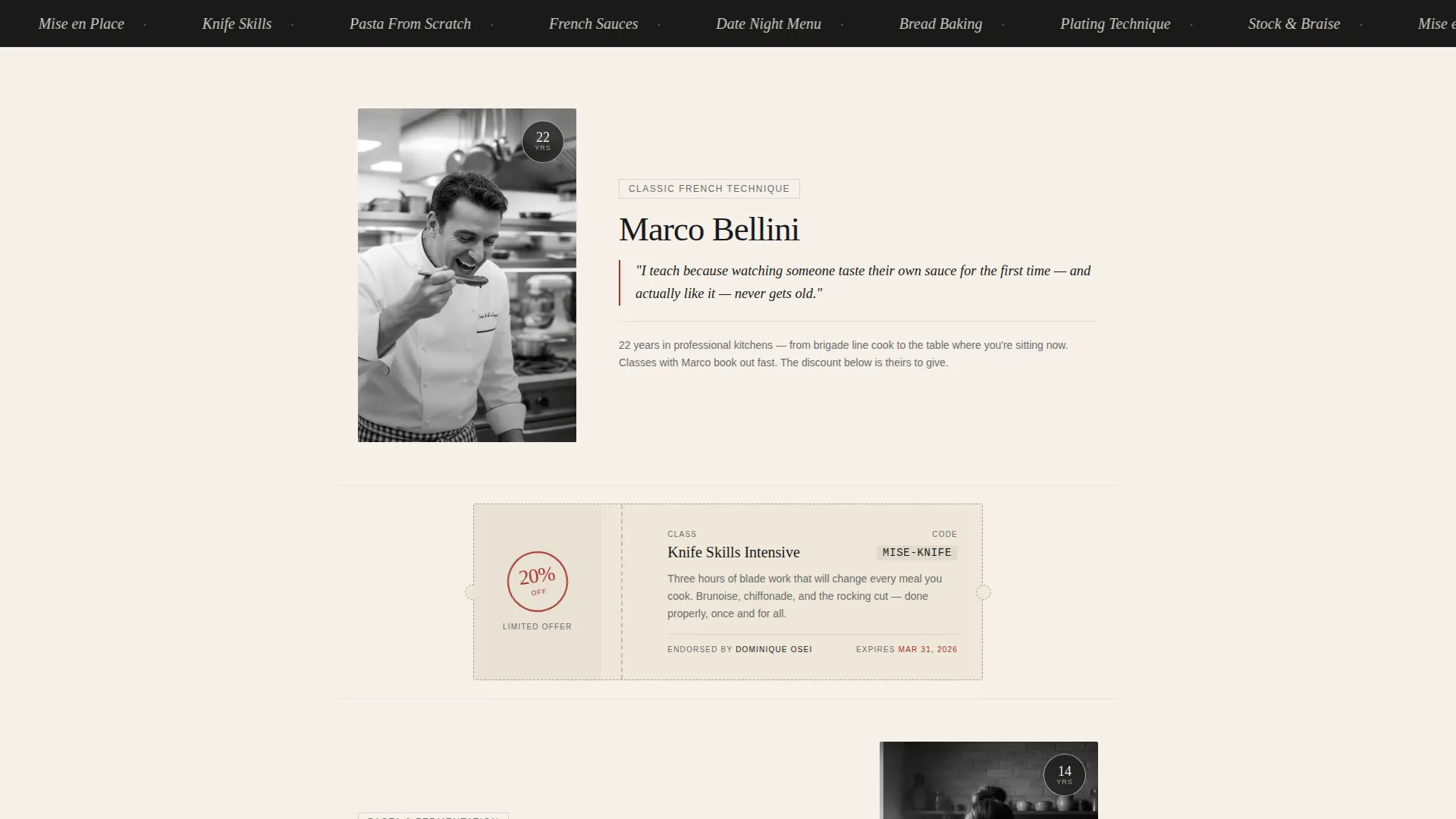
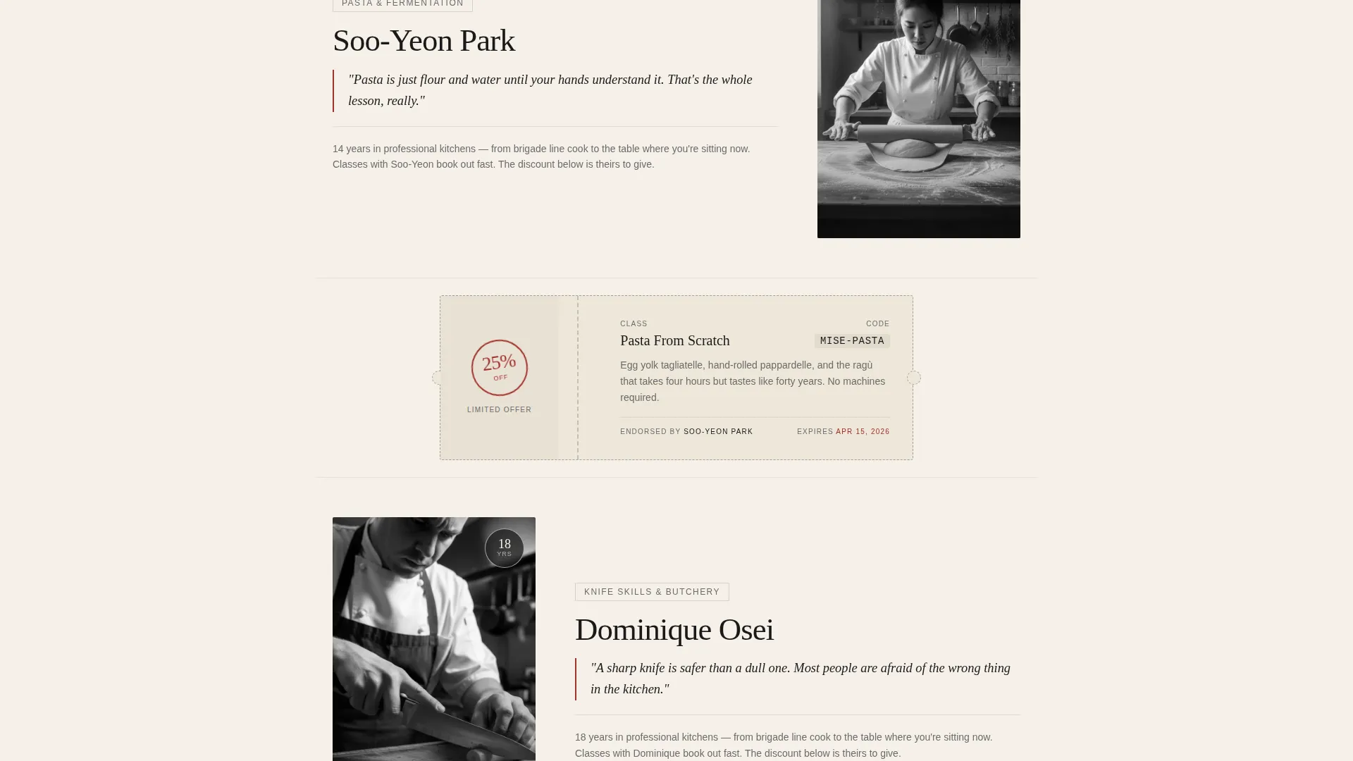
Instructors appear one by one in documentary-style portrait cards. Each card shows the instructor's specialty, years of experience, and one sentence they wrote themselves about why they teach. Between every card, a torn-ticket discount graphic with a dotted-line border and a stamped percentage mark appears, making each offer feel personally endorsed.
Torn-Ticket Discount Graphics
Discount offers are styled as hand-issued ticket stubs with dotted perforation borders and wax-seal stamp marks. This visual language makes coupons feel deliberate and scarce rather than automated, which increases perceived value.
Anchored Lead-Capture Form
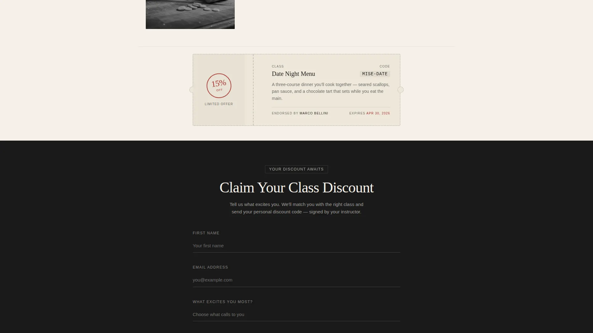
After the third instructor reveal, a primary call-to-action section anchors the conversion moment. The form collects first name, email, and a single dropdown asking what excites the visitor most, with options including Knife Skills, Pasta From Scratch, Date Night Menu, and Career Exploration.
PDF Calendar Download Gate
A secondary conversion path offers a downloadable full class calendar for visitors who are not yet ready to fill out the lead form. This keeps undecided visitors engaged and gives the school a way to follow up without requiring full commitment upfront.
Single-Column Scroll Flow
The entire layout runs in one focused column with no sidebars or competing navigation. This keeps the reader's eye moving downward through each instructor reveal and offer, reducing distraction and guiding attention toward the conversion sections.
Page sections overview
| Section | Purpose |
|---|---|
| Manifesto Header | Opens with a bold serif quote and a candid instructor portrait to set an editorial tone |
| Instructor Card One | Introduces the first instructor with portrait, specialty, experience, and personal teaching statement |
| Discount Ticket One | Presents the first stamped coupon offer between the first and second instructor reveals |
| Instructor Card Two | Continues the alternating rhythm with a second documentary-style instructor profile |
| Discount Ticket Two | Delivers the second hand-issued discount graphic in the page flow |
| Instructor Card Three | Completes the three-instructor sequence before the primary conversion moment |
| Primary call to action Form | Anchors lead capture with a name, email, and interest-dropdown form |
| Calendar PDF Gate | Offers a secondary download path for visitors not ready to commit to the form |
Design & branding system
The visual identity follows an Ink and Paper color system that feels like a hand-pressed menu at a private supper club. Every color choice is restrained and typographic, with wax-seal red reserved strictly for action moments.
- Aged parchment cream (#F5F0E8) as the base background, fountain-pen black (#1A1A1A) for body text, and smudged graphite (#6B6B6B) for supporting copy and attributions
- Stamped wax-seal red (#A3302A) used exclusively on discount badges and primary call-to-action buttons to create clear visual hierarchy
- Documentary black-and-white photography for instructor portraits, paired with serif type for headings and editorial italic styles for attributions
Mobile & speed optimization
The single-column layout naturally adapts to smaller screens without requiring complex grid adjustments. Every section stacks cleanly in the order it was designed to be read.
- The alternating portrait-and-ticket flow reads as a natural vertical scroll on mobile, preserving the editorial rhythm on any screen size
- Oversized serif headings and high-contrast parchment-and-black text remain legible at small sizes without losing their typographic authority
- The lead-capture form and PDF gate are positioned as focused single-column blocks, making them easy to interact with on a touch screen
How this template helps you convert
The page is built to move a visitor from curious browser to enrolled student by making every step feel like a personal invitation rather than a transaction.
- The manifesto header creates an immediate emotional connection, framing the school as a place with real people and a real point of view before a single discount is shown.
- The alternating instructor-and-offer rhythm means every discount is introduced by a face and a name, giving each coupon personal credibility rather than algorithmic detachment.
- The dual-path conversion section captures leads at two levels of readiness, so visitors who want to book now and visitors who want to browse the calendar are both moved into the school's pipeline.
Other information about this template
This template was designed specifically for the cooking school coupon and discount page use case. It sits within the broader cooking school marketing category and is built to serve promotional campaigns where trust and personality are as important as the offer itself.
- The Legal Shield theme applied here means the layout feels authoritative and considered, as if each offer has been personally signed off rather than bulk-generated
- The template style is Single Column Flow, meaning there are no competing sidebars, tabbed sections, or multi-column grids to distract the reader from the page's one goal
- The header concept is Quote and Manifesto, a deliberate editorial choice that positions the school's head instructor as the voice of authority from the very first scroll position
- The creative direction is Team and People, so the template is structured around human faces and personal statements rather than product grids or feature lists
- This template is categorized under Professional Services and Cooking School Marketing, making it suitable for schools that want to present culinary education as a premium, considered purchase
Theme
Legal Shield
Creative direction
Team & People
Color system
Ink & Paper
Style
Single Column Flow
Direction
Lead Generation
Page Sections
Quote and Manifesto Header
Alternating Instructor and Offer Rhythm
Torn-ticket Discount Graphics
Anchored Lead-capture Form
PDF Class Calendar Gate
Single-column Scroll Layout
Related questions
Can I customize the instructor cards with my own team's photos and bios?
How many discount offers does the template include by default?
Is this template suitable for a school with only one or two instructors?
What is the purpose of the class calendar PDF gate?
Can the wax-seal red accent color be changed to match a different brand palette?



