Political Action Community Landing Page Template
The Caucus Community Hearth political action landing page template is built for political action committees that run on small-dollar donations and neighbor-to-neighbor organizing. A staged manifesto hero, modular card grid, sticky registration bar, and event-proximity modal work together to move first-time visitors from frustration to committed action in a single scroll.
by Rocket studio
Quick summary
The Caucus template is a single-page, card-grid landing page designed for grassroots political action committees. It opens on a full-screen manifesto quote, then unfolds into a structured grid that moves visitors from ideology to geography to personal commitment. Every section earns the next click, from policy fight cards at the top to a sticky "Save My Seat" registration bar at the bottom.
Who this template is for
This landing page is built for political action committees, advocacy organizations, and civic groups that need to convert frustrated neighbors into registered event attendees and recurring donors. It suits first-time political campaign organizers just as well as seasoned field directors running get-out-the-vote programs.
Ideal users include:
- Political action committees and super PACs running local candidate campaigns or ballot-initiative drives
- Advocacy groups and advocacy organizations coordinating volunteer canvassing, phone banking, or fundraising around specific political goals
- Union chapters, retired-educator coalitions, and other community-rooted organizations launching a new political campaign or civic mobilization effort
What problem this template solves
Grassroots political landing pages often fail at the moment of truth. Visitors arrive energized by a viral clip or a shared link, then land on a cluttered page that buries the action and loses the energy. The political landing page ends up looking like a brochure instead of a call to arms. Supporters leave without registering, donating, or knowing where to show up.
This template solves that problem directly:
- It sequences the page like a meeting that builds toward a vote, moving visitors from "why we fight" cards to "where we fight" event listings to "how you join" action cards, so momentum never stalls
- It shows live headcount numbers and countdown clocks on every event card, so inaction feels like a missed vote rather than a casual option
- It keeps the primary action simple and friction-free: one sticky action button, one lightweight modal, four fields, and a done button that actually gets pressed
What you get with this template
This template delivers a fully structured political landing page ready to represent any political campaign, from a single district race to a multi-issue advocacy push. The design system, layout structure, animation logic, and conversion flow are all defined and ready to adapt. No blank canvas, no guesswork about what comes first.
You get:
- A five-section card-grid layout covering manifesto hero, policy fight cards, event listings, volunteer stories, and join actions, with a Pattern 1 linear single-row footer
- A Navy Authority color system using deep constitutional navy, warm parchment, muted brick red, and worn gold, paired with Fraunces serif headlines and DM Sans body labels
- Scroll-triggered card entries, a staged text reveal in the hero, a sticky bottom call-to-action bar with registration modal, live headcount numbers, and countdown clocks on event cards
Feature list
This section describes the core capabilities built into the template. Each feature is grounded in the template design brief and represents a real, delivered component.
Staged Manifesto Hero
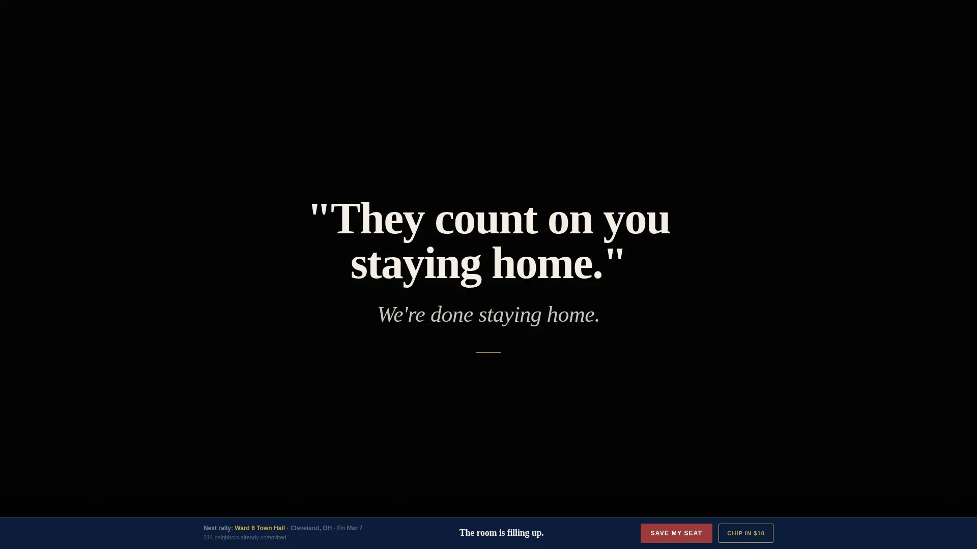
The landing page opens on a black screen with no logo, no navigation, and no imagery. A single serif sentence fades in against the parchment field. A second line follows. A pulsing arrow is the only motion. This bold headline approach concentrates visitor attention before any grid content appears, giving the political message room to land. Research shows that most website users spend the bulk of their time looking at content above the fold, and this hero takes full advantage of that behavior.
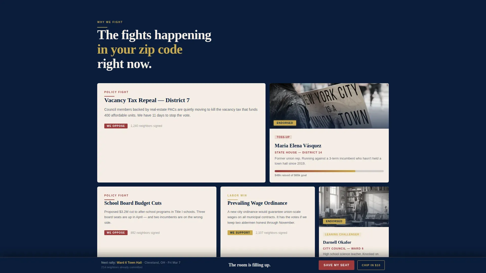
Modular "Movement Builds" Card Grid
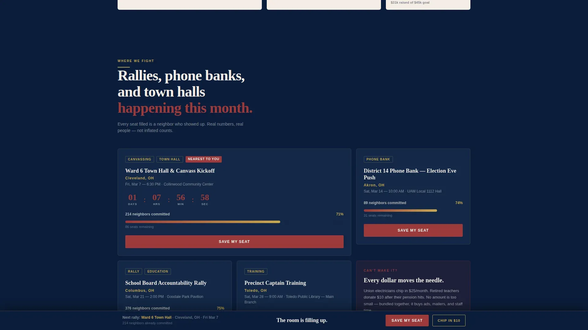
The page body is an asymmetric bento-style card grid organized into three scroll zones. The top zone contains policy fight cards with stance badges and candidate spotlight cards showing district numbers and race status. The middle zone holds event cards with headcount thermometer fills and countdown clocks. The bottom zone presents volunteer story cards and action cards for donating, volunteering, and registering. Scroll-triggered card entries animate each row into view as the visitor moves down the page, keeping the experience dynamic without being distracting.
Sticky Registration Bar with Proximity Modal
After the first scroll, a sticky bottom bar appears with the primary action button. Tapping or clicking opens a lightweight modal that asks for a first name, ZIP code, email address, and a dropdown of upcoming events auto-sorted by proximity to the entered ZIP. This keeps the register path short and immediate. A secondary path inside the modal offers a "Can't Attend, Chip In $10 Instead" option for supporters who are outside event range, so every visit produces a productive outcome.
Live Headcount and Countdown Social Proof
Each event card displays a live headcount number and a thermometer-style fill that shows how close the event is to capacity. A countdown clock on the nearest rally creates urgency without manufactured pressure, because the seat count is real. This social proof approach is grounded in the principle that users act faster when they can see that real neighbors are already committed. Data, statistics, and visible participation numbers validate the cause and push undecided visitors toward the register action.
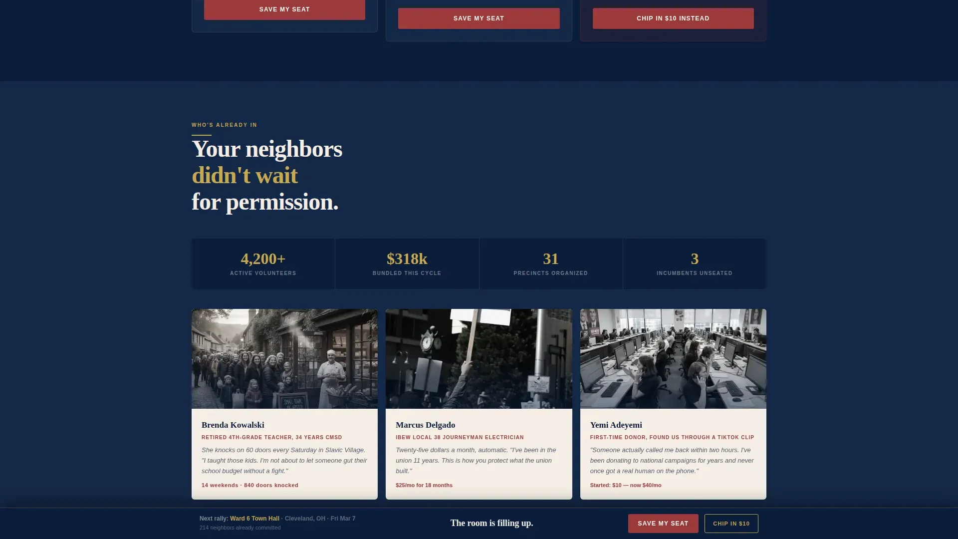
Volunteer Story Cards
The "Who's Already In" section uses one photo and two sentences per volunteer to put a face and a name to the political campaign. These cards are not generic testimonials. They represent retired teachers, union electricians, and first-time donors, the actual communities the PAC serves. Legislative caucus credibility comes from showing who is already in the room, and these cards do exactly that.
Navy Authority Design System
The visual identity uses deep constitutional navy as the primary background, warm parchment for card surfaces, muted brick red on every action button and urgency indicator, and worn gold for endorsement badges and event pins. Fraunces serif carries the headlines and hero text. DM Sans handles body copy and labels. The palette and typography together produce a campaign field-office aesthetic that feels raw, urgent, and authentic, the right register for a political landing page asking neighbors to show up.
Page sections overview
| Section | Purpose |
|---|---|
| Manifesto Hero | Delivers the bold headline with a staged serif quote reveal and a pulsing scroll arrow above the fold |
| Why We Fight | Asymmetric bento grid of policy fight cards, candidate spotlights, and stance badges |
| Where We Fight | Event cards with live headcount thermometers and countdown clocks |
| Who's Already In | Volunteer story cards using one photo and two sentences each for social proof |
| How You Join | Action cards for donating, volunteering, and registering, anchored by the sticky call to action bar |
| Footer | Pattern 1 linear single-row footer with contact details and essential page links |
Design & branding system
The template's visual language is built around a Community Hearth theme and a Navy Authority color system. Every design choice reinforces the feeling of a campaign field office at midnight, purposeful, lived-in, and urgently real. The typography pairing keeps hierarchy clear without sacrificing warmth.
Key design elements include:
- Color palette: deep constitutional navy (#0B1D3A) as the primary background, warm parchment (#F4EDE4) for card surfaces, muted brick red (#9B3A3A) on action buttons and urgency indicators, and worn gold (#C9A94E) for endorsement badges and event pins
- Typography: Fraunces serif for hero text, section headlines, and candidate spotlight headings; DM Sans for body copy, card labels, contact details fields, and modal inputs
- Animation: high animation intensity across the page, including staged text reveal in the hero, scroll-triggered card entries across all three grid zones, thermometer fills, and countdown clock motion
Mobile & speed optimization
This template is built mobile-first. Political campaign supporters often discover a landing page through social media platforms on their phones, and the page is designed to deliver its full conversion flow on small screens without asking users to pinch, zoom, or navigate complex menus. The sticky bar, modal, and card grid all resize and reflow for mobile devices without losing hierarchy or clarity.
Mobile-specific design decisions include:
- The sticky registration bar stays anchored at the bottom of the viewport on mobile devices, keeping the primary action button visible at all times without blocking card content
- The card grid collapses to a single-column scroll on smaller screens, preserving the "why to where to how" narrative sequence on phones and tablets
- Server components handle the static grid layout while client components manage the modal, countdown clocks, and live headcount numbers, so the page loads the structural content first and interactive elements layer in cleanly
How this template helps you convert
A political landing page only works if it moves visitors from reading to acting. This template is structured around that goal at every layer. The call to action is the heart of the page, not an afterthought.
Here is how the conversion flow works:
- The manifesto hero lands above the fold with a bold headline and no competing links. Research confirms that most users spend the majority of their time on content above the fold, so the hero uses that attention budget on the political message alone. The pulsing arrow then pulls the visitor into the scroll without friction.
- The card grid builds commitment progressively. Policy fight cards and candidate spotlights answer "why does this matter?" Event cards with live headcounts and countdown clocks answer "what's happening right now?" Action cards answer "what do I do next?" Each zone tightens the circle, and the sticky action button stays visible throughout, ready the moment the visitor is ready.
- The registration modal closes the loop with clear communication and minimal effort. Four fields, a proximity-sorted event dropdown, and a fallback donation path mean every visitor has a productive next step. Users who cannot attend can still chip in, and every interaction keeps supporters inside the funnel rather than bouncing away.
Other information about this template
This landing page template sits at an intersection that few web design resources address directly: the specific needs of grassroots political action committees that must compete for attention on the same social media platforms as consumer marketing campaigns while operating on the community budget of a neighborhood fundraiser. The Caucus template was built with that gap in mind.
The template supports a range of political goals and use cases beyond a single candidate race. Advocacy groups focused on public health policy, health equity legislation, issues affecting people with disabilities, autism awareness programs, or environmental policy fights can all adapt the card grid sections to their specific cause. The policy fight card format works for any issue where a brief forty-word summary and a clear stance badge communicate the stakes quickly.
For site owners representing advocacy organizations that span several issue areas, the "Why We Fight" grid can hold multiple policy fight cards simultaneously. Each card links to a deeper resource page or petition, and the page structure supports newsletter subscriptions as a secondary conversion path alongside event registration. Contact details in the footer give visitors a direct link to the team, reinforcing trust for new visitors who are not yet ready to register but are interested in learning more.
This template is relevant to various businesses and organizations across the civic sector, including:
- Political parties and their local chapters running candidate programs across multiple districts
- Legislative caucus groups that meet to coordinate voting and influence legislation around shared principles, including issues such as rare diseases, cancer research, economic well being, or food policy
- Advocacy organizations that use innovative strategies to recruit new members, coordinate with other organizations, and build diverse coalitions that reflect the diversity of the communities they serve
- Cause-driven groups that want to highlight specific district wins, dollar totals raised, and volunteer hours logged as proof of impact, giving potential customers of the cause reasons to trust and join
- Organizations that need a powerful tool for event-driven mobilization without the overhead of a fully custom website build
The page structure also makes it straightforward for a site owner to test different versions of key copy. A/B test the hero quote, the action button label, or the secondary chip-in amount. Because the modal and sticky bar are client components, individual elements can be swapped and tested without rebuilding the full page. Continuous A/B testing of call-to-action variations is one of the most effective practices for improving conversion rates, and the modular layout of this template makes that testing practical rather than theoretical.
For groups that focus on civic education and participation, the "Who's Already In" volunteer story section doubles as a bio section. It shows who the caucus represents and provides a history of impact through real faces and real stories. Legislative caucuses consist of elected officials and advocates who organize based on shared ideology, identity, and specific interests, and this section gives those advocates the visibility they deserve. Advocates can use the page to communicate with legislators, invite new collaborators, and thank co-chairs and supporters publicly, all within the same scrollable experience.
The template is designed to serve communities across a wide spectrum of political engagement levels, from first-time donors who found the PAC through a viral clip to experienced organizers managing field programs across multiple ZIP codes. The proximity-sorted event dropdown in the modal is particularly useful for organizations operating in dispersed communities where matching a supporter to the nearest event can mean the difference between a commitment and a missed opportunity.
Theme
Community Hearth
Creative direction
Movement & Cause
Color system
Navy Authority
Style
Card Grid (Modular)
Direction
Event Registration
Page Sections
Staged Manifesto Hero with Serif Quote Reveal
Modular Movement-builds Card Grid
Sticky Registration Bar with Proximity Modal
Live Headcount and Countdown Social Proof
Volunteer Story Cards
Navy Authority Design System
Related questions
Can I use this template for a legislative caucus rather than a standard political campaign?
How does the event registration modal work?
Can advocacy organizations outside electoral politics use this template?
Is this landing page genuinely mobile friendly?
Can I test different versions of the call-to-action copy?


