Physical Therapist Landing Page Template
Mobilize is a single-page landing page template designed for restorative physical therapy clinics. It combines editorial magazine aesthetics with a case study narrative structure, guiding visitors through real patient recovery arcs. A kinetic data header, zigzag story sections, and contextually placed booking calls to action work together to build clinical trust and drive evaluation bookings.
by Rocket studio
Quick summary
Mobilize is a physical therapist landing page template built around a case study narrative format. It opens with animated recovery statistics, then walks visitors through alternating patient stories, treatment methodology, and outcomes. Every section builds toward a low-friction booking form, making it ideal for clinics that want to turn first-time visitors into booked evaluation appointments.
Who this template is for
This template is built for physical therapy clinics and independent physical therapists who want a polished, story-driven online presence. It suits practices that serve a mix of patient types and want their website to reflect genuine clinical depth rather than generic stock imagery.
- Physical therapy practices serving post-surgical patients, athletes, and desk workers
- Clinicians who want their landing page to lead with outcomes and patient stories
- Practices ready to capture both appointment bookings and email leads from a single page
What problem this template solves
Most physical therapy websites look identical. They feature a smiling stock photo, a short paragraph about "holistic care," and a phone number. That approach does not build trust with a nervous post-surgical patient or a skeptical weekend athlete. Mobilize solves this by replacing generic content with structured, narrative-driven proof.
- Clinics lose potential patients who need credibility signals before they will pick up the phone
- Visitors leave without converting because the page offers no middle path between "call now" and "leave"
- Generic layouts fail to communicate the specific injuries and patient types a clinic actually treats
What you get with this template
You get a fully structured, single-page layout that moves a visitor from awareness through trust to action. Every section is intentional, from the opening data sequence to the final recovery outcome panel. The form logic is built to reduce friction by asking about the visitor's injury before asking for their name.
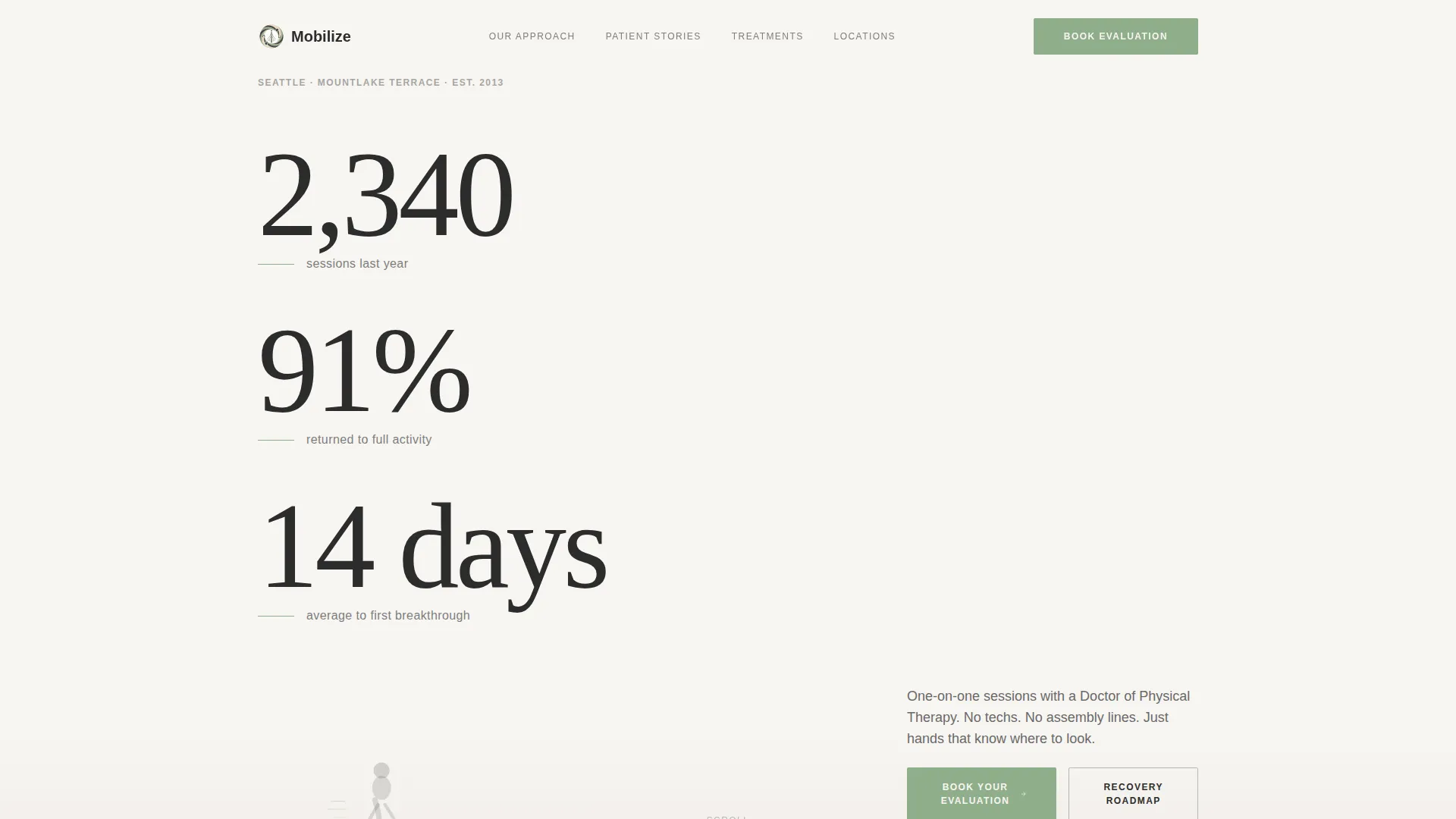
- A kinetic typography header section displaying clinic statistics one figure at a time
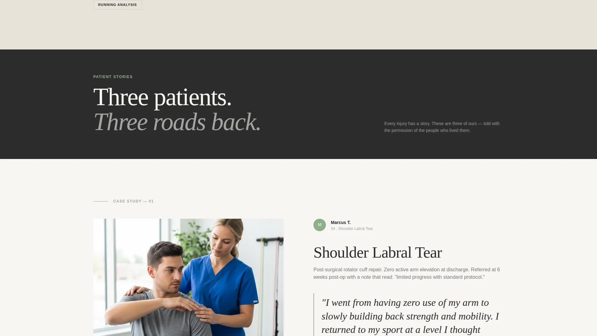
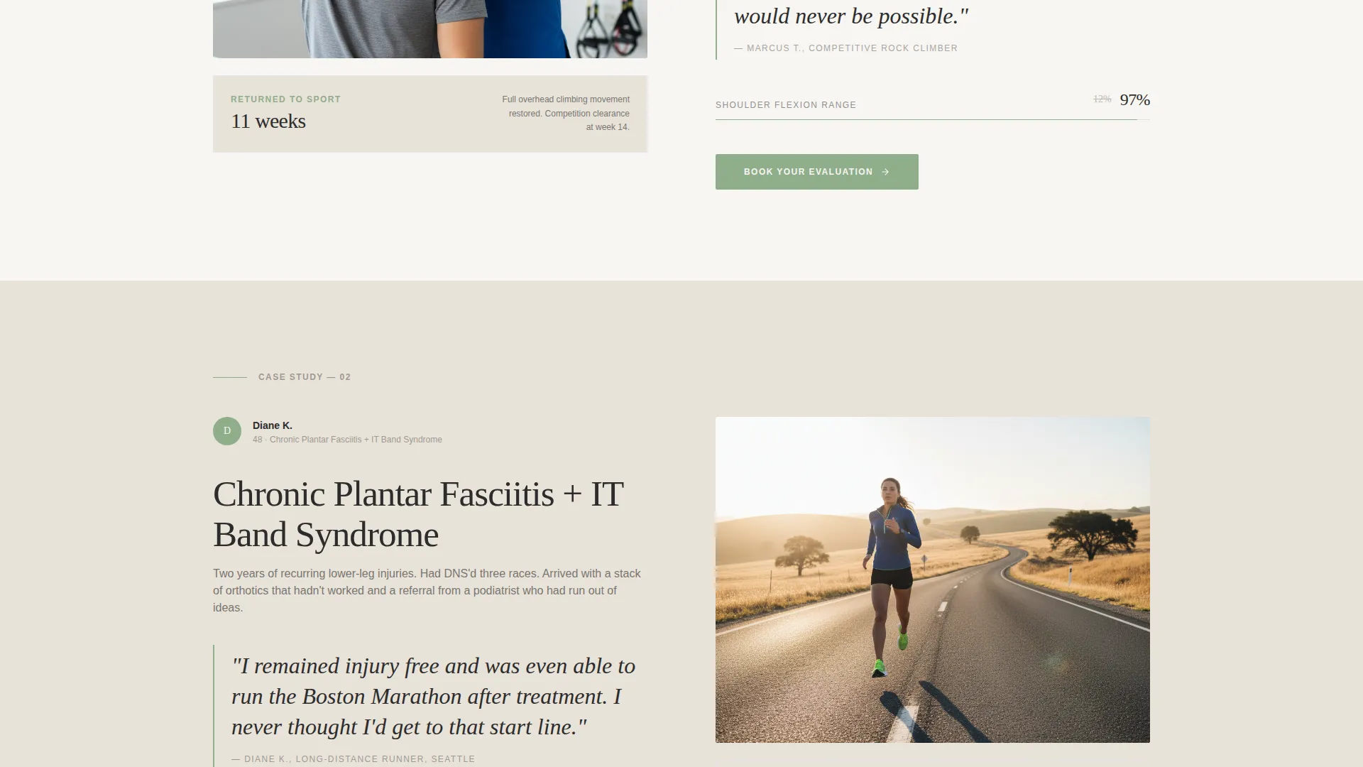
- Alternating zigzag case study sections with pull-quote typography and outcome panels
- A dual conversion path: a primary booking form and a secondary gated PDF download option
Feature list
This template packs several purposeful design and conversion features into a single coherent layout. Each one is grounded in the clinic's specific patient journey and editorial visual direction.
Kinetic Statistics Header
The header opens with a quiet animated sequence. Three key metrics appear one at a time in elegant serif type against a vapor white background. A patient silhouette fades in below the final figure, grounding the data in a human body rather than a slide deck.
Zigzag Case Study Layout
Each scrollable section alternates image-left and image-right in a magazine feature spread format. One panel shows the patient's injury context, including the referral note or brace. The opposite panel holds the patient's words in pull-quote typography. The final panel of each case reveals the outcome.
Contextual Booking Form
The "Book Your Evaluation" call to action appears at the close of each case study, timed to the moment of narrative resolution. The form leads with an injury or concern area dropdown, then preferred location, then name and phone number, reducing friction by letting the visitor describe their problem first.
Gated Recovery Roadmap Download
A secondary conversion path offers a downloadable recovery roadmap as a gated PDF. Visitors who are not yet ready to book can share their email address to receive the resource, creating a nurture-friendly lead capture option without requiring a phone call commitment.
Editorial Pull-Quote Typography
Patient words are set in large pull-quote style type, styled to feel like a print magazine feature. This gives patient voice prominent visual weight and helps prospective patients recognize their own experience in the story being told.
Cloud Canvas Color System
The palette uses soft vapor white, warm linen, editorial charcoal, and therapeutic sage. Sage is reserved for calls to action, progress indicators, and highlighted statistics, keeping the visual hierarchy clear and the overall feel calm, literate, and high-end wellness-adjacent.
Page sections overview
| Section | Purpose |
|---|---|
| Statistics header | Opens with animated clinic metrics and a patient silhouette |
| Case study one | Shows first patient arc: injury, patient quote, treatment, outcome |
| Booking form one | Captures evaluation leads at peak narrative resolution |
| Case study two | Escalates clinical complexity with a second patient story |
| Booking form two | Repeats primary call to action in context after the second arc |
| Case study three | Final case: highest complexity, strongest emotional outcome |
| Recovery roadmap call to action | Secondary lead capture via gated PDF download |
| Booking form three | Final primary call to action closing the full page sequence |
Design & branding system
The visual identity follows an editorial magazine direction built on the Cloud Canvas color system. Typography is set in elegant serif, chosen to feel like a high-end wellness journal rather than a clinical brochure. The overall tone is unhurried, literate, and clean.
- Colors: vapor white (#F7F5F2), warm linen (#E8E2D9), editorial charcoal (#2C2C2C), and therapeutic sage (#8FAE8B)
- Sage is used exclusively for calls to action, progress indicators, and highlighted statistics to preserve visual hierarchy
- No hero portraits or stock smile photography; visuals are patient-journey-focused, including MRI imagery, braces, exercise progressions, and outcome moments
Mobile & speed optimization
The template is designed with a layout structure that translates cleanly from desktop to mobile. The zigzag alternating columns reflow into a single stacked column on smaller screens, keeping the narrative sequence intact and readable without horizontal scrolling.
- Zigzag columns collapse into a single vertical stack on mobile devices
- The kinetic header sequence is designed to work within a contained viewport without overflow issues
- Form fields are sized and spaced for comfortable touch input on phone screens
How this template helps you convert
Every layout decision in Mobilize points toward one outcome: turning a hesitant visitor into a booked evaluation or a captured email lead. The structure is deliberately sequential rather than scattered.
- The statistics header earns credibility in the first few seconds, before the visitor has read a single sentence of body copy, establishing trust with hard clinic data.
- Each case study ends with a contextual booking form, so the call to action appears at the moment the visitor is most emotionally engaged with a patient story that mirrors their own situation.
- The gated PDF download gives undecided visitors a low-commitment next step, capturing their email address and keeping the clinic in their consideration without requiring a phone call.
Other information about this template
Mobilize is categorized under Professional Services with a focus on physical therapist online presence and physical therapist booking page use cases. It is built as a single-page layout, meaning all content flows within one scrollable experience rather than across multiple linked pages. The template style is editorial magazine and the theme is service utility, meaning it balances visual sophistication with a clear functional purpose. The creative direction follows a case study narrative approach, distinct from a testimonial mosaic style, though patient voice is still central to the layout through pull-quote typography. The header concept uses a light, data-forward approach rather than a dark full-bleed background, keeping the editorial feel consistent throughout.
- Template style: Editorial Magazine
- Theme: Service Utility
- Color system: Cloud Canvas
- Page type: Single-page landing page
- Primary call to action: "Book Your Evaluation"
- Secondary call to action: "Download Our Recovery Roadmap"

Theme
Service Utility
Creative direction
Testimonial Mosaic
Color system
Cloud Canvas
Style
Editorial/Magazine
Direction
Click-Through
Page Sections
Kinetic Statistics Header
Zigzag Case Study Sections
Contextual Booking Form Placement
Gated PDF Lead Capture
Editorial Pull-quote Typography
Cloud Canvas Branding System
Related questions
Who is this landing page template designed for?
Can I customize the case study sections with my own patient stories?
What does the booking form ask visitors?
What is the Recovery Roadmap download section for?
Do I need design experience to use this template?



