State Department Landing Page Template
Dispatch is a card grid landing page template built for State Department recruitment and public engagement portals. It opens with animated stat counters, a deep navy hero, and a gold-ruled headline, then unfolds a 12-card bento mosaic that proves institutional scale before asking visitors to apply. A three-step progressive form guides Foreign Service candidates from career interest to résumé upload.
by Rocket studio
Quick summary
Dispatch is a single-page landing page template designed for government recruitment and public engagement. It pairs an Institutional Authority visual theme with a Stats-First Impact creative direction, opening with bold numbers and closing with a progressive application form. Every section of this landing page is built to earn the applicant's trust before it asks for anything.
Who this template is for
This landing page template is made for teams that need to communicate institutional weight and recruit qualified candidates at the same time. It serves government communications staff, agency web teams, and digital leads who manage a department's public-facing presence.
- Mid-career civil servants studying for the Foreign Service Officer exam who want a clear, authoritative entry point into the application process
- Policy analysts and recent graduates from international relations programs who are exploring career tracks within a large federal agency
- Government web teams and communications offices that need a structured, credential-worthy landing page to represent a department's scope and services
What problem this template solves
A landing page provides someone's first impression of an agency or program. Most government recruitment landing pages fail because they lead with bureaucratic copy and bury the proof of institutional scale. Visitors arrive without much context, and a page that does not quickly answer "why does this organization matter?" loses them before they reach the form. This template solves that problem by putting numbers first and narrative second.
- Visitors see animated stat counters immediately, so the landing page establishes the department's scale before asking anyone to act
- The card grid breaks complex information into scannable chunks, so users can navigate a large agency's services without feeling lost in jargon
- The progressive three-step form reduces friction by revealing only what is required at each stage, guiding candidates through career interest, qualifications, and résumé upload in sequence
What you get with this template
This template delivers a complete, ready-to-customize landing page structure that supports both recruitment goals and public engagement goals. Every component described in the source brief is included as a built-in section or interactive element.
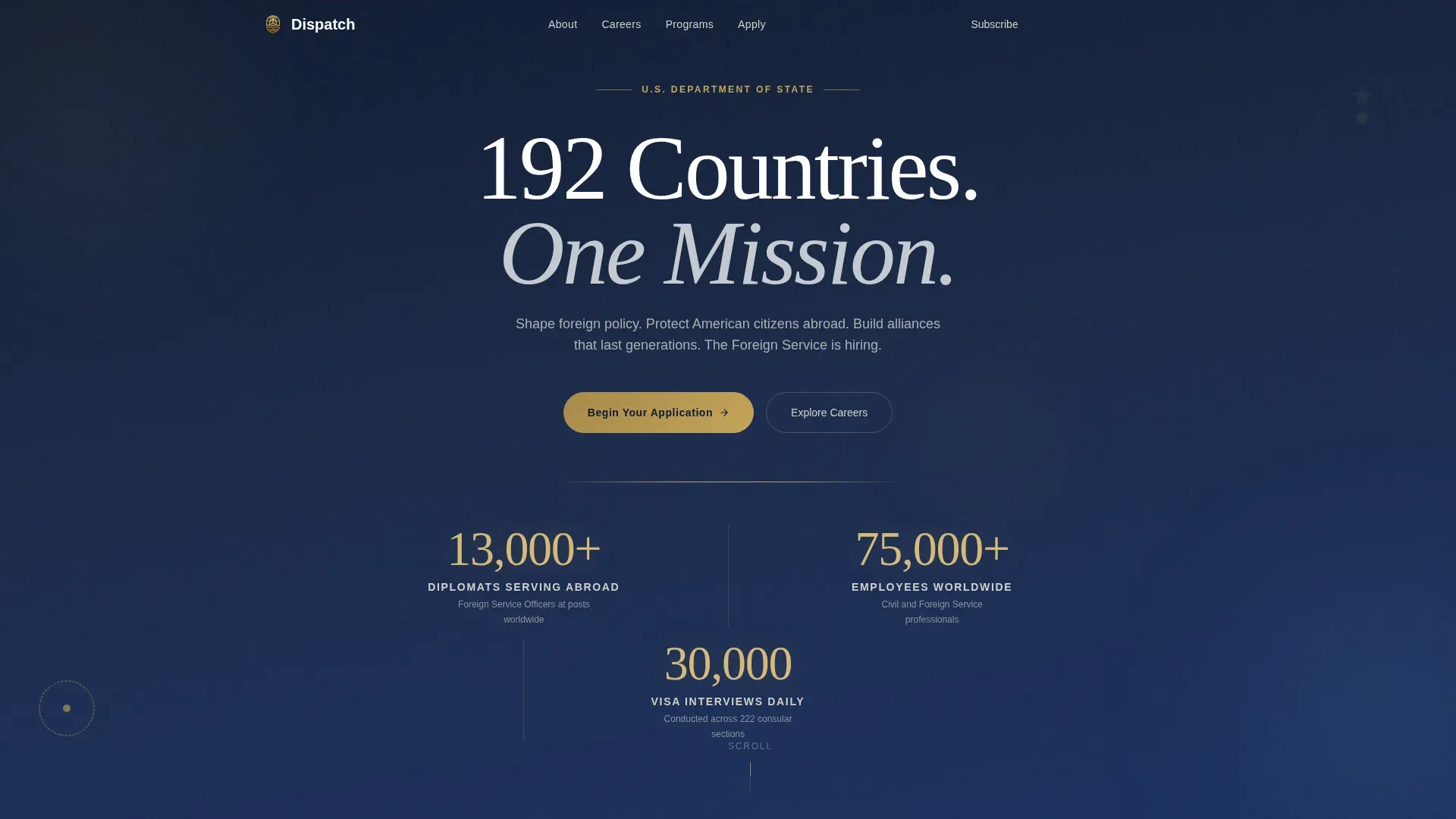
- A hero section with a centered giant headline, three animated stat counters, and a gold rule separator, all set on a deep state navy background
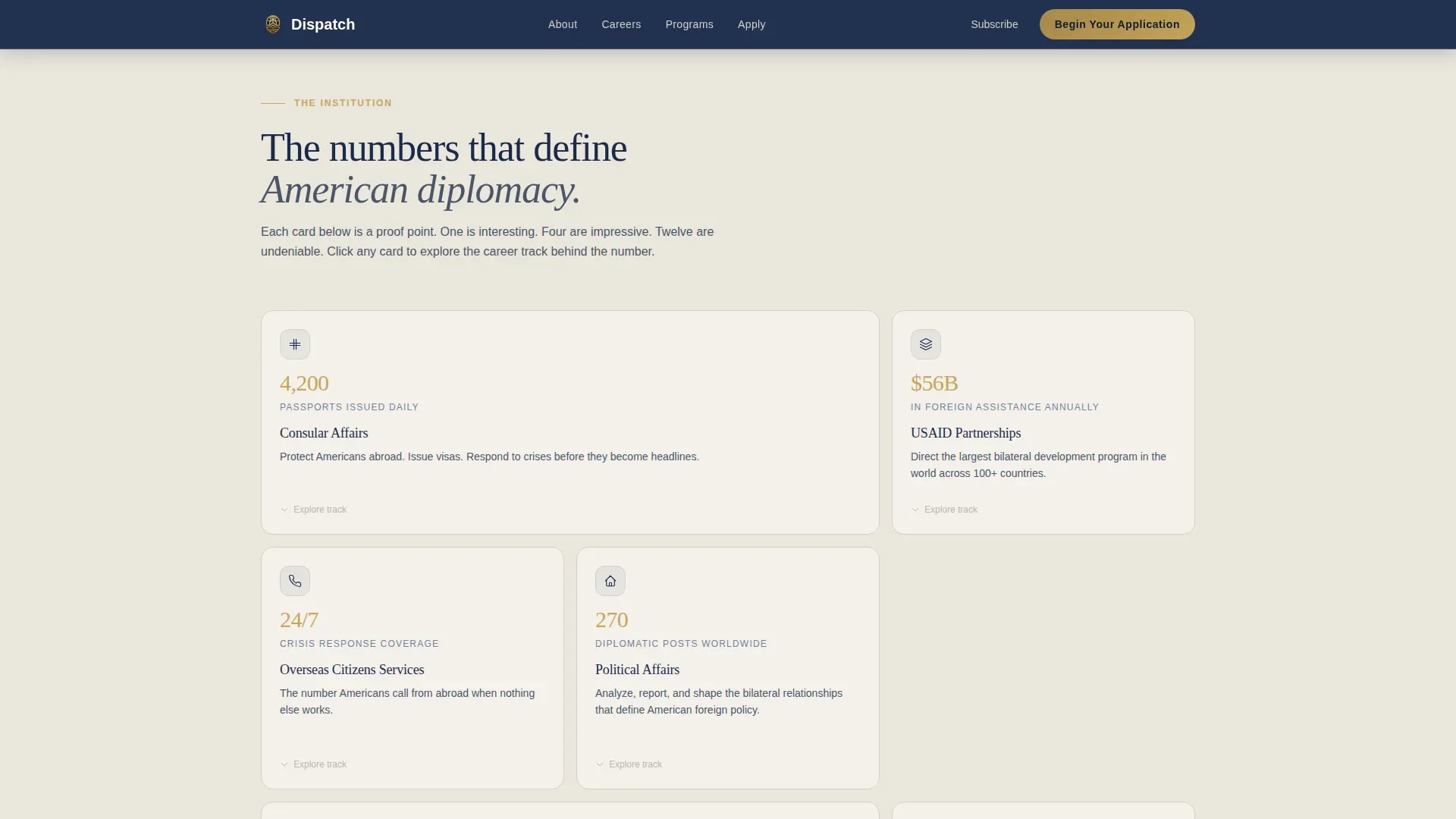
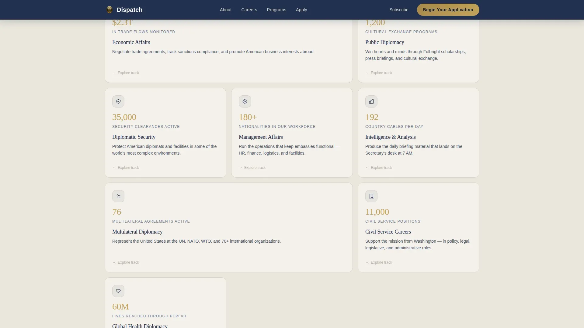
- A 12-card bento mosaic grid where each card opens with a statistic, expands to reveal a career track and a pathway deeper into the department's services, and collapses cleanly back into the grid
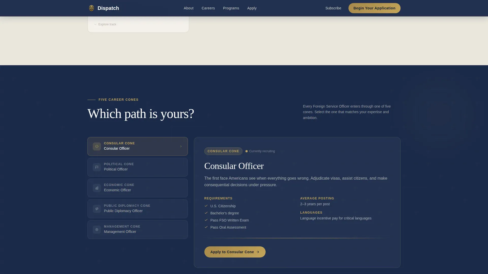
- Five career track pathway cards covering Consular, Political, Economic, Public Diplomacy, and Management tracks, plus a three-step progressive application form and a sticky navigation bar with a pinned call-to-action button
Feature list
This landing page template is built around six primary functional components. Each one is designed to carry a specific share of the page's conversion and engagement goals.
Animated Stat Counter Hero Section
The hero section of this landing page opens with a stark white serif headline on deep state navy. Three stat counters animate on load, ticking upward like an arrivals board at an international terminal. The numbers do the work of a photograph. A restrained gold rule separates the headline block from the scroll below, signaling that the body of the page has something important to say.
Stats-First Bento Card Grid
The card mosaic is the structural heart of this landing page template. Twelve cards of varied sizes create a modular grid where every card leads with a number before a narrative. Each card is expandable: clicking it reveals a brief article-style explainer, a relevant career track label, and a pathway deeper into the department's information. The rhythm of accumulation makes each successive card more persuasive than the last.
Five Career Track Pathway Cards
A dedicated section displays five cone-shaped pathway cards, one for each career track: Consular, Political, Economic, Public Diplomacy, and Management. This section helps users quickly identify which track aligns with their background and goals, reducing the cognitive load that a large agency's career page generally creates for first-time visitors.
Progressive Three-Step Application Form
The application form uses progressive disclosure to collect information across three steps. Step one asks for career interest area and highest degree held. Step two asks for citizenship status and language proficiencies. Step three requests a résumé upload. This structure means users are never confronted with an overwhelming list of fields at once, and the form earns trust by asking for commitment gradually.
Sticky Navigation with Pinned Call-to-Action Button
A sticky navigation bar activates after the first scroll and keeps the primary call-to-action button visible at all times. The button reads "Begin Your Application" and remains locked in place as the visitor moves through the page. A secondary action, "Subscribe to Diplomatic Briefs," is available for lighter-commitment leads who are not ready to enter the full application sequence.
Social Proof and Diplomat Testimonials Section
A dedicated social proof section displays three career diplomat testimonials with specific posting details, grounding the page in lived experience rather than abstract agency values. An animated global metrics bar runs alongside the testimonials, reinforcing institutional scale with additional numbers. This section answers the quiet question every applicant carries: do real people build careers here?
Page sections overview
| Section | Purpose |
|---|---|
| Hero Headline Block | Establish institutional scale with animated stat counters and gold rule |
| Bento Card Mosaic | Showcase twelve stats-first expandable service and career cards |
| Career Tracks Section | Present five pathway cards for each Foreign Service career cone |
| Social Proof Bar | Display diplomat testimonials and animated global metrics |
| Progressive Application Form | Collect career interest, qualifications, and résumé in three steps |
| Sticky Navigation Bar | Keep the primary action button visible throughout the page |
| Footer | Single-row linear footer with contact and department links |
Design & branding system
The visual identity of this landing page follows the Cloud Canvas color system, built around four core values: diplomatic ivory, fog gray, deep state navy, and restrained gold. The overall aesthetic feels like a classified folder resting on a mahogany desk, where every surface is deliberate and every detail communicates authority.
- Deep state navy (#1B2A4A) dominates the header and footer sections, while diplomatic ivory (#F4F1EB) breathes across card backgrounds and the body of the page; fog gray (#D5D0C8) separates sections the way a quiet pause separates sentences in a careful document
- Restrained gold (#C5A55A) is reserved for seals, interactive borders, hover states, and active button highlights, ensuring that the color only appears where authority needs to speak
- Typography pairs Fraunces serif headlines with DM Sans for body copy and user interface elements, creating a contrast between the weight of institutional history and the clarity of modern digital design
Mobile & speed optimization
This landing page template is built desktop-first, reflecting the research behavior of Foreign Service exam candidates who generally work on desktop devices. Full mobile responsiveness ensures the page adapts cleanly to phones and tablets as well, so no visitor is excluded depending on the device they use.
- The card grid layout reflows for smaller screens, ensuring the bento mosaic remains navigable on mobile without losing the stats-first visual hierarchy
- Counter animations, staggered card reveals, shimmer effects, and card expand-and-collapse interactions are all handled by client-side components, while static sections use server components for faster initial load
How this template helps you convert
This landing page is built around a specific conversion sequence: prove scale first, then earn the application. The page does not ask for commitment until it has demonstrated that this agency is worth committing to.
- The animated stat counters in the hero section establish institutional credibility within the first three seconds of landing on the page, making the decision to apply feel informed rather than impulsive
- The expandable card grid progressively builds a case for the department's scope and services across twelve self-contained proof points, so by the time a visitor reaches the form, the numbers have already made the argument
- The sticky navigation bar with a pinned "Begin Your Application" button ensures the primary call-to-action remains visible and reachable at every scroll depth, removing any friction between intent and action
Other information about this template
This section covers additional practical context about how the Dispatch template fits into the broader landscape of government web design, what standards it is aligned with, and how teams can use it as a starting point for their own projects.
The Dispatch institutional authority state department landing page template is aligned with the design principles that govern federal government websites. Templates designed for federal government websites generally follow the United States Web Design System (USWDS) guidelines to ensure consistency, accessibility, and trust across public-facing government pages. The USWDS provides a shared visual and structural language that users of federal government websites already recognize, which helps a department's landing page feel immediately credible.
The Department of State operates under a wide range of statutes and regulations, including the State Department Basic Authorities Act and the Foreign Service Act of 1980. The Bureau of Administration, overseen by the Assistant Secretary, is responsible for establishing program priorities and overseeing the preparation of budget estimates for the bureau. The Secretary and the office of the Assistant Secretary manage the department's logistics functions, including acquisition, supply, transportation, and property management. The Assistant Secretary also ensures that a process is in place to evaluate proposed collections of information for Office of Management and Budget review and approval.
The Bureau of Administration is responsible for the development and implementation of a department-wide risk-based breach notification policy, and it oversees the department's Records Program and Information Access Management. It serves as the department's Chief Freedom of Information Act Officer, responsible for agency-wide compliance, and it coordinates with the Office of Management and Budget and Congressional committees regarding department operations. The bureau is also responsible for the department's compliance with the Freedom of Information Act and the Privacy Act. It develops and implements policies for the management of personal property and records, including transportation and fleet management, supply chain activities, and domestic real property and facilities management services.
A dispatch institutional authority, in the broader government context, refers to a centralized, authorized unit within a government agency that has the power to direct, assign, and control resources. Operational Command in this context serves as the voice of top leadership for directing field units, often operating on a 24-hour, 7-day basis. A dispatch institutional authority also monitors state-level facilities and manages emergency situations, which is part of why a landing page for this kind of agency must clearly describe the scope and chain of command.
This template can serve as a starting point for teams working on a range of government web projects. DUSWDS templates are customizable and designed within USWDS guidelines to ensure compliance with government design standards. The USDOT Web Design System provides templates that include features like hero sections, carousels, and news components, offering a useful example of how government design systems implement modular page types. Templates in DUSWDS include various page types such as landing pages, documentation pages, and error pages. The DUSWDS landing page template combines flexible layouts with customizable components to showcase government departments or programs, and this template follows the same principle.
Modern no-code and AI-powered tools make it easier to implement and customize templates like Dispatch without traditional programming skills. AI-powered no-code tools enable users to create production-ready applications from natural language prompts, and no-code platforms can handle deployment processes automatically. This means a government communications team can launch a polished, scalable landing page without extensive coding knowledge, while still maintaining full control over the content, article copy, and section order.
- The landing page must prominently feature a.gov identifier to signal authenticity to all site visitors
- The page should use direct, non-jargon language that breaks down complex department information into scannable chunks for diverse audiences
- A clear, action-oriented headline describing the dispatch or authority in 10 to 20 words is a required element of any effective government landing page
- The homepage and internal landing pages across a department's site should provide clear navigation so users can find the resources, office contacts, and program information they need
- This template supports landing page goals ranging from recruitment and public engagement to policy communication and program showcase, depending on how teams configure the card grid and form components
Theme
Institutional Authority
Creative direction
Stats-First Impact
Color system
Cloud Canvas
Style
Card Grid (Modular)
Direction
Lead Generation
Page Sections
Animated Stat Counter Hero Section
Stats-first Bento Card Mosaic
Five Career Track Pathway Cards
Progressive Three-step Application Form
Sticky Navigation with Pinned Call to Action Button
Social Proof and Global Metrics Bar
Related questions
Who is this landing page template designed for?
Can I customize the card grid and career track sections?
Does the template include the application form?
Is the template aligned with government web design standards?
How does the sticky navigation bar work on this page?