VTO Platform, Comparison Table Landing Page
The Mobilize template is a comparison table landing page built for Volunteer Time Off (VTO) platforms targeting HR directors, CSR managers, and People Ops leads. It pairs an employee testimonial hero card with a three-column feature comparison, real volunteer event photos, and a diagnostic lead generation form, teaching visitors why manual tracking fails before presenting the solution.
by Rocket studio
Quick summary
The Mobilize template is a single-page, comparison-led landing page designed for a Volunteer Time Off platform. It opens with an oversized employee testimonial card, flows into an educational explainer section, and drops visitors into a decisive three-column comparison table. A diagnostic lead form captures qualified leads mid-page and again via a sticky bottom bar.
Who this template is for
This template is built for B2B SaaS teams in the HR tech and corporate social responsibility space. It is specifically designed to speak to decision-makers who need to justify a volunteer benefit to leadership and procurement.
- HR directors at mid-size companies rolling out ESG or VTO initiatives
- CSR managers coordinating nonprofit partnerships across multiple office locations
- People Ops leads who need board-ready impact data to prove the value of volunteer programming
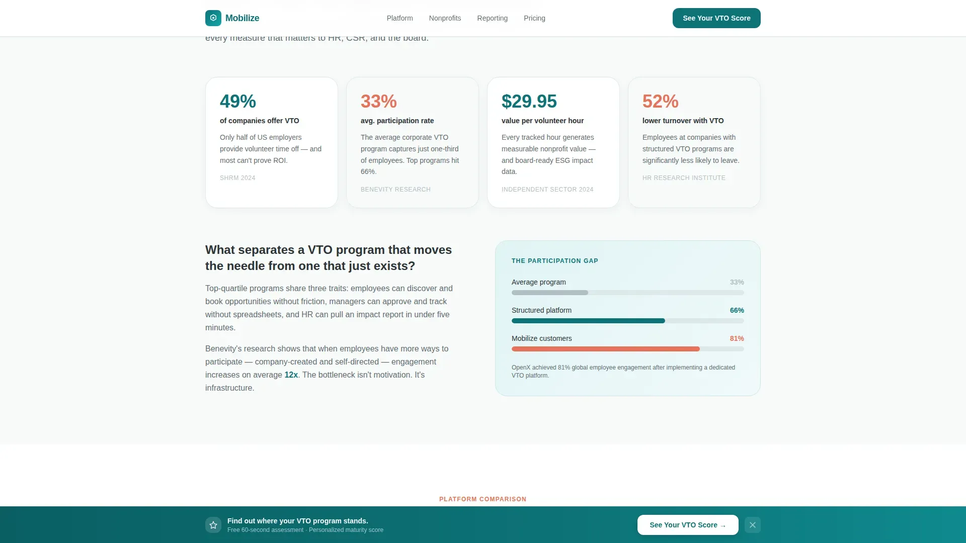
What problem this template solves
Most companies offer a Volunteer Time Off benefit on paper but have no reliable way to track usage, report outcomes, or connect employees to real opportunities. The result is a benefit that exists in the employee handbook but rarely shows up in quarterly reports.
- Employees cannot easily find, book, or log volunteer hours without juggling spreadsheets
- HR teams cannot produce participation data when leadership or ESG audits ask for proof
- CSR managers waste time manually coordinating between nonprofit calendars and internal PTO systems
What you get with this template
This template gives you a complete lead generation landing page structured to educate, compare, and convert. Every section is purposefully sequenced to build trust before asking for anything.
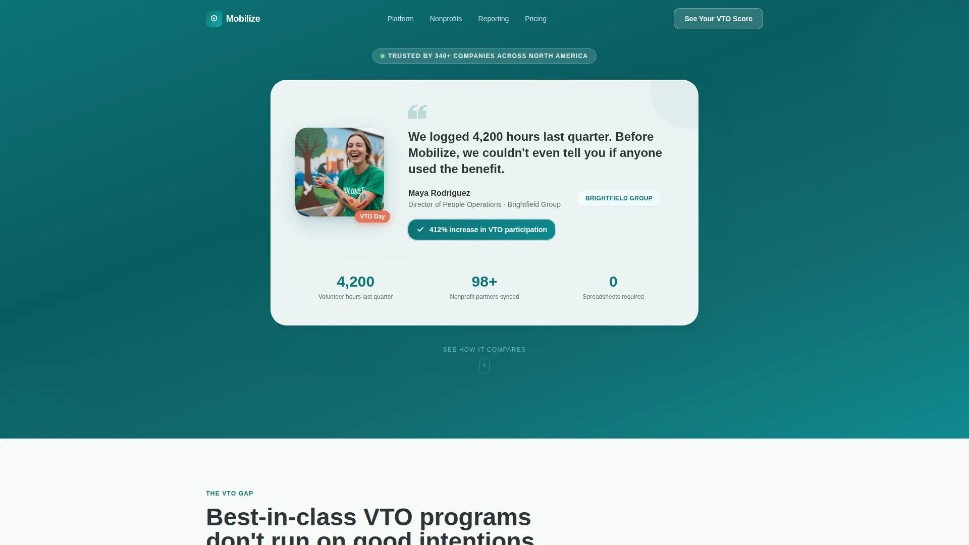
- An oversized testimonial hero card featuring an employee photo, a two-sentence quote, company logo, and a stat badge showing 412% increase in VTO participation
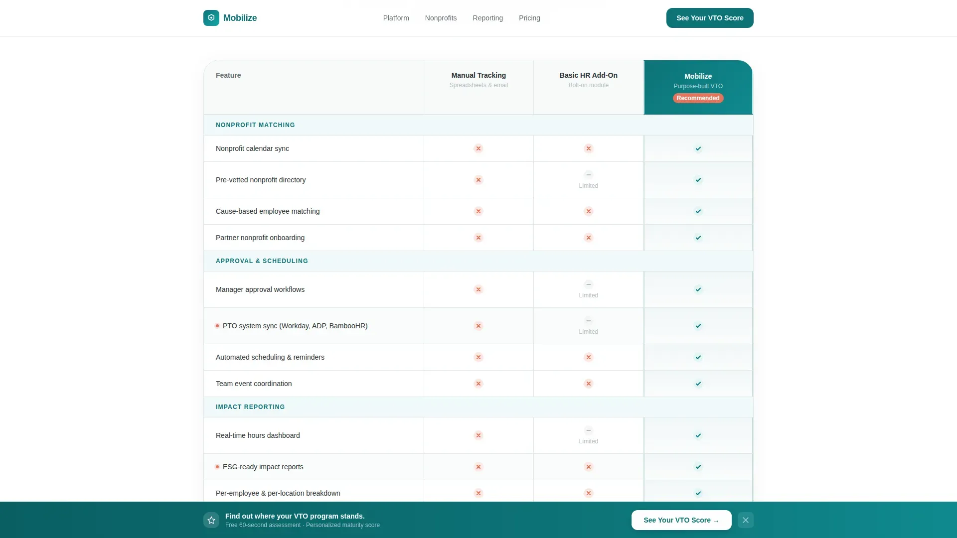
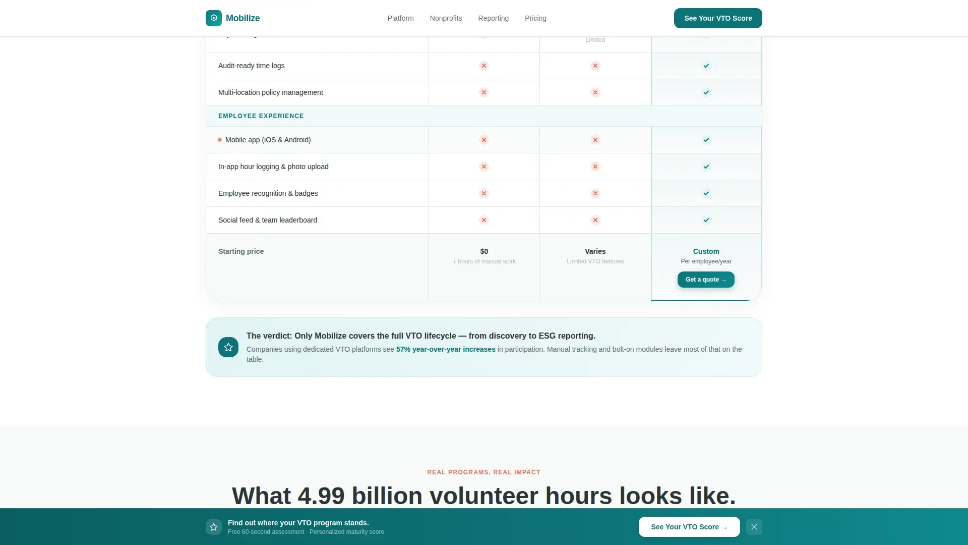
- A three-column comparison table contrasting Manual Tracking, Basic HR Add-On, and the platform across rows covering nonprofit matching, manager approval, impact reporting, payroll integration, and mobile experience
- Full-bleed volunteer event photo breaks captioned with company names and hours logged, placed between table sections to humanize the data
- A mid-page diagnostic lead form and a scroll-triggered sticky bottom bar, both driving visitors to request their personalized VTO maturity assessment
Feature list
This template is built around components that do real work. Each one is grounded in the page's educational-to-conversion flow.
Testimonial Card Hero
A large floating card sits at the top of the page on a soft white background. It features an employee photo, her name and title, her company logo, a two-sentence quote, and a teal badge reading "412% increase in VTO participation." There is no competing hero image, the card is the hero.
Three-Column Comparison Table
The table contrasts Manual Tracking, a Basic HR Add-On, and the Mobilize platform side by side. Rows cover nonprofit matching, manager approval workflows, impact reporting, payroll integration, and employee mobile experience, with green checkmarks and coral X-marks making the verdict immediately clear.
Educational Explainer Section
Before the comparison table, a short explainer section teaches visitors what best-in-class VTO programs actually look like. This "teach before you sell" structure builds credibility and frames the comparison that follows.
Volunteer Event Photo Breaks
Full-bleed team photos from real volunteer events are placed between table sections to break the grid. Each photo is captioned with a company name and hours logged, grounding the data in human moments.
Diagnostic Lead Generation Form
The mid-page form asks four short questions: company size, current VTO policy status, number of office locations, and work email. The diagnostic framing promises a personalized VTO maturity assessment rather than a sales call, making the form feel like a tool.
Scroll-Triggered Sticky Bottom Bar
A sticky bottom bar appears as the visitor scrolls, carrying the same "See Your VTO Score" call to action. It provides a persistent conversion path without interrupting the reading experience.
Page sections overview
| Section | Purpose |
|---|---|
| Testimonial Card Hero | Opens with human-scale social proof and a participation stat badge |
| Best-in-Class Explainer | Teaches visitors what a strong VTO program looks like before selling |
| Comparison Table | Lets visitors see Manual, HR Add-On, and platform side by side |
| Volunteer Event Photos | Humanizes data with real team moments and captioned hours logged |
| VTO Score Form | Captures qualified leads via a four-question diagnostic mid-page |
| Sticky Bottom Bar | Provides persistent scroll-triggered access to the lead form |
| Footer | Single-row linear footer pattern closing the page |
Design & branding system
The visual identity follows an Educational Guide theme using a Teal Catalyst color system. The palette feels earnest enough to signal purpose and polished enough to survive a procurement review.
- Deep mission teal (#0D7377) anchors headers, primary buttons, and the top third of the page; soft volunteer white (#F7FAFA) fills section backgrounds with generous breathing room between comparison rows
- Warm humanity coral (#E8735A) is used sparingly on badges, notification pings, data highlights, and X-marks in the comparison table to pull the eye exactly where it needs to go
- Typography uses Plus Jakarta Sans for headers and interface elements alongside DM Sans for body text, keeping the tone professional without feeling corporate
Mobile & speed optimization
Although the page is designed desktop-first to match how HR and procurement decision-makers browse, the layout is built with a solid mobile fallback so no lead is lost on a smaller screen.
- Scroll reveal animations and staggered table row entrances are set to medium intensity, keeping the page lively without overwhelming slower connections
- The sticky bottom bar and lead form are handled as client-side components, while static page sections use server-side rendering to keep the initial load fast
- The comparison table uses hover states on desktop and adapts cleanly to vertical scrolling on mobile so the data remains readable at any screen width
How this template helps you convert
The page is built around a teach-first, convert-second sequence that reduces friction at every step.
- The testimonial card opens the page with a real employee story and a specific participation stat, establishing credibility before the visitor reads a single feature claim.
- The comparison table makes the case visually and logically, using checkmarks and coral X-marks to deliver a verdict that feels earned rather than sold.
- The diagnostic form reframes data capture as a value exchange, visitors get a personalized VTO maturity assessment, which makes submitting a work email feel worth it.
Other information about this template
This template is built inside a modern component architecture that supports medium animation complexity. It is suited to HR tech teams, CSR platform vendors, and employee benefits software companies looking to launch or refresh a lead generation page for their volunteer time off offering.
- The page uses Plus Jakarta Sans and DM Sans as its typography pairing, both widely available and well-suited to SaaS product marketing
- The Teal Catalyst color system and Educational Guide theme can be adapted to align with existing brand guidelines without restructuring the layout
- The template is categorized under HR and Hiring, with a focus on Employee Wellness and Benefits, making it a strong fit for platforms competing in the corporate volunteering, ESG reporting, and employee engagement software space
- Localization defaults are set to English, USD, and US date format, which suits the primary target market of mid-size US companies with 500 to 5,000 employees
Theme
Educational Guide
Creative direction
Team & People
Color system
Teal Catalyst
Style
Comparison Table
Direction
Lead Generation
Page Sections
Testimonial Card Hero Section
Three-column Comparison Table
Educational Explainer Section
Volunteer Event Photo Breaks
Diagnostic Lead Generation Form
Scroll-triggered Sticky Bottom Bar
Related questions
Who is this landing page template designed for?
What does the comparison table section include?
How does the diagnostic lead generation form work?
Can the color system be updated to match an existing brand?
Does this template include a mobile-friendly layout?


